Designers often have to cajole clients into adding color to their interiors. That wasn’t the case with this Houston home, however. The clients—a married couple with college-age children—“wanted a layered home with jewel tones,” says Chandos Epley Dodson, of Chandos Interiors. In fact, they even specified a red kitchen and a green library.
The clients also wanted “a very traditional home but with modern amenities,” Chandos says. So while the 6,000-square-foot house was a new build, Chandos and architect Ryan Gordon “spent countless hours on millwork and hardware to give it the feeling of an old house,” she explains. “I think these details make the most impact on the longevity of a home. Most people who visit the home think it was a renovation instead of new construction.”
Chandos and team took inspiration from John Staub, an architect known for designing grand Regency-style homes in the Houston area. (Bayou Bend, the one-time home of the unfortunately named philanthropist and art collector Ima Hogg, is probably Staub’s best-known work.) In this home, the shell motifs on the corner built-in dining room cabinets reflect Staub’s influence, as do the marble fireplace surrounds and the broad, uninterrupted walls ideal for displaying large artworks.
Given these traditional influences, along with the clients’ impressive assortment of antiques, the home could easily have looked like a museum piece or, worse, a pastiche of a stately home. But designer and architect made sure to keep contemporary livability at the forefront.
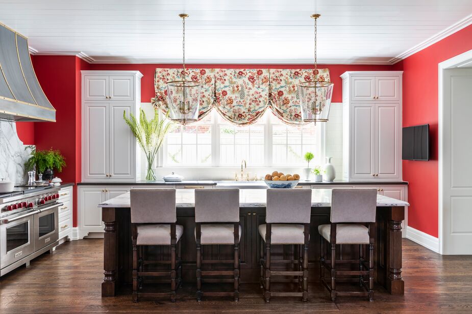
The white cabinetry and the island’s white stone counter balance the kitchen’s red walls and the dark wood of the stool legs and island base.
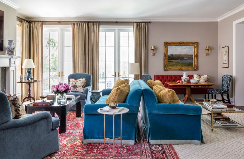
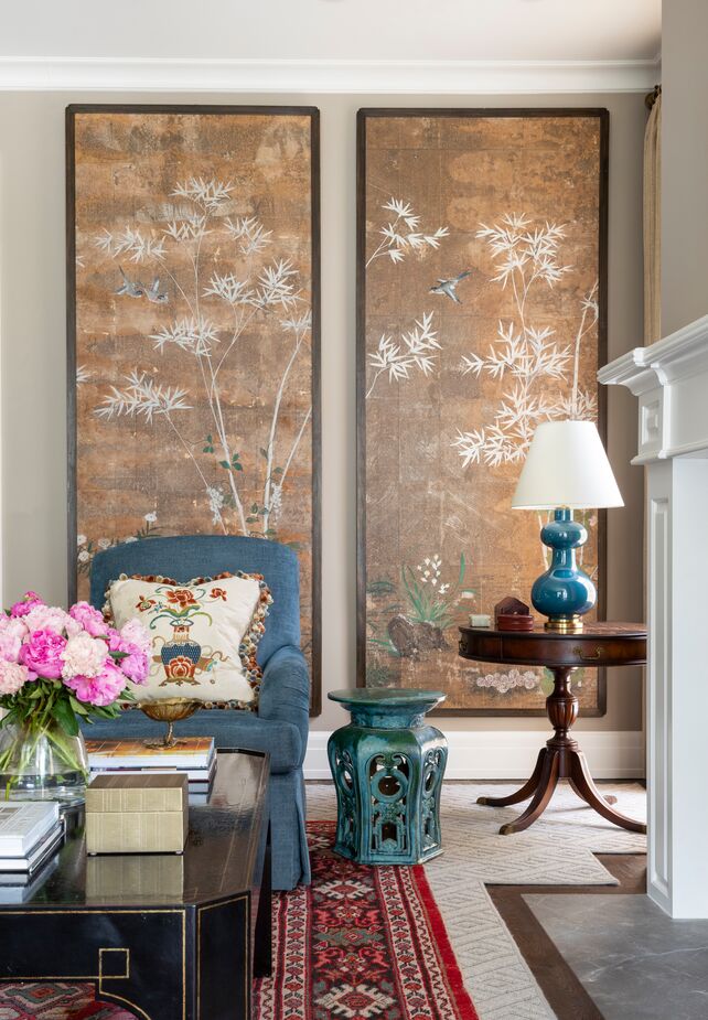
Take the living room, where back-to-back skirted sofas create two distinct sitting areas. One sofa, accompanied by English-arm chairs and chinoiserie decor, faces a fireplace. The other looks into the kitchen, something that Staub’s clientele would never have dreamed of. Chandos did this because the homeowners like to entertain, “so when the client is cooking there is a comfortable spot for guests and family to sit and chat. We often combine living and dining spaces together these days to make a room multifunctional, and everyone seems to gravitate to the kitchen, so I like to pull them into more of the living spaces.”
To “create harmony between the spaces,” Chandos made sure that the red of the kitchen walls was also present in the adjoining living room. The diamond-tufted banquette, for instance, is upholstered in lush ruby fabric, and the ground of the antique rug is a similarly rich red.
Modernizing the scale of the interiors was another way to ensure that this traditional home felt anything but dated. “Scale seems to change with every decade. In older homes if ceilings were high, doors still remained low,” Chandos notes. “We made sure the interior architecture and finishes spoke to the past but still respected the aesthetics of today in a modern way.”
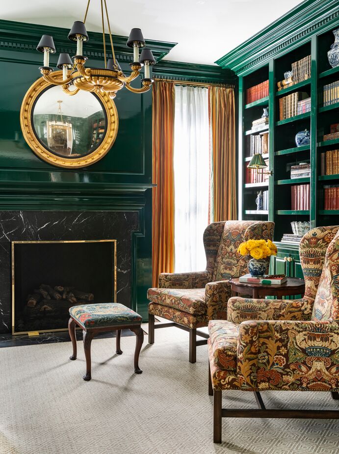
Flashes of gold—including the upholstery of the wingback chairs as well as the mirror and the chandelier—complement the glossy finish of the library’s deep green walls and millwork.
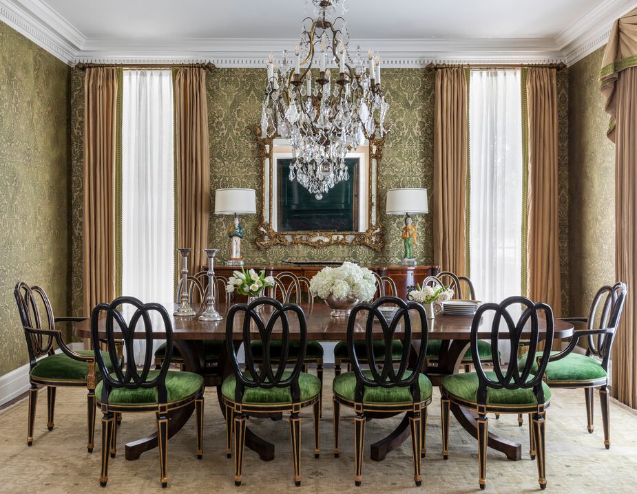
The dining room is probably Chandos’s favorite space in the home: “It has a wonderful mix of antiques, and it just seems the perfect spot for any holiday with the green-and-gold damask walls. I love an ebony chair with a classic Sheraton table too.”
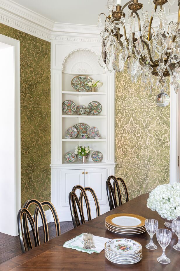
Chandos and architect Ryan Gordon designed the dining room built-ins. “The client had a gorgeous collection of Rose Medallion porcelain, and this was the perfect way to display it,” she says.
The house’s generous proportions allowed Chandos and the homeowners to fill the rooms with a wealth of heirlooms, collections, and traditional-style furnishings while maintaining a contemporary sense of airiness. It also helps that crystal chandeliers and glass-top tables provide a glimmering, sparkling counterpoint to the skirted seating and dark woods.
Brides have long been told to wear something old, something new, something borrowed, and something blue for good luck. With its antique furnishings, new construction, eye for detail borrowed from Chandos, and inviting blue (and red, and green) palette, this house is certain to be a lucky one—and of course, a beautifully livable one—for its owners.
Shop New Traditionalist favorites >
Shop chinoiserie >
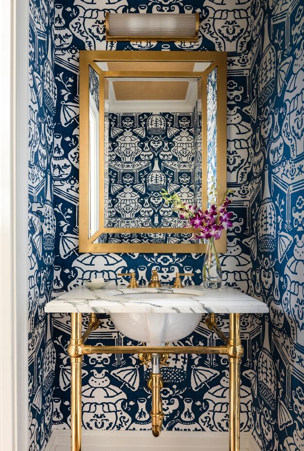
The oversize chinoiserie motif of this powder room’s wallpaper is a playful take on traditional elegance.
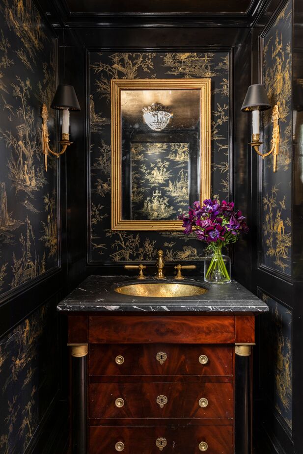
This powder room is Old World allure at its most dramatic.
Join the Discussion