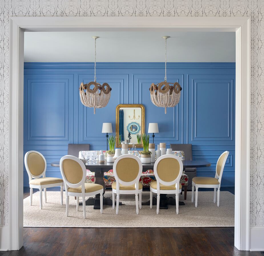
With its vivid blue walls, distinctive millwork, and sunny fabrics, the dining room of this Atlanta home is a showstopper. But for more than a year, it was a de facto tricycle racetrack for the owners’ two older children.
“This young family moved from the DC area and were very excited to have more space but also overwhelmed by the number of decisions,” explains Lathem Gordon, one-half of interior design firm GordonDunning.
“The room was a white box,” adds Lathem’s business partner, Cate Gordon. “There was no molding, no light fixture, no nothing. When they bought the house, they knew they wanted a dedicated dining space, but they wanted to wait until their children were a little older and they could fully focus on doing the space as they dreamed.”
The clients wanted the dining room, and the home in general, to accommodate family life and dinner parties alike. “We took great care to design and map out the millwork and select the just-right blue [Notable Hue from Sherwin-Williams] to be the backdrop of the memories created in this room,” Cate says. “We worked to incorporate classic lines to give the space a strong foundation, but we also brought in some punchy color and pattern for spunk.” That includes a banquette with floral upholstery that complements the wall color and Louis XVI-style chairs with fresh white frames.
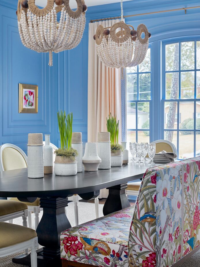
The wooden beads of the chandeliers and the collection of stoneware vessels on the table accentuate the dining room’s joie de vivre. Find a mirror similar to the one in the top photo here.
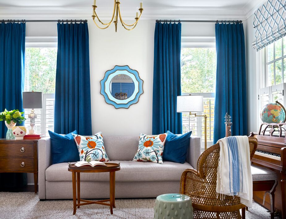
Directly across from the dining room (which is visible in the wall mirror), the music room also tells a lively color story. The easy-to-move wicker chair, the tray table, and the adjustable floor lamp enable this room to accommodate solo reading sessions, after-dinner cocktails, and impromptu concerts alike. Find a similar floor lamp here.
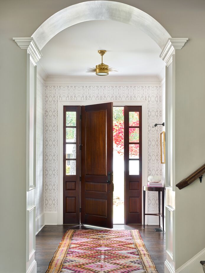
Along with the dining room, the foyer was a favorite space to design. “We wanted it to feel classic but have meaningful and memorable impact as you entered the home,” Lathem says. Find similar vintage floor runners here.
Opposite the dining room, separated only by the entry, is the music room. “Given that these spaces are the first you see upon entering the foyer and are directly across from each other, we really had to consider how they worked together,” Cate says. “We wanted the dining room to be the star of the show, but the music room needed to be complementary.” To that end, Cate and Lathem opted for bold blue curtains and accents to visually tie the spaces together.
Because the entry is sandwiched between two vibrantly hued rooms, “we wanted to keep color to a minimum,” Lathem says. The patterned but neutral-toned wallpaper provides enough visual and textural interest to hold its own amid the flanking rooms without detracting from the enviable millwork, doorway arch, and artwork.
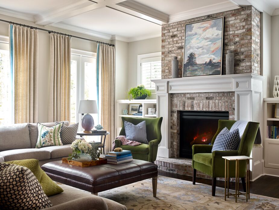
Deeper into the house is the living room. “This is the center of their home—where the Christmas tree lives, where family movie nights happen, where the core family memories are made—and we wanted to embrace that,” Lathem says. Here the palette is warmer, with earthy browns and mossy greens. Two emerald-green armchairs, however, reference the bolder, brighter colors of the front rooms.
“The greatest challenge was ensuring that all the neighboring spaces worked well together, because the floor plan is relatively open,” Cate says. Not only did GordonDunning rise to the challenge, but the designers ensured that the memories made here will be beautifully colorful ones.
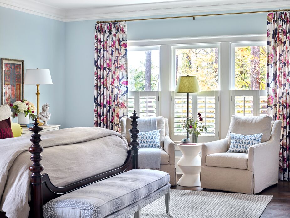
Lively floral curtains and the dark wood of the carved bed frame provide just enough contrast to enliven the main bedroom’s pastels without disturbing the serene ambience.
Join the Discussion