Retirement can be a time of major changes. It certainly was for Ron and Andrea Hein. Not only did they decide to move from bustling Los Angeles to the quiet town of Montecito in California’s Santa Barbara County, where they could walk to the beach, but in doing so they opted for a Mid-Century Modern home rather than a house similar to their 1920s Spanish Colonial in L.A.
One thing they didn’t change was their interior designer. Just as they had for their L.A. home, the Heins called on Karen Harautuneian, owner and principal designer of Hub of the House Studio.
The Heins’ previous home “featured deep rich woods and white plaster walls,” Karen says. “For their new home, they requested clean lines with a calming palette in light natural woods, cool metals, and blue-green colors to complement the indoor/outdoor feeling of the home.” To that end, Karen worked with local construction company Giffin & Crane on “a full interior architectural remodel, with a focus on the kitchen, baths, fireplaces, and laundry room as well as architectural finish changes throughout.”
Expansive windows frame the beauty of the surroundings, which include a Japanese-style garden, a patio with living and dining areas shaded by umbrellas, and Montecito Peak just beyond.
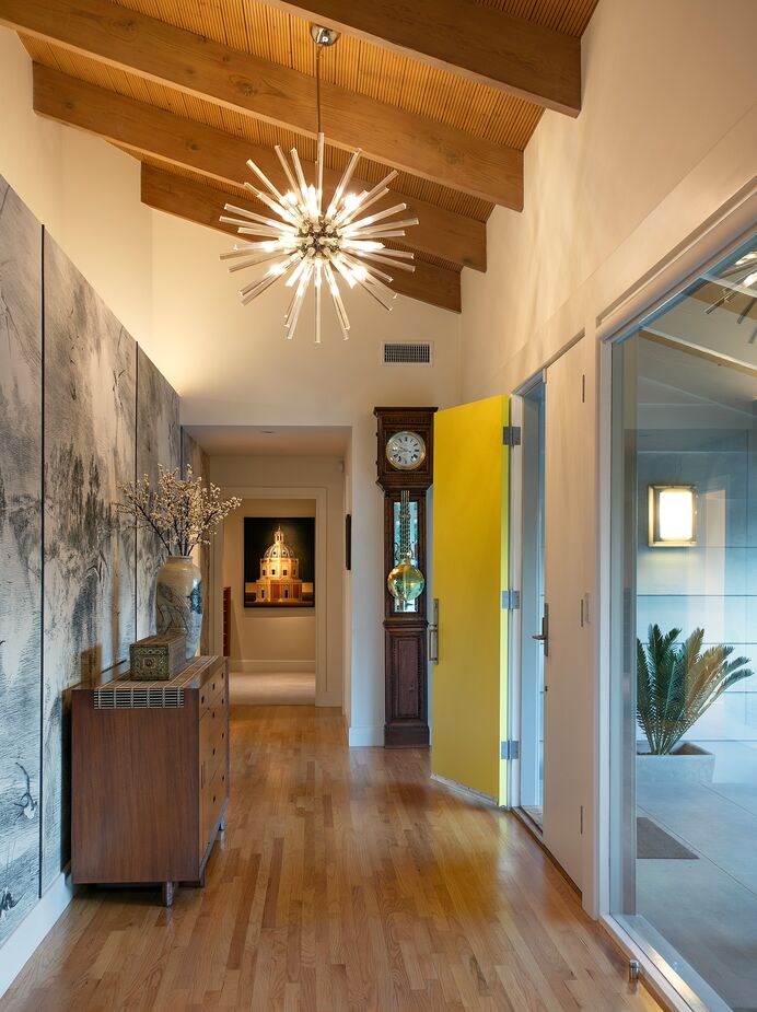
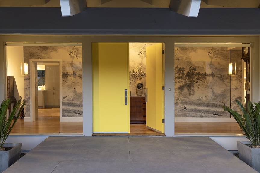
“I am most proud of how a long, awkward, nondescript entryway was transformed into a beautiful layered space with an inviting yellow front door and a secret door hidden behind the wallpaper,” Karen says. Find a similar Sputnik chandelier here.
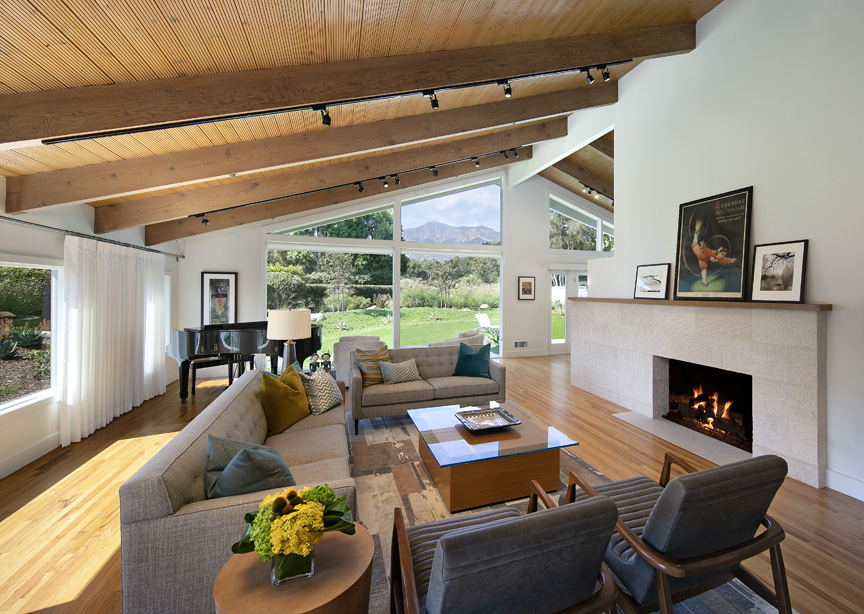
The woven fabric covering the sofa and settee, along with the channeled upholstery of the armchairs, softens the smooth surfaces that form the foundation of the living room.
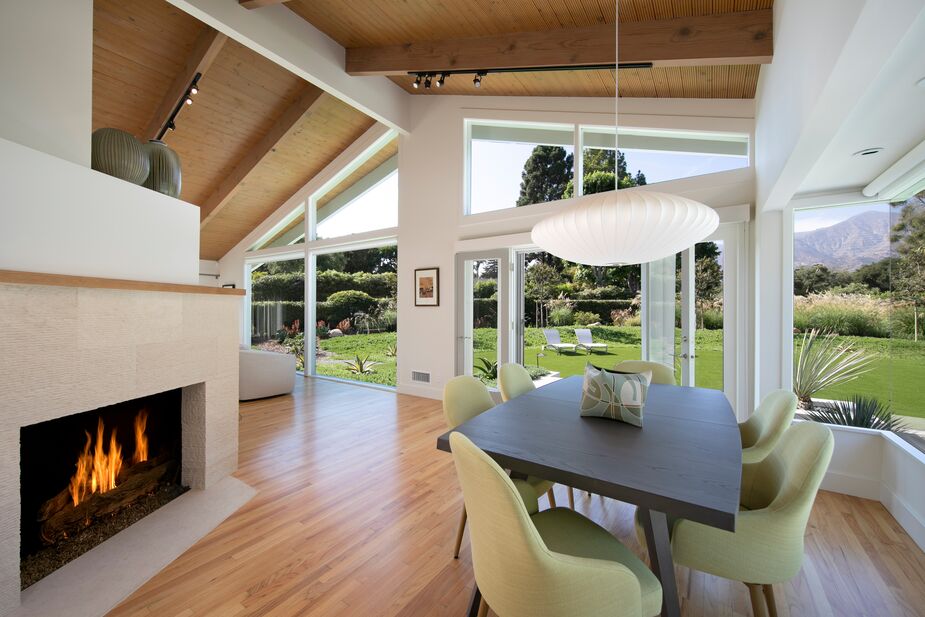
A two-sided fireplace separates the living and dining areas. The green upholstery of the softly curved dining chairs complements the lawn and hedges seen through the windows.
Inside, vaulted ceilings clad in pale wood, kitchen skylights, and white walls add to the bright, airy ambience. Smooth surfaces dominate, from the flat-front kitchen cabinets to the sleek stone fireplace surrounds. Curvaceous furnishings, however, such as globe- and saucer-shape light pendants, provide shapely contrast.
While the Heins embraced the midcentury vibe of the home, they did have a number of antiques they wanted incorporated into the home. One spot where Karen did so was the entryway. “I love mixing pieces from different eras and styles to reflect the client’s personal taste for furniture while honoring the architecture of the home,” she says. “The Sputnik lamp honors the era of the home, and its clean lines are the perfect complement to the ornateness of the owners’ antique grandfather clock.”
Even the most ornate of the home’s furnishings, however, cannot compete with the epic beauty of surrounding vistas. From just about every room one can see the carefully tended gardens and trees and the Montecito Mountains. If indoor-outdoor living is the California dream, this is undoubtedly a dream home.
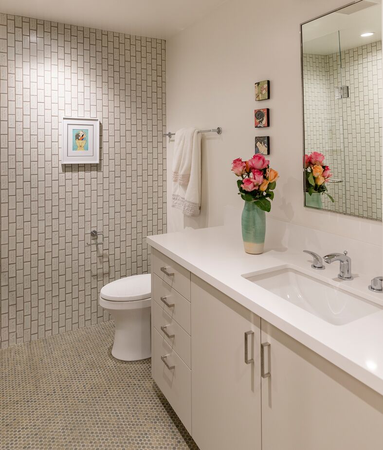
“When you are an interior designer, you have a responsibility to look after your client’s safety as well as make aesthetic choices,” Karen notes. “The small scale of the penny-round flooring reduces the risk of slippage due to the increased amount of grout creating more traction.” Vertical subway tiles on the walls contribute quiet contrast.
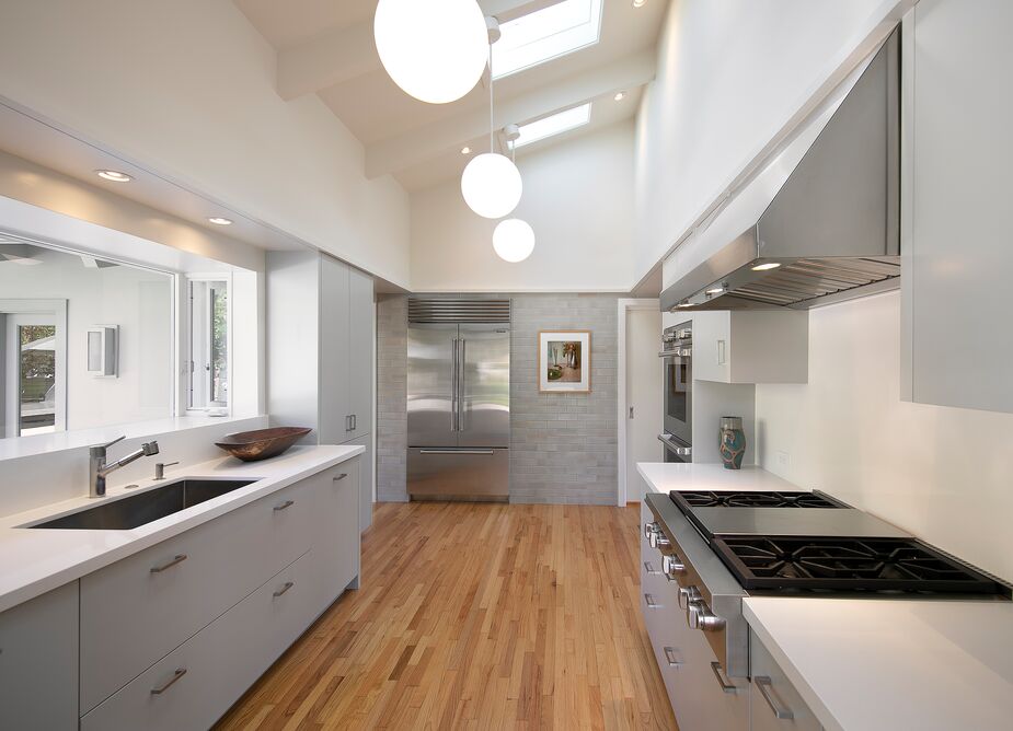
For the Heins’ kitchen, “the use of a generic subway tile backsplash was too predictable of a move, so I decided to continue the solid surface countertop material up onto the backsplash,” Karen explains. “Subway tiles were added to the entire refrigerator/freezer wall to provide an appropriate material transition from the wall to the appliance and additionally creating a strong focal point in the kitchen on a previously unused wall.”

“The yellow bathroom mural is a wallpaper by UK brand Surface View,” Karen says. “The mural was sourced by the client and was the starting point of the bathroom remodel’s finished palette.”
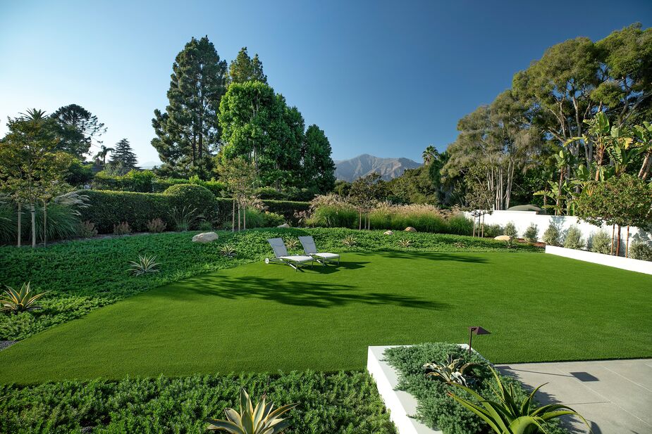
True Nature Landscape Design helped create the ecologically sensitive grounds.
Join the Discussion