Neither a starter home nor a forever home, this Houston house is something of an interim home. The empty-nester clients were relocating from Dallas for work, but they weren’t selling their Dallas home, as they expect to return within 10 years. Nor did they want to move most of their Dallas furnishings to their new home. This gave Katie Davis, of Katie Davis Design, a fair amount of decorating leeway.
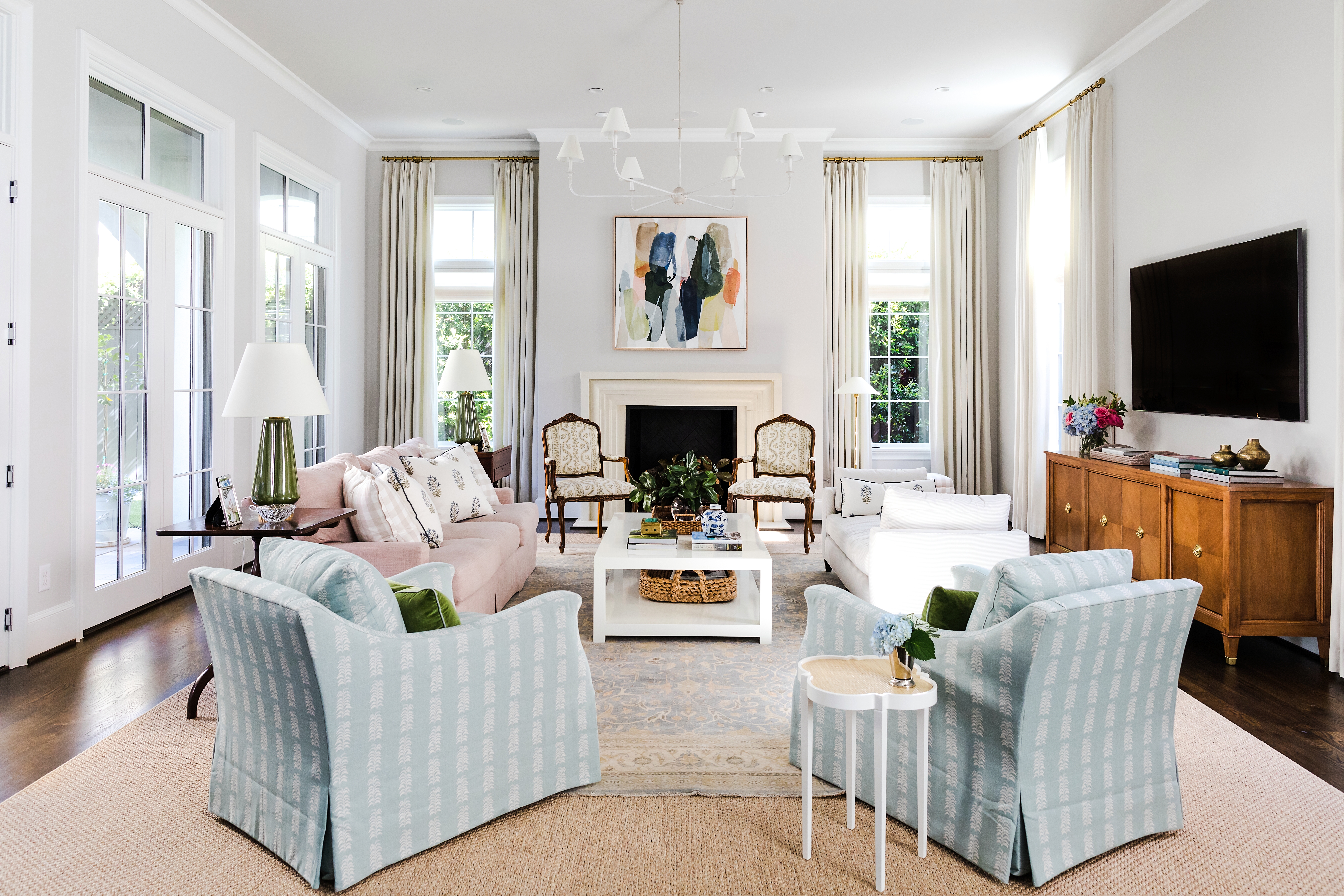
“The palette started with the living room,” Katie says. “The light blue rug that is layered on top of the sisal is theirs that they had sourced on their own, and they loved it. We really loved the idea of contrasting that rug with the sofa. Once the man of the house was on board with a dusty-rose sofa—I never used the word pink!—then all the other colors fell into place.” The table lamps and chandelier are by Visual Comfort.
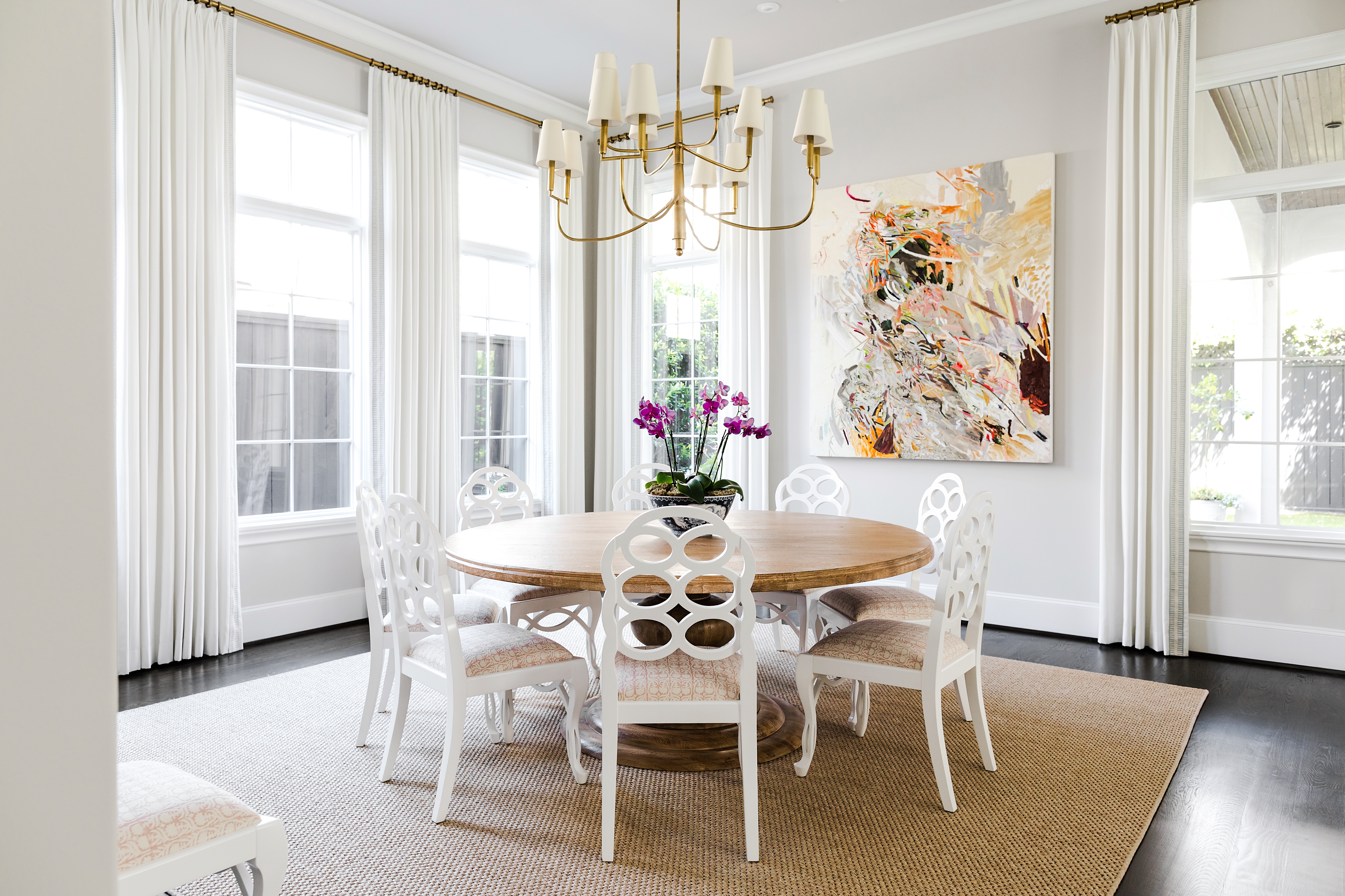
Most of the furnishings in the Houston home are new, though the clients “did have a handful of pieces that were meaningful to them that we integrated into the spaces,” Katie says. “The art in the dining room specifically was a piece they loved. They brought those bigger, important ‘we’re going to live here for eight to ten years and we want to see this’ art pieces.”
While she describes the aesthetic of the home as New Traditional, Katie says that “style-wise, the clients were super open.” But they did know what they wanted—or rather, what they didn’t. “They did not like the modern style of the furnishings that were in the home previously—everything in the house was white, black, and a bit too glam. We made small changes that had a big impact.” In the dining room, for instance, they replaced the black trim of the white curtains with a blue design; in the kitchen, they swapped out the black light fixtures and hardware for brass.
One of the biggest challenges was “transforming the entry into a more inviting, casual space,” Katie says. “The stairs at the entrance are very curvy and grand. However, the clients are not ‘grand entry’ people.” She persuaded the homeowners to replace the existing black stair runner with a sisal one to create a warmer first impression. As for the foyer and the space under the stairs, “we thought instead of a formal pass-through space, we could create a gathering spot for when people arrive. The client had that antique daybed, and we pivoted off that.”
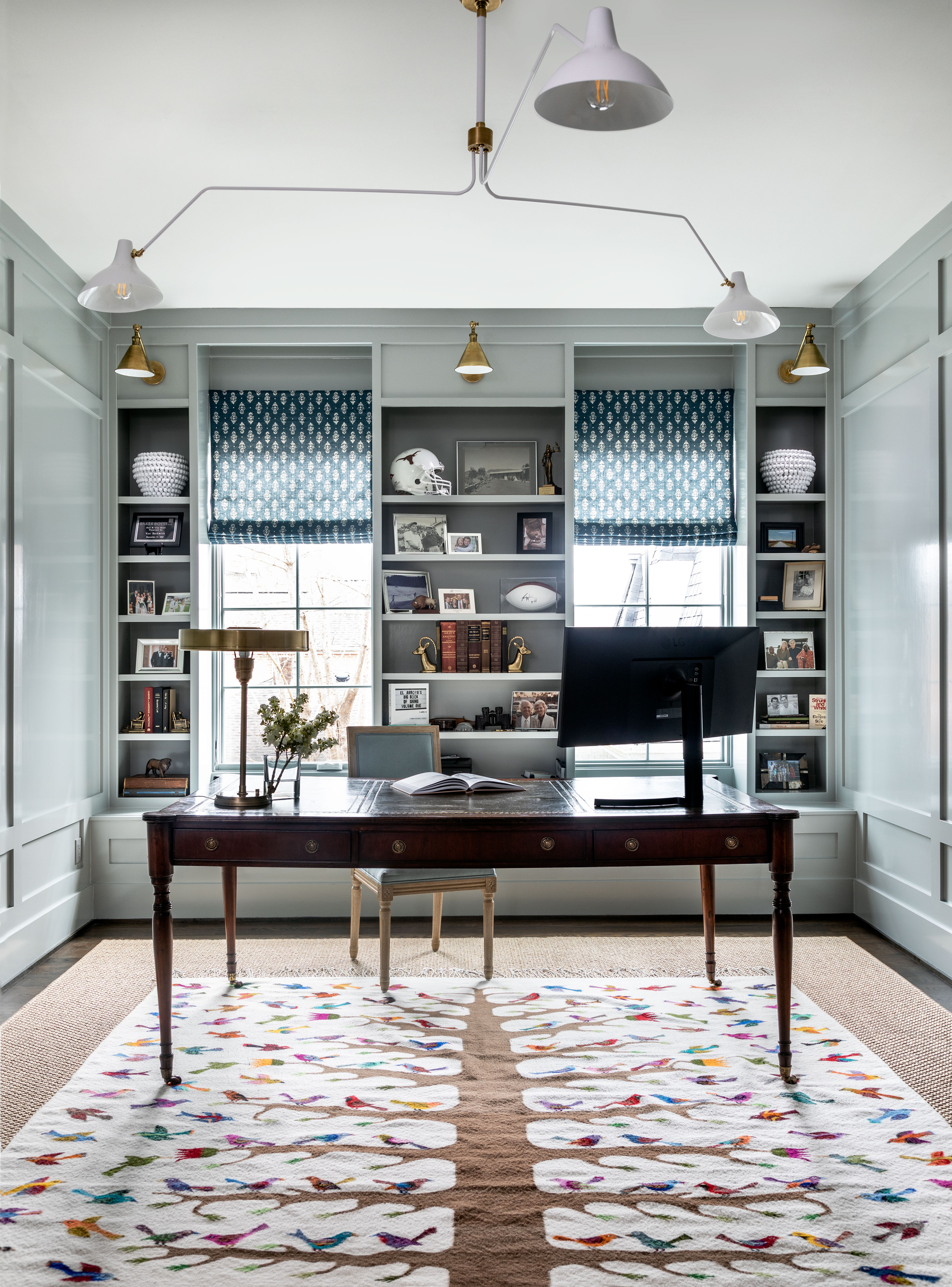
Until COVID-19, the couple hadn’t wanted a home office. But once the room’s original cobalt-blue walls made the husband “the talk of all his Zoom meetings,” he called on Katie to redesign the space. The handmade Mexican rug, which the homeowners had helped design with the artisan, determined the palette. Find the sconces here.
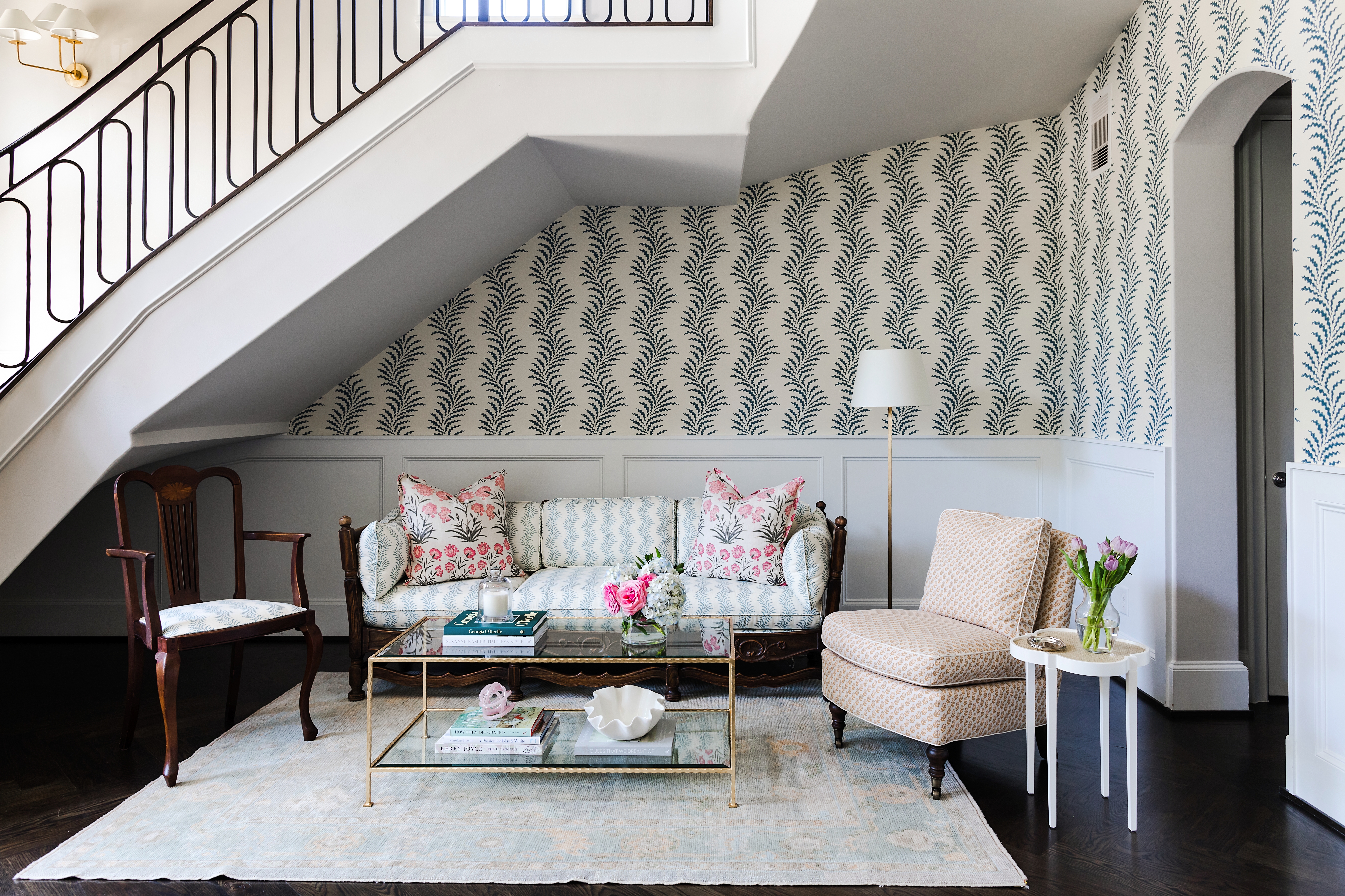
In the entry, “the wallpaper helped to give it warmth and make it feel like a singular space, even though it is three stories high,” Katie says. The pattern of the wallpaper, Scrolling Fern Frond by Soane, is repeated on the sofa and the armchair in a lighter colorway.
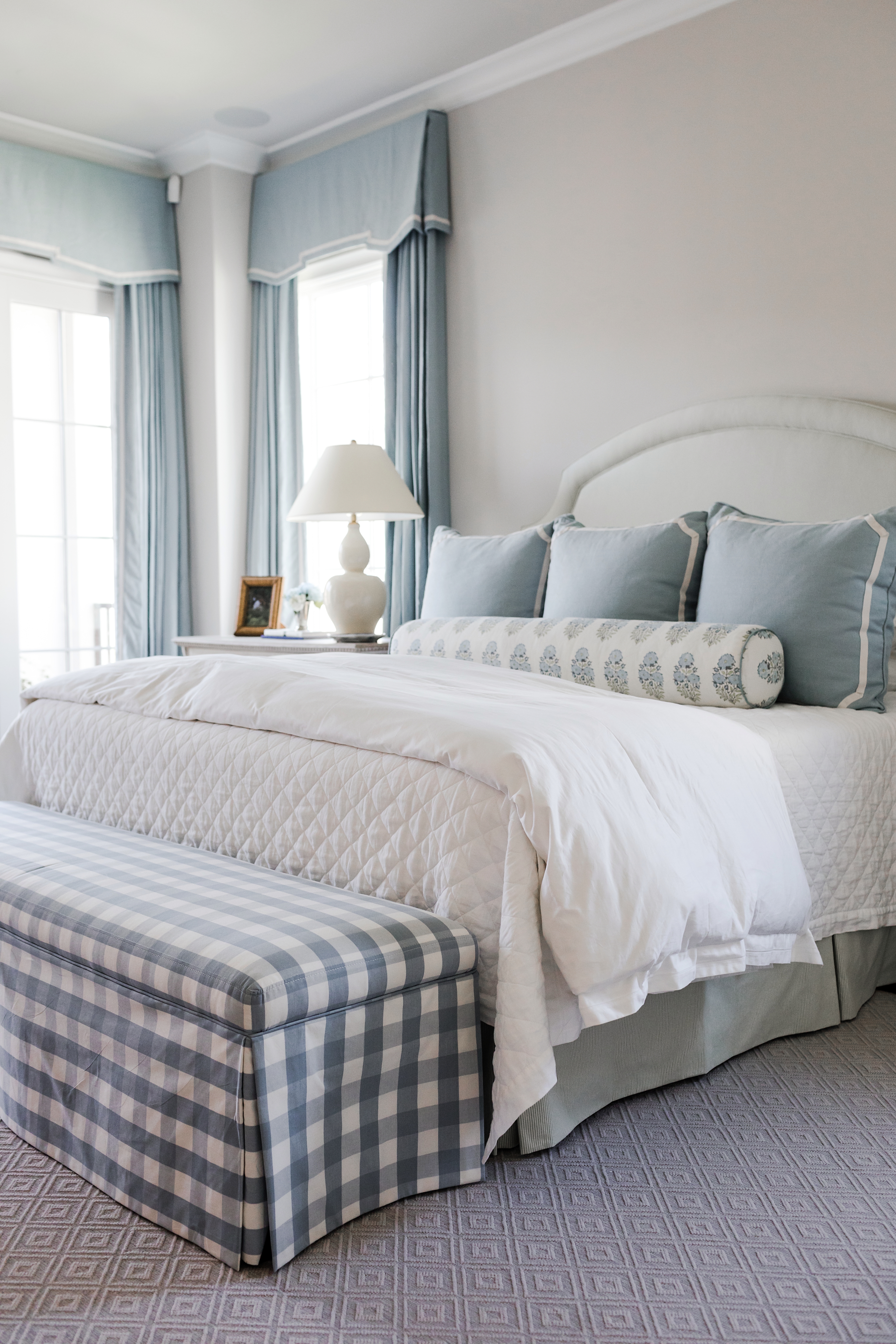
The varied textures and patterns ensure that the main bedroom’s tightly edited blue-and-white palette never feels tired. Find a similar diamond-quilted coverlet here.
Now the entry is less a showpiece than a functional, comfortable space. As such, it perfectly sets the tone for the home as a whole. And the entire house shows that it’s possible to decorate with an eye to the future as well as on the present, all while incorporating elements of the past.
The clients “were mindful that their move was temporary, but not that temporary,” Katie says. “Eight to ten years is a good chunk of time. They definitely were open to investments, but it was a balancing act. They wanted to invest in pieces that could fit into their Dallas home when it was time to move back.” With their New Trad aesthetic, these furnishings—and this home—transcend time and trends.
Shop our New Traditionalist edit >
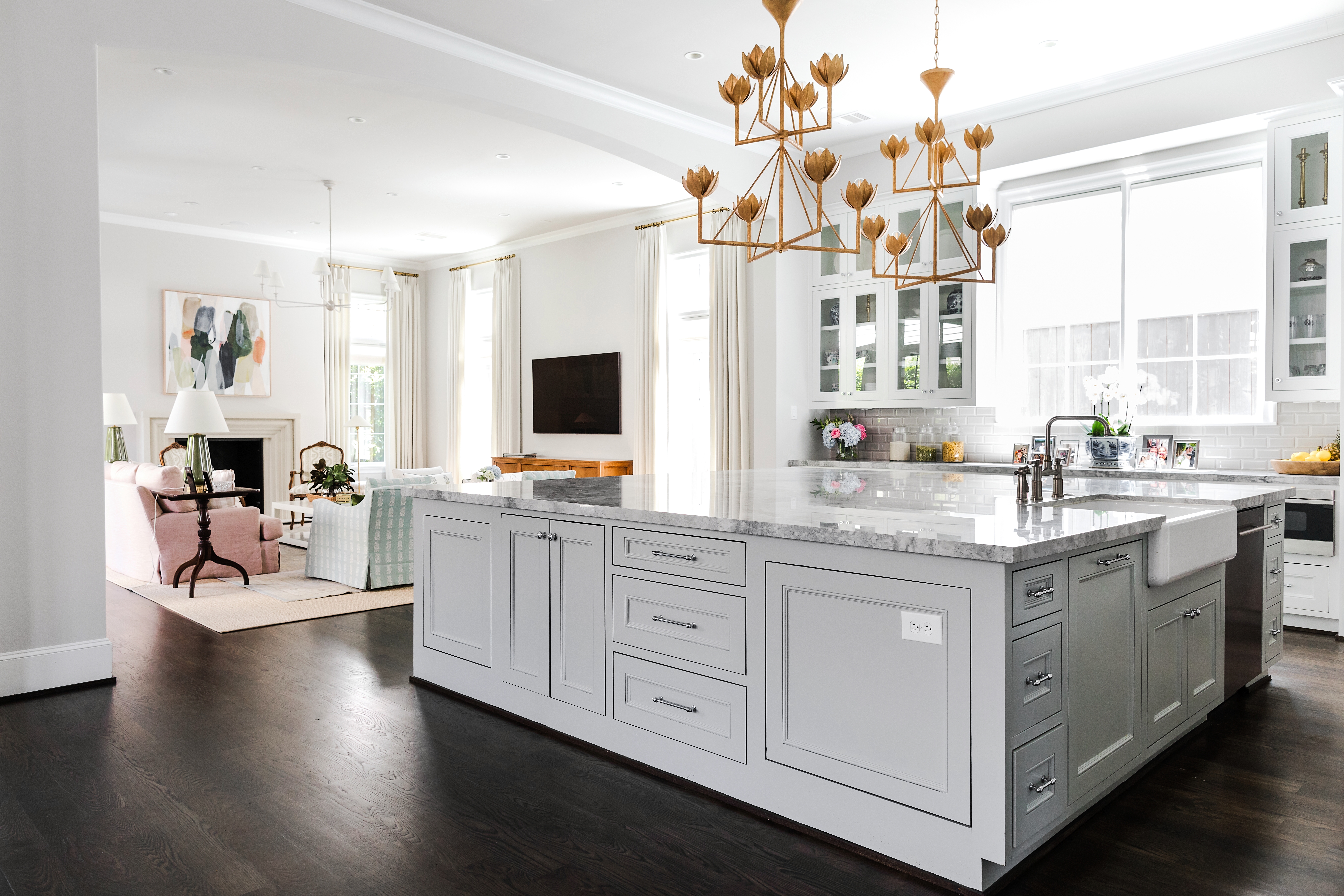
The living room flows into the kitchen, which shares the same warm, bright ambience. Find the chandeliers here.
Join the Discussion