Martyn Lawrence Bullard, Ken Fulk, Alexa Hampton, and Corey Damen Jenkins were among the more than two dozen designers participating in the Second Annual Kips Bay Decorator Show House Dallas. Running from Sept. 24 through Oct. 24, it benefited the Kips Bay Boys & Girls Club, Dwell with Dignity (a not-for-profit that creates homes for those in need), and the Crystal Charity Ball (which supports children’s charities in the Dallas area).
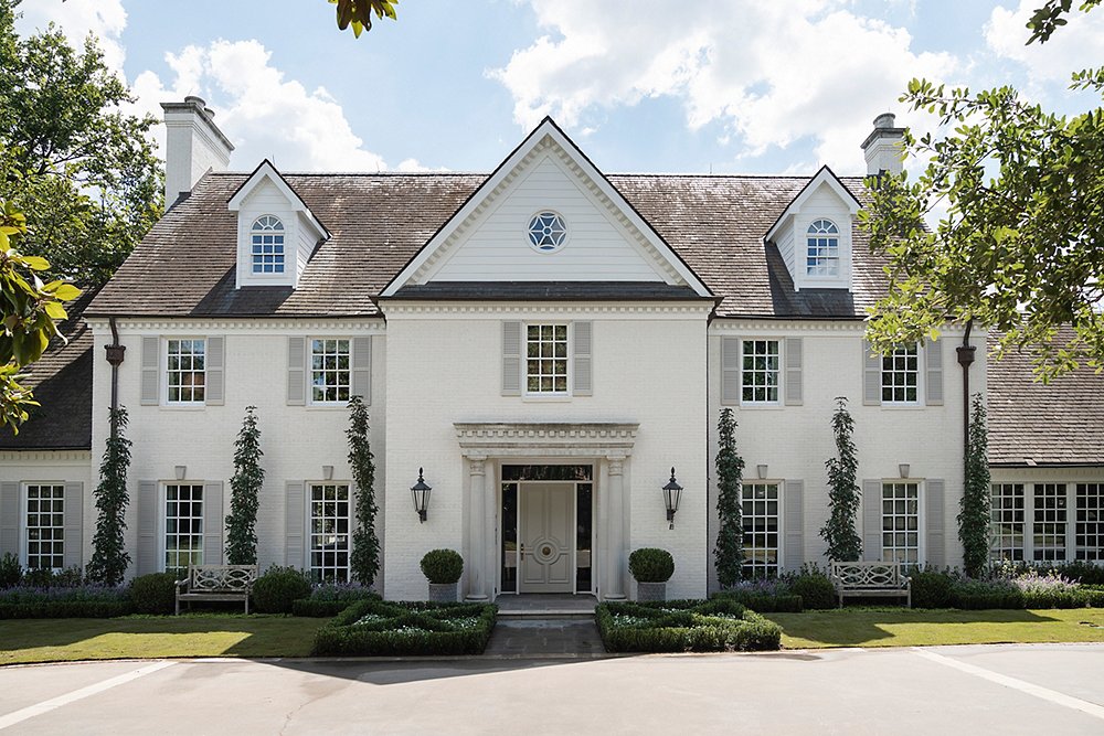
Couldn’t make it to Dallas? Below are a few highlights from the sprawling (more than 11,000 square feet) home.
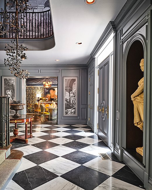
Bobbitt & Co. took a neoclassical approach to the entry, with Zuber et Cie wallpaper panels depicting Psyche, the Greek goddess of the soul, as well as antique sculptures. The alcove above was converted from a coat closet “since you don’t need coats in Texas,” says designer John Bobbitt. Photo by Stephen Karlisch.
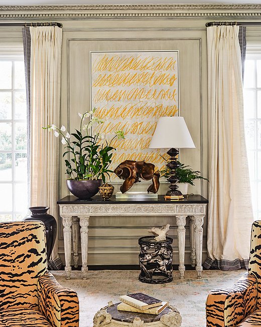
Michael Aiduss Interiors + Architecture added plaster moldings inspired by Sir Edwin Lutyens to the room Michael dubbed the Salon. The designer also gave the walls a strié finish. “I love mixing plaster together with modern art,” Michael says. “It creates a timeless impression and shows that nothing is too precious.” Photo by Stephen Karlisch.
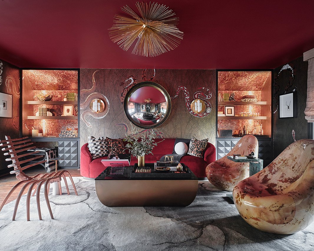
Beth Dotolo and Carolina Gentry for Pulp Design Studios settled on the theme “the wise and the wicked” for the office suite, which includes a lounge area. “We really wanted to showcase different styles but have them all flow back together,” explains Carolina. Curves—in the furniture silhouettes, the wallpaper and rug patterns—among the rooms’ straight lines play into the dichotomy of their imaginary client, a woman who is wise in business but wicked after work. Photo by Stephen Karlisch.
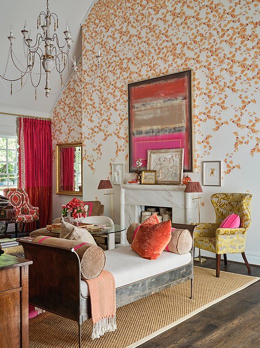
In the “family retreat,” the father-and-daughter team behind A. Lantz Design “intentionally eliminated all technology,” says Amanda Lantz, “to create a space where you can truly relax with the family.” Instead of staring at a TV, the family can admire the various artworks—including acrylic paintings by Amanda’s father, Barry—and the gingko-leaf wallpaper that Kravet customized for the space. Photo by Stephen Karlisch.
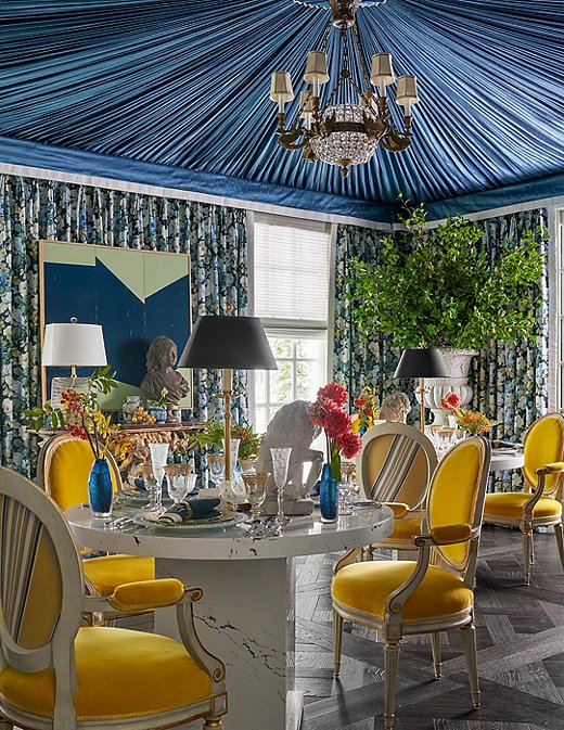
Corey Damen Jenkins & Associates used 200 yards of fabric on the ceiling of this dining room and more than 200 yards on the walls. To provide residents with maximum versatility, Corey used two smaller round tables rather than a single large dining table. This way, one could serve as a desk or a homework station while the other is used for family dining or small parties. “I wanted to take the general concept of the dining room and spin it on its head,” Corey says. Photo by Nathan Schroeder.
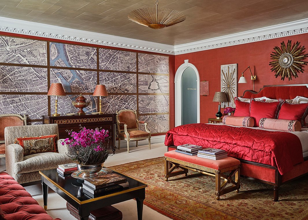
“Everyone says you can’t do a red bedroom, and the contrarian that I am wanted to do it,” laughs Alexa Hampton. The seemingly multipart wall map of Paris is actually a trompe l’oeil work from a new collaboration between Alexa Hampton for Mark Hampton LLC and Gracie Studio. To further offset the red, Alexa added bright white molding and taupe ticking-stripe bedding from Eastern Accents. “It’s a nice pu pu platter of a room,” Alexa says. Photo by Stephen Karlisch.
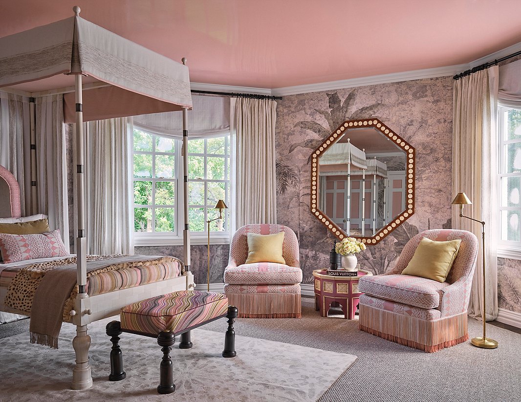
Jaipur, nicknamed the Pink City for the color commonly seen on its buildings, was one of Martyn Lawrence Bullard Design’s inspirations for this en-suite guest bedroom. The “think pink” theme extends up to the lacquered ceiling. Syrian side tables and a Moroccan rug, among other pieces, give this space globe-trotting flair. Photo by Stephen Karlisch.
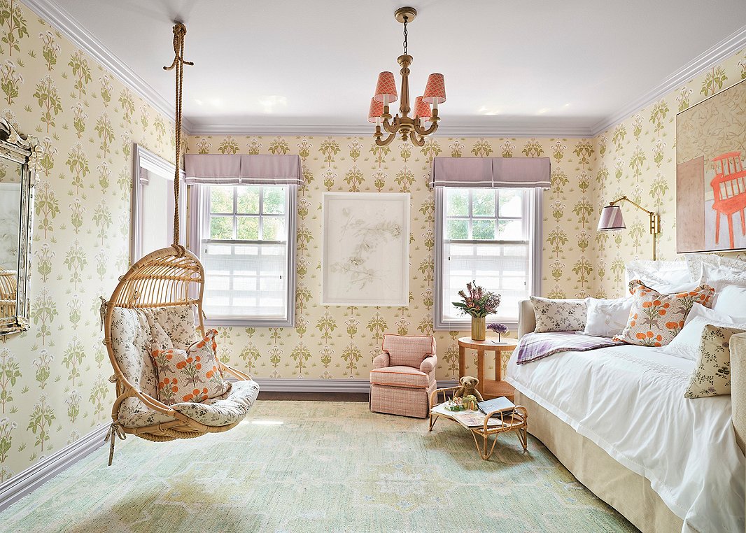
A seven-year-old with Rett Syndrome who uses a wheelchair for mobility and a retinal device to “speak” inspired this en-suite bedroom from Acorn & Oak by Shelly Rosenberg. Shelly worked with 2g Habitats to incorporate adaptive design techniques, a discipline very close to her heart, as one of her children lives with Down Syndrome. Photo by Stephen Karlisch.
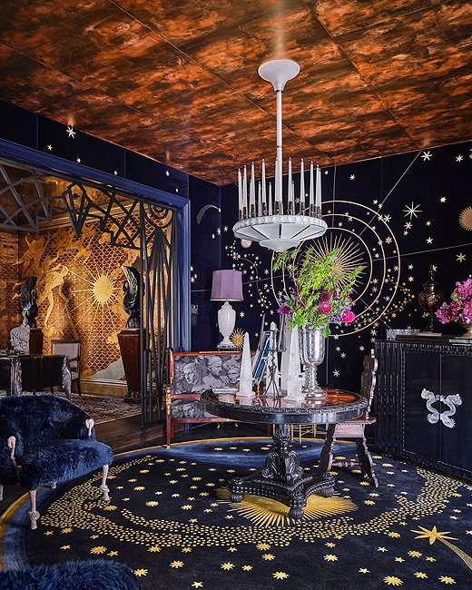
The study by Ken Fulk Inc. pays tribute to Art Deco, mysticism, and the Roaring ’20s, among other influences. The celestial map on the wall depicts the sky over Dallas on the opening night of the show house. Photo by Stephen Karlisch.
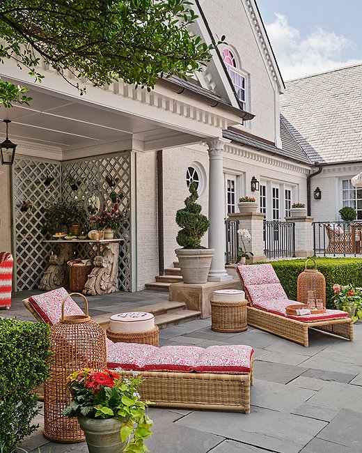
The photographs of Slim Aarons, depicting “attractive people doing attractive things in attractive places,” inspired this pool area by Robin Henry Studio. The table in the bar area uses antique French corbels as legs. Photo by Stephen Karlisch.
Join the Discussion