Mid-Century Modern is a polarizing decor style. Fans love its simplicity; foes contend that it’s too simple, if not cold and boring.
It’s true that MCM style leans toward the simple. “Function over form” was a major tenet of Alvar Aalto, Charles and Ray Eames, George Nelson, and other giants of Mid-Century Modern design. You won’t find carved cabriole legs and scrolled aprons on MCM tables, fringed and pleated skirts on MCM sofas, tiers of crystals on MCM lighting.
Mid-Century Modern’s simplicity is why it can complement so many other styles. Incorporating one or two elements of MCM design will refresh and update just about any other aesthetic—even traditional.
Hallmarks of MCM
The technologies behind fiberglass, molded plywood, and chrome plating came into their own during the mid-20th century, and designers took advantage of them to create furnishings in colors and shapes that were previously impossible or impossibly expensive to produce. Most of Mid-Century Modern’s distinctive elements are a result of these innovations, including:
• Curvaceous silhouettes. Moldable materials such as fiberglass and plastics allowed for kidney-shape tabletops, egg-shape chairs, and all manner of curves and swoops that could not be easily or affordably produced with just wood, stone, and glass.
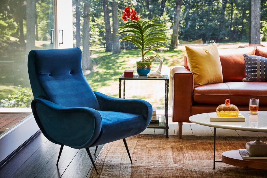
• Splayed, tapered, or pin-style legs—and leggy furniture in general. Slender legs gave furniture a more open, airy vibe, a perfect reaction to the heavier furnishings of the early 20th century and centuries prior. Just as skirts allowed women to show more of their legs by the mid-’60s, upholstered furniture did away with skirts altogether to flaunt its sleek gams. These lighter designs also echoed the optimism and buoyancy of the post-World War II era. And splayed legs in particular provided a fun contrast to all those newfound curves.
• Juxtaposing natural and manmade materials. Bentwood chairs around a molded plastic table. A bar cart made of brass and glass or acrylic. A bouclé-upholstered sofa with sleek white-oak or chrome legs. Mid-Century Modern design reveled in both new technologies and timeless natural beauty.
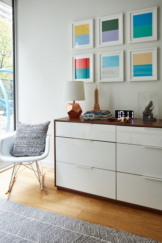
Wood and acrylic, metal and wool, neutral hues with pops of color: This room is MCM style in a nutshell. Room by One Kings Lane Interior Design. Photo by Frank Tribble.
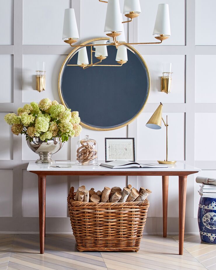
The conical shapes and brass finish of the lighting are MCM-inspired, as is the console table with its acrylic top, wood base, and tapered legs. But they complement the more-traditional furnishings beautifully. Shown above: the Jemma Round Wall Mirror, the Fontaine Large Offset Chandelier, and the Clemente Table Lamp.
• Pops of color. Neutrals were just one element of a Mid-Century Modern palette. Muted colors, such as the notorious avocado green and burnt orange that dominated the era’s kitchens, were another. But MCM style also incorporated splashes of bold primary colors that were now achievable in plastics.
• Square tufting on upholstery. What diamond tufting was to Victorian settees and sofas, square tufting was to MCM chairs and chaises, particularly those upholstered in leather (real or faux).
• Sputnik lighting and other Atomic Age motifs. Sputnik light fixtures were named after the first manmade Earth satellite, a metallic globe with four long antennae stretching out toward one side. In actuality, the lighting more closely resembled the atom-inspired imagery of that era, a sort of Space Age take on the venerable starburst motif. Lighting, mirrors, and other elements characterized by numerous spokes, often punctuated with small orbs, spoke to the era’s interest in space and science.
• Geometric abstract art. Pre-Pop Art, post-Dada, in colors and designs for every mood, palette, and space. Works by Mark Rothko and Joan Miró also fit right in.
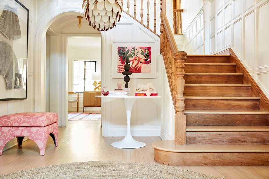
Because the Tulip-style table is white like the walls, it plays nicely with the more-traditional moldings and stairs, while the curved “petals” of the Cynara Chandelier echo the arched doorways. Photo by Joe Schmelzer.
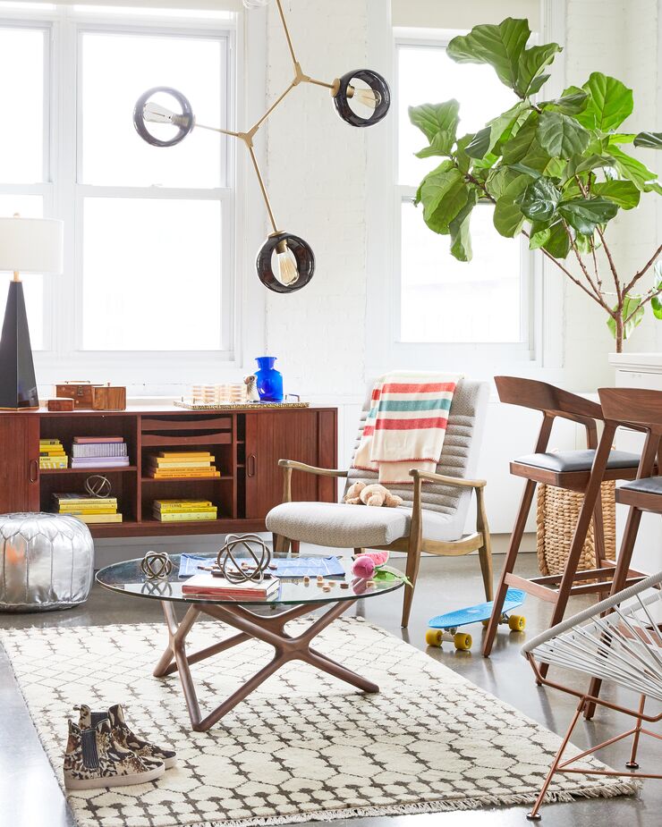
Adding MCM to Your Style
So you’re now sold on the beauty of Mid-Century Modern design and want to incorporate it among your existing furnishings? Find suggestions below based on your core aesthetic (and if you’re not sure what that is, check here).
New Traditionalist: You might think that New Traditionalist style, with its focus on Old World elegance, would be the most incompatible with Mid-Century Modern. But the simplicity of MCM makes it ideal for ensuring that a room rich with ornate antiques, Persian rugs, ginger jars, and portraits in gilded frames doesn’t feel too heavy. One way to start is by adding one or two pieces that put a Mid-Century Modern twist on a classic design, such as a wingback chair with exaggerated curves or a free-form Aalto vase in lieu of a chinoiserie version. Another option is to use transparent acrylic furnishings as your gateway to MCM, such as pairing acrylic side chairs with a more elaborate dining table or setting a clear console table beneath a classical artwork.
Eclectic: With its anything-goes vibe, Eclectic style tends toward maximalism. The clean silhouettes of MCM serve as a palate cleanser while allowing the more dramatic pieces to really shine. (If everything is special, then nothing is!) A floor lamp with a simple tripod base, for instance, brightens a room without distracting from a gallery wall, while a minimalist sofa with unobtrusive tapered legs sets an ideal backdrop for a vibrant assortment of patterned pillows.

Mid-Century Modern furniture with wood, rather than acrylic or metallic, frames slides right into the Naturalist aesthetic. Opting for pale, neutral upholstery helps too, as with the Ebonwood Accent Chair and the Everleigh Sofa above. Also shown: the Ashlee Jute Rug, the Theo Dome Floor Lamp, and above the sofa, Ocean Beach by Christine Flynn.
Naturalist: The wood frames integral to so much MCM design are tailor-made for Naturalist interiors, as are the more muted colors of the MCM palette. But why not enliven a quiet Naturalist scheme with some of the flashier elements of Mid-Century Modern, bearing in mind that “flashy” is relative here. Brass, another dominant MCM material, provides both warmth and metallic glimmer, so why not consider a minimalist side table that pairs oak with brass or a Space Age chandelier with a bevy of glass globes?
Curator: Along with the warm glow of brass, the cool glimmer of chrome fits right in with the Curator’s love of glamour, whether it’s a sleek ceiling fan with a metallic finish, a chrome-and-glass occasional table, or a lambswool-upholstered bench with silvery stretchers. For a space that already has its share of shine and shimmer, consider pieces that play up the sculptural shapes of MCM design in wood, such as a geometric oak side table or an étagère that teams rectangular wood shelves with square iron brackets.
Get inspired by a Mid-Century Modern home in Montecito >
Need design help? Book a free appointment with One Kings Lane Interior Design >
Tour a pre-war apartment with Mid-Century Modern influences >

The slender tapered legs of the chair bring MCM ease to this Curator-style office, as do the brass finish of the desk’s open base and of the arched task lamp.
Join the Discussion