“I’m a 20th-century modernist at heart,” says Gideon Mendelson, founder and creative director of Mendelson Group, and that’s apparent from the Upper West Side apartment he and his firm designed for a family of three.
“I try to share my love of Mid-Century Modern with my clients when I can,” Gideon says. “I’m always trying to design, specify, and curate a unique collection of pieces for our clients, one that excites them and suits their needs and personalities.”
It’s this tailored process that prevents this home, and indeed all of Mendelson Group’s projects, from feeling like MCM pastiches. Here, for instance, many of the clients’ needs revolved around storage. Within the three-bedroom apartment’s relatively modest 1,634 square feet, the family required space to display their collection of art and to store their myriad books.
“We kept the kitchen and bathrooms as is but added some millwork to bring more storage and functionality to the space,” Gideon says. “The master bedroom gained a suitelike feel with the addition of thoughtful millwork that provides storage for the wife’s extensive shoe and bag collections.” Living room built-ins feature both hidden storage and open shelves. More built-ins transform the small third bedroom into a home office that can pull double duty as a guest room.
The office/bedroom isn’t the only multitasking space. Adjacent to the open kitchen, the dining room also serves as a spot for playing games and doing homework. The Mid-Century Modern influence is especially apparent here, thanks largely to the retro dining table and chairs.
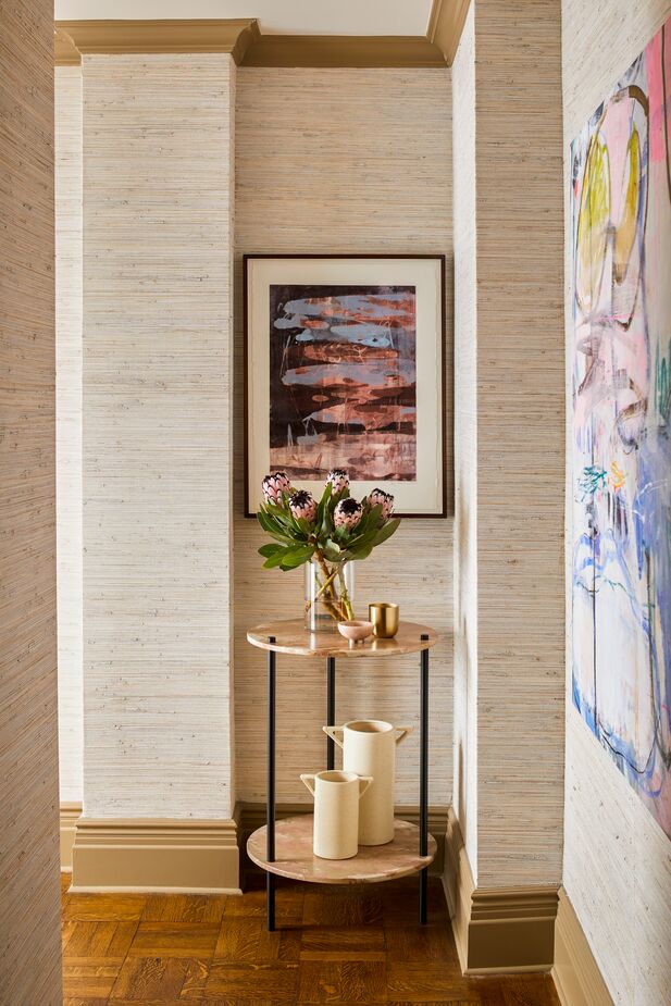
Built in the 1920s, the apartment has its share of quirky niches. Gideon made sure they’re as functional and stylish as the rest of the home.
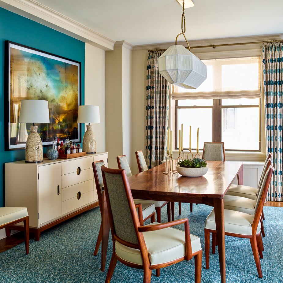
The section of the dining room wall on which a contemporary artwork hangs was painted teal, in contrast to the paler neutral hue of the other walls. This not only spotlights the art but also creates a sense of cohesiveness by tying it in with the teal rug and the similar blues on the curtains.
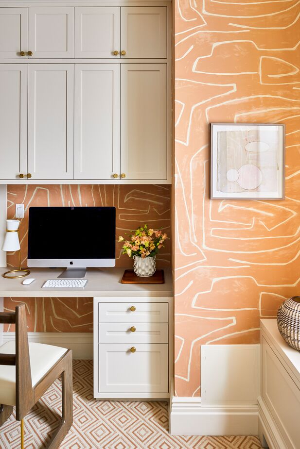
The diamond motif of the home office’s rug is a tailored complement to the large-scale freeform pattern of the wallpaper.
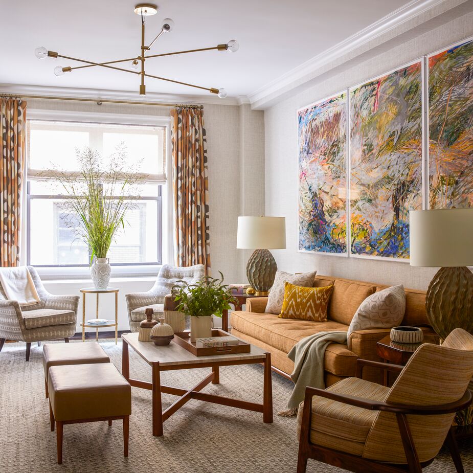
In addition to teal, the home’s palette includes mustard, orange, coral, salmon, and courtesy of the primary bedroom’s headboard, fuchsia, all of which are apparent in the artwork as well as the furnishings. “The palette is unusual and has a lot of energy,” Gideon says.
The multitude of patterns, from flame-stitched pillows in the living room to faux bois carpet in the primary bedroom, contributes to the lively ambience. Ditto the artwork and accents such as the highly textured vintage lamps and the ridged and speckled grouping of vases on the living room’s cocktail table.
“These clients recognized the importance of art and accessories to make the space feel personal, layered, and finished. The final touches brought an exuberance to this one-of-a-kind project,” Gideon says. “Refreshingly, they weren’t interested in achieving a ‘look’ or assembling the same furniture that their friends or others they followed had in their homes. They wanted a colorful, pattern-filled space that reflected their personalities.” And that’s exactly what they received.
Shop Mid-Century Modern finds >
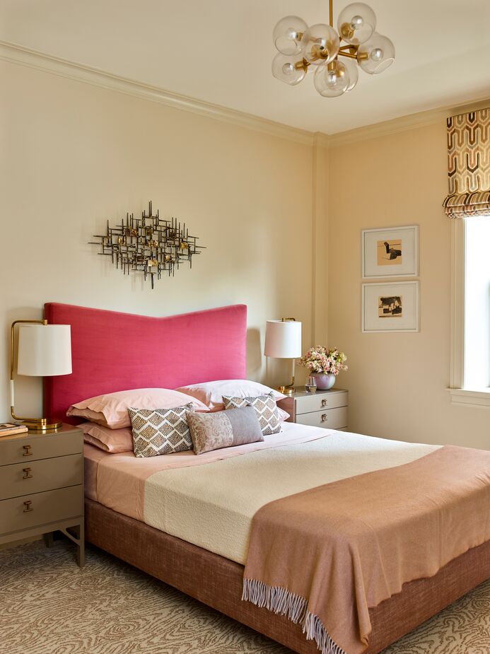
The fuchsia headboard on this custom bed provides a pop of color without detracting from the room’s overall serenity.
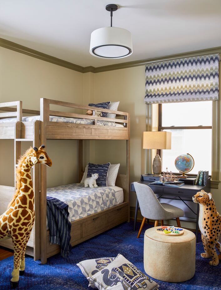
“The boy’s room showcases his current love of animals, games, and comics, but the carefully chosen colors, patterns, and textures are sophisticated enough to grow with him,” Gideon explains.
Join the Discussion