As more and more people flood into Austin, TX, the more it changes. Yet amid the sleek skyscrapers of steel and glass, at its heart the city is still laid-back and decidedly quirky. Finding the balance between the old and the new was what Christina Nielsen’s clients asked her to do in their home. “They wanted to maintain some individuality and mix traditional with contemporary accents,” she says. “That’s where I came in.”
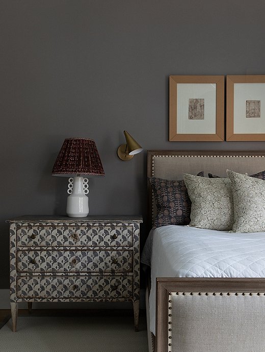
Dusty gray is the perfect foil to the white and bright palette throughout the downstairs living area.
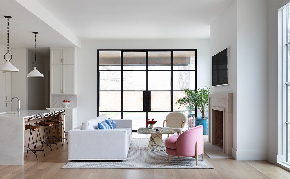
While the home’s style overall is a mix of modern and farmhouse, the downstairs is where the modern elements really shine. Christina set the tone with Sherwin-Williams’s Pure White paint on all the walls, then accented the space with jolts of chrome and steel.
The floor plan embraces an open flow between the living and outdoor areas—“Everything is about the outdoors,” says Christina—as well between the kitchen, the formal dining area, and the living area. Large steel windows and doors drown the space in the bright Texas sunlight. “I really wanted to highlight and create cohesion between the spaces.” Cohesion came from keeping visual clutter to a minimum. “I didn’t want any of the furniture to feel too heavy or to overpower the landscape.”
Upstairs, she tells a different story. Christina loves color that feels timeless, even though she hates that word. “I want something livable and sustainable. You’re not going to get sick of it,” she says. “Originally they wanted everything to be white. But because the home was predominantly white and very neutral, I thought the bedroom was a great place to incorporate more of a statement color.” She went with a moody gray to create the bedroom oasis. “I wanted to create a space where they can come and relax and feel like this is just an intimate space for the two of them.”
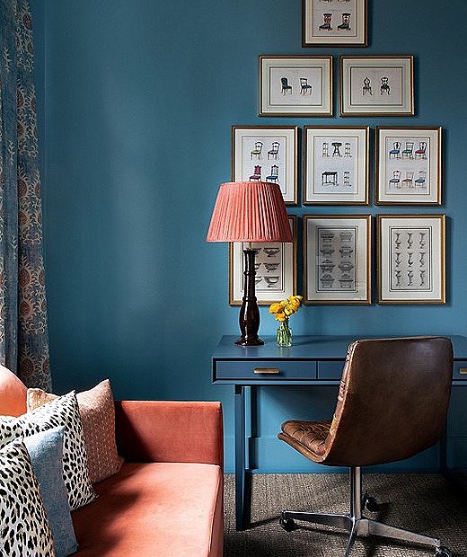
Vintage furniture prints were sourced by the client. Moody blue paint gave the office a jewel-box effect, fostering a cozy and contemplative atmosphere.
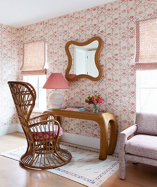
The vintage atmosphere in the office is a departure from the rest of the home’s more modern approach. The client’s vision “was just to say yes and take a lot of risks here,” says Christina of the office.
The second bedroom also gave Christina a chance to play around with patterns: “This is where I could experiment more because it’s a room that they don’t use every day.”
If the primary living area was modern and the bedrooms a bit moody, the offices are perfect representations of the clients’ personalities. In the pink office, Christina opted for a psychedelic handprinted wallpaper. “She was very into the idea of layering patterns and going for a very feminine, 1970s aesthetic,” Christina says. The blue office is a bit more subdued, with touches of burnt coral and just a dash of pattern. “The mix of denim blues and burnt oranges are a nod to that Southwestern aesthetic,” says Christina.
Austin sits at the center of old and new, and this house is a perfect example of that spirit. With modern color and clean lines, it feels firmly set in the 21st century. But thanks to Christina’s deft hand, you can be transported to a world of tradition and color just by turning the corner.
Explore another Texas home with French country charm →
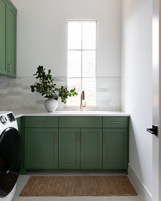
“I wanted a fun, cheery pop of color here,” says Christina of the laundry room. She painted the cabinetry a classic shade of Calke Green from Farrow & Ball.
Join the Discussion