Who says you can’t go home again? Certainly not the owner of this five-bedroom home in the Westlake neighborhood of Austin, TX. He grew up here and, after a stint in New York City, recently moved back.
“The home is a bit of a ’90s-style new build—not a lot of true architectural character,” says designer Shannon Eddings, who was charged with bringing in “character, color, and pattern, all with a classics-meets-the-’70s vibe.”
To ensure an ideal balance of traditional and modern, “we added in more classical architectural elements like painted wainscoting in some of the rooms so that we could create a ‘traditional’ base for the remainder of the space to rest in,” Shannon explains. “I am always inspired by historic homes throughout the world that are filled with rich architecture but paired with sleeker furnishings. You can create that pretty easily in a house like this one that didn’t have a definitive architectural style.”
It helped that the client was a fan of William Morris wallpaper, with its lush flora and fauna themes. Shannon used wallpapers by Morris & Co. and another brand dating back to the Arts and Crafts movement, G P & J Baker, not only to create a traditional foundation but also to generate the wow factor.
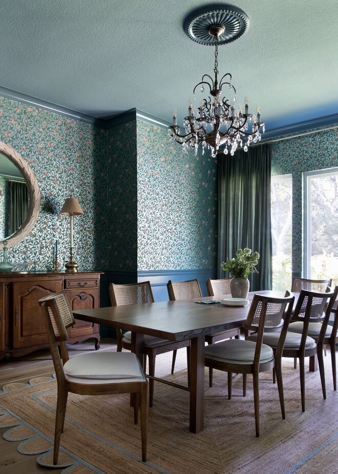
Shannon played up traditional elegance in the dining room with formal moldings, botanical wallpaper, and a crystal-embellished chandelier. The peacock-blue paint, the streamlined chairs and table, and the whimsical natural-fiber rug provide a contemporary balance.
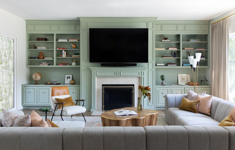
Previously the family room paired the traditional feel of the built-ins with a formal furniture arrangement that included a pair of sofas facing each other. Shannon opted to contrast them with more relaxed, modern furnishings and a fresh, light palette.

“The guest bedroom with its moody blue trim and ceiling and gorgeous wallpaper makes for such a serene and inviting space,” Shannon says. Find a similar ceiling light fixture here.
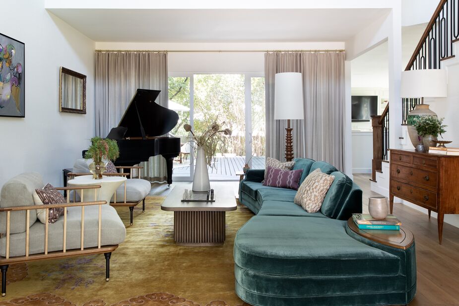
Balance in this home extends beyond ensuring each room incorporates classic and contemporary. It also entails balancing livelier spaces with calmer, less busy ones. That’s one reason Shannon refrained from including wallpaper in some of the larger, most-frequented spaces such as the living room. But though that space has white walls, it’s far from lacking in color and wow. The serpentine vintage sofa, for instance, was an eBay find that she had shipped from Florida and covered in teal performance velvet. “I love sourcing vintage chairs and sofas and reupholstering them, because there is generally not going to be another chair or sofa out there that is the same when all is said and done,” Shannon notes.
In addition to juxtaposing past and present, lively and serene throughout, Shannon also mixed high and low, “splurging on a few antiques and newer pieces and pulling it back on some,” she says. “The coffee table in the family room is higher-end, while the one in the formal living room is a much more approachable price point. We splurged on designer fabrics for the window treatments in most of the rooms but saved by doing ready-made panels in the formal living room and the upstairs landing.”
As to whether the client is happy with the makeover, consider this: Shannon and her team decorated the entire home, except for two of the bedrooms—one was to be used as a music studio and the other as a gym. But the homeowner recently called Shannon to have her transform the gym into another guest bedroom. Perhaps it’s only a matter of time until even the music studio is clad in lively wallpaper as well.
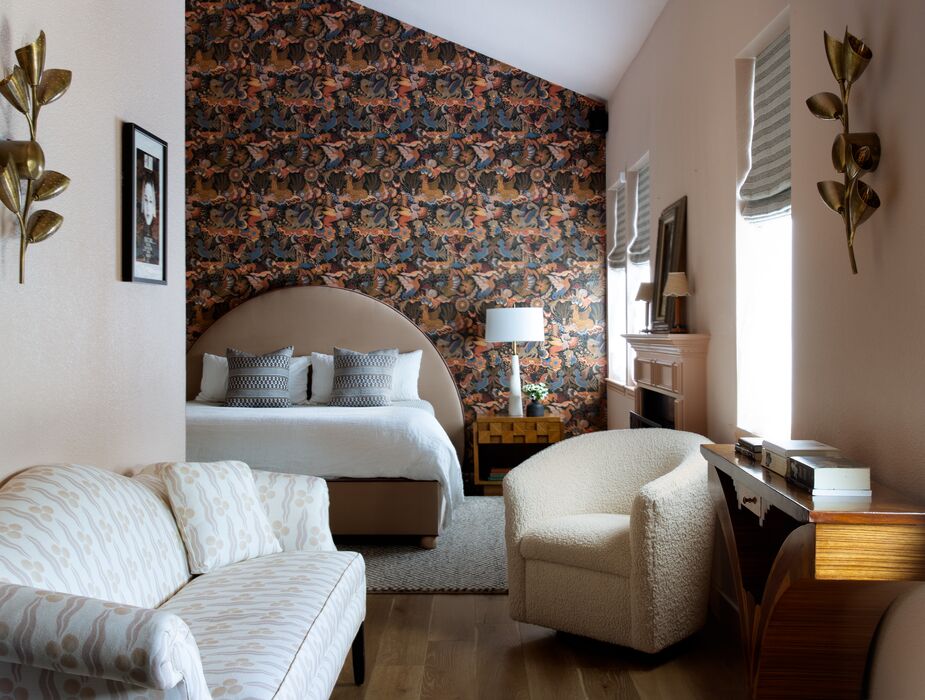
A wall was opened up to give the client a sitting area by the primary bedroom’s fireplace. Vintage nightstands flank the custom bed. Find a similar bouclé chair here.

Have fun and let go of the idea that different eras or styles of furniture don’t go together. Work on scale and color play to incorporate both contemporary and traditional elements.
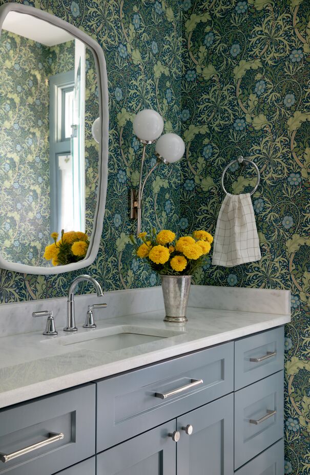
Juxtaposed against the traditional wallpaper, the contemporary sconce (find similar here) and mirror help “keep things unexpected,” according to Shannon.
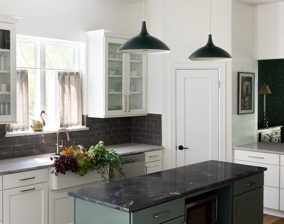
The green of the kitchen island ties in with the palette of the dining room, which is visible via a pass-through. Find similar pendants here.
Join the Discussion