Wallpapers in vibrant prints and brilliant hues seem to be the star attraction in the rooms now featured in design magazines. Little wonder: The right wallpaper can establish the ambience and theme of a room more vividly than paint. Especially for those who prefer sofas, tables, and other major furnishings in solid, neutral tones that transcend trends, papering a room—or even just a wall or the back of a bookshelf—instantly introduces pattern, color, and most important, personality.

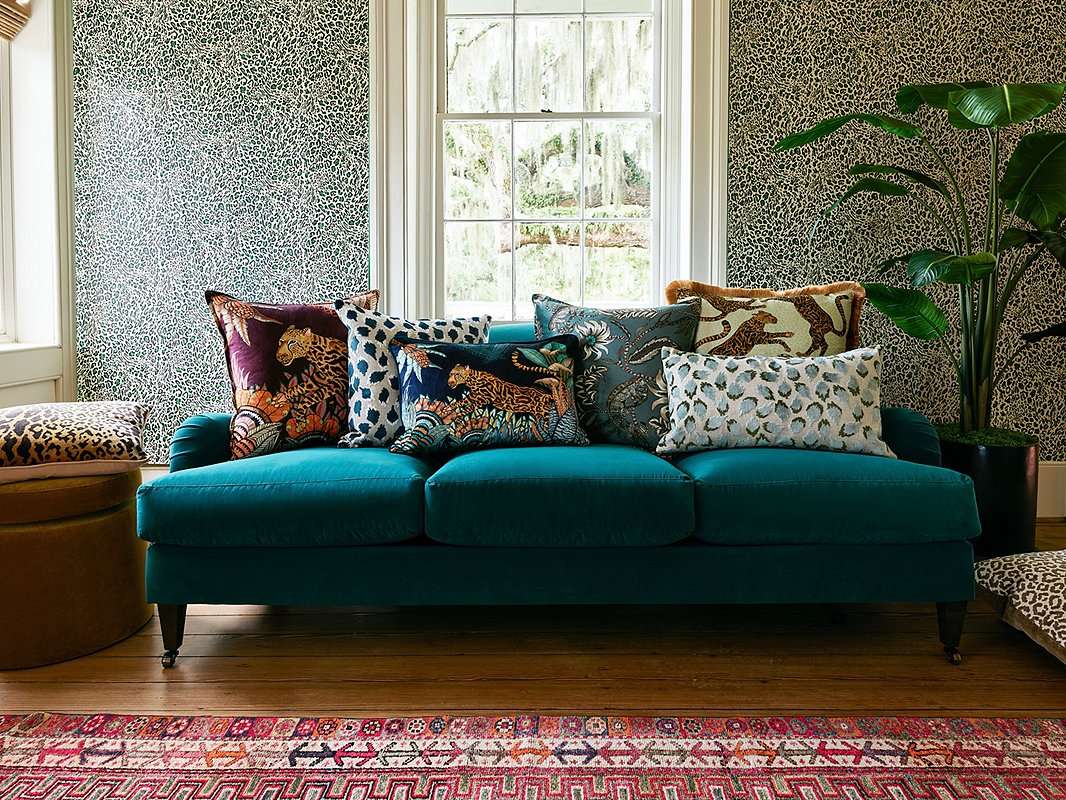
The small scale of our exclusive Pounce Wallpaper in Khaki balances the larger prints of the pillows (from left: Cheetah Kings in Plum; Trinka Pillow in Navy; Cheetah Kings Lumbar in Tanzanite Velvet; Floral Pheasant Pillow in Blue; Cheetah Kings in Stone Velvet; Trinka Lumbar in Spa Green). Find the sofa here.
“I absolutely love using wallpaper in my projects,” says Jess Hutchinson, a member of the One Kings Lane Interior Design team. (You can see a recent project in which see used wallpaper here.) “It can bring so much depth and style to a space.”
That said, adding bold wallpaper to a space can seem daunting. Below are some tips to help minimize the risk and maximize the likelihood that you’ll love your new walls.

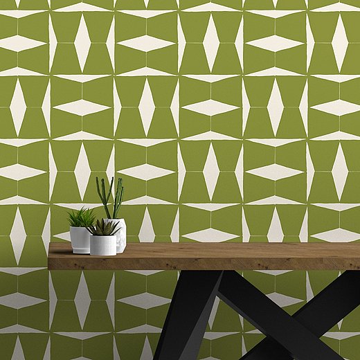
Susan Hable’s Brancusi Wallpaper in Napa is water- and stain-resistant, making it a great choice for high-traffic spaces.
• Go with the flow. A large-scale geometric print might look fabulous in your living room, and a dramatic floral paper could be ideal for your dining room—but if each room is visible from the other, you don’t want the two wallpapers to clash. “I would avoid pairing two large wallpaper prints in the same room or in spaces that flow from one into the next,” says Shannon Frappied, another member of the One Kings Lane Interior Design team. “You want to create a subtle flow.”
• Consider using wallpaper to define zones. In a large open space that serves as, say, living room, dining area, and home office, you could use wallpaper to create a sort of room within the room, just as a room screen might.
• Maintain balance. “When it comes to picking color and pattern, think about the other pieces in the space,” Jess says. “Mixing a large-scale print with a small-scale print is a good rule to follow.” Selecting a wallpaper with a palette that encompasses prominent colors in the room’s existing furnishings also helps ensure balance.

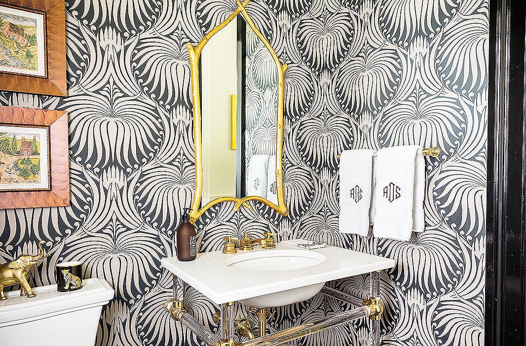
This powder room, featuring Lotus Wallpaper from Farrow & Ball, shows that large patterns can provide the perfect oomph to small spaces. Photo by Lesley Unruh.
• Think about texture as well as color and pattern. While boldly patterned papers are commanding the lion’s share of attention right now, don’t overlook how subtler grass-cloth wallpapers can introduce welcome texture to your room.
• Be mindful of materials. In a kitchen or a frequently used bathroom, opt for vinyl wallpaper, which can handle appreciable moisture. And in kids’ rooms, hallways, or other spaces subject to heavy traffic, spills, fingerprints, and such, consider papers that can be wiped clean and are scratch-resistant and tear-resistant.
• Ignore the “rules” about not using large patterns in small spaces. Large-scale wallpaper can actually make a petite space feel bigger; the sheer drama of the print makes you forget that the room is small. What’s more, a wallpaper that might be overwhelming on a large expanse of wall can bring just the right amount of wow to a smaller area.
• Use vertical stripes to make ceilings feel taller. It really does work!
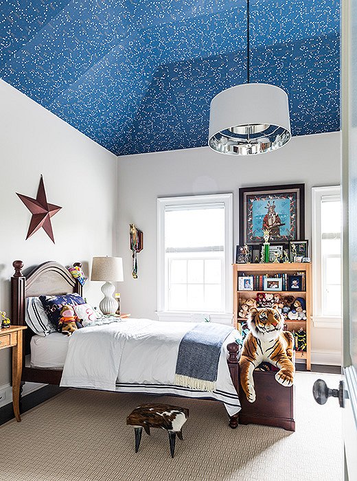
• Don’t forget the “fifth wall.” “You always have the ceiling as an added surface,” Shannon says. “I love a small print on the ceiling of a nursery for added interest and depth.”

The celestial wallpaper in this bedroom adds pattern while complementing the serene white walls. Find a similar starry wallpaper here. Photo by Lesley Unruh.
Join the Discussion