James Huniford claims to be “a minimalist at heart.” And while that may well be true (his interiors are never too packed, too layered, too colorful, or too overwhelming), he’s also never afraid to make a grand statement. “I’m not really into little vignettes,” he says. “I’m into bold strokes. My visual sensibility is based on what is going to have the most impact.”
Never is that philosophy more evident than in his weekend home, a circa 1855 Bridgehampton, NY, farmhouse that he meticulously restored (out went the unfortunate aluminum siding and in went details like shingles, wide-plank floors, and cast-iron radiators). But the house isn’t such a period piece that it’s not cozy. “I wanted it to be comfortable for me, my family, and my friends,” says the designer. That it is, but it’s also a next-level example of how to use reclaimed and rustic elements to create a totally refined space.
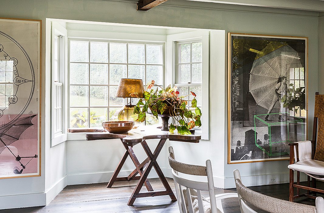
Robert Rauschenberg works, framed in a honey-colored wood, are an example of Huniford’s preference for large pieces. He calls the Belgian table in the bay window—a 19th-century jeweler’s table—“probably the best piece of furniture in the house.”
Lesson No. 1
Use Objects in Unexpected Ways
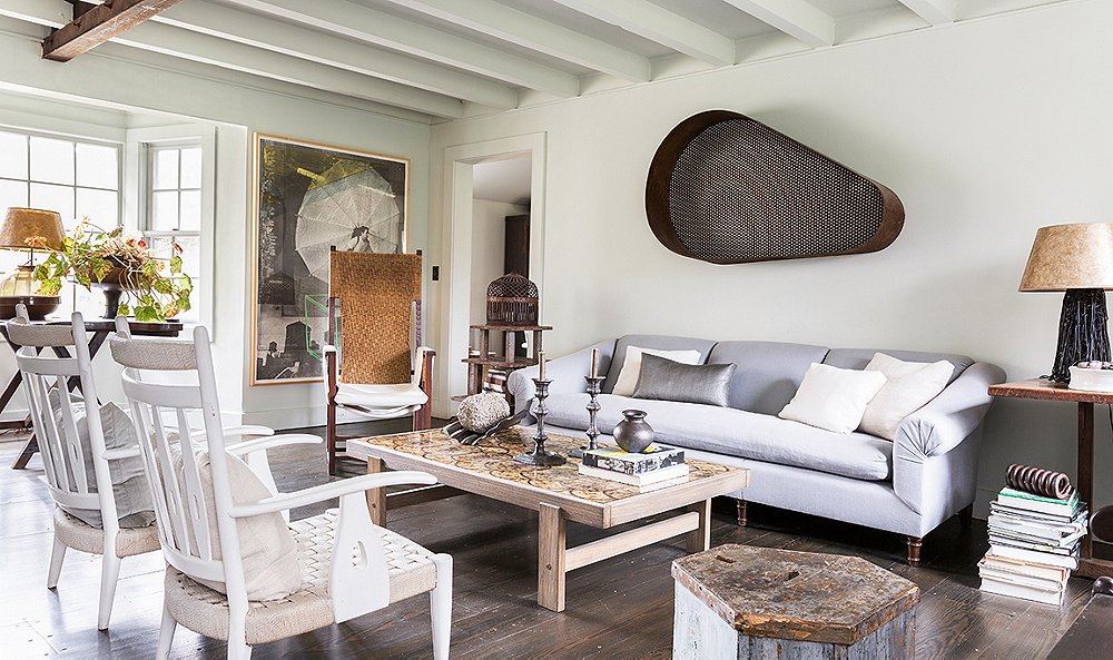
“I’m always collecting found objects,” says Huniford. “I love things that I can repurpose and use in a different way, whether it’s a conveyor belt or a belt cover that I can put on the wall as a sculpture.” (He did just that in the main living room). “I think it’s about taking elements from different periods and not letting the history of them affect how you use them.” While his finds are always sophisticated, often they’re practical too. “I collected an octagon-shape 68-drawer cabinet from a hardware store that my son actually keeps his Legos in,” says Huniford.
Huniford isn’t one to say what specifically to collect, but he is a big advocate of authenticity. “Each person may have their own taste and sensibility,” he acknowledges, “but having an adventurous eye is important.”
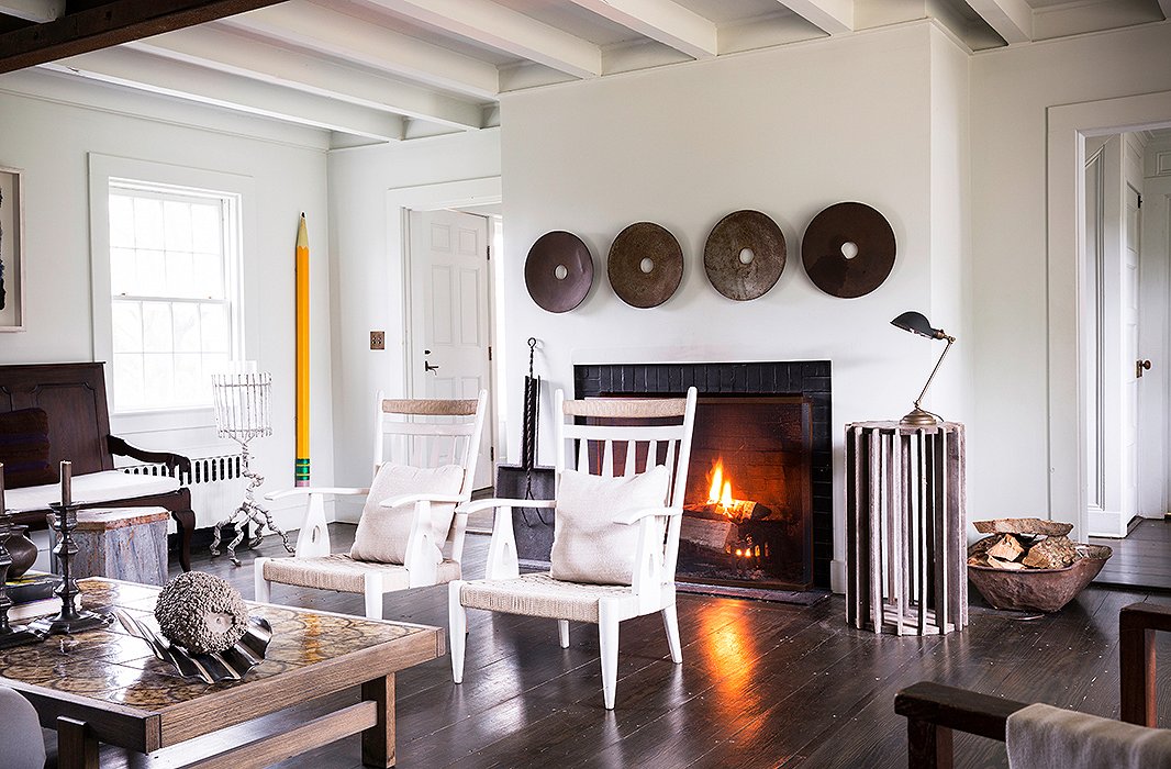
The four pieces above the fireplace were sourced from a welder. “I look at objects and I look at wall spaces to see where I can create a detail that’s strong but clear,” Huniford says.
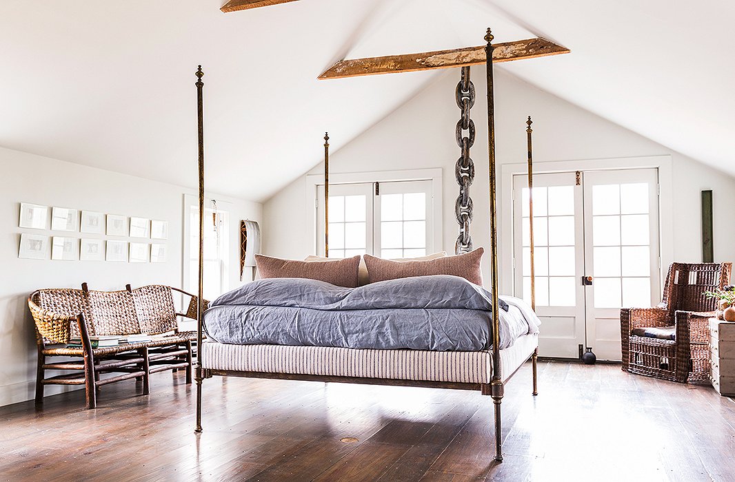
The master bedroom is simultaneously quiet and packed with drama. As for bed linens, “I think bedding should be very calm and serene and have nice textures rather than bold colors,” says Huniford.
Lesson No. 2
Turn Convention on Its Head
Huniford’s adventurous approach is perhaps best exemplified by his master bedroom, which manages to be traditional and rule-defying at once. While most find it impossible to resist placing a bed against a wall, Huniford presents it almost like a work of art, making it the undisputed focus of the space. “I like the idea of the bed floating in the middle of the room,” he says. “To me, the placement creates a sense of stability so that when you sleep, it’s almost like you’re floating.” The drama is amplified by the room’s amazing light, calming colors, and high angled ceiling.
Of course, the layout of the room is probably not the first thing a guest would notice. That would be the large wooden chain (sourced from a ship from the San Juan Islands) that Huniford draped from a ceiling beam. Given his masterful eye and ingenious layout, it plays like a museum piece.

I’m always collecting found objects. I love things that I can repurpose and use in a different way.
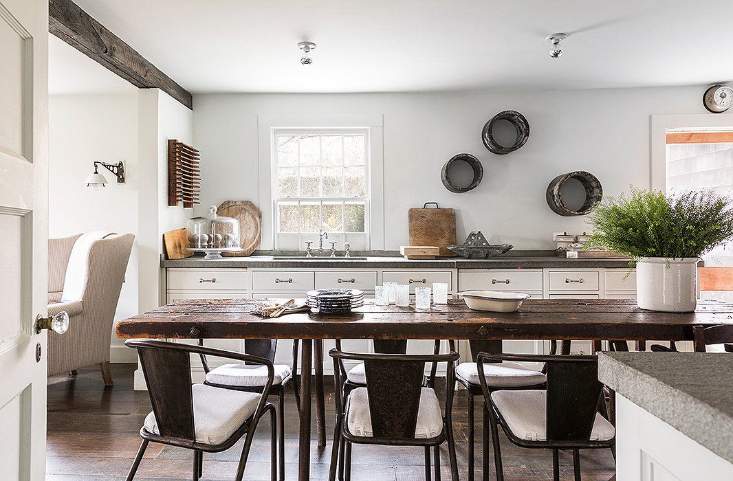
Artfulness is achieved though the interplay of the raw materials—the contrast of wood and steel, the combination of matte and shiny surfaces—rather than through bursts of color.
Lesson No. 3
Scale Back on Color
“The key to this house is the palette,” Huniford says, “the calmness and the soothing that, for me, is everything.” Indeed: While eccentric elements abound, the effect is always elevated, always timeless. “I really like grays and blues and greens, celadon greens. They’re colors I relate to, and they’re the colors in paintings I really like.” The blue of the living room was chosen because it reminded him of the blue in an Agnes Martin painting he admires, and the entire interior is painted a shade that Huniford mixed up himself and dubbed “foggy summer squall.” “Depending on the shadows and the light, it reads as different colors,” he says.
Much of Huniford’s palette is achieved through his choice of raw materials. Wood is omnipresent in this home and lends a natural, nuanced richness to the space. “It’s interesting to mix woods or grain materials for contrast,” says Huniford. “I think it’s more important to have the mix than the match.”
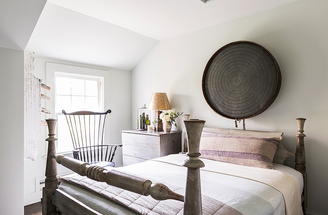
A cistern, repurposed as wall art, and a heavy wood bed ground the guest bedroom, while the glass bottles are an arrangement the designer put together and considers a personal sculpture. Huniford’s custom wall paint appears almost gray in the afternoon light.
Lesson No. 4
Think Big (but Balanced)
When using large-scale pieces as decor elements—be they tree trunks, ship chains, or the cistern from Indiana that hangs above the bed in the guest bedroom—Huniford believes in going all out. Once you have your statement makers in place, it’s important that they fit into the overall scheme. “Think about what is going to balance out the rest of the room,” he says. As always, the challenge is putting it all together: “I think a great interior is about editing, and being restrained, and knowing how to balance out comfort, function, and the visual idea of what the room could be.” He’s a stickler when it comes to sight lines, always aware of how all the elements work together. “When you walk into a room, consider what your eyes are going to be drawn to,” he says. “There always needs to be a calmness, a tranquil moment, to make you want to be there. The rooms I design are always curious and inviting and comfortable.”
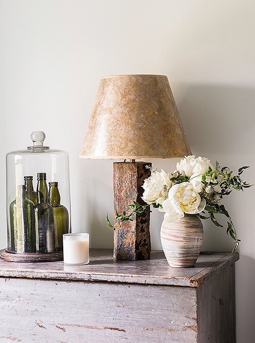
A collection of green glass vases is one of the only pops of color in the serene guest bedroom.

I think a great interior is about editing, and being restrained, and knowing how to balance out comfort, function, and the visual idea of what a room could be.
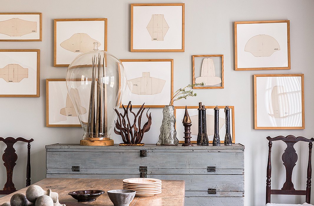
Every piece has a story. For instance, under a glass cloche he acquired in England, Huniford placed a sculpture he made of swordfish noses. The candlesticks are another testament to his creativity: He made them from found wood objects.
Lesson No. 5
Collect with a Curatorial Eye
Huniford’s aesthetic is so singular and his design experience so vast, it’s easy for him to immediately know if a piece fits his vision. But whatever your point of view, consider the bones of a piece. “I really look for objects with a sculptural shape or form or an interesting color,” he says. “That, for me, is key.”
When displaying your finds, grouping similar objects is a simple way to create a streamlined look. Hunniford’s home features many clever collections placed throughout the house—green glass bottles, grouped artfully under a glass cloche; a series of black wood candlesticks. Within reach and out in the open for use, they also serve as objets d’art.
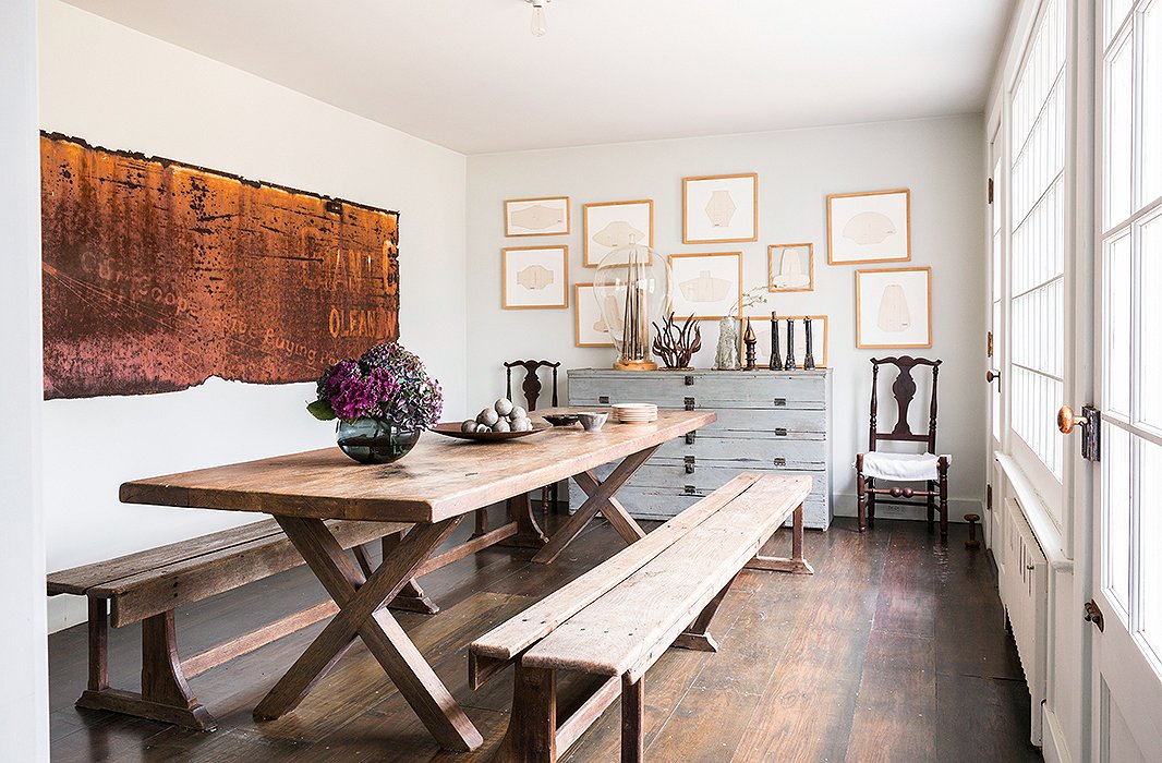
A WPA-era advertising sign that once lived on the side of a truck looks refined in this well-edited room.
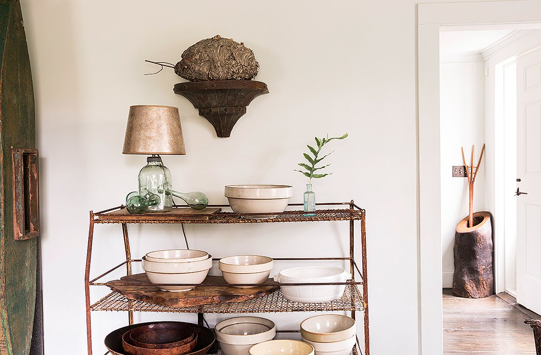
Huniford is a longtime admirer of American ceramics—in particular, California pottery. “I admire the adventurousness of the wheel and working with clay. I love that process of the unknown and having it become something that you couldn’t imagine until the end.”
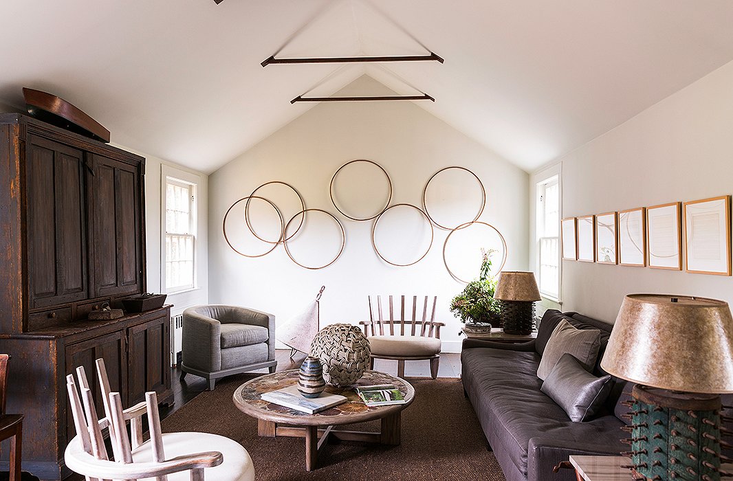
The hoops are the work of early American weavers (“I just loved those shapes. They seemed whimsical and playful,” Huniford says), and the spiked lamps were made from pieces of old farm equipment originally used to turn soil.
Lesson No. 6
Planning Is Everything
Huniford storyboards out all the elements of a room before settling on a design. “In the same way that you lay out a shirt or a blouse and a jacket or pants and shoes so you know how to accessorize it, it’s about creating that story for an interior so that you have a clear vision,” he says. He measures everything in advance and pays particular attention to scale. What you don’t want, says the designer, is a flat plane. “Try different table heights,” he advises. “For instance, if the seat cushions for the sofa are 19 inches high, then the coffee table should be lower.”
Lesson No. 7
Aim for a Sophisticated Mix
Though his Bridgehampton home is full of rough finishes, a closer look reveals the depth of his approach. His preferences regarding wood are a case in point: “You can use tinted wax on wood to have it look a little more refined, which I do often. It’s about the high and the low, to be able to have a reclaimed or rugged material with a very elegant and luxurious material, like a porous wood with a silk velvet. It’s that mix of very delicate, refined finishes and some rugged elements that creates that tension, which I think is what rooms need.”

I’m not really into little vignettes. I’m into bold strokes. My visual sensibility is based on what is going to have the most impact.

Join the Discussion