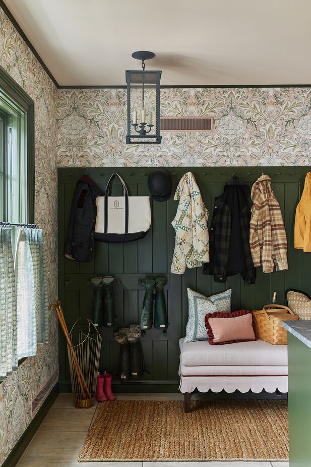
Katy Evans Design used a William Morris wallpaper and a scalloped skirt on the bench to dress up this hardworking mudroom. Photo by Heather Talbert.
The 2023 Lake Forest Showhouse & Gardens is actually several showcases in one. In addition to the two-story, six-bedroom main building, there are a three-bedroom East Cottage and a smaller but no less stunning West Cottage set on nine spectacular acres north of Chicago. All told, 41 design and landscaping firms created spaces to benefit Chicago’s IWS Family Health.
Although the rooms differed vastly in style, several trends emerged. Scalloped silhouettes brought curves and whimsy to numerous spaces, while fringe, embroidered tape, and other types of trim referenced classic elegance. Ceilings were treated as much more than an afterthought (something we previously spotlighted), and wallpaper was just about everywhere.
The Lake Forest show house is open through June 4. Can’t make it? Check out a few favorite spaces at left and below.
View highlights from the 2023 San Francisco Decorator Showcase >
See favorite spaces from New York’s 2023 Kips Bay Decorator Show House >
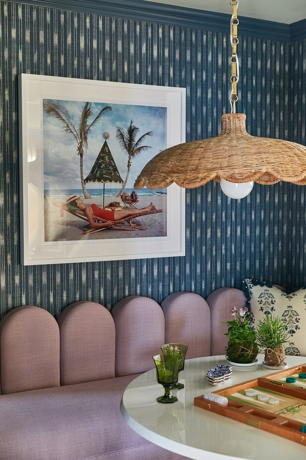
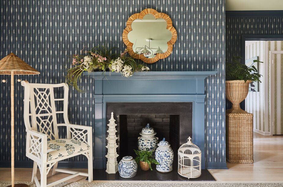
Palm Beach is a long way from the Chicago area in terms of miles, but Michele Frigon Design transported its style to the East Cottage’s living/dining area (above, right, and at top). The blue-and-white grass-cloth wallpaper is a breezy backdrop for Slim Aarons’s Palm Beach Idyll and the rattan lampshade. Photo by Heather Talbert.
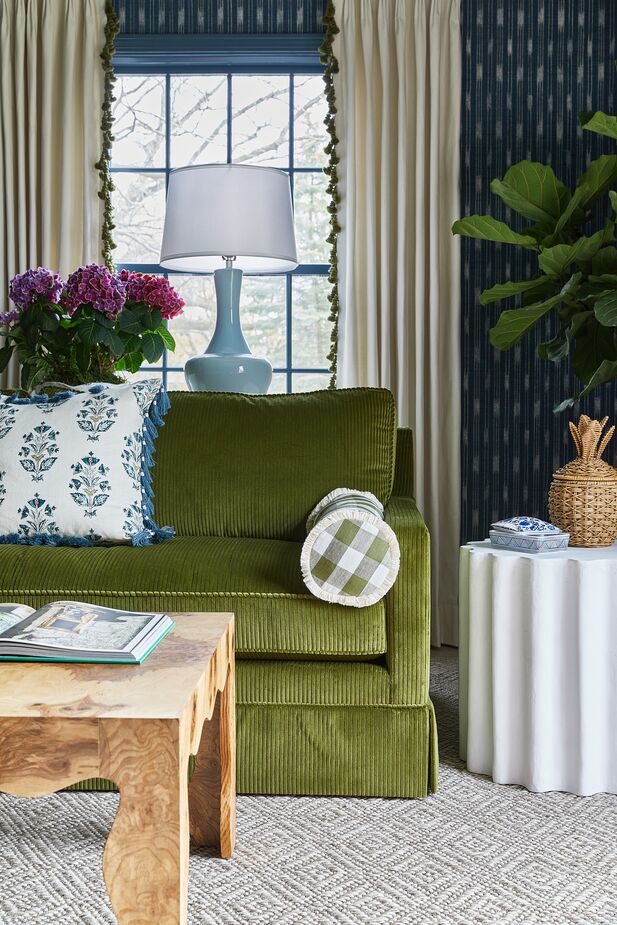
The apron and legs of the cocktail table echo the scallops of the dining area’s fixture and banquette. Fringe and tassels on the curtains and the pillows add a bespoke element thoroughly in keeping with the Palm Beach vibe. Photo by Heather Talbert. (Like the look? Then shop our Palm Beach curation.)
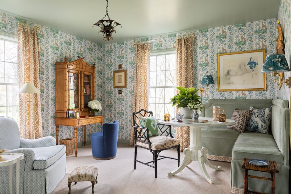
Emily Sturgess Design envisioned the den as a multitasking room that didn’t skimp on charm. The 19th-century bamboo desk makes work a bit less onerous; the table and the corner banquette provide a space for enjoying after-dinner drinks or playing games. Pierre Frey’s Ismaelia wallpaper, featuring giraffes and flowers, inspired the room’s palette and wraps the disparate elements into a cohesive whole. Photo by Aimée Mazzenga.
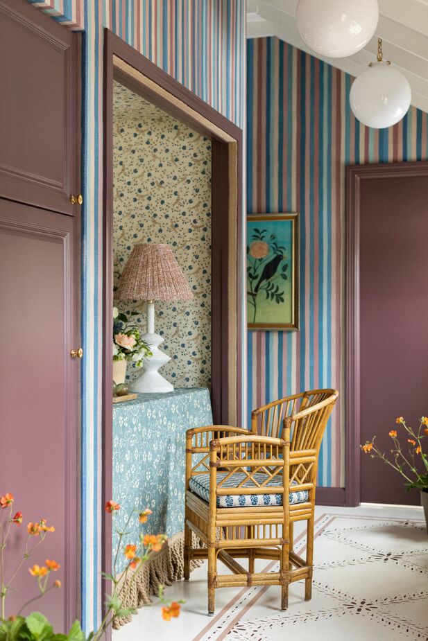
Many of the designers made a point of giving even the smallest niches a purpose. In the East Cottage’s side entry hall, Maggie Getz Studio nestled a table into a petite closet and voilà! a handy spot to open mail or answer texts. The nook’s floral patterns help set it apart from the striped hall. Photo by Aimée Mazzenga.
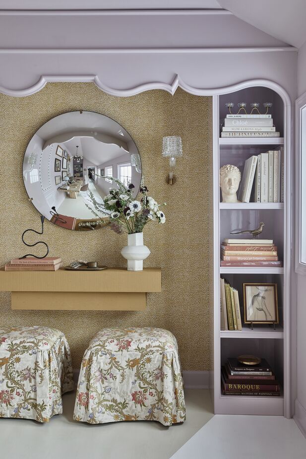
Kelly Hurliman Interior Design transformed a different niche—the space between two built-ins—into a vanity. Inspired by Fleur Cowles, the beyond-chic founder of the legendary Flair magazine, this room also serves as an office, proof that one can mix business with pleasure. Photo by Heather Talbot.
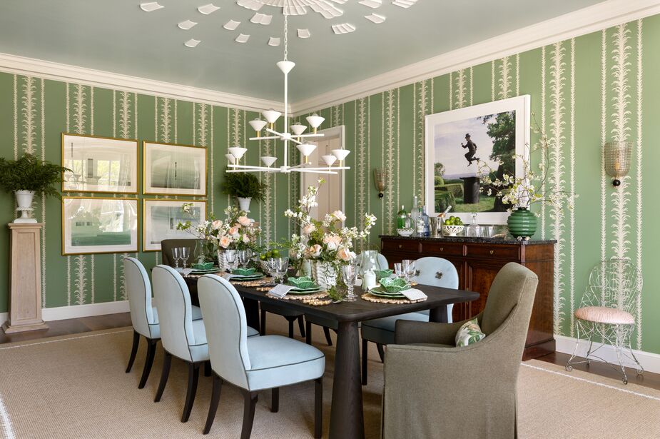
“The dining room has expansive floor-to-ceiling windows that look out onto the home’s beautiful gardens,” notes Alex Kaehler of Alexandra Kaehler Design. “The idea for our design is to bring the outside in. The dining room is now feeling like an extension of the garden”—from the hand-blocked vine wallpaper to the cabbageware (find similar here). While much of the room is traditional, the scalloped plaster ceiling medallion is anything but. Photo by Aimée Mazzenga. (View another project by Alex here.)
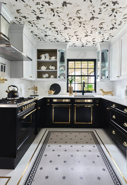
Given how dramatic the rest of the kitchen is—the gold-on-black range and lower cabinets, the tile “rug” outlined with more gold—a plain white ceiling simply wouldn’t do. Instead, Lori Lennon & Associates balanced all that luxe by papering the ceiling with a black-and-white floral motif.
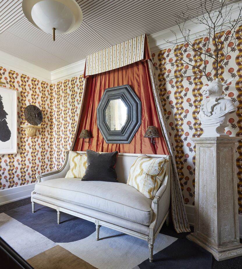
Lee Radziwell’s London apartment inspired James Thomas Interiors to create a retreat both stately and serene. The tester makes the settee worthy of royalty. The lined wallpaper on the ceiling and the geometric rug ensure that the room remains of the moment. Photo by Werner Straube Photography.
Join the Discussion