Response to our previous “Ideas to Steal” post was so positive, we decided to follow it up with more beautiful spaces that recently caught our eye on Instagram—and just as important, more suggestions regarding how to incorporate the elements we love.
For daily inspiration, follow us on Instagram @onekingslane—and feel free to share your own spaces by tagging us with #myOKLstyle.
The space: The entryway of designer Amy Studebaker’s home.
Why we love it: This foyer isn’t merely a throughway to the rest of the home. From the painted wood floor to the gallery wall, it’s a destination in and of itself. The chair encourages one to sit down and admire the art. And including a plant, real or faux, eases the transition from outdoors to in (and vice versa). Find a similar light fixture here.
Idea to steal: Be intentional with your hardware. Because they have the same brass finish as the doorknob, many of the picture frames, and the light fixture, the door hinges add to the entry’s elevated feel.
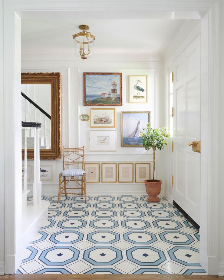
Photo by @maxkimbee.
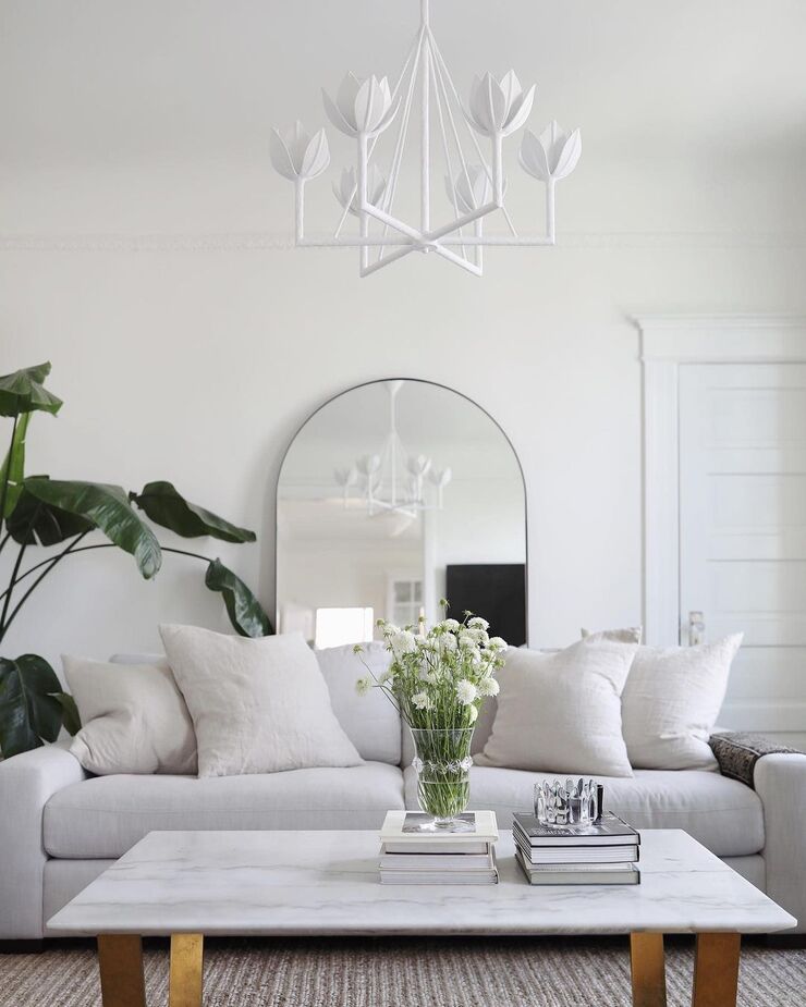
The space: A living room from blogger Ashley Kane.
Why we love it: Quiet luxury has become a buzzword, and this room shows how relatively simple it is to achieve. Stick with a limited, neutral palette and let the quality and texture of the materials do the heavy lifting. Here the plasterlike texture of the Alberto Tier Chandelier, the linen weave of the sofa upholstery, the ribbed rug, and the glossy marble tabletop add plenty of visual interest while ensuring a serene ambience. Find a similar sofa here and a similar rug here.
Idea to steal: Place a large mirror so that it reflects the light from a lamp or fixture; it’s the easiest way to maximize brightness in a room.
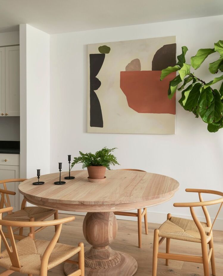
The space: A dining area designed by The Brooklyn Home Company.
Why we love it: As with the living room above, the tight, muted palette creates a sense of calm—especially welcome when the room is in the midst of a Brooklyn neighborhood like this one is. The few pops of color in the artwork—the green and the terracotta—are repeated in the plants and the planter.
Idea to steal: A quiet color scheme makes it even easier to mix styles and provenances—in this case, the classic Charlotte Dining Table and the Danish Modern-inspired Nina Side Chairs.
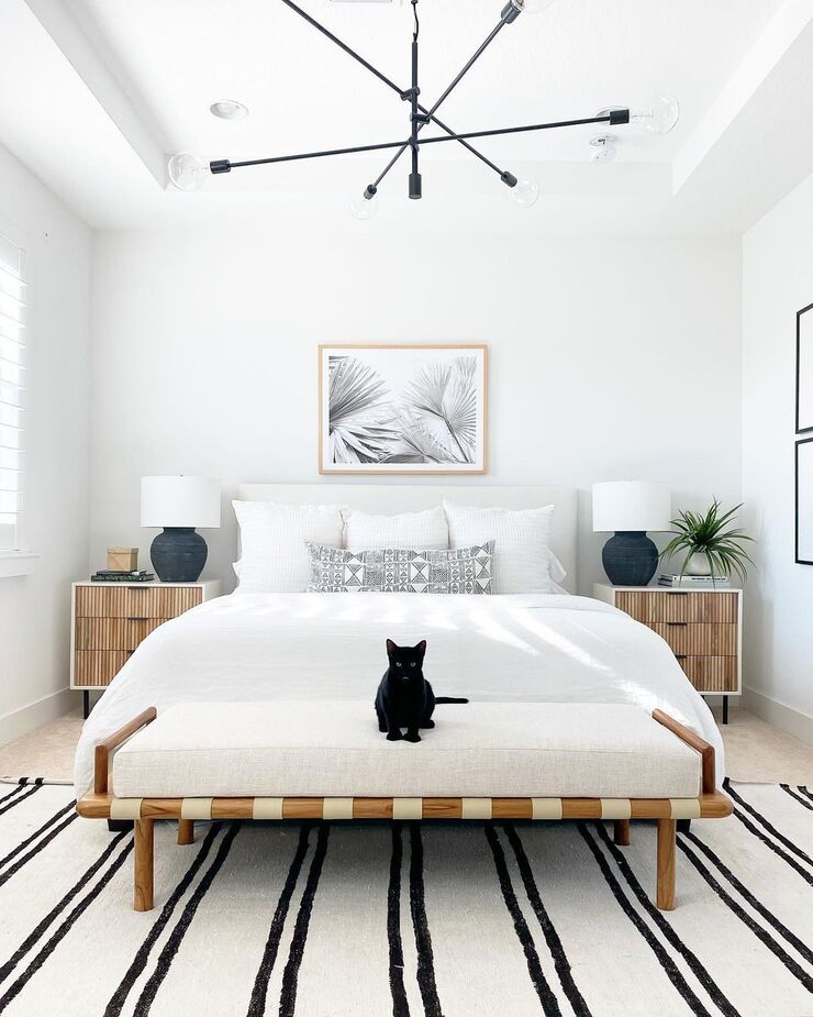
The space: A bedroom from Studio Ett Hem.
Why we love it: In keeping with the neutral theme, this bedroom leans into the organic ease of Scandinavian Modern design. (Ett hem is Swedish for “a home.”) With its streamlined oak frame and leather straps, the Vander Bench exemplifies the aesthetic, as do the square nightstands with drawer fronts adorned with wood. Find a similar headboard here.
Idea to steal: Introduce a few linear black accents—here, the stripes on the rug, the chandelier, the picture frames on the side wall—to give a neutral room some definition and urban flair.
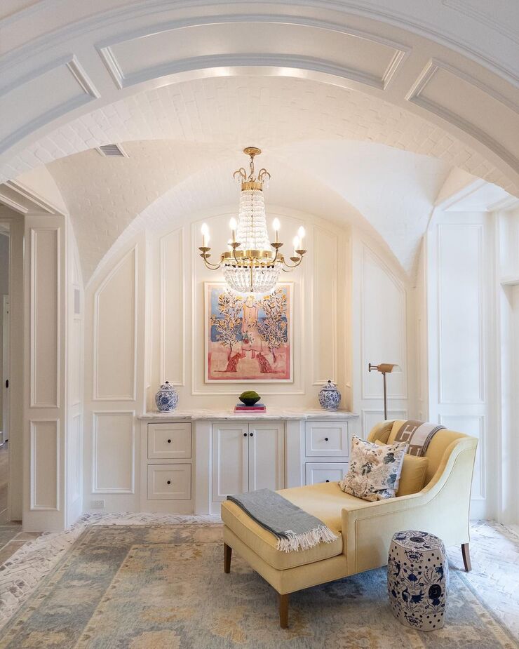
The space: A sitting area designed by Shasta Snell Mitchell.
Why we love it: What’s not to love? From the Roslin Chaise in Canary Yellow to the Paris Flea Market Chandelier to the timeless rug, everything about this space invites you to relax and savor. The Cloud Chinoiserie Garden Stool is an idea perch for a beverage, while the Studio Swing-Arm Floor Lamp shines light exactly where you need it.
Idea to steal: Rethink how you use certain rooms to make them work for your lifestyle. This space was originally a wine room; with the brick floor and ceiling now painted white, you’d never guess it. Perhaps that formal dining room you never use would serve you better as a family room or that empty walk-in closet as a home office.
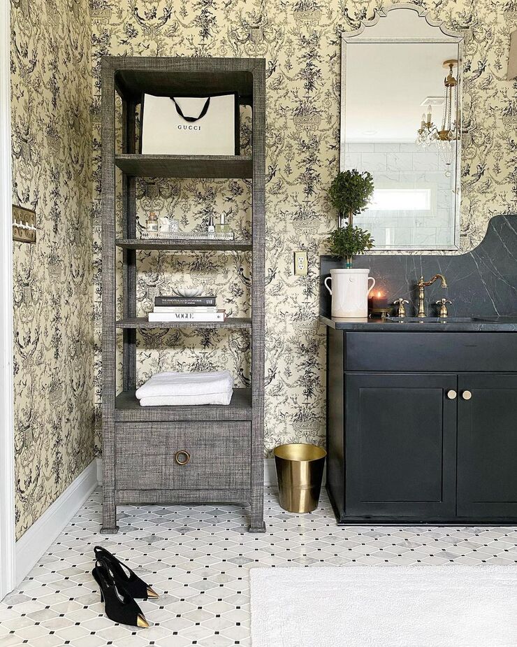
The space: A bathroom by Brexton Cole Interiors.
Why we love it: More cabinetry would have detracted from this bathroom’s Parisian elegance. The Kos Raffia Étagère in Charcoal, however, offers storage with panache that retains the room’s airy, romantic feel. It also allows more of that fabulous wallpaper to be seen than than a closed cabinet would.
Idea to steal: A small topiary is a sophisticated alternative to a floral arrangement, and it will complement any color palette.
Join the Discussion