Gallery walls have received the lion’s share of design attention during the past few years, and for good reason: They’re a wonderful way to make a big decor statement with smaller artworks. Some people find them too busy, though, especially in rooms where they’re striving for a tranquil ambience. (And if you cannot tolerate artwork that is even slightly ajar, a gallery wall could have you continually straightening frames.)
For those reasons, we’re happy to see oversize artworks also getting some designer love. When displayed to best advantage, a large piece of art proves that less really can be more.
If you’re considering opting for a large painting, photo, or other work, consider this rule of thumb: The art should be about two-thirds to three-fourths the width of the sofa, bed, or other furniture piece below it, and the bottom of the artwork should hang roughly five to eight inches above the furniture.
Not that you have to anchor your art to a piece of furniture. If you’re choosing a painting or photograph to display in a hallway or any other expanse, the two-thirds/three-fourths guideline still applies, this time in relation to the width of the empty space. As for height, the center of the art should be approximately eye level—57 inches or so above the floor.
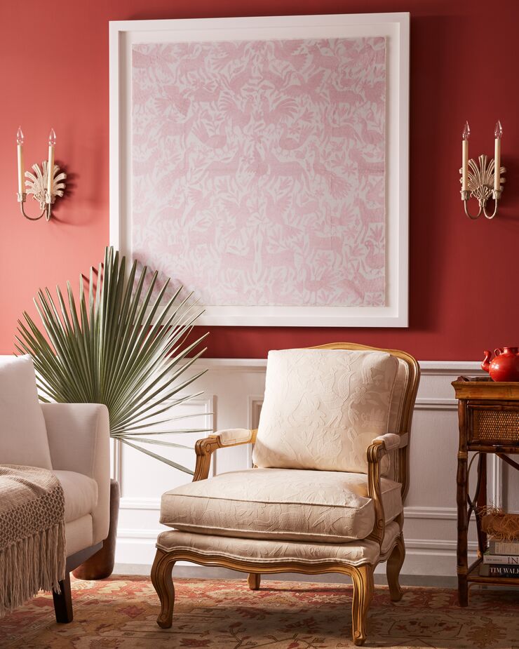
Blush Otomi by Dawn Wolfe fills what could have been an awkward blank space between sconces.
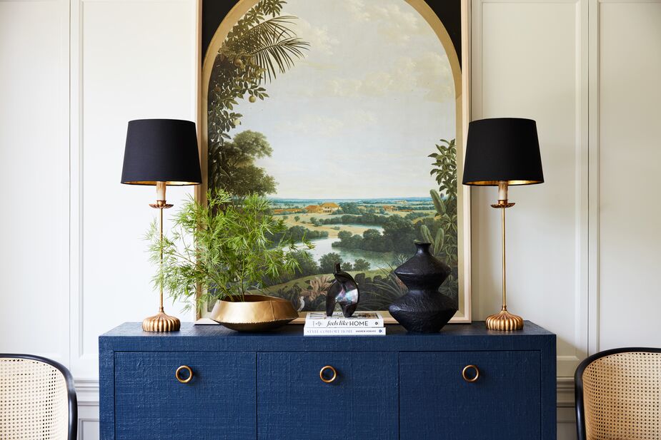
Vista View from designer Olivia Song’s exclusive curation for One Kings Lane, helps unify the diverse objects that make up the vignette atop the Kos Raffia Three-Door Sideboard in Navy. The Clove Stem Buffet Lamps in Gold/Black reinforce the symmetry. Find the vase here. Photo by Joe Schmelzer.
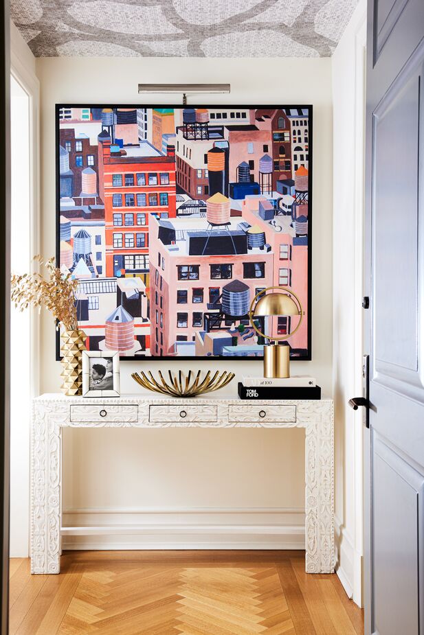
It’s counterintuitive but true: An oversize artwork can make a small space look larger than several smaller pieces would. Case in point: this foyer designed by Nikki Chu for actress Nicole Ari Parker featuring NYC Water Tanks by Toni Silber-Delerive. Find the console here. Photo by Erin Kunkel.
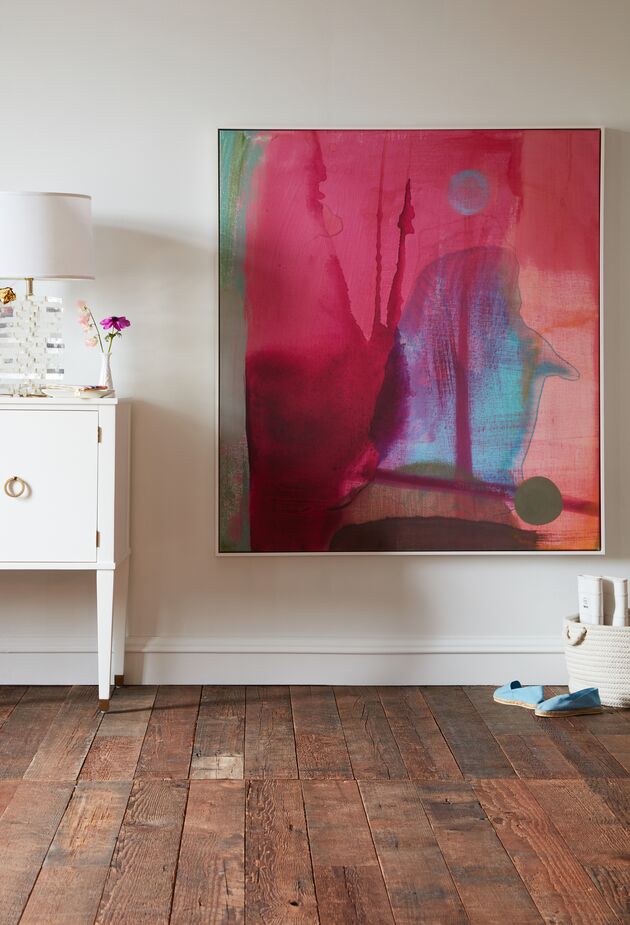
Rewind by Michelle Armas is displayed well below (standing) eye level here so that it can be enjoyed by a person lounging on the bed opposite. Sometimes rules are made to be broken!
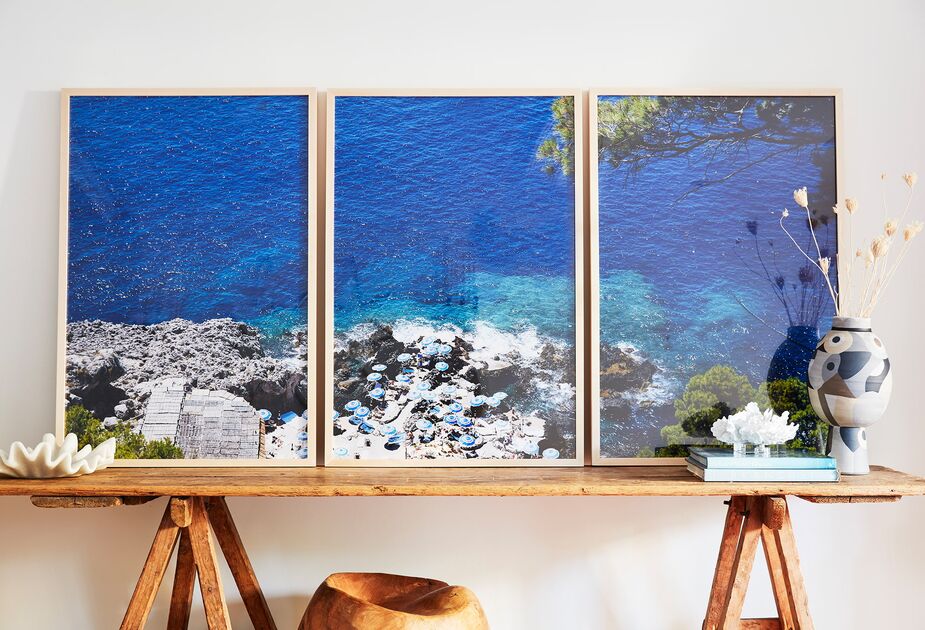
When placed close together, the individual works that make up a diptych or triptych read as one large artwork. And as shown here with Fontelina Cliffside Triptych by Natalie Obradovich, large art doesn’t have to be hung. Photo by Joe Schmelzer.
A few other helpful tips:
• Consider designing the room around the art rather than choosing art to accommodate the furnishings. This is especially if you’re decorating from scratch or you find a work that you can’t live without. Too often art is an afterthought.
• Be sure your screws and anchors are sturdy enough to support the art. Don’t skimp!
• When buying new art, make sure you can fit it into your doorway, up your staircase, or into your elevator. If you can’t, consider hoisting it through a window, as people do when moving pianos.
Shop art >
Book a free appointment with our designers >
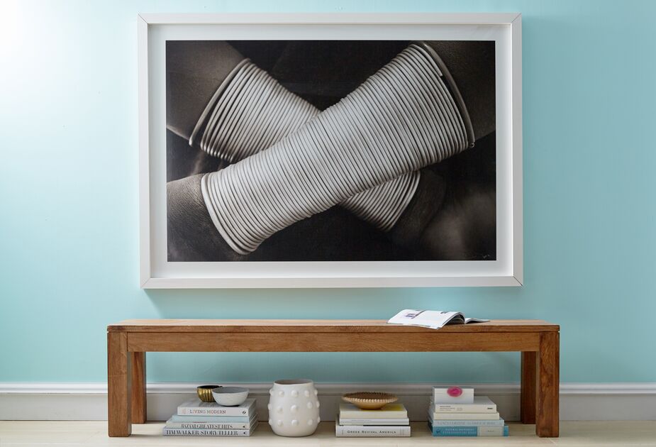
Untitled 45: Omo by Drew Doggett transforms this hallway from a space to pass through into a destination.
Join the Discussion