Even before she was given “free rein” to refashion this home, designer Sara Johnson knew that the owner “loves whimsy, prep, and color.” In fact, she’s known the client for years: They were sorority sisters at Southern Methodist University.
But when the client and her family moved into the apartment, in a 1924 co-op building on Chicago’s Gold Coast, there wasn’t much whimsy, preppiness, or color. Neutrals reigned supreme, and the owner’s collectibles—she works at Sotheby’s—weren’t shown off to their full advantage.
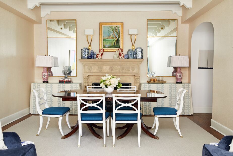
Among the significant changes Sara made was reversing the orientation of the living-dining area. Originally the half of the space with the fireplace was used as the living room, with the windows in the dining area. Now skirted tables that serve as buffets flank the fireplace, with the dining table resting in front of them.
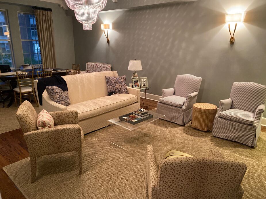
The living/dining area before Sara worked her magic.
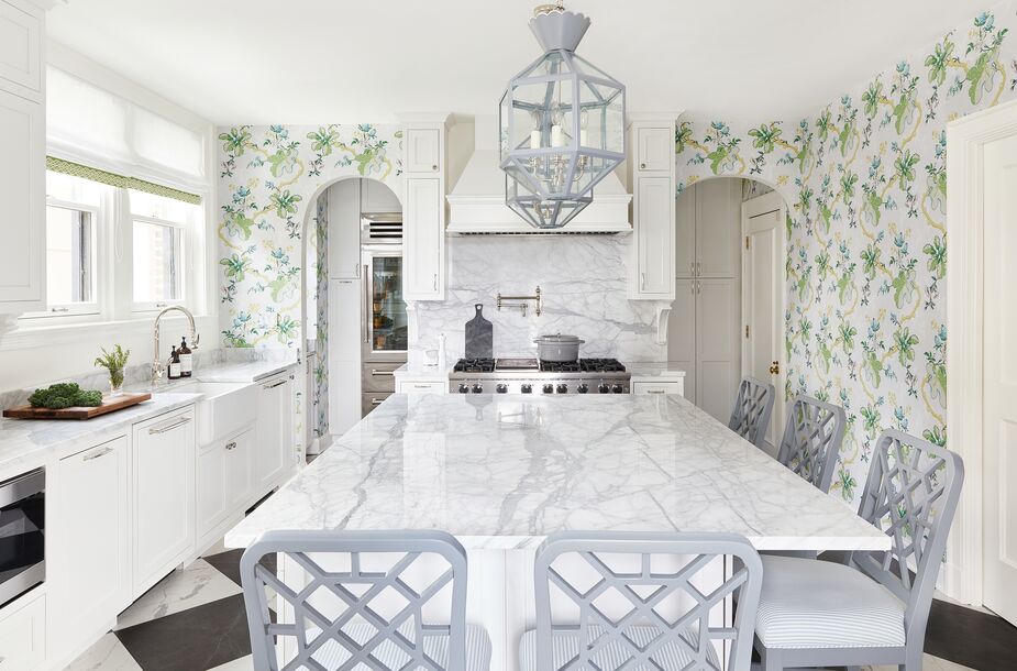
The kitchen pendants were custom-painted to match the counter stools; the stools’ geometric motifs subtly echo the diamond pattern of the floor. Find similar stools here.
In a compact space like this one, garden stools are an ideal pinch-hitter for side tables and extra seating alike.
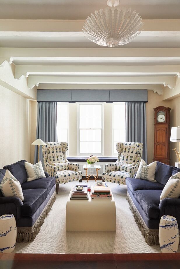
In turn, the window has become a focal point of the living area. Blue curtains and a classic valance frame the view, and a cushioned window seat provides an extra perch.
Sara also reorganized the room for a more harmonious flow between the two areas. Gone is the sofa positioned as a divider, with the dining area looking onto its back. In its place: a pair of sofas in the living area placed perpendicular, not parallel, to the dining area, making the space feel roomier and less crowded.
The room’s walls and carved ceiling beams are still painted in pale neutrals, serving as a restful backdrop to the myriad shades of blue used throughout. The powder room is a rhapsody in blues as well. Not only was the millwork painted blue (New Born’s Eyes by Benjamin Moore) but a custom trellis pattern was also painted over the silver Mylar wallpaper. “The room became the perfect spot for my client to display her blue-and-white ginger jar collection,” Sara says. More of the collection is shown on the dining room’s fireplace mantel.
The project did encounter one major obstacle. “We began weeks before the pandemic,” Dallas-based Sara says, “and I had to rely heavily on my client and Chicago tradespeople to execute my vision to the finish line, without me physically being there.”
But Sara and her sorority sister agree that all parties more than rose to the challenge. And Sara is hard-pressed to single out a favorite room or feature: “I won’t design a space with anything but my favorites, so I love all these rooms!”
Shop our New Traditionalist edit >
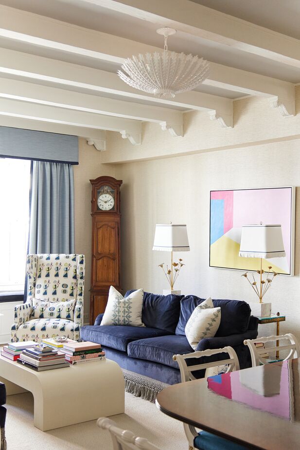
The abstract artwork brings modern energy and unexpected colors to the living area. The table lamps add a touch of whimsy. Find a similar chandelier here.
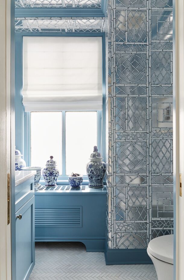
A custom design by Quadrille, the trellis on the Mylar wallpaper was painted with New Born’s Eyes—the same blue as the millwork—and Shaker Gray, both from Benjamin Moore.
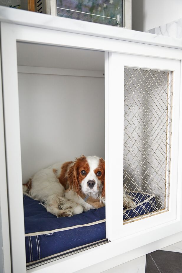
“Sadly, I cannot take credit for Carpenter’s cubby,” Sara says of the space just off the kitchen where the family’s Cavalier King Charles spaniel often nestles. “This area was planned by my client and her general contractor, and the cubby is perfectly incorporated into the pantry and utility space.”
Join the Discussion