One of Nashville’s most beloved couples hits the road a lot. Cassie Kelley, the founder of the media site Womanista, often joins her husband, Charles, leader of the country-music band Lady Antebellum, on tour. But anticipating the arrival of their first child, the couple realized their Nashville home’s main living space—a room that encompasses the kitchen, breakfast nook, and living room—deeply needed a refresh. When they’re in residence, Cassie says, “we spend 90% of our time in that space.” It hadn’t been updated since they moved in, and it reflected a glamorous, glitzy sensibility—as Cassie explains it, “I was in my late 20s when we decorated.” In keeping with their prebaby lifestyle, almost every inch of the space was white.
Now Cassie felt ready for a more easygoing, colorful type of chic. They needed a lot more storage and family-friendliness across the board. Plus when they’re home, Cassie and Charles have a constant stream of friends coming through, so they wanted a better flow for entertaining.
Led by Alex Reid, our team from One Kings Lane Interior Design flew into Nashville to help Cassie and Charles. “It was out with the chevron and the glitz, in with a more layered, current style that doesn’t take itself too seriously,” Alex says. “We looked at everything with an eye to childproofing. Now it really reflects where they are right now—they have a new baby, and they themselves are also young and very social.”
Cassie was thrilled to come home with baby Ward to a space that looked and felt completely refreshed. While Ward napped, we chatted with her about the design process. Check out the transformed space and pick up Alex’s tips on how to decorate for a family—without sacrificing an inch of style.
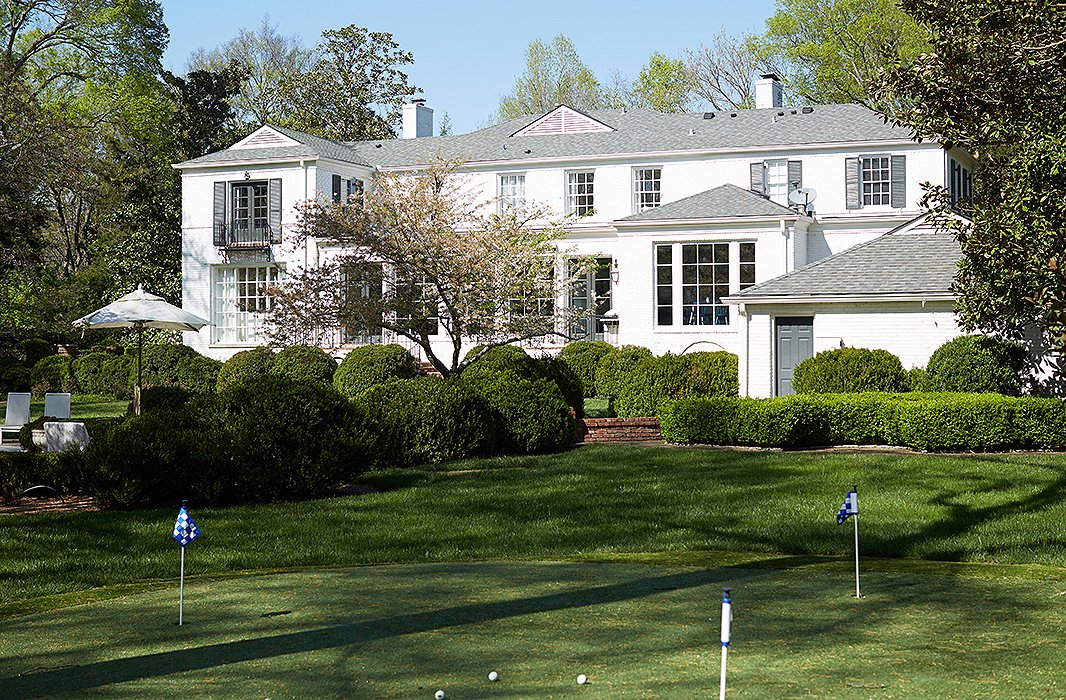
The lawn of the 1942 house has much of its original plantings and trees, but the couple added a little putting green near the pool.
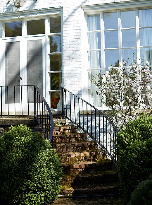
Cassie calls this “hopefully our forever home.”
Embracing the New Nashville
As a Nashville native, Cassie has a confident grasp of both the established character of the city and its emerging style. While many of their friends are settling in what Cassie calls “Nashville’s hipper neighborhoods like 12 South and East Nashville,” she and Charles chose a 1942 colonial in Belle Meade, perhaps Nashville’s most tony, traditional enclave. They fell in love with the graceful lawn—“It had such mature landscaping and an amazing pool,” Cassie says—and settled there in 2012 after a “lightning-fast” renovation.
The exterior is a vision of genteel loveliness, but indoors Cassie wanted something more reflective of current Nashville: Think of the fresh energy and color-forward Southern style of Nashville brands such as Pencil and Paper and Reese Witherspoon’s Draper James. “Nashville is the ‘it’ city right now—there are a lot of eyes on it from a creative standpoint,” Cassie notes. “Yet everyone’s warm and friendly, and the high design is really married with that warmth and sense of fun.” This sensibility—which is contagious the moment you touch down in Nashville—guided One Kings Lane team’s entire approach to the interior.
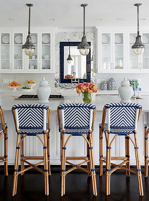
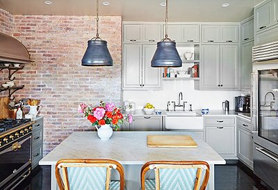
In the newly decorated kitchen, the only pieces that remained from the original design are the trio of antiqued steel pendants, which Cassie picked up on a drive through Franklin, TN.
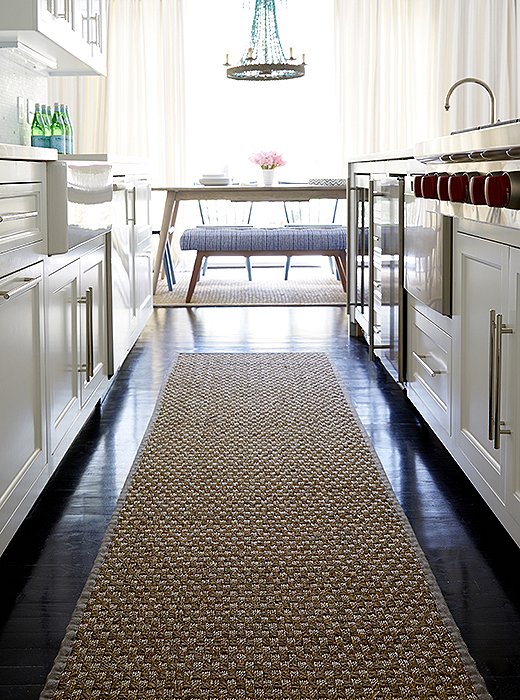
“I wanted to cut all the darkness of the floors,” Alex says, “so we lined each area with sea-grass rugs—they are inexpensive and durable.” And they feel good on the feet—especially in a place like the kitchen galley.
Letting Loose with Color and Texture
For the palette, Alex took direction from the inspirational images Cassie had sent over, which featured lots of blue and white done in a hipped-up style—indigo batiks, turquoise beading.
In its former all-white incarnation, the kitchen felt slightly faded and quiet. Alex really played into the dynamism of blue-and-white combinations here, swapping out white stools for Parisian bistro barstools with jazzy blue-and-white bamboo and rush seats (which are beyond easy to clean with a sponge). A glossy navy mirror, installed above the kitchen sink, “bounces light around the room and lets you carry on conversations even while you’re washing dishes with your back turned.” Ginger jars, perfect as cookie jars, add a few smaller hits of blue and white. These were light-touch, high-impact changes: The contrast of the new blue against the white base lit up the whole space.
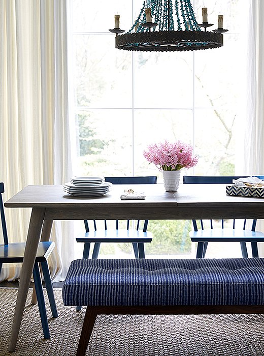
Cassie loves that nothing in the new breakfast-nook layout blocks the view out the window—and that “nothing feels stuffy.” She often cuts flowers from their yard—they grow six kinds of peonies, along with roses and hydrangeas—to put on the table.
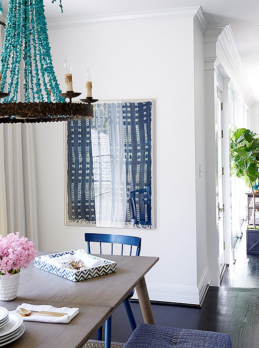
“The new chandelier gives the space new dimension,” Cassie says. “It’s the ‘wow’ piece, for sure.” If you have children, chandeliers are the perfect place to go all-out, since they’ll remain out of reach of little hands.
Opening (and Brightening) Up for Entertaining
When it comes to entertaining, Cassie says, “I have two speeds: either very casual or very fancy. We’re either sitting on the couch with a cocktail, or sitting down to a decked-out tablescape.” While Cassie and Charles do have a formal dining room, Cassie says, “If you have less than eight people in there, you feel like you’re missing half your party.” For smaller dinner parties, as well as cocktail parties and other gatherings, the crowd stays in this open living space.
The breakfast nook becomes the mainstay of these gatherings—in addition to serving as the family’s everyday spot for meals. The nook had formerly featured a dripping-crystal chandelier and chevron-patterned chairs, along with a “rickety table that I was excited to get rid of,” Cassie says.
Alex went about “taming the glitz a bit and bringing in a more current mood.” Specifically, that meant a healthy mixture of design eras. He brought in a midcentury-style dining table—one with two leaves, to accommodate a bigger crowd. For seating, they landed on four spindle chairs and an indigo batik-upholstered bench. The spindle chairs can be cleaned with a sponge, and the bench can be spot-cleaned (plus the indigo will hide dirt). The pièce de résistance is the chandelier, an elegant riot of turquoise beading hung in an industrial-style frame.

I have two entertaining speeds: either very casual or very fancy. We’re either sitting on the couch with a cocktail, or sitting down to a decked-out tablescape.
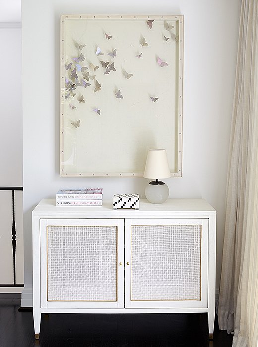
The butterfly artwork was a gift from Charles to Cassie. “My husband is such a good gift-giver,” she says, “and the art was one thing I absolutely wanted to stay in this space.”
Finding Sexy Solutions for Storage
Even without a growing family, Cassie and Charles were ready for more storage space. “Over the years, we’ve accumulated more china, more dinner napkins, more everything,” she says. “Tabletop decor sings to my heart.”
To stow the china, Alex brought in a console and placed it below an ivory-color butterfly artwork near the breakfast table. The console can also work as a serving station or a bar during parties. By day, the new setup, complete with a little midcentury-style lamp, makes a lovely vignette.
As for more-durable items that need to be stored—such as stuffed animals and toys—Alex looked to the living room, where they could add more double-duty pieces.
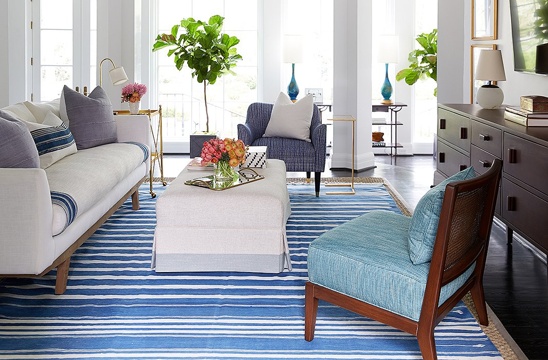
Of the new living space, Cassie says, “My husband had told me that he didn’t care about anything except a comfortable couch. We’re lounge-y couch people. Thankfully, this new one is so comfortable. And the whole space feels so much more open.”
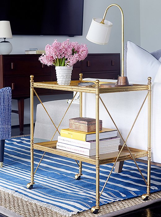
A gold bar cart adds traditional lines as well as surface area for a lamp and drinks.
Taking a Chic Approach to Lounging
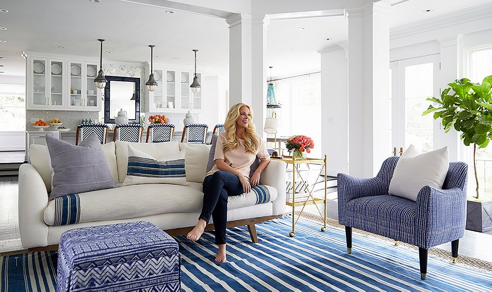
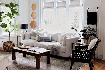
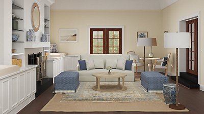
Previously Cassie and Charles had a sprawling beige sectional in the living space—it was beyond comfy and perfect for cozying up to a movie. But, Alex says, “this is the first area you see when you walk into this gorgeous home, and we wanted it to feel stylish and fun.” So the first thing to go was the sectional. “Sectionals are great for lounging but not for flow and a proper seating area,” Alex continues. “Plus it was oversize for the space. By scaling down the furniture, we were able to fit more pieces in and not lose any seating.”
For the main furnishings, he and Cassie landed on a flax-color ottoman and a white upholstered couch with beautiful lines—and a creative solution to childproofing. Alex ordered two of what he calls “essentially a big throw, custom-sized for the sofa.” The throws are flax—in the same tone as the ottoman—trimmed in an indigo stripe. When one gets a spill, it can be washed on a delicate cycle and air-dried while the second one goes onto the couch.
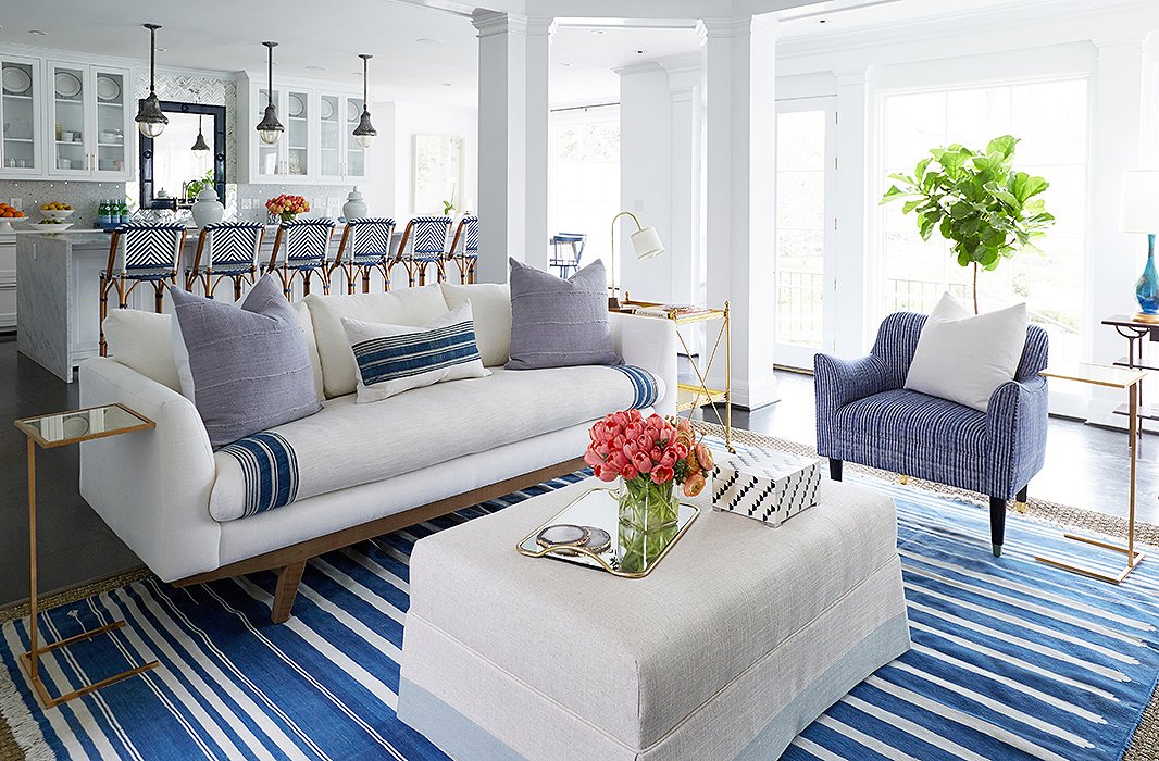
The custom-sized throw, wrapped around both sides of the seat cushion, protects the couch with a “washable barrier,” as Cassie puts it, for any spills. The cushions add more layers of washable fabric and ramp up the easy, colorful style.
To complete a cozy conversational seating area, Alex added more chairs, upholstering one in the same fabric as the breakfast-nook bench, along with little storage benches that can be brought in for extra seating. Alex laid down a sea-grass rug and topped it with an antique blue-and-white dhurrie. He filled out the main wall—blank except for the TV—with artwork and a console that adds a ton of storage. He brought in small low-wattage lamps, placing them on top of a new bar cart and the console, so that “when you entertain, the space feels really cozy—and you don’t need the overheads.”

My husband had told me that he didn’t care about anything except a comfortable couch. We’re lounge-y couch people.
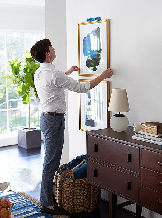
A pair of artworks balances out the visual weight of the TV.
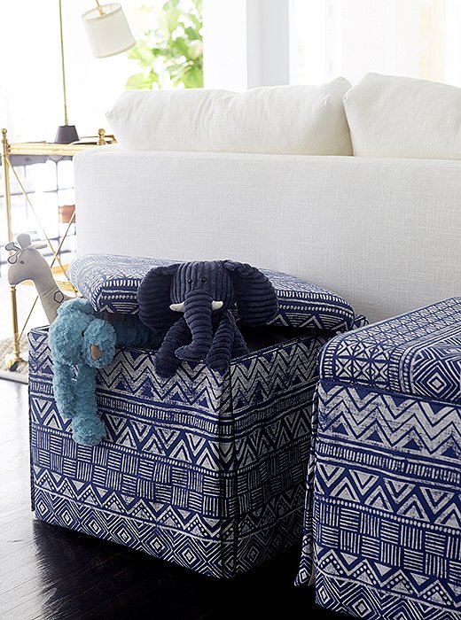
Of these storage benches, Alex says, “They are great for hiding toys, and they can be brought over and used as extra seating when you’re hosting your book club.”
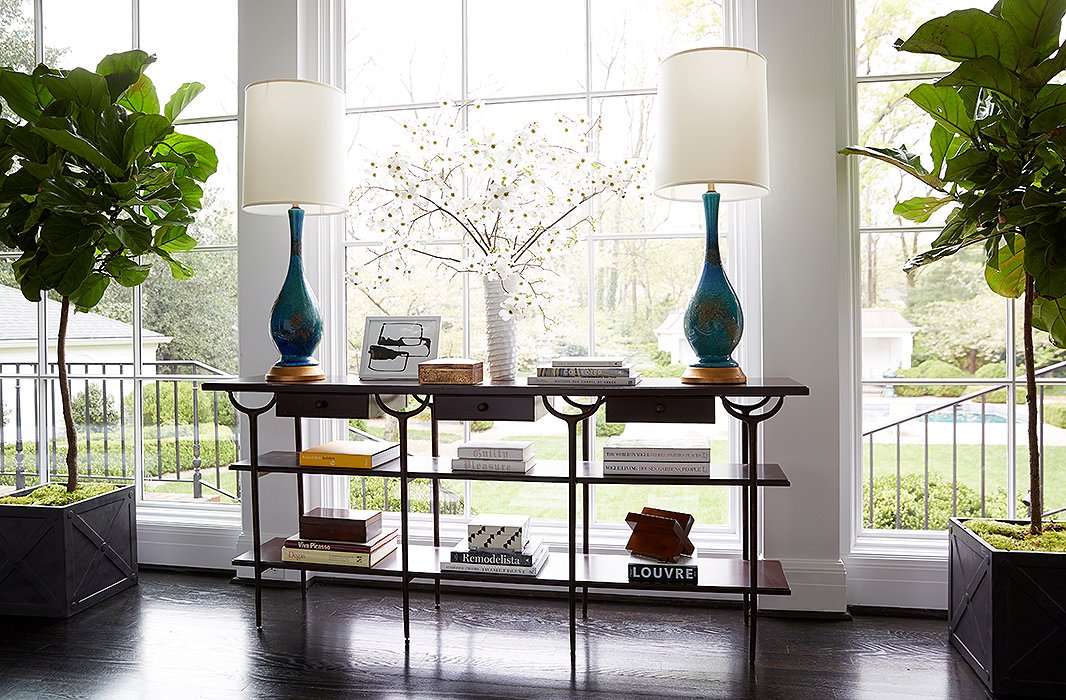
The open lines of this credenza allow plenty of natural light to flow in while giving space for coffee table books and favorite objets.
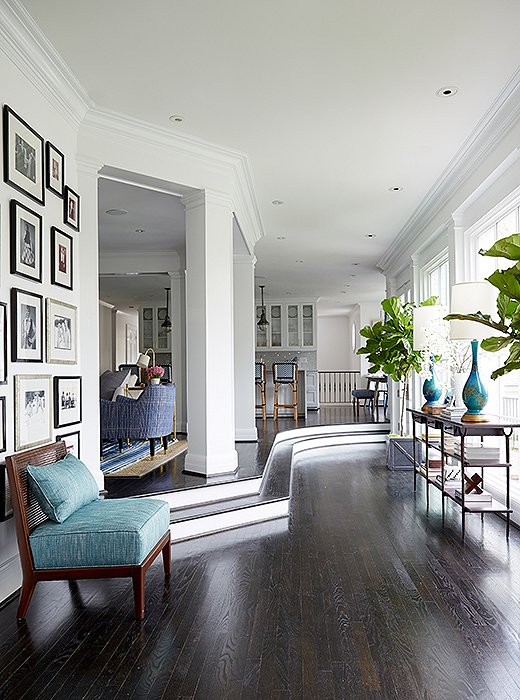
Before the makeover, the curving gallerylike space featured a wall of family photographs—and that’s it. Alex added “more life” along the wall of windows.
Framing the View
Back to that genteel loveliness outdoors: Beyond the kitchen/living zone is a gallery hall, with a wall of windows looking out onto the lawn. This space, which is set off from the rest of the room, becomes central when the couple entertains. Cassie often puts a bar here for larger cocktail parties. And when they have daytime parties in spring and summer, the French doors stay open so that everyone can be outside by the pool.
When he arrived, Alex was blown away by the architectural lines of this area, and he resolved to bring more life into it. Between the two French doors he added a midcentury-inspired credenza, topped with a pair of aqua-glazed gooseneck lamps. A pair of fig trees, picked up at a local nursery, reinforced the symmetry. “You don’t need to sit in this space, but now it’s set off with ambient lighting,” Alex says. “We gave it more of a purpose.”
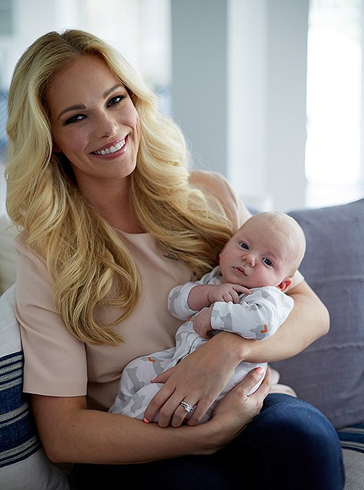
Cassie and Ward cuddle on the new couch—not a spill in sight.
Letting It Roll
When it comes to the design process, Cassie has mastered letting go—a skill that will serve her well as a working mother with an editorial team of 20 and a brand with rapid-fire growth. “What I’ve learned working with interior designers, you really just have to let them be creative and do what they do. When you try to micromanage a designer, neither one of you likes it as much. So you have to let them roll. And in my experience, you’ll be thrilled with what happens.”
Even though she’s only been home “for about a minute” since the redo, Carrie has eased right into the new look: “I love that we still have a lot of white going on, but now there’s more color and more fun. Alex mixed the beachy Cali-cool inspirational images I sent with a midcentury vibe, which makes it high design, chic, and really comfortable.” As for Charles, he was still on the road—but “he’s seen the pictures, and he’s so impressed. He loves all the new vibrancy.”
Cassie’s looking forward to their first dinner party in the new space, but first things first: “Right now, I’m just trying to get sleep. Once the baby is sleeping through the night, I envision us staying up past 9 p.m.!”

Nashville is the ‘it’ city right now—there are a lot of eyes on it from a creative standpoint. Yet everyone’s warm and friendly, and the high design is really married with that warmth and sense of fun.
Can you share the source for the custom throws used on the sofa?
Can’t find the bright blue accent chair, next to the sofa. Who made that please?
Can you share the source of the Butterfly artwork?