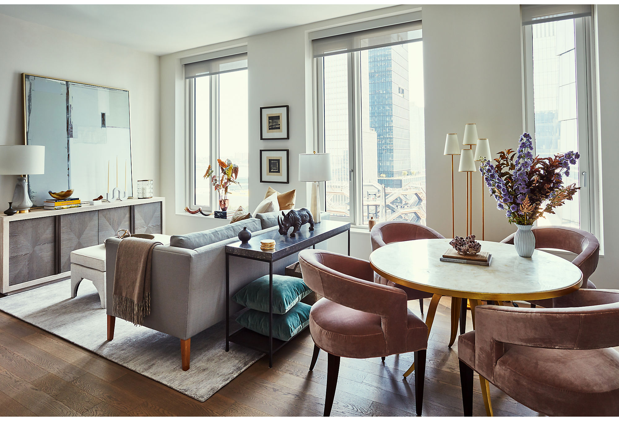
Located in a Manhattan high-rise, this pied-à-terre offers a respite from the hubbub below. Through the large living room windows you have unobstructed views of the city in all its glory out to the Hudson River, dotted with sailboats. Unlike most other Manhattan apartments, whose natural light is blocked by neighboring skyscrapers, this space is flooded with it.
The apartment’s owners wanted the interior of the home to complement the beautiful view. So they called on One Kings Lane Interior Design. “They moved in with just their suitcases and a set of flatware,” says Becca Roderick, director of interior design at One Kings Lane. “The benefit of working with us is that we’re able to provide everything from soup to nuts, from furniture to tabletop.” And from soup to nuts, the menu was created.
The plan was simple: Make a space that was zen but also sophisticated. That meant bringing in sumptuous velvets and crisp linens. “Nothing is more elegant than a beautiful set of textiles,” says Becca.
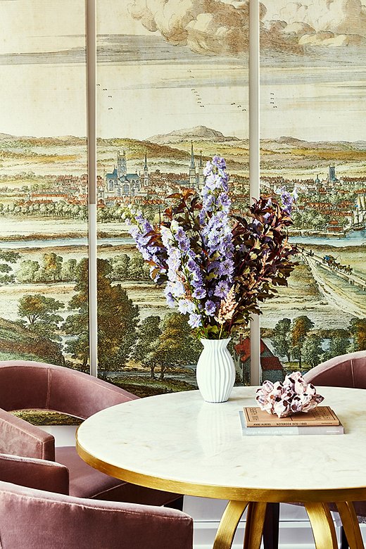
“In the living room, that quadriptych is really a nod to the history of the Manhattan landscape and helps to tell the story of the apartment’s location,” says Becca. “You can easily forget, where you’re walking the streets of the urban jungle that is New York, that this island was once rich farmland without a skyscraper in sight.”
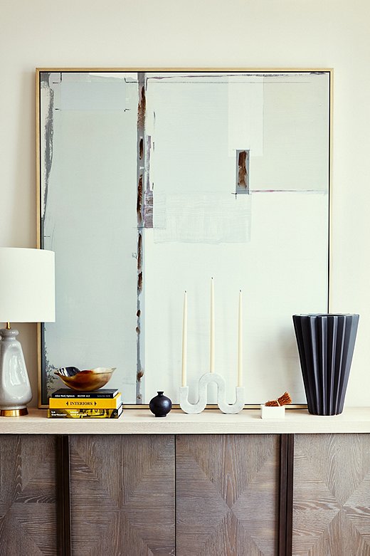
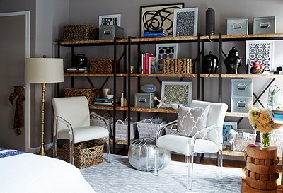
Layering without creating clutter, especially in small spaces, takes a keen eye. Becca opted for one unique candleholder rather than a grouping atop the sideboard. Adding in books, objets, and lamps of various heights is a smart way to entertain the eye. Find the table lamp here.
But the true magic is in the mix. “Nobody wants to live in a furniture catalog where everything is matched perfectly,” Becca says. So she and the One Kings Lane Interior Design team found modern art and pastoral murals, midcentury lines and classic silhouettes, to create an air of worldly elegance. “It feels sophisticated and cosmopolitan with lavish details,” Becca says. “The stone top on the sofa table, the inlay on the sideboard, the touches of brass, that all speaks to the quality of the pieces that were selected.”
The apartment is bathed in neutral tones and warm textures. “It is so important for your home to act as an oasis from the hustle and bustle of your life,” says Becca. “As our lives get busier, I see more and more clients asking for spaces that are serene and calming,” And as this home shows, even the most restful space can be filled with character and panache.
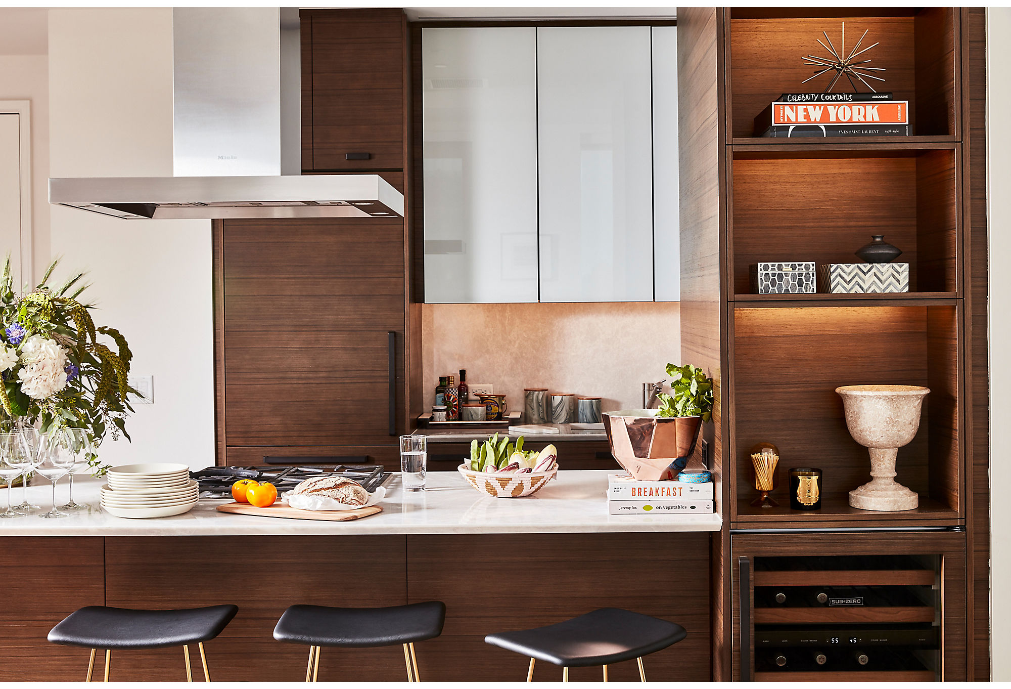
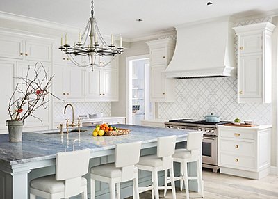
What do you do when a client wants to add seating in a compact space? Find unique stools that fit perfectly under the lip of a kitchen counter. “These long, narrow stools were a fantastic find,” says Becca.

I think it’s always important to blend different styles and time periods. Nobody wants to live in a furniture catalog where everything matches perfectly!
?wid=520&op_sharpen=1)
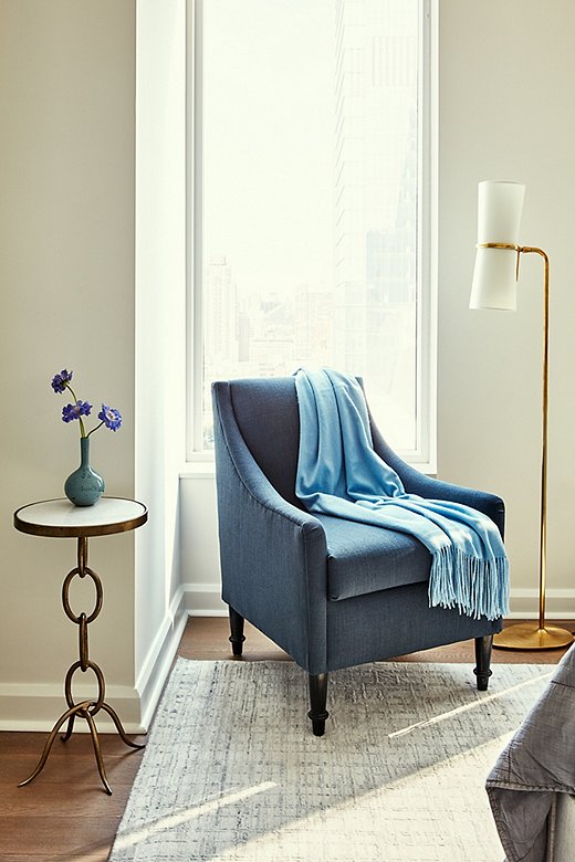
Never one to give up an opportunity to maximize seating options, Becca chose a chair with a small silhouette that fits just so in the corner of the master bedroom. She selected blue to keep the color palette cohesive throughout the room.
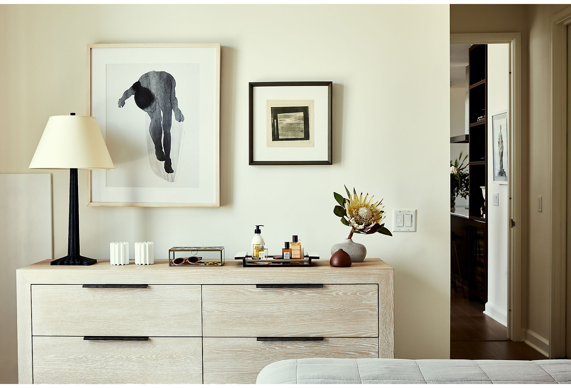
The dark hardware against the blonde wood of the dresser gives the piece a more sophisticated feel. “Adding black to the most neutral space can add a touch of elegance,” says Becca.
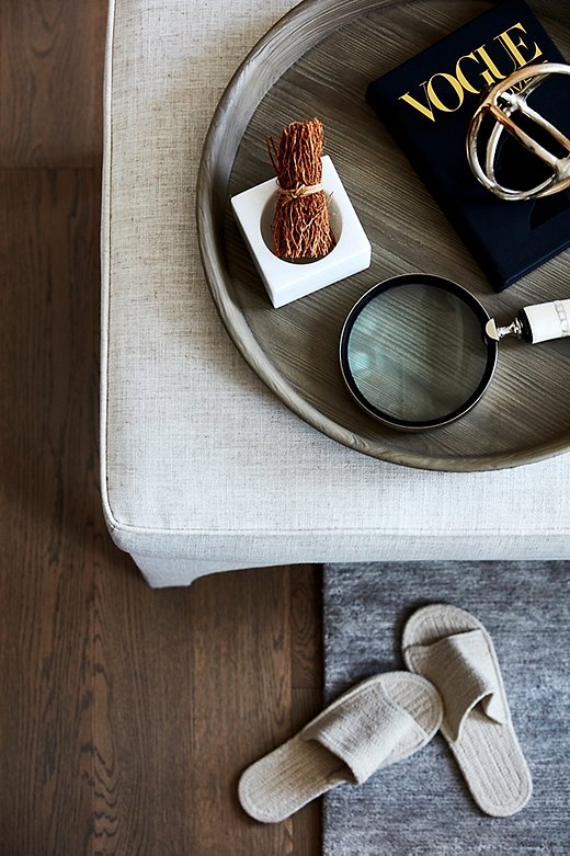
An upholstered ottoman serves as a table and a seat. “You can always perch on an ottoman and have a glass of wine. You just can’t do that on a coffee table,” Becca says.
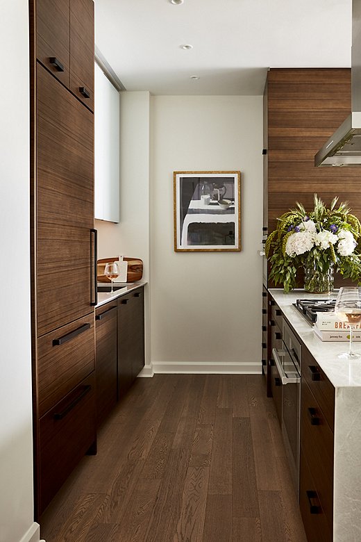
“Kitchens are filled with hard surfaces, so you’ll always benefit from adding things that are whimsical and soft,” says Becca. Cookbooks, art, and textiles are a quick way to soften a kitchen.
?$fullzoom$)
Subtle reds and greens in the bucolic quadriptych translate into teals and blush pinks in other areas of the room. “Aren’t those chairs just fabulous? Pink can be so challenging, and I think this shade gets it just right,” says Becca. Opting for large art like this enables you to add pattern and color to walls without wallpaper. You can find the stone-top dining table here.

It’s a nice juxtaposition to have the hard urban landscape just outside the window. The soft lines and comfortable pieces create this feeling of an urban getaway.
?$fullzoom$)
Join the Discussion