Architecture aficionados have one cardinal rule: Always look up. If you were to walk along the eastern edge of Central Park and look up, you’d see an assortment of buildings designed by Rosario Candela and James Carpenter. These two architects dictated the architectural style of the Upper East Side from the 1920s onward. Walk a little farther up Fifth Avenue and you might just stumble upon a jewel-box apartment designed by Cathy Kincaid. that appears in her first book, The Well Adorned Home.
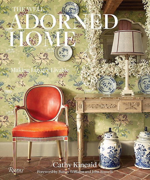
“Everyone kept asking me why I didn’t have a book,” Cathy says, “so I thought, Good idea!”
Over her storied career as an interior designer, Dallas-based Cathy has developed an iconic sense of style. She loves traditional design that looks fresh but comfortable. Striking that balance requires precise choices in each room she designs. As any lover of traditional design should, she considers the ever-popular blue and white color palette to be neutral. “It’s refreshing and simple yet elegant,” she says. Above all else, Cathy considers herself a colorist, a label she discusses in The Well Adorned Home.
“I have always enjoyed working with color in paint and fabric,” she says. “To me, it’s the most important ingredient in a successful space. If it is right, the room works. If not, it is a disaster.”
The book is filled with some of Cathy’s best tips and tricks. She discusses the art of collecting, the power of symmetry and pattern, the right and wrong ways to use color, and many other important design lessons. The tips are woven in among images of Cathy’s work.
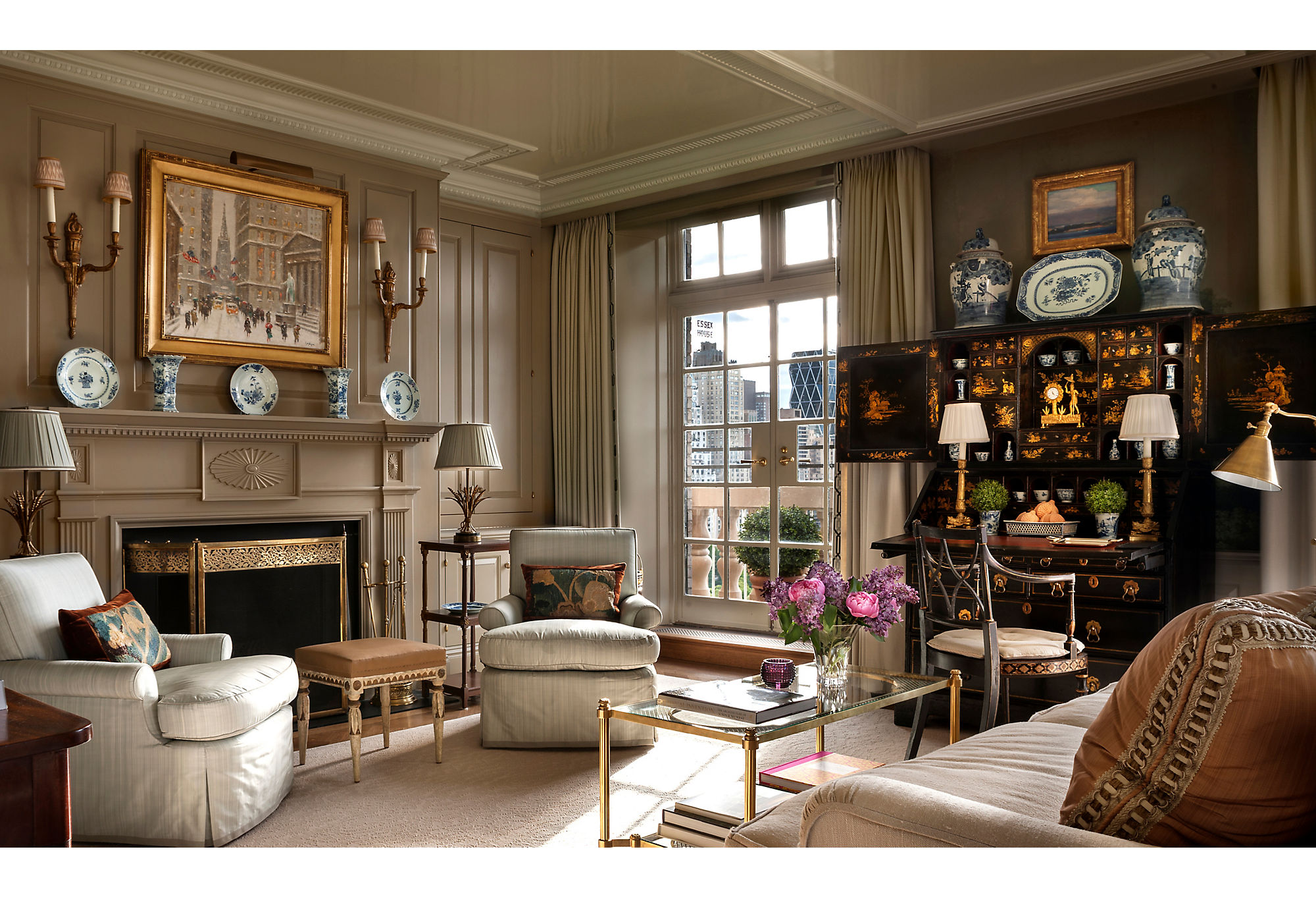
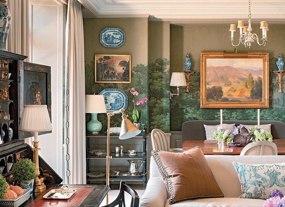
The 1,100-square-foot Fifth Avenue apartment (seen in the photos here) is the second home shown in the book. It’s also an amazing example of Cathy’s ability to update traditional design. Before anything else, the owners—longstanding clients of Cathy’s— tasked architect John B. Murray with making the apartment feel bigger. New molding was installed. Mirrored panels went up. Ceilings were lacquered pale blue to evoke a limitless sky.
“We did this throughout,” Cathy writes in The Well Adorned Home, “and then we did what we do best: We layered the decor without going overboard.”
After the renovations, which saved the large-scale murals from French heritage brand Zuber that came with the apartment, Cathy had to create a design that felt fresh while honoring the classic elements in the space. “We took the colors from the Zuber panels and used those colors for furnishings in the room,” she says. “Since they tend to make the room dark, we used a lot of lighter colors and white.”
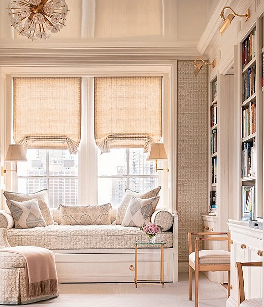
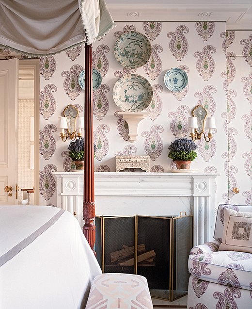
Designing in New York means designing in smaller proportions, even in a pied-à-terre overlooking Central Park. Cathy’s principle when it comes to designing well in compact quarters is comfort over everything. “Rooms must be comfortable or no one will use them,” she says.
Prioritizing comfort doesn’t mean shying away from pattern. The bedroom is positively swathed in it. The clients chose a paisley fabric packed with movement but muted in color. Covering the walls with it gives depth and perspective, amplifying the space rather than making it busy.
The pied-à-terre is just one of 11 projects in The Well Adorned Home. “I feel they represent my point of view but also reflected the clients’ personality,” Cathy says of the selected projects. Without a doubt, they all exemplify the best decorating advice she’s received: “Don’t try to match anything perfectly, whether it be colors or styles. The mix is what makes rooms interesting.”




Join the Discussion