Transforming this spacious Dallas house into the client’s forever home was “a dream, dream project,” says Martha Sweezey, one of the eponymous partners in design firm Collins & Sweezey. “The client was ready to get rid of everything. She trusted us, and we decided to go in a different direction.”
That direction, European graciousness with splashes of the unexpected, is something of a Collins & Sweezey specialty. Martha describes the aesthetic of this particular home as “Louis XVI with transitional pieces and contemporary, so it has a really good balance. It’s a very Southern home—columns, red brick—but when you walk inside it’s got a twist.”
Twists, of course, can be risky. But here the risks paid off. “I think the house flows so beautifully,” says Martha’s business partner, Katie Collins. “When you walk in the front door and travel from room to room, there’s so much light. It feels lighthearted and comfortable.”
The client agrees. She stayed in another home during the two-and-a-half-month revamp, but “as soon as she walked in she said, ‘I love this house,’” Katie says.
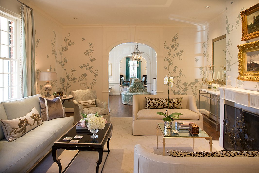
The Living Room
In both this room and the dining room, bookcases that were decreed aesthetically unpleasing were removed. The walls were clad in a chinoiserie paper to detract from the asymmetry of the windows. The animal-print pillows are a fun flourish.
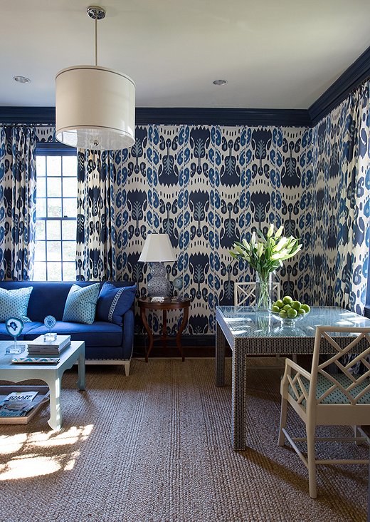
The Lounge
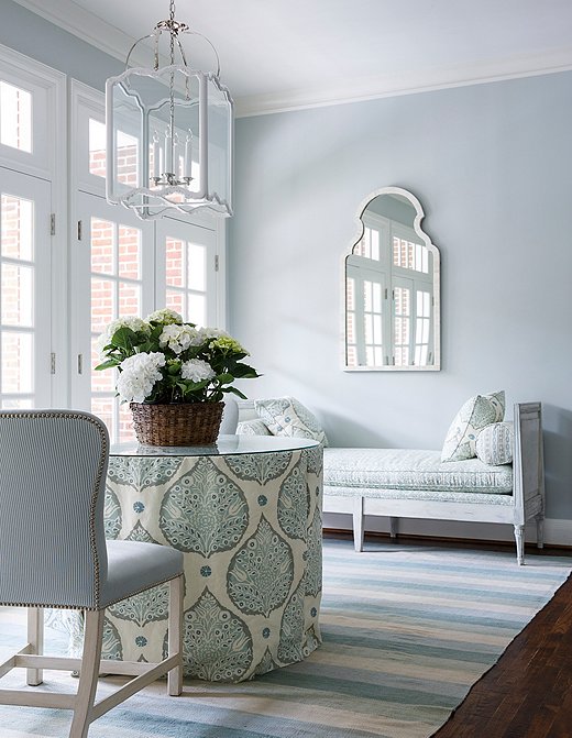
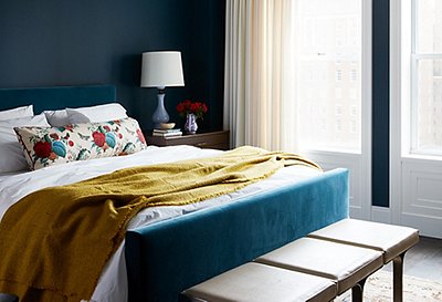
“What could be more cozy than enveloping a room in that ikat?” Martha asks. A spectrum of blues dominates this room, but the color is apparent throughout other spaces in the home as well, reflecting the client’s love of the seaside. The Parsons table was covered in fabric and trimmed with nail heads; glass protects the tabletop.
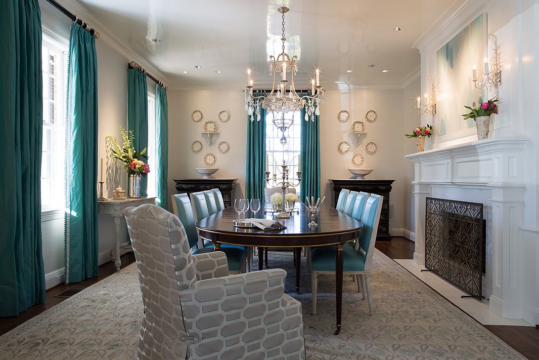
The Dining Room
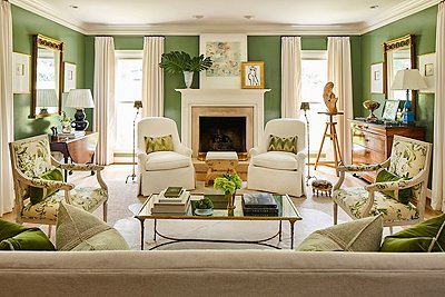
The dining room’s ceiling was lacquered for “extra sparkle,” Martha says. The roomy armchairs with their contemporary Cowtan & Tout upholstery and the abstract artwork over the fireplace ensure that the room doesn’t come across as a period piece.

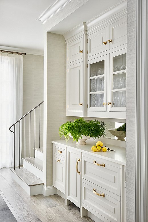
The Kitchen
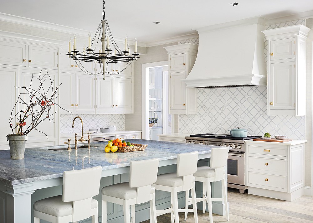
It’s tough to believe that the kitchen had once been dark and cavernous. To brighten it up, the designers finally persuaded the client to replace tiny windows and a banquette with a large picture window overlooking the verdant grounds. “It makes it seem like a vacation when you look out,” Martha says. Pale engineered-wood flooring replaced dark wood; the island’s blue quartzite countertop is an unexpected splash of the client’s favorite color. “And who can wrong with fantastic Christopher Peacock cabinetry?” Martha adds.
The wet bar at left came about because “the client wanted a separate space for kids and guests away from the cooking area,” Christopher explains. “The glass cabinetry was chosen to show off the client’s glassware collection. We also added a fridge and ice maker below for ease of space.”
The Second-Floor Landing
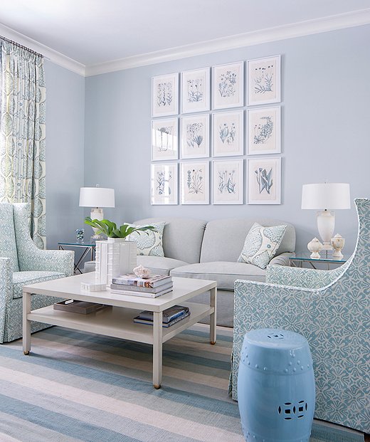
The sitting area at the top of the staircase is the ultimate in New Traditionalist serenity. A tight palette keeps the bevy of patterns—stripes, paisley, florals—from appearing cacophonous. Hand-colored lithographs make up the gallery wall.
The Master Suite
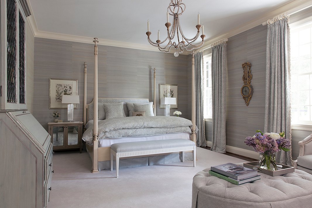
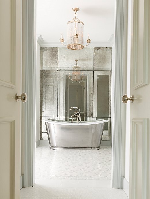
Katie and Martha agree that this space provided the greatest challenge and required the most construction to convert it into the haven it is today. Among other changes, the designers had an asymmetrical fireplace and the soffit removed. “It was a structural nightmare,” Martha admits, “but the changes made the room feel so much better and the ceiling higher.” As for that showstopping bathroom, Katie and Martha fought with the architect to have the tub centered in the doorway view.
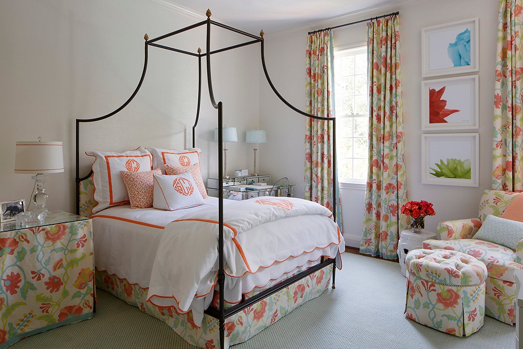
The Daughters’ Bedrooms
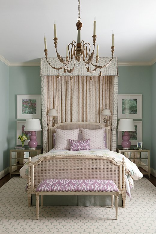
Neutral walls prevent the vibrant floral pattern that appears throughout the younger daughter’s bedroom from being overwhelming—this is a space made for sleeping, studying, and relaxing, after all. The bespoke floral art? The designers took a smaller print, isolated parts of individual flowers, and enlarged them before matting and framing them. In the elder daughter’s room, “the touches of lavender were unexpected and a bit kicky,” Martha says.
Join the Discussion