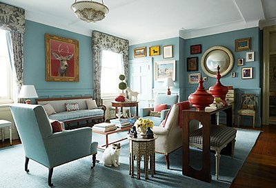
This spring we’re all about revamping our home and using color in exciting new ways. Our trend forecast for spring paint includes a lot of pastels, and it can be challenging to make these colors feel sophisticated rather than childish. Fear not: With the tips below, you’ll be more than up for challenge!
Design by Suzanne Kasler. Photo by Erica George-Dinas.
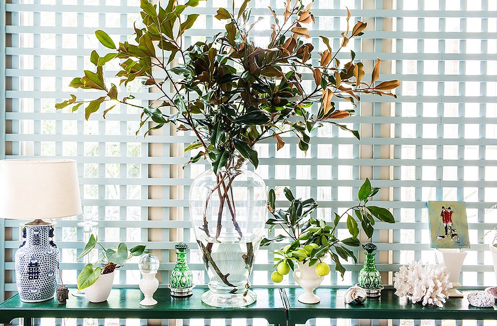
Small Introductions
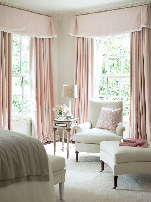
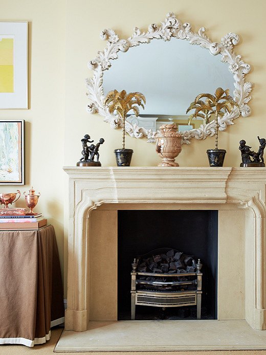
If you aren’t ready for a full-on pastel moment, start introducing it through small moments in drapery or pillows. Subtle touches like these especially enliven monochromatic rooms.
Layer It On
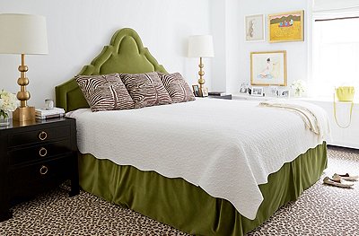
Of course, the opposite of subtlety is going over-the-top. This master suite is decked in layers of pastel. The soft creamy undertones of the pinks and mints unify the hues. The result is a colorful room that still feels grown-up.
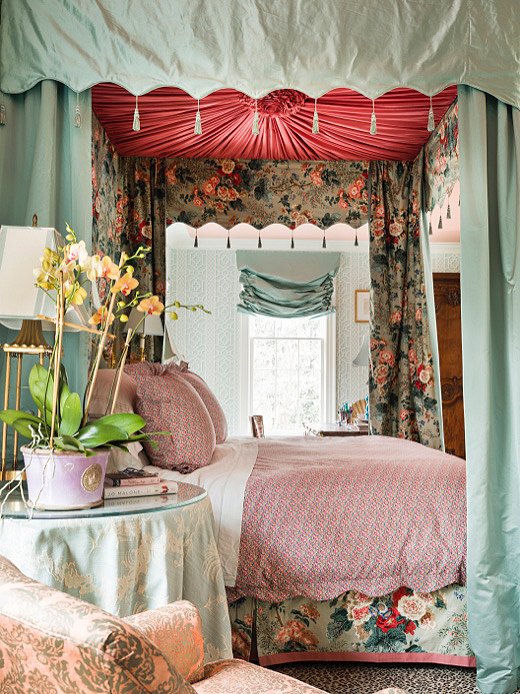
Design by Danielle Rollins. Photo by Lesley Unruh.
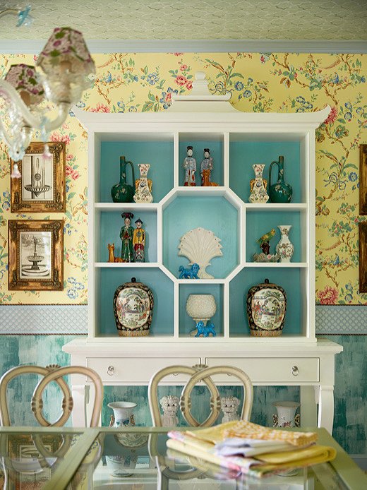
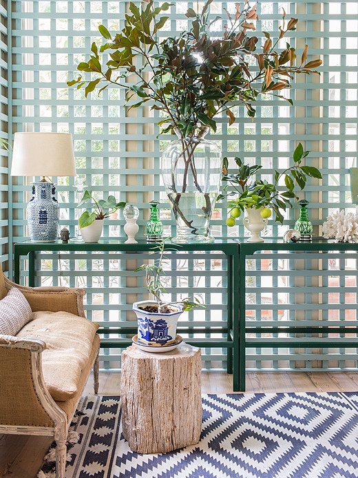
Design by Madcap Cottage. Photo by Tony Vu
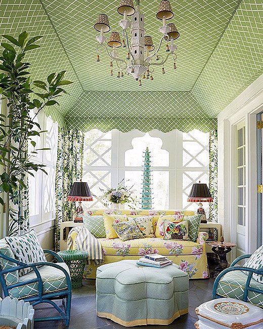
Hide Among Patterns
You can easily incorporate pastel colors when they’re within pastoral scenes, floral prints, or other interesting motifs. Use complementary colors within the pattern as a palette cheat sheet and pull them into other parts of the room to create cohesion.
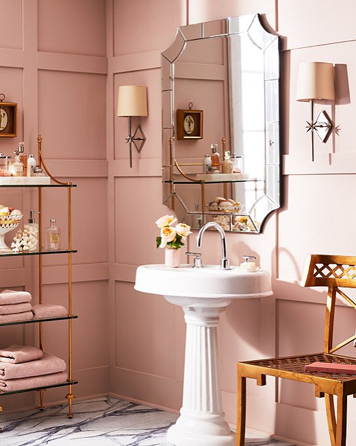
This all-pink bathroom makes a fun and pretty statement. Opting for a single color makes for a more manageable moment of color.
It’s important that the colors in a room of pastels speak to each other easily. For maximum effectiveness, stick to similar color families or start from a pattern that combines all of them. Design by Madcap Cottage. Photo by Tony Vu
Lean Warm
One way to make sure your pastels look sophisticated rather than childish is to make sure they’re warm in tone. Baby pink is still gorgeous when it leans toward a flesh tone than ballet-slipper pink. A cloudy blue can feel more grown-up than baby blue and is just as—if not more—impactful.
Design by Amanda Nisbet. Photo by Tony Vu
Design by Heather Clawson. Photo by Manuel Rodriguez
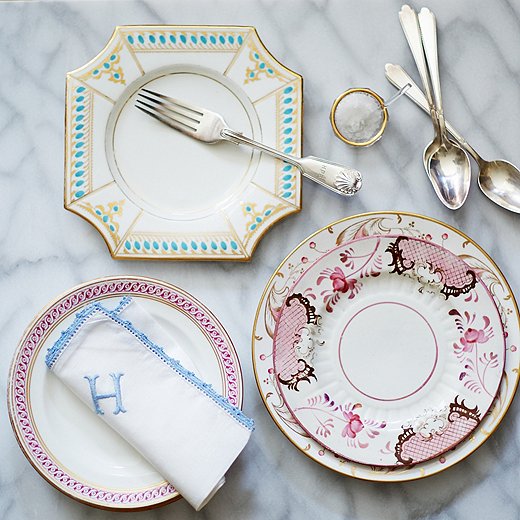
Accessorize Accordingly
Accessories and tableware are great places to add pastels. On a table, you can introduce them through glassware or linens—white cloth napkins embroidered in spring-fresh colors are especially elegant. These moments bring a touch of levity to the table while still keeping things classic.
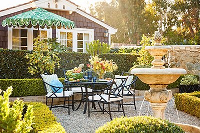
Take It Outside
Take inspiration from the natural world and use soft greens and blues in your outdoor spaces. Layering them on top of one other creates wonderful tonal moments. If your outdoor space is small or surrounded by other buildings, using these colors creates another level of escape by figuratively transporting you to greener pastures.
Design by Sara Ruffin Costello. Photo by Nicole LaMotte
Join the Discussion