“We began by thinking, ‘What’s durable? What’s indestructible?’ And then we tried to make everything as beautiful as we possibly could,” says interior designer Lilly Bunn. She’s speaking specifically about the New York apartment she designed for a family of five, but her approach pretty much sums up an ideal decorating strategy for those early childhood years. When Lilly’s client, Amory McAndrew, and her husband found their prewar apartment on a tree-lined street in downtown Manhattan, they already had a growing family. Lilly stepped in to design interiors that would satisfy Amory’s taste for glamour and airy elegance but withstand the unavoidable wear and tear of energetic little ones. Already devoted fans of Lilly’s own apartment—where she lives with her husband and two girls—we were thrilled to see her gorgeous aesthetic at play in yet another family-friendly home.
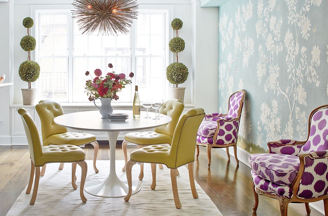
One of the children drew another flower onto the Gracie wallpaper, but otherwise everything—the Tulip table, the chairs, the rug—can be easily wiped down or washed.
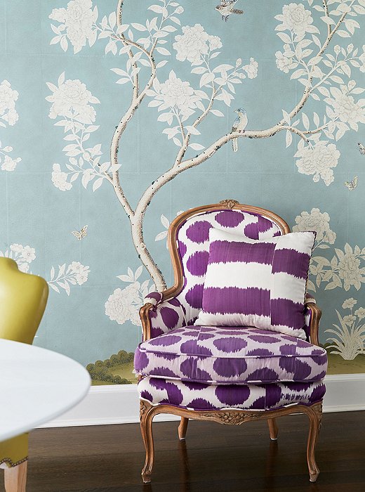
The purple Madeline Weinrib fabric on a pair of bergères balances the dominant palette of blues and greens.
The Daytime Shift
Amory describes the dining area as “much more of an arts and crafts area—coloring, fake tattoos, you name it—and a breakfast room more than anything formal.” On typical mornings, she says, “one of the kids is running between rooms, another is having a few bites of breakfast then starting a coloring project, and so on,” until they’re out the door to school and playdates. She embraces the chaos and, rather than dinner parties, prefers to entertain during the day. She and her husband invite friends and their kids over for parties like a summertime “Beat the Heat” fete and just push the furniture against the walls.
Yet once the coloring books are put away and the playdates are over, the dining space takes on a more composed beauty. “Amory adored this beautiful, formal Gracie wallpaper,” Lilly says. “Since there wasn’t a formal dining room, we put it on an accent wall. The wallpaper helps it feel like a grown-up space once the kids are asleep—it’s important not to feel 100% mom all the time.”

The wallpaper helps it feel like a grown-up space once the kids are asleep—it’s important not to feel 100% mom all the time.
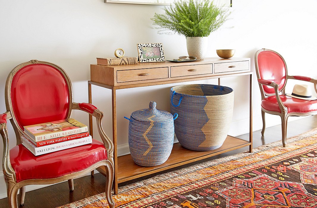
“Normally the entrance hall is all stroller parking,” Amory says. The lidded baskets keep a rein on clutter.
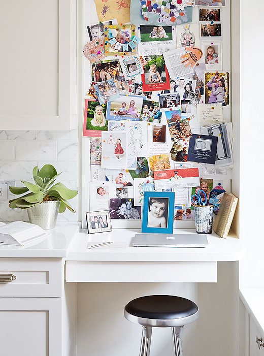
A lawyer by training, Amory decided to focus full-time on her family during these early years. She uses downtime to organize everyone’s schedules and schools.
Embracing the Mess
As a mother of two children slightly older than Amory’s, Lilly had much to share in the way of practical advice, like understanding and planning for the amount of space that toys will take up. Sure enough, now that her children are ages two, four, and seven, Amory says the floor and other surfaces are full of toys and activities. “We constantly have Transformers and art supplies and baby toys everywhere. But I know there will be a time when I miss having all of those things around, so I’m trying to just embrace the mess!” One of her sanity-saving rules is that she doesn’t straighten up constantly. “I’d be spending all of my time cleaning and miss everything else they’re doing. And they’d just pull things out again! At the end of the day, I put it all away, and that establishes that now is adult time.”
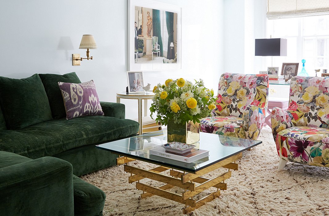
Lilly upholstered a pair of Vladimir Kagan chairs in a print she calls “a kind of contemporary chintz.” The Roman shades were created using a Fortuny print, which stays safely out of reach of little hands.
Shop the Look
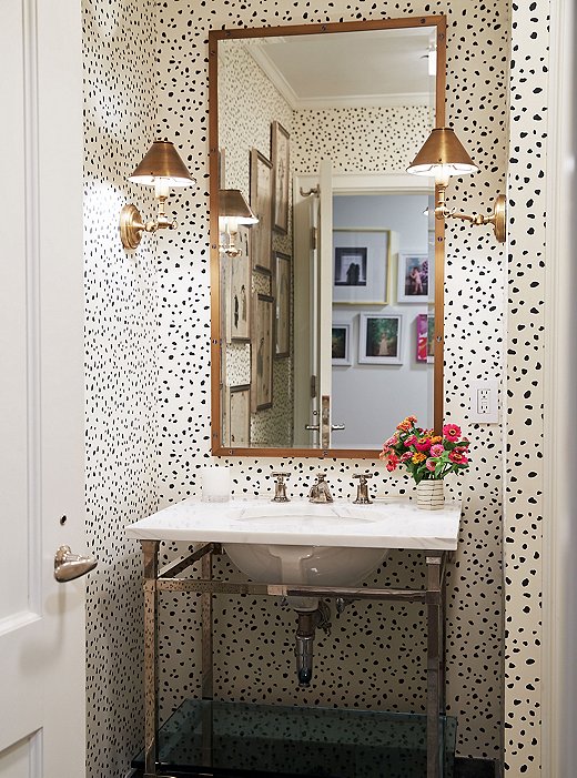
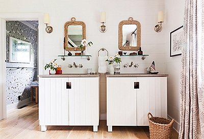
Lilly keeps major walls white but sees no need for restraint in a powder room: “You have less space and less clutter, so you can go for it,” she says.
Fashioning the Spaces
Amory and her husband’s first apartment, which Lilly also designed, had a jewel-box feel with separate rooms each boasting their own unique look. In this apartment, the open layout meant the spaces had to relate to one another—the entrance hall leads to the kitchen and dining space on one side and the living room on the other. “We’re much more in motion here,” Amory says, “running around and not sitting quietly and working like we were in our old apartment.” For the major open spaces, such as the living and dining rooms, Lilly kept the foundation light. “I almost never suggest a room that you’re spending a lot of time in should be dark. Blues and greens tend to work well in a space that’s that open.”
Beyond that, she took her cues from what was in Amory’s closet—Lilly often uses someone’s taste in clothes as a key to what they’ll love seeing in their interiors. That said, “you don’t want your interior look to be like a hot outfit you wear once! You want the type of pieces you’ll want to wear for at least five years. Amory is into high fashion and loves very feminine pieces—nothing dark or austere. I’d say that directly correlates to this design.”

You don’t want your interiors to be like a hot outfit you wear once!
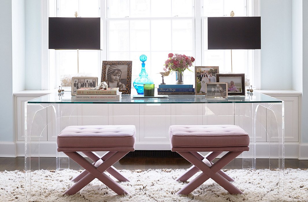
The living room has a single sitting area to make it feel cozy and modern, while a Lucite desk and upholstered X-benches give the space a striking, glamorous note.
Shop the Look
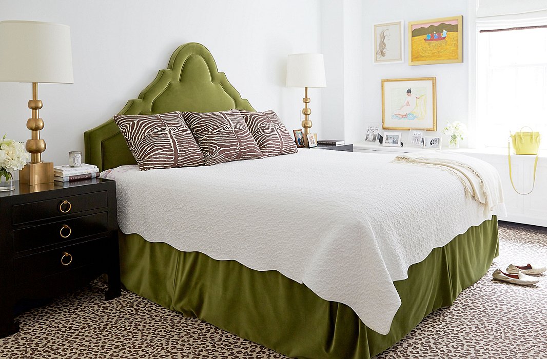
Three artworks are the master bedroom’s only wall decor, which allows the headboard to take center stage. The trio consist of a work by American artist Milton Avery (bottom), a three-quarter profile sketch of Amory, and a painting by Milton Avery’s wife, Sally Avery.
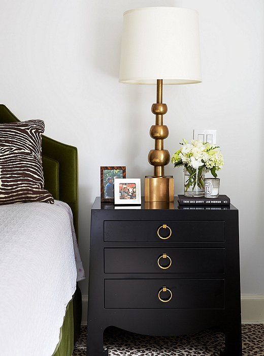
Lilly calls the combination of greens, blues, and brass—which she used in the living room and, to an extent, in the bedroom—a “fairly formal palette.”
Keeping Calm
A stunning green headboard anchors the master bedroom. In keeping with her aversion to too much pattern in a large space— “a lot of us who grew up in the ’80s got overdosed on Laura Ashley!”—Lilly kept the walls spare. The floor, however, is covered in wall-to-wall leopard carpeting. It gives a perfect hit of fun glamour, but most important, it is durable and doesn’t show dirt.
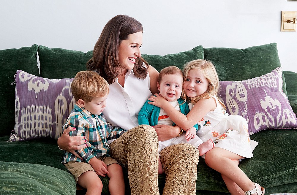
Like all other mothers, Amory finds quiet moments hard to come by—she mentions a recent time when she thought she was all alone in her bedroom and then discovered her two-year-old son giggling from inside her closet. But as her children are playing together more easily, she steals her moments—”The two older kids were happily playing for a full 25 minutes recently, and I got to actually page through Vogue and just listen to them from another room to make sure all was well. It’s tiny, but it felt like a breakthrough!”
Shop the Look
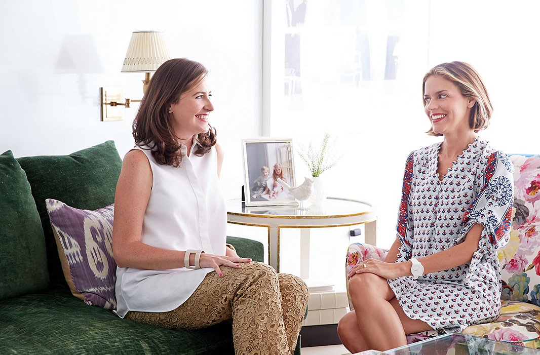
Amory and Lilly, pictured here together, have an amazing designer/client relationship. In hindsight, Amory says, “any moment that I questioned or tried to muddle in the design process, I later realized I should have left it alone!”
A Traditionalist at Heart
Lilly doesn’t see much fun in creating a space that will stay perfectly frozen as is. “I don’t want to decorate every inch of a home in a month. I really try to help it become a living, breathing space, so you can easily add pieces you pick up traveling, or a new piece you fall in love with, or just change up the flowers and coffee table books!”
That said, she’s a traditionalist at heart—perfectly suited to Amory’s aesthetic—and also a practical busy mother. Lilly loved “taking a contemporary space and giving it a traditional family feel. For me, there’s nothing better.”

I don’t want to decorate every inch of a home in a month. I really try to help it become a living, breathing space.
Being a mother of 3 myself, I immediately fell in love with this. A specific question, my favorite room is the dining room – the yellow chairs are beautiful and practical. Where on earth can I find something similar… and yellow!