In need of some living room inspiration? We’re breaking down the fundamentals of this classic space, from the overall layout to the key furniture pieces: Read on and get ideas you can translate to your own home.
A Sense of Symmetry
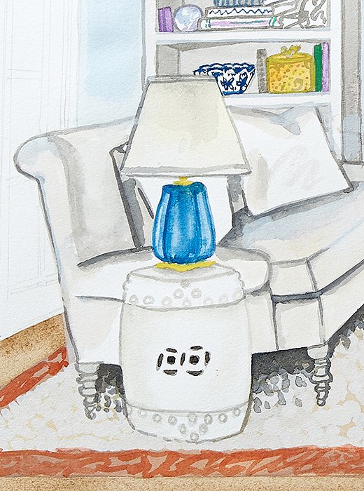
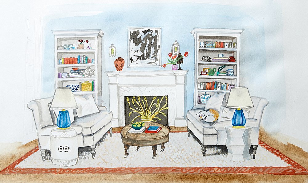
A little symmetry goes a long way toward making a room feel cohesive. From the bookcases to the sofas to the table lamps, symmetrical elements provide the framework for this space, creating a look that’s balanced, cohesive, and visually pleasing.
That said, don’t feel hemmed in by a need for symmetry; often, incorporating an element that’s slightly “off” makes for a more interesting space. Try a set of mismatched pairs, such as the garden stools above, which feel purposeful but not overly precise. (Seen at left: Kelly Garden Stool in white.)
Versatile Foundation Pieces
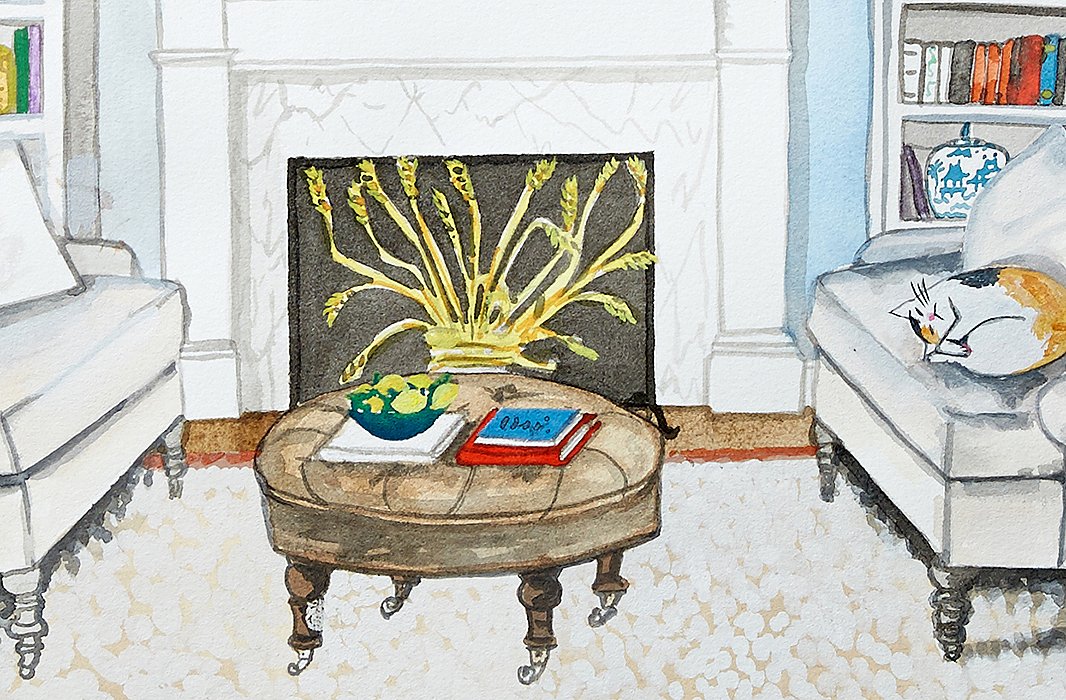
The upholstered ottoman is a living room workhorse: It offers a comfy spot for guests to prop up their feet; it serves as a stylish coffee table when topped with a tray; and it can fill in as extra seating. In a neutral hue, it also makes a versatile foundation for the rest of a room’s decor.
Likewise, a classic sofa is a true decor chameleon. With their neutral color and simple shape, the roll-arm styles here can be easily updated with the seasons (or your mood!) with the simple addition of a colorful throw or a pile of patterned pillows.
A Strong Focal Point
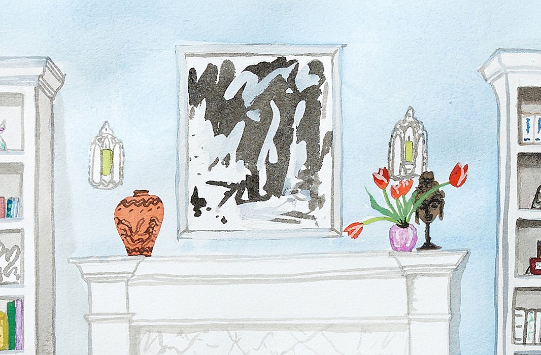
Every space needs somewhere for the eye to rest. A fireplace makes a natural focal point, but you can achieve the same grounding effect with a console or a media cabinet. Here, we accessorized the mantel with an oversize painting, which helps to draw the eye up, and a collection of sculptural objets. A pair of sconces lends extra emphasis to the area and builds on the symmetry of the overall space.
Accents with Personality
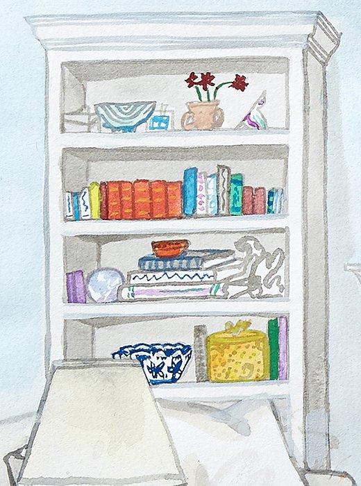
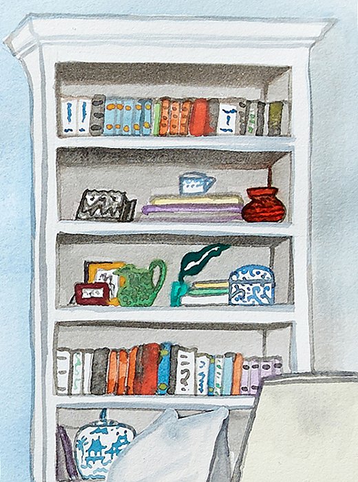
The little things sometimes have the biggest impact on a room. Treasured books, vessels brimming with flowers, one-of-a-kind objects picked up on your travels: Displaying a collection of your favorite pieces is a foolproof way to make a space feel lived-in and loved.
Here, we filled out tall shelves with a mix of books and eye-catching objects, varying the arrangement—books standing upright and stacked on their sides, frames and objects layered and overlapping—for an approachable yet polished look.

Join the Discussion