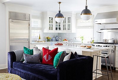
Decorating a space is typically the last step in a design project because there are so many other structural things to consider, like renovation and electrical work. But sometimes clients have other priorities. Designer Lynn Kloythanomsup’s clients wanted to get straight to decorating. They’re Taiwanese Americans and, before coronavirus, hosted lots of family from Asia. “They were really concerned about their common areas being able to receive their guests,” Lynn explains. Before she was able to design any other space in the house, she had to ready the living and dining areas for family.
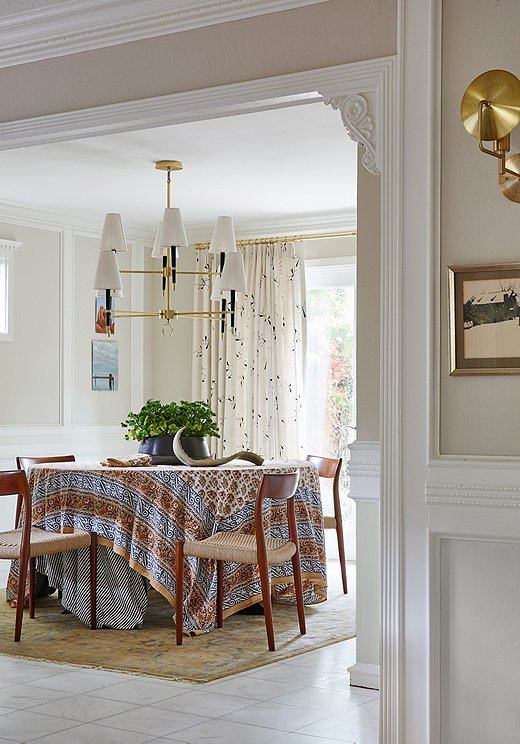
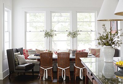
Lynn went neutral with the dining area. A block-printed tablecloth added a pop of pattern to the space. A gold chandelier with linen shades makes a statement over the table.
Lynn was tasked with creating a harmonious space that could work for more formal entertaining and the daily needs of the young family of four. The home is Tudor Revival and came with loads of architectural elements, but not all were authentic to the style. With old and new elements in play, Lynn needed to blend them.
“We used some tricks to hide some of the architecture that didn’t feel authentic or could disappear into the background, but really the furnishings are directed by how the clients wanted to live,” says Lynn. “They’re young and Californian. They don’t need it to be crazy formal. It needs to be livable.” Lynn relied on Sunbrella fabrics for livability and added in cottons and linens for natural texture. The whole space is a balancing act: formality and distinction on one hand and California ease on the other.
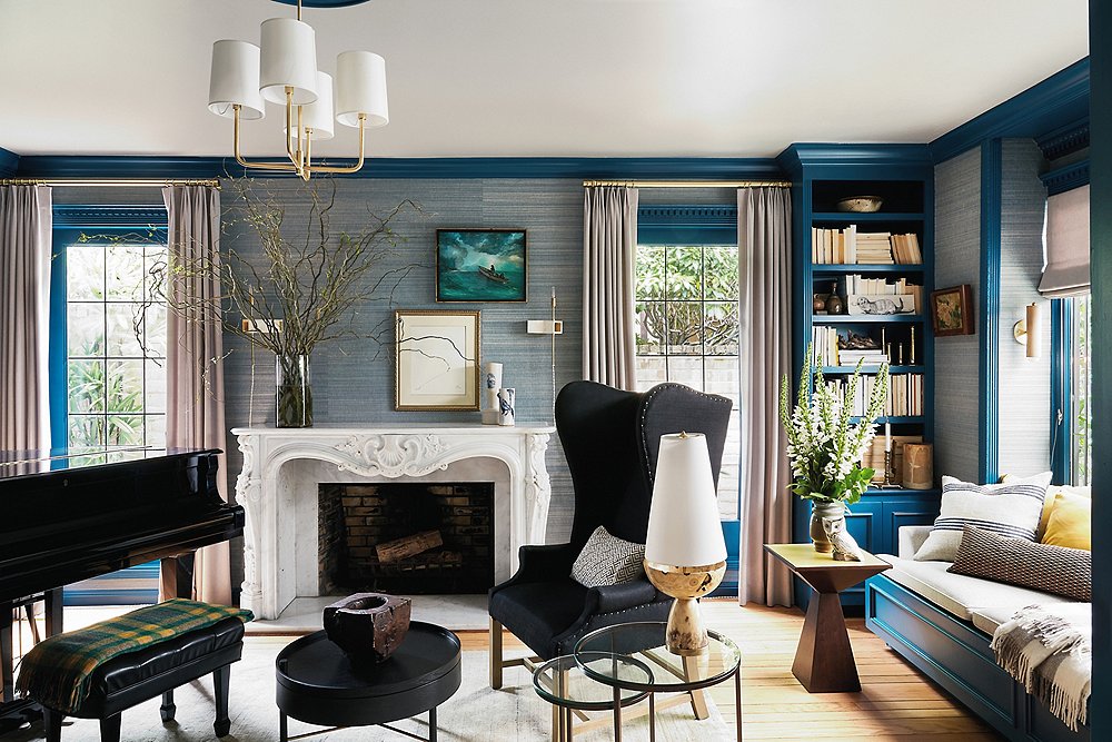
“Most of my clients are adventurous,” says Lynn, and these homeowners were no exception. For the formal living room, they came to her with the idea of a bright color scheme with the molding and cabinetry work as the centerpiece. Benjamin Moore’s Slate Teal set the mood in a striking blue. Lynn chose a grass-cloth wallpaper in a complementary navy color to help neutralize the more formal elements of the space. “There are inconsistencies in it, and there is texture, so it adds a bit of room for mistakes,” she says. The grand piano, the black wingback chairs, and a Visual Comfort chandelier bring back some of that formality.
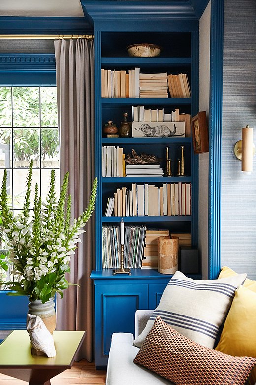
A mix of pattern in subdued colors keeps the family room grounded and visually interesting. A wooden vase and other natural elements bring in some welcome warmth.
Lynn let the blue color palette do the work in the formal living room. She turned books around to let the worn color of the pages work symbiotically with other natural elements. She relied on the pillows to bring out the room’s complementary colors.
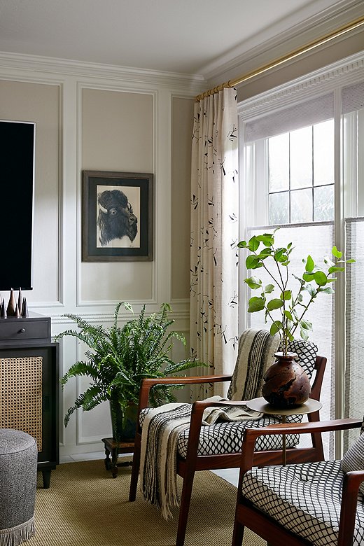
The less formal family and dining areas take a laid-back approach. “We didn’t need an explosion in every room,” says Lynn, who relied on her love of English classicism and her California roots to create livable areas for this modern family. Natural materials ground the space. A mix of easily digestible patterns adds just enough visual interest to keep things fresh. Ochers, navy blues, grays, and browns were brought into both spaces to continue the narrative of color throughout the common areas.
Lynn’s first order of business on this multistep project was to create a place where the clients’ families could feel welcome after their long travels, and she delivered. While entertaining might be on hold at the moment, the young family can rest easy knowing that once they’re able to welcome guests, they have a beautiful place to do so.
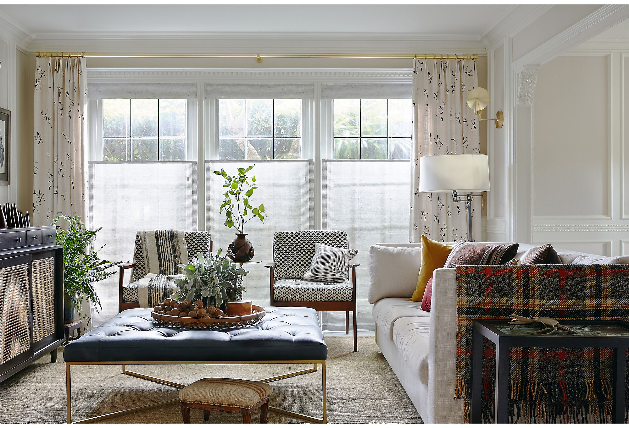
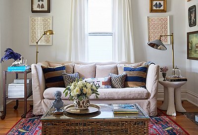
The family room went neutral in color but poppy in pattern. Lynn kept things low-key by choosing creams and whites but complemented the color with inviting patterns on the drapes and accent chairs. Find a similar sofa here.
Design School
We asked Lynn, a House Beautiful Next Wave designer, to share some of the design lessons you can see in this house. Check out her tips and tricks below.
- Trust the classics. “If you’re unsure about where to start with pattern, rely on classic patterns. Our clients were new to living with pattern, so here we brought in traditional plaid and geometric patterns.”
- Lean into casual elegance. “To make your space feel casual, opt for natural materials like cotton, linen, and wool. In this project, we chose grass-cloth wall coverings, linen upholstery, a credenza and dining chairs with woven cane and rattan, and natural-fiber rugs mixed with wool rugs.”
- Focus on finishes. “Not everything has to be glossy. We made minimal selections when it comes to high shine. Here, the lacquered grand piano gets all the attention, while the rest of the finishes are less reflective.”
- Add a touch of nature. “Greenery brings a room to life. We like to finish a space by peppering in some house plants or simple foliage.”
- Aim for balance, not perfection. “Balance tailored with handmade, artisan pieces. A little imperfection lends itself to a custom, one-of-a-kind look.”
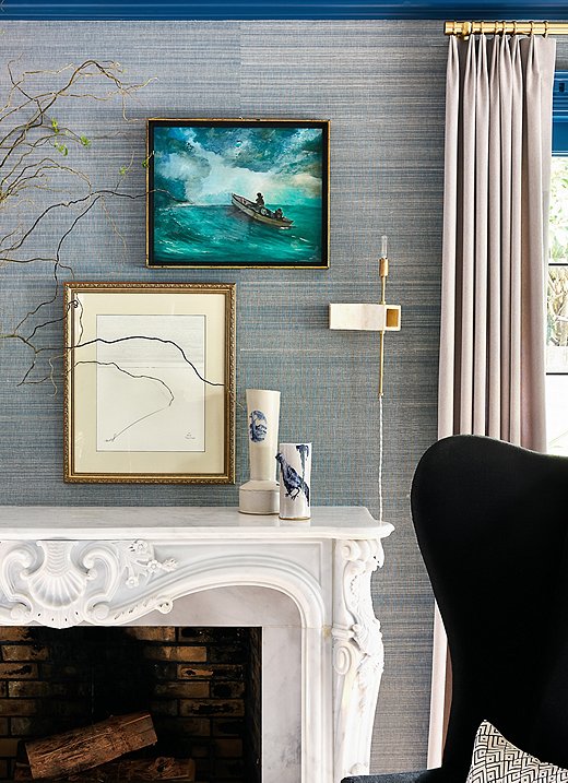
Lynn took a curatorial approach when styling the mantel. The abstract art mixes beautifully with the more traditional seascape. The ceramic vases also play nicely off the handcrafted sconces by ceramicist John Sheppard. Moments like these really bring the design to life.
Join the Discussion