In the heart of Atlanta, designer Lauren Lowe of Lauren Elaine Interiors was faced with an interesting design challenge: a cow. No, not a living, breathing cow, but a large, colorful painting. Her client wanted it to be the center of their dining room but had one question. “She asked, ‘Is that crazy?’” Lauren recalls with a laugh. It wasn’t, and it led to a charming bungalow filled with hints of color and traditional ease.
Like any good design-lovers, Lauren’s clients appreciate vintage. “She’s all about the hunt and finding a deal,” says Lauren. The one downside to too much vintage (if there is such a thing) is that sometimes things can feel disjointed. The homeowners needed Lauren’s expert eye to curate a cohesive visual narrative for their small two-bedroom bungalow. “The main plan was clean up and edit,” she says.
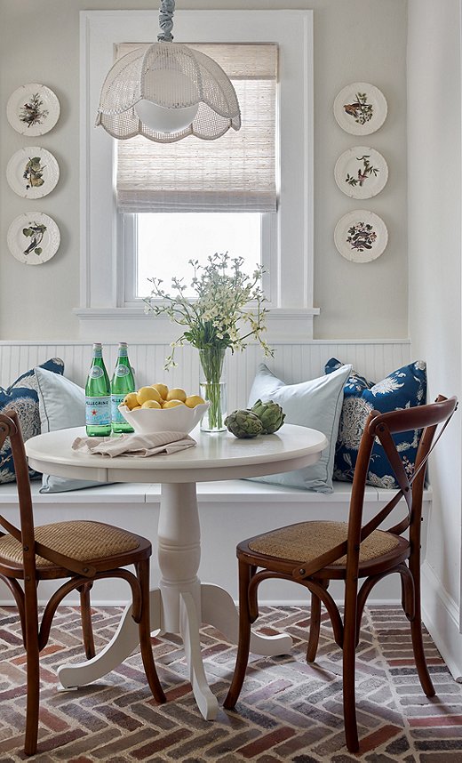
Brick flooring was a natural choice for this pet-loving family. The durable surface also adds a layer of informality and ease. Find similar side chairs here.
Lauren’s focus was making the small space feel bright and airy while highlighting the pieces that are important to the couple, “like the cow,” says Lauren. The walls went white to highlight the bungalow’s architectural character. Brick floors in the kitchen play up the home’s cottage style. Floral touches and a pop of buffalo check speak to the clients’ love of “traditional with a twist,” says Lauren. Bright splashes of color and a layer of animal patterns keep things feeling fresh. “I think that keeps it from being boring,” she says.
Cottage Kitchen
“We wanted to bring that cottage vibe,” says Lauren of the kitchen. While the bungalow may be situated in Atlanta, she wanted to the space to evoke a bucolic softness. The more formal dining area just off the kitchen served as foil to this cozy dining nook. Lauren played up the cottage element by going with white beadboard and traditional silhouettes. Brick floors in a herringbone pattern add texture and a lived-in feel to the space. The curves of the turned table base, which provides a graceful counterpoint to the straight lines of the bricks, are echoed in the scalloped pendant light. Blue pillows and wall-mounted plates emphasize traditional ease. Each piece plays part in creating an impactful kitchen in this small home.
Bovine Color Theory
Framed by molding as if it were made for this space, the clients’ cow painting hangs front and center in the formal dining area. “My clients love color and print,” says Lauren. She used this love to weave the painting’s bright hues in with more-traditional design elements. The chairs surrounding the dining table are covered in Schumacher’s Pyne Hollyhock; the blush color puts a modern spin on the maximalist classic pattern. The rug went subtle with an understated pattern in neutral hues. The dining table, an estate sale find by the always-hunting clients, is where the personality really comes alive. A swan juxtaposes the larger cow painting. Stacks of books on subjects ranging from Oscar de la Renta to famed furniture house Knoll are set just so on the table. An update on the classic lantern hangs above the scene. Exaggerated greenery adds a dramatic finishing flourish.
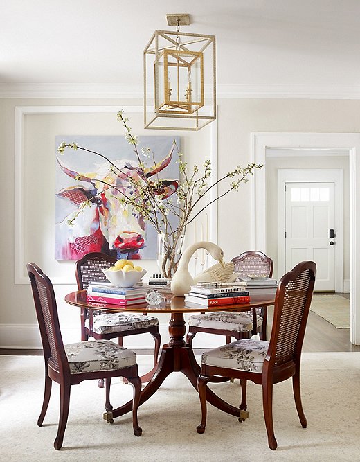
Lauren’s clients wanted this painting, which they found at an estate sale, to anchor their main dining area.
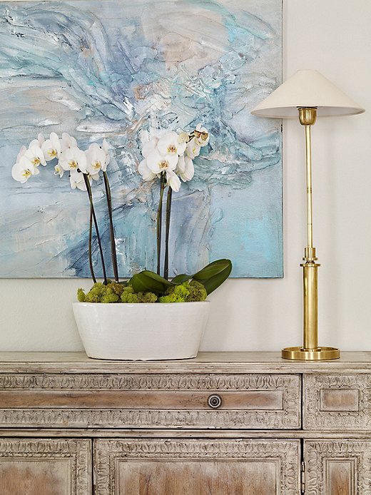
Lauren hung abstract art to add some modern style to the more traditional mix.
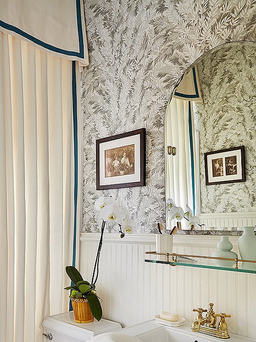
The pop of jewel tone on the custom shower curtain brings depth to the bungalow bathroom. The walls are covered in the iconic Florencecourt Wallpaper from Cole & Son.
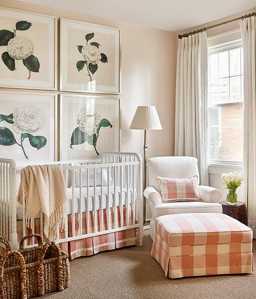
Lauren bolted oversize floral prints to the wall above the crib to make a statement with traditional flair.
Sweet Style
“Don’t worry, those paintings are very secure. The wall would have to fall down for them to come down,” says Lauren of the oversize florals that take center stage in the nursery. The hunt to find the perfect quadriptych led Lauren on a circuitous journey. Would she find one print and blow it up before slicing it four ways? Would she try to find four of the same print to frame? Or would she take a note from her client and hunt for the perfect piece in an unexpected location? Luck was on her side when she traipsed through a showroom at America’s Mart in Atlanta and found these four oversize prints sitting there.
To complement the large pieces of art, Lauren kept everything classic. Buffalo check was the perfect nod to the clients’ love of traditional, and the sweet hue made it an ideal choice for a nursery. The white accent chair is the perfect place for parents to hang out during nap time. A sweater-weave basket is a perennial favorite of designers looking for style and function.
Traditional Twist
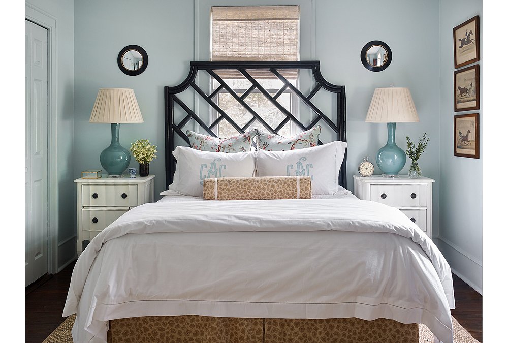
The main bedroom is a study in how to make an impact in a small space. “This room is small, and they were feeling cramped,” says Lauren. “We wanted it to feel fresh and airy and like there was more room than there really is.” The first order of business was to paint the crown and trim the same color as the walls. An old design trick, this breaks down visual boundaries in the space to make it appear larger. A large Chippendale-inspired headboard makes a statement on the back wall. A trio of prints makes use of the small space between the corner and a window, while a small black convex mirror continues the color line started by the headboard. Lauren’s clients wanted to keep things from feeling too stuffy, so they requested animal print somewhere in the house. The bolster and the bed skirt were both custom made of a tone-on-tone leopard print, providing just enough twist to the traditional scheme to keep things fresh and fun.
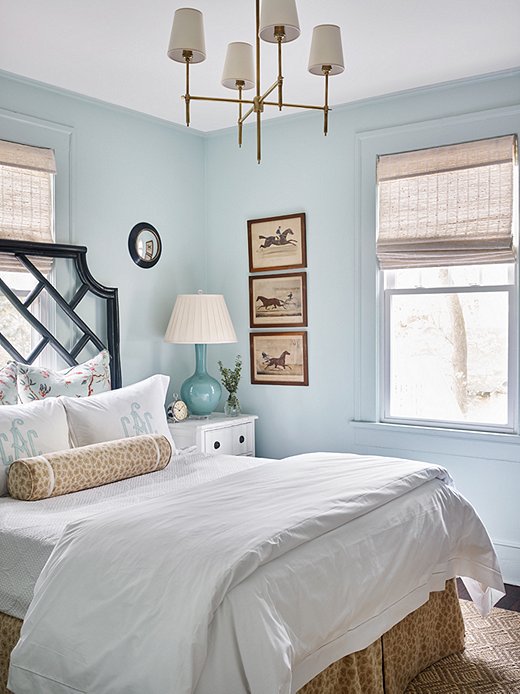
Benjamin Moore’s Palladian Blue sets the serene stage for the main bedroom. Natural tones play on the sunlit room to bring warmth. The Visual Comfort chandelier adds a touch of glam.
Join the Discussion