After 27 years in Brooklyn, Jason Oliver Nixon and John Loecke, the designing duo behind the celebrated firm Madcap Cottage, were ready for a change. They felt that it was time to downsize, city-wise. They’d been visiting High Point, NC, for the past 20 years to attend the biannual design market, and they decided this could be a place where they could get involved and help the community flourish. But it was the charming 1930s Regency Revival home they found that sealed the deal. “It feels like it’s been plucked from the edge of Regent’s Park in London, and that’s very much our sensibility and style,” says Jason. So they put their Brooklyn brownstone on the market, packed their three dogs in the car, and headed south.
Once they were securely below the Mason-Dixon Line, the couple got to work bringing the home “back to its heyday” and adding their signature whimsical style. They also brought a historical perspective to the design. “In addition to making a home feel livable, we really want to create a storyline and sense of history,” says John. They took cues—and used actual pieces—from the homes of legendary tastemakers such as Bunny Mellon, C.Z. Guest, and Nancy Reagan.
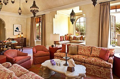
Jason and John are also consummate entertainers and devised spaces that are guest-worthy but still comfortable enough for them to just kick back with the dogs. “We don’t ever do spaces that we don’t use,” says Jason. The living room has plenty of spots to sit or set a drink, and the card table in the corner encourages guests to play a hand or two. It’s touches like these, along with Jason and John’s exuberant use of pattern and color, that bring the home to life. “It’s very much the highlights and the details: the hand-painted floors, murals, hand-painted medallions, and wallpaper,” says Jason. “Those little unexpected moments take a house and really make it a home.”
While they’ve spent only a few years in the home, they’ve thoroughly revived it to its 1930s glory—but with their own Madcap twist. “We wanted it to have a good energy and a good spirit,” says Jason. But most of all, “we wanted it to feel lived in. It looks like we’ve been there 20 years.”
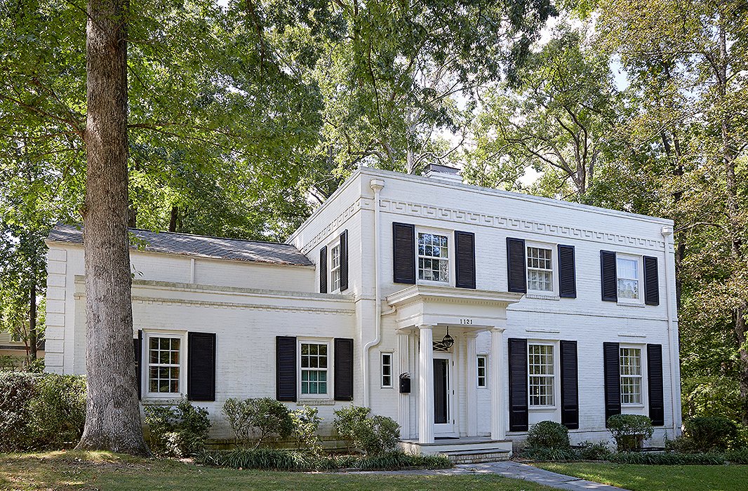
John and Jason are only the third owners of the Regency Revival home, which was built in the 1930s. “There’s very much an English sensibility to the house,” says Jason.
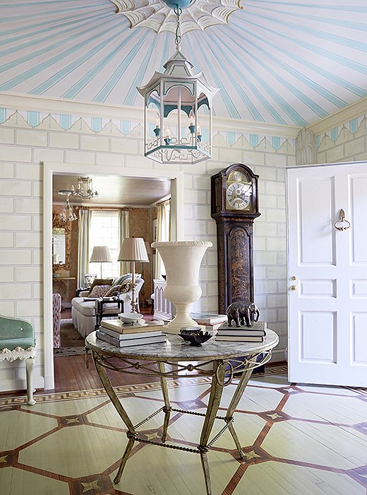
The foyer, which features decorative painting from floor to ceiling, “took its cues from the decorative paintwork that made Bunny Mellon’s residences so legendary,” says John. The floor was designed to have a sense of patina. “We wanted it to feel like it wasn’t perfect, because we have dogs,” says Jason. “We wanted to make it feel like it was getting better with time.”

We are big fans of history and of the history of design. In addition to making a home feel livable, we really want to create a storyline and sense of history.
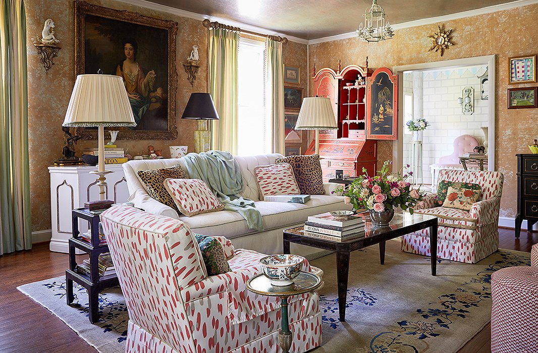
The living room gets used daily and was inspired by a design that iconic decorator Elsie de Wolfe created in Beverly Hills. The treatment was a happy accident. While stripping the wallpaper, they discovered that the remnants of the previous papers and original damask created an interesting texture. “You never know what you’re going to discover when you renovate, and if you find something magical, keep it,” Jason says.
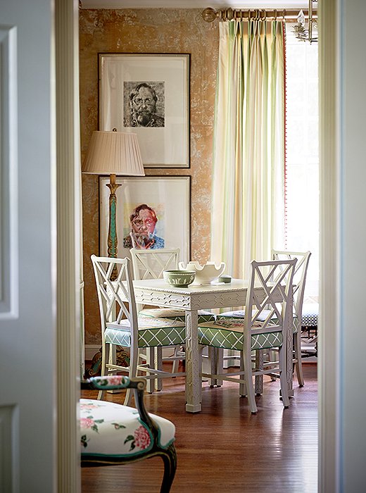
The designers set a card table and chairs in a corner of the living room as a second seating area. “We love a good card table,” says Jason. John adds, “The great thing about a card table or a game table is that it prompts you to play cards or sit down and do something that doesn’t involve your computer or your phone.”
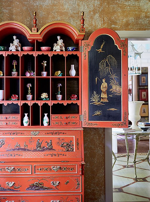
Jason and John filled the “dragon-lady red” lacquered secretary with a collection of porcelain flowers. “That piece is a little more decorative, but we also use it as a writing desk,” says Jason.
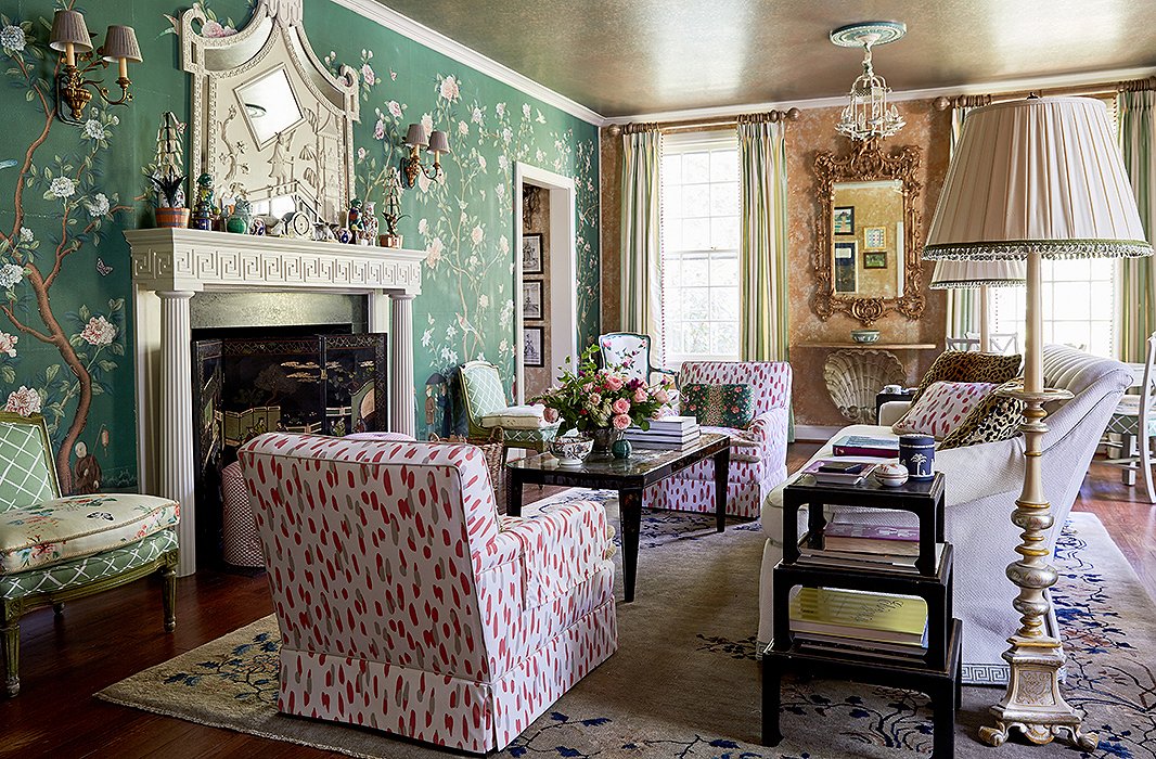
While the home is filled with classic details, Jason and John customized them to feel personal. For instance, the custom Gracie wallpaper features depictions of the couple’s three dogs. They placed a plush sofa and vintage chairs facing the fireplace. “It’s a place you can put your feet up, but it’s still a high style.”
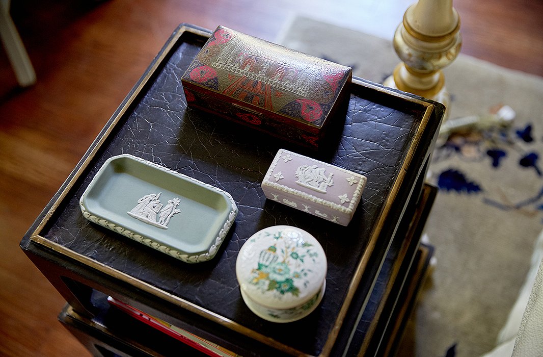
“We love having those little moments,” says Jason of the collections displayed throughout the house. “Every little piece that we have is a story from our travels or something that we inherited from our family, and those memories and traditions bring those collections to life.”
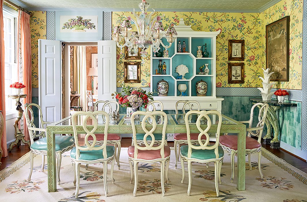
The dining room is an homage to Bar Longhi at the Gritti Palace hotel in Venice. “You sit in that bar and you feel like you’ve been whisked away to this magical world,” Jason says. “We wanted to recreate that experience in our own home.” The designers mixed a Murano glass chandelier and antique floral plasterwork with a glass-top table and chairs from eBay for an elegant but approachable space. “It’s a more formal dining room, but it’s a glass-top table, so nothing feels stuffy,” says John.
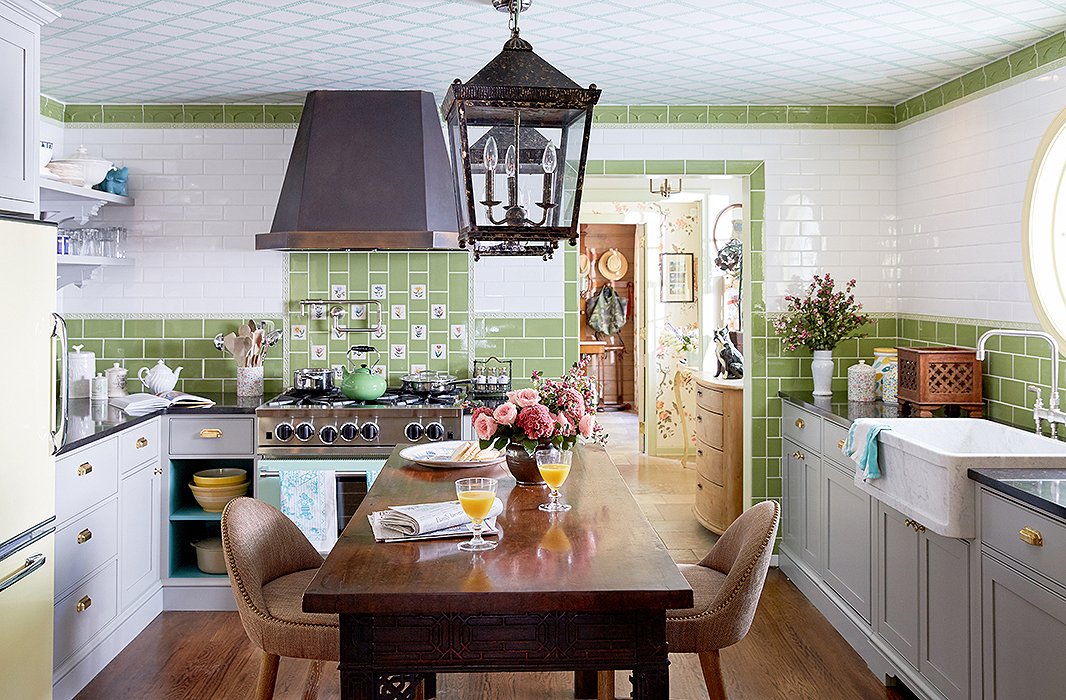
John and Jason gave the kitchen a total makeover inspired by the Royal Pavilion in Brighton, England. “We pretty much wanted to do an English country-house kitchen with tile from floor to ceiling,” Jason explains. They found floral tiles in Portugal and integrated them into the green-and-white scheme. They added vintage lanterns above the island, which is actually an 18th-century table that they had raised.
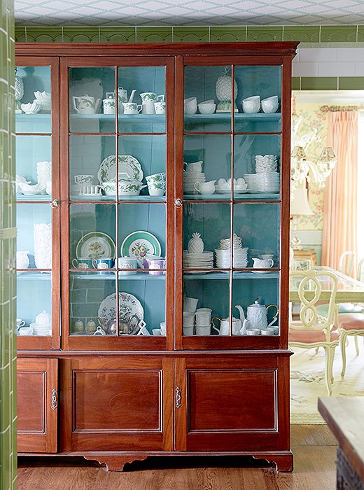
The designers installed an antique library cabinet to store and display their china. “It’s another great place to show our collection and try things that are right at your fingertips,” Jason explains.
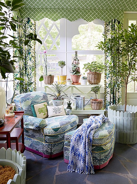
The bright and airy sunroom, which was the space that sold the couple on the house, is what Jason calls a “24/7/365 room.” They added orange trees, orchids, and geraniums to make the space feel like it was half indoors, half outdoors.
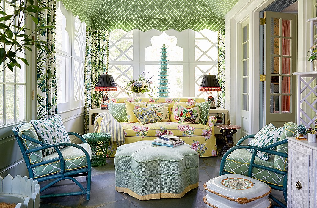
The sunroom is tented in Madcap Cottage’s Cove End fabric. “Who doesn’t love a tented room?” asks Jason. “It makes you feel like you’re a kid in your backyard minus that sprinkler that turned on at 2 o’clock in the morning.” They added a cheerful yellow sofa and casual rattan chairs. “The idea was to create a space that was fun and relaxed and made you happy,” he adds.
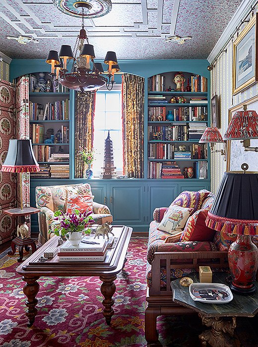
In a room known as the opium den, John and Jason went bold with teal paint and a riot of pattern. “When you paint a small space and take it over the top, it feels more intimate,” says John. “There’s so much to look at that you don’t realize how small the room really is.”

People are afraid of mixing a lot of things together. If you have a small space, start there. The more you do to it, the less you notice how funny the proportions are.
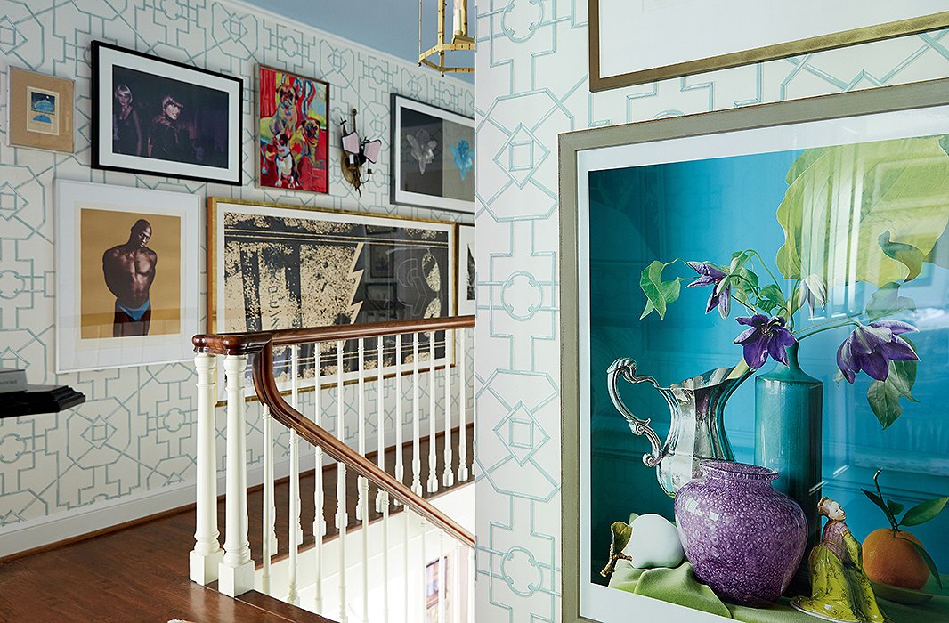
“We love a good salon grouping,” says Jason of a landing filled with an array of artwork. “It’s about having fun with art and mixing up the framing and the matting. Art is a really good reflector of your travels, your family, and your adventures.”
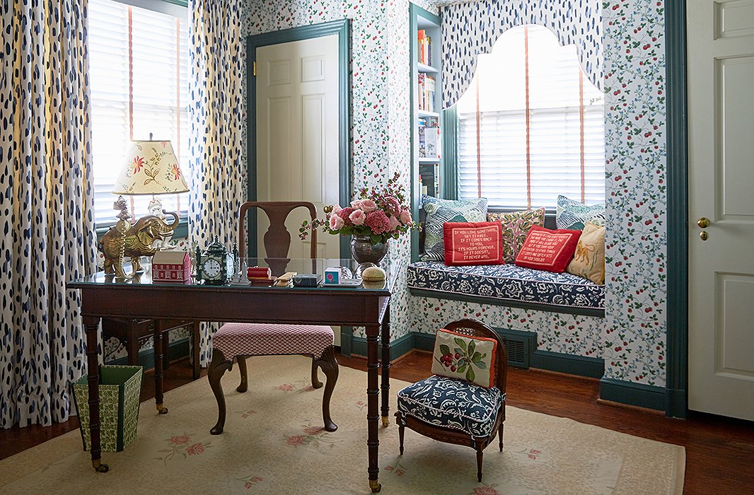
The designers scored a vintage strawberry wallpaper from Brunschwig & Fils and used a mix of Madcap Cottage fabrics and needlepoint pillows from the estate of C.Z. Guest to create a cozy reading nook.
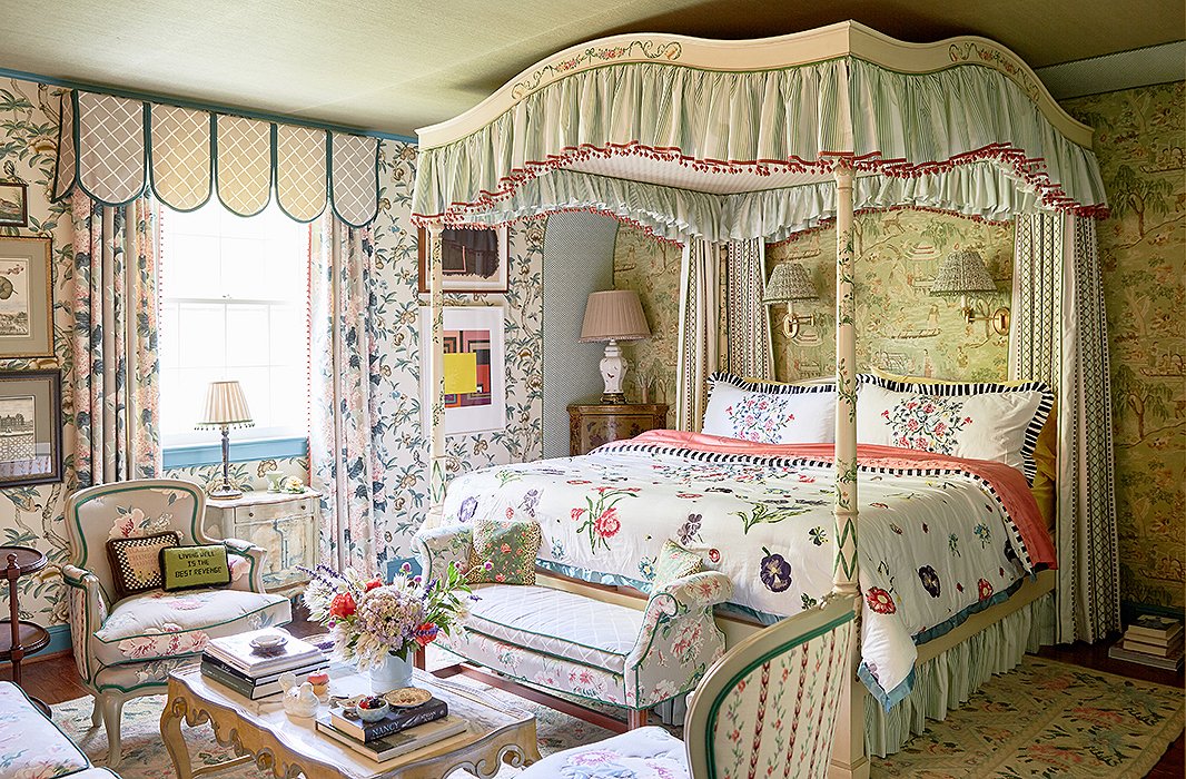
John and Jason used an “explosion of print and pattern” in the master bedroom. “It feels very much of the house in its heyday but contemporized,” says Jason. A decorative painter added chinoiserie details to the canopy bed’s original floral motifs. “You can take something that you buy and reinvent it and add a further spin of your own,” John says.
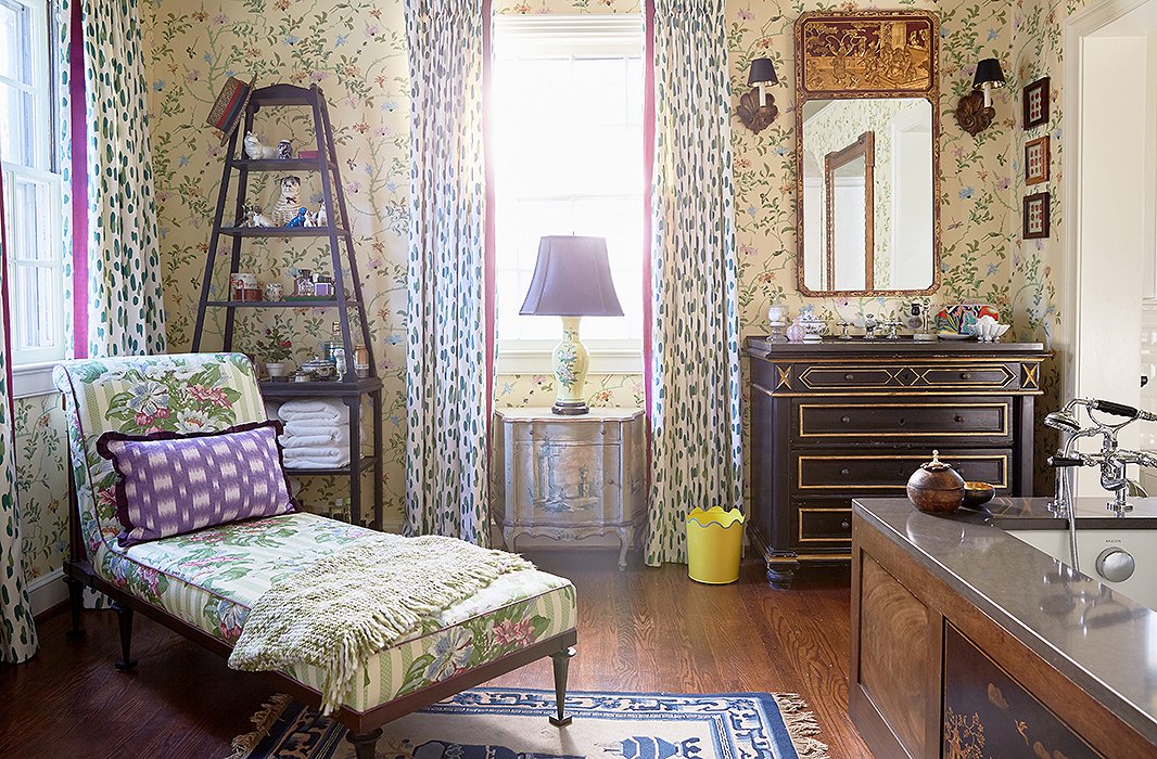
Antiques are used prominently throughout the house, even in the master bath. A vintage chinoiserie panel was set into the side of the tub, and they converted an 18th-century chest into a sink vanity. “You want to sit in the tub for hours and read World of Interiors and drink a martini,” Jason says. “It’s so warm and inviting.”
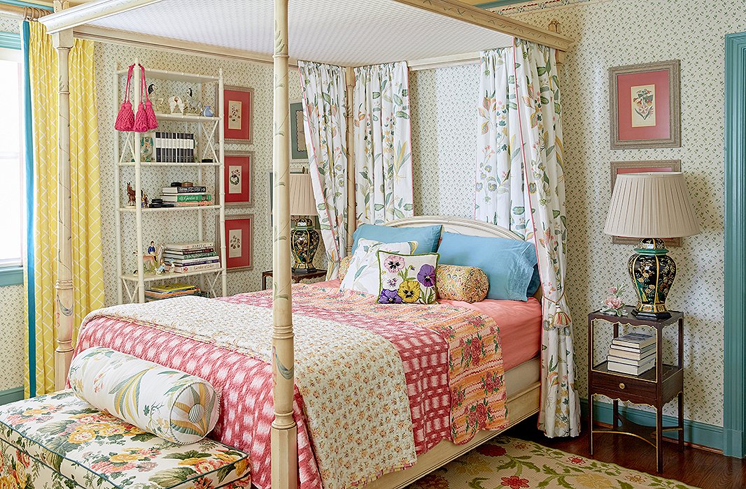
The designers love pieces with a great backstory. “Pretty much everything in the house is vintage or antique, and a lot of those pieces come from persons of relative note,” says Jason. A guest room’s canopy bed is from the estate of actress Joan Fontaine.
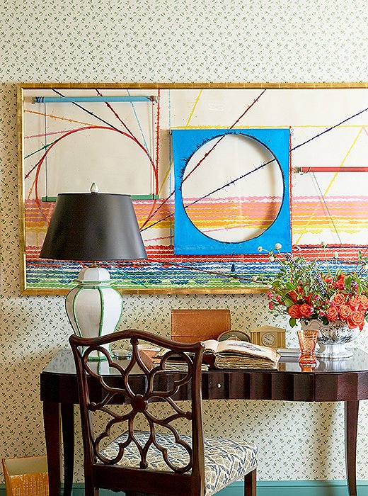
A James Rosenquist painting adds a contemporary contrast to the guest room. “If you have a piece that you really love, regardless of the style, it will work,” says John.

It’s about a life well lived. I think art is a really good reflector of your travels, your family, and your adventures. You use art to bring that story to life.
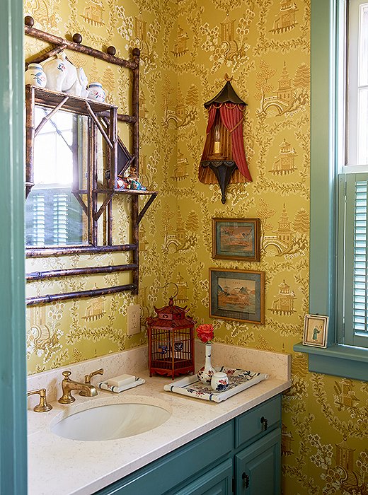
The designers used a vintage chinoiserie wallpaper to add impact to a small powder room and displayed objects and art on the walls and the vanity. “Bathrooms can have collections too,” notes Jason.
The Madcap Cottage Pattern Principles
While visiting the exuberant home, we tapped John and Jason for a few tried-and-true lessons on lavish pattern mixing. Here, they share their genius tips.
Go bold in a small space. “Pattern breaks the architecture of a room and tricks the eye. It makes it feel that much bigger,” Jason explains.
Modernize a traditional print. “Pairing a graphic pattern with something like a chintz or a toile will make the traditional print feel really fresh,” says John. “Or look for it in a more unusual color story.”
Try something unexpected. “A lampshade is a great unexpected use of pattern,” says John. “The pleating creates a new pattern.” Jason adds, “Try using it when matting an artwork. Have fun with it—matting doesn’t have to be black or white.”
When in doubt, add more. “The further you push it, the less it becomes about the specific pattern rather than the environment,” says John. “That’s the ultimate goal.”

Join the Discussion