Call it intuition or aesthetic ESP, but designer Mark D. Sikes saw how his Hollywood Hills home would look before he laid eyes on the property. “I knew the palette and fabrics I wanted, I knew the furniture that we would have,” he says. “I created the final design in my head without seeing the space, which I know sounds a little weird.”
Soon after he and partner Michael Griffin bought the home , they began a renovation, expanding the tiny galley kitchen, removing the walls of their evergreen damask wallpaper, and leveling the outdoor spaces and terraces. The end result is East Coast pedigree meets California cool. The masterful mix is seen in every room—chinoiserie and canvas, sisal and silk, all commingling to create a sense of ease and elegance. “I guess it’s traditional,” says Mark. “But living here, there’s a connection to the outdoors that infuses a casualness into it.”
Fusing decorating styles and creative endeavors comes naturally to Mark, who grew up in the Midwest and the South before a career in visual merchandising took him to San Francisco and finally Los Angeles, where he made the transition to interior design.
“Visual merchandising is not very different than designing a living room,” he says. After his home was photographed and featured on the cover of House Beautiful, clients began contacting Mark for interior design work. “It just started taking off,” he says. Here, Mark lets us inside his effortlessly elegant Hollywood home.
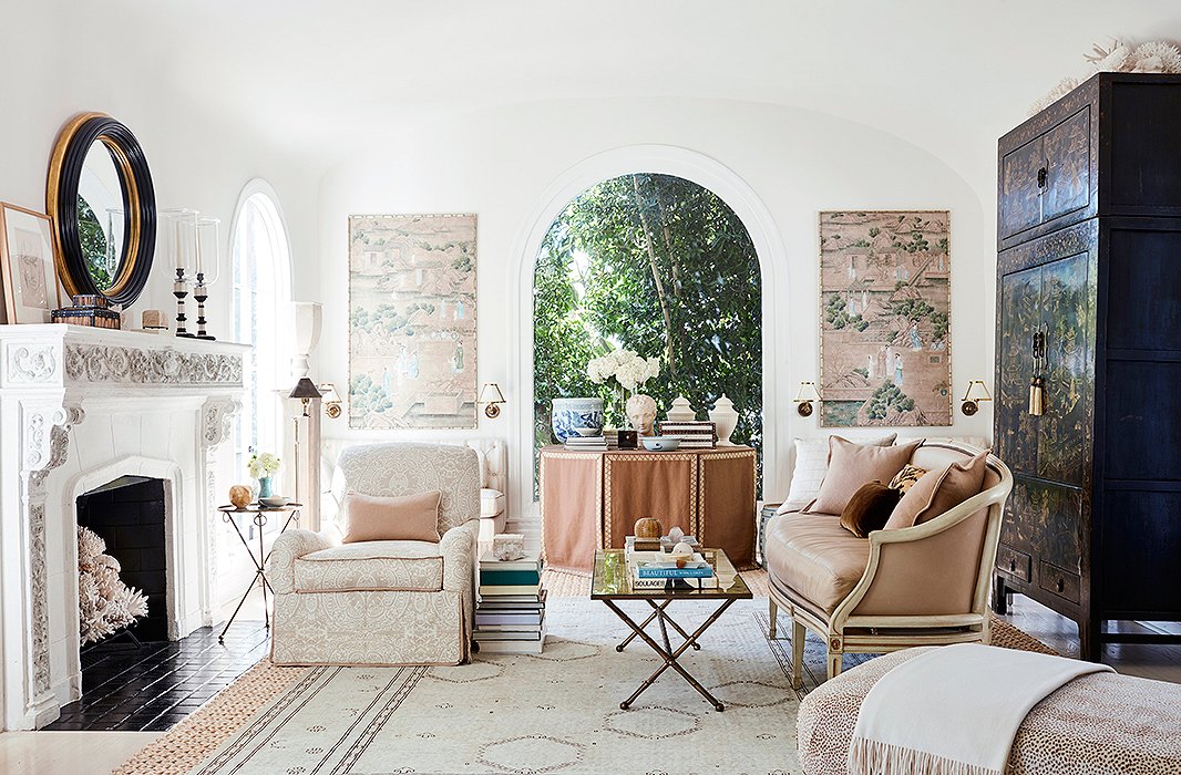
The wallpaper panels that flank the arched window inspired the overall design of the serene living room. “I love the pattern of these Gracie wallpaper panels. They really set the palette for the room,” Mark says. “The last time I redecorated I pulled the window treatments down because I really wanted the architecture of the room to open, and the arch windows are so beautiful.” An 18th-century chinoiserie armoire presides over the multiple seating areas.
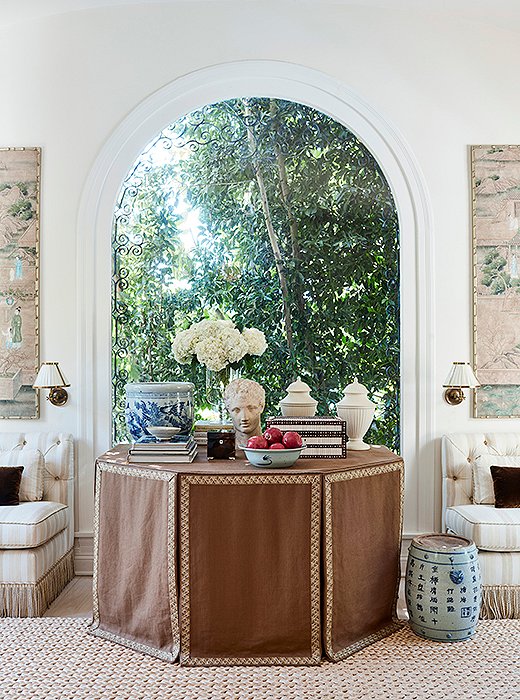
“A skirted table adds a feminine and sophisticated touch to a room,” says Mark. “And they’re practical—you can stow things out of sight.” The bust was found in Charlotte, NC; the bowls are from San Francisco; and the books are a small part of a sizable library. “We have books everywhere,” he says. “They’re under tables, used as side tables. When I try to find a particular one, it’s quite the hunt.”

I like an eclectic mix of periods, of scale, of finishes, and a mix of textures. I think that creates not only beauty but a sense of ease.
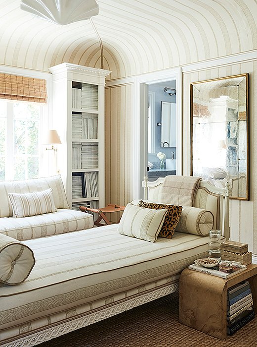
The sumptuous study, awash in Carolina Irving’s Patmos Stripe fabric, doubles as a guest bedroom. “Having the daybed in the center allows for the feeling of a library and a spot for people to sleep,” says Mark. A Karl Springer parchment table, matchstick blinds, and a leather stool add tonal texture. “The artwork is from Paris flea markets,” Mark says. “There’s a booth there that has wonderful abstract paintings and sketches.”
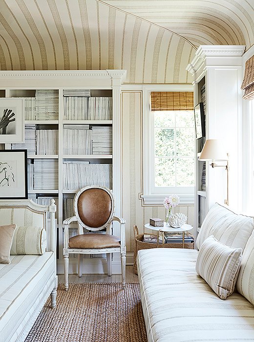
Mark’s beloved collection of fashion and design magazines is housed in built-in bookshelves. “I’m embarrassed to say some go back as far as the mid-1980s.” The banquette is a cozy spot to flip through a British Vogue, Town & Country, or Vanity Fair.

There are things that just work in design—natural-fiber rugs, striped dhurries, chinoiserie. Beautiful textiles and great texture work no matter if it’s a traditional interior or a clean, minimal space.
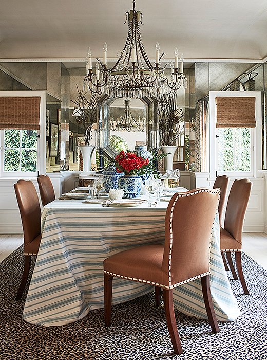
“The dining room had a racy wallpaper,” says Mark. “I took it out and mirrored the space so it would feel bigger and reflect the outdoors.” Adding extra character are leather-covered chairs, a cheetah-print rug, and an antique chandelier. “Everything kind of glistens and shines in here.”
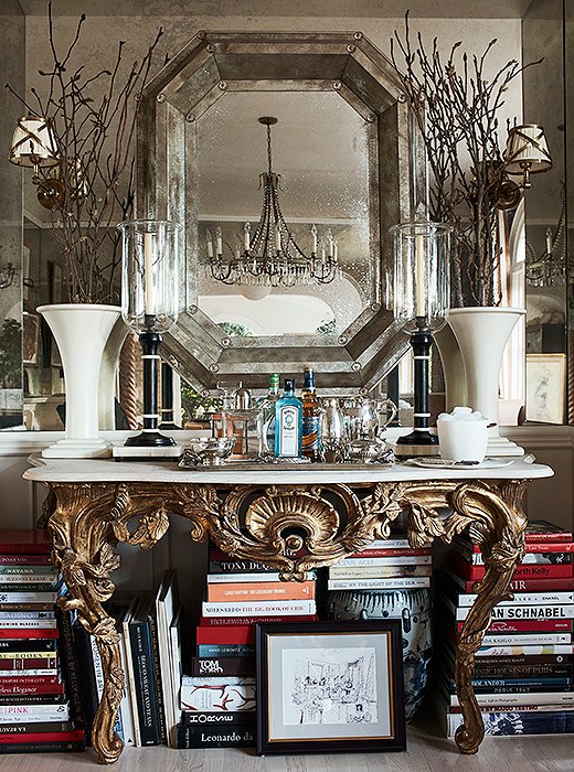
A gilded console at one end of the dining room houses a bar and more of Mark’s design books. “We don’t formally entertain,” he says. “So I wanted this to be a place where I could sit and work too.” The hurricane lamps are from his friend John Rosselli’s antiques shop. The custom mirror was made from antique glass.

I want what I’m doing not only to look good today but also to feel it would have looked good 20 years ago and will look good in 25 years. A sense of timelessness is really important.
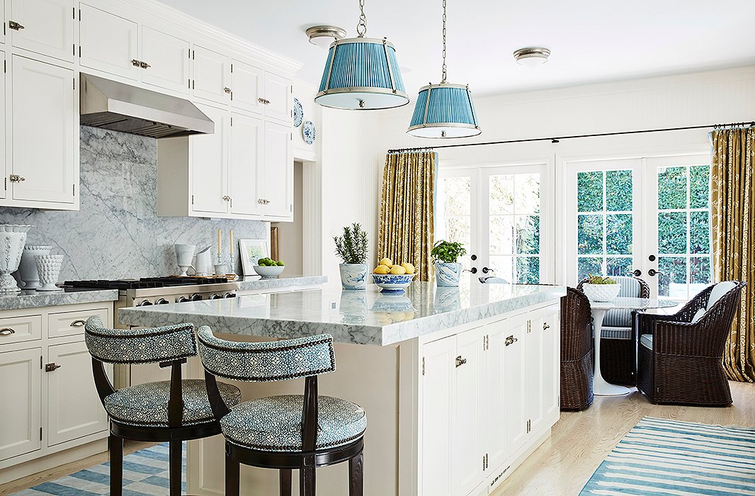
The designer combined the original galley kitchen and adjoining maid’s room to achieve an open, airy blue-and-white space that is another multifunctional area. “We don’t cook a lot, so it really serves as a family room,” says Mark. “The TV is here, and we have lots of seating areas.”
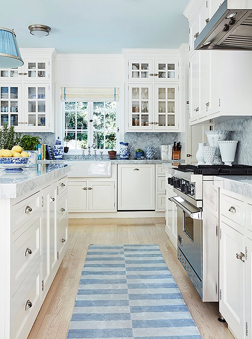
Shades of blue and white make for a cheerful, crisp kitchen. “I love blue-and-white dhurries,” Mark says.
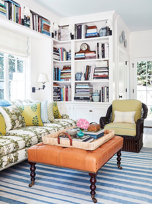
The cozy family room is a study in pattern and texture. “I love the mix of upholstery fabrics with the leather ottoman and wicker chairs,” says Mark. “The bookshelves balance the kitchen cabinets across the room.” The rug is antique, and the tray is Ralph Lauren Home.
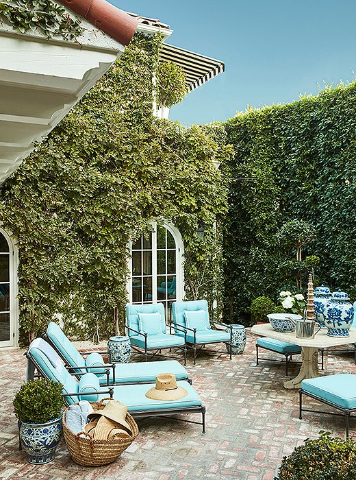
A courtyard, framed by ficus hedges, makes a lush spot for relaxing or dining year-round. “I love this antique stone table, even though it’s crumbling, and designed the entire space around it,” Mark says. “We use it for dining, as a bar, or just as a focal point.” A straw tote is filled with sun hats; garden stools are used as both side tables and seating.
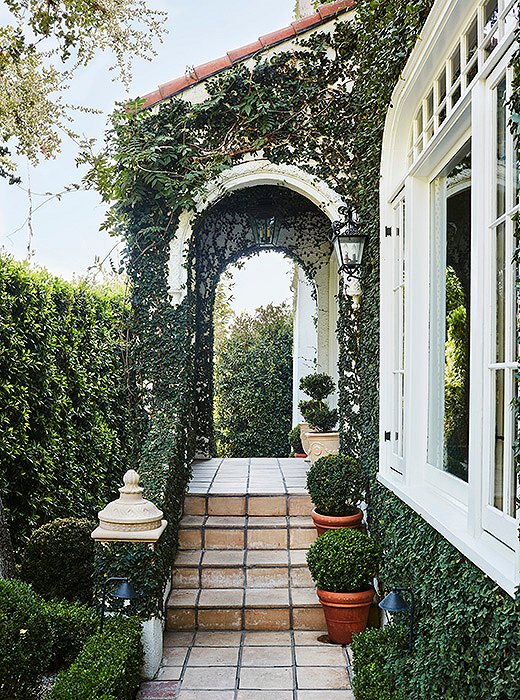
“I love to design homes that blend the indoors with the outside,” says Mark. “I think of outdoor spaces as additional rooms.” A tiled path lined with potted boxwoods leads to an enchanting entrance covered in creeping fig.

I’m happy to be known for blue. There’s something optimistic and all-American about it. And I’ve never, ever had anyone come to me and say they don’t like blue.
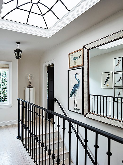
The skylight on the upstairs landing brings in lots of California light. “It adds drama and height to the space,” says Mark. Custom wrought-iron railings echo the window’s design. The bird prints are inspired by his friend Bunny Williams’s home in the Dominican Republic—“one of my favorite homes anywhere.”
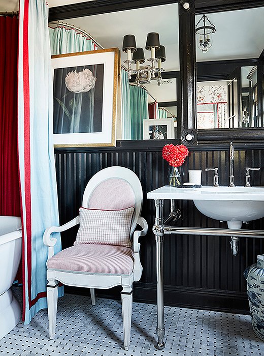
The lacquered black bath off the guest room is balanced with a series of mirrors. “It makes it all feel bigger, and the black works with the red bedroom,” says Mark. The armchair is a Bunny Williams design.
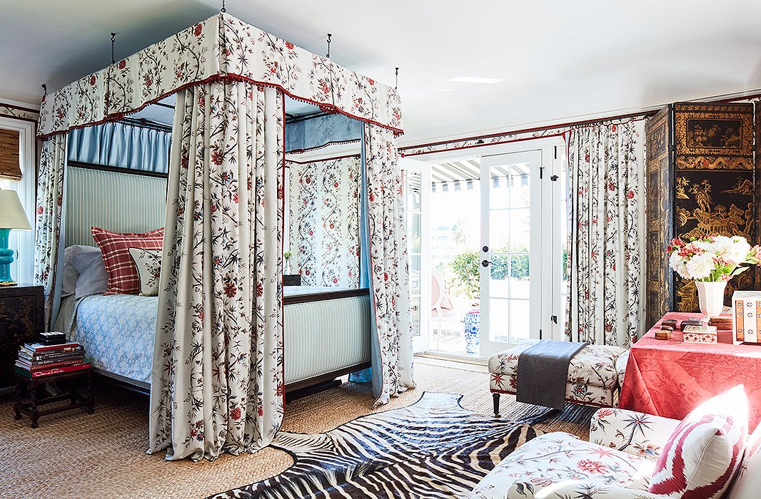
The guest bedroom feels like a chambre in a French château thanks to the resplendent Pierre Frey Braquenié print. “I’ve actually slept in here a few times, and waking up in it is really spectacular,” says Mark. “It’s fun and glamorous, but it still has a sense of California ease because of the nature just outside.”
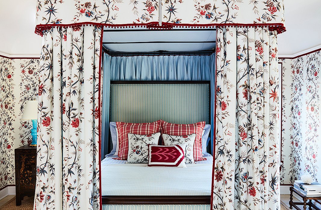
Scalamandré stripes and pillows dressed in Mark’s own fabric finish off the bed. The nightstands are from an antiques store in Sonoma County. The lamps are Christopher Spitzmiller. The designer’s guest room checklist? “Lots of towels, water by the bed, note cards, and something to write with.”
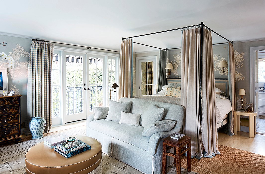
Mark’s favorite space, the master bedroom, is dressed in a Gracie paper. “I call it China blue and use it in many bedrooms because it’s so calming. This room is very functional. We made it bigger and added cabinetry. It’s truly a room we live in.” The settee and the ottoman are custom.
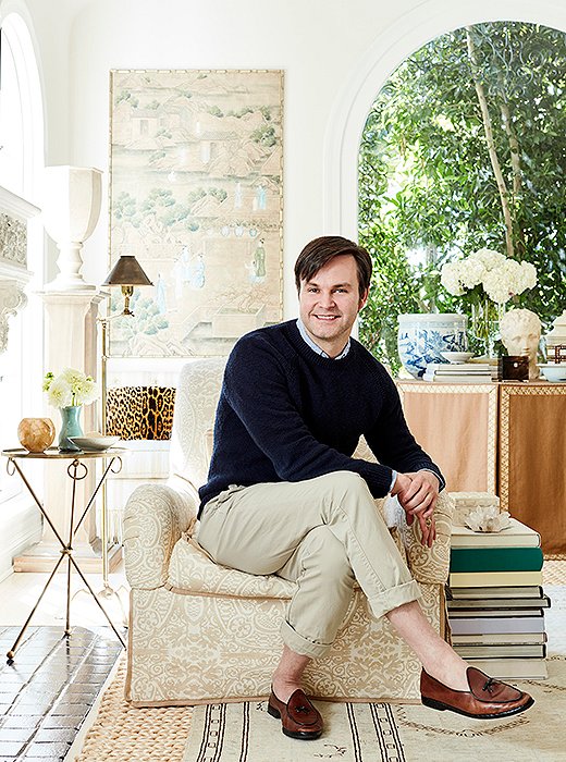
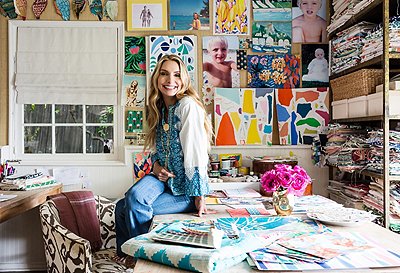
Designer Mark D. Sikes

I’m a student of what’s come before me for sure… the great rooms and great designers of the past. I find the inspiration but do it in a more modern way.


Join the Discussion