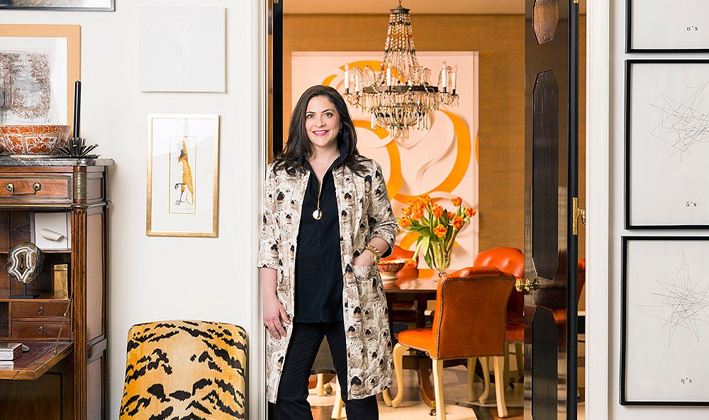
Kate Rheinstein Brodsky is who you want to sit next to at dinner. Gracious and curious, she operates with the kind of quick-witted humor you’d be tempted to call Southern. Born in Los Angeles and raised in the city’s Hancock Park neighborhood, Kate moved to New York to attend NYU and now runs her own store, KRB, on Manhattan’s Upper East Side. Citing Diana Vreeland and her mother, famed interior designer Suzanne Rheinstein, as influencers, Kate says of her personal style, “I only have two modes: anonymous or out-there… and I think the same could be said for the way I decorate.”
To step inside her pre-war Madison Avenue apartment is to step inside a place of warmth. Radiant colors, antiques, and art spanning all eras are set against a backdrop of surfaces intended to get better with wear. Working closely with architects Dick Bories and James Shearron, she created a home where she, her husband, and her three daughters could live in both comfort and style.
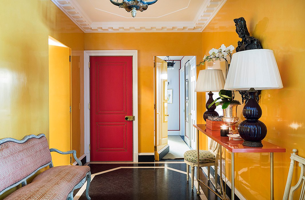
Kate wanted the windowless foyer to be both warm and inviting. The solution? “Guts and drama” by way of lacquered walls (painted in Farrow & Ball’s Orangery), stone floors, and an Eve Kaplan mirror. The pièce de résistance is a door upholstered in red Dualoy leather embellished with brass nail heads.

There’s no room that’s off-limits to my children. They’re welcome anywhere in the house, but there are different levels of behavior allowed in different rooms. It helps to have zones—some more controlled and others that are more free-range.
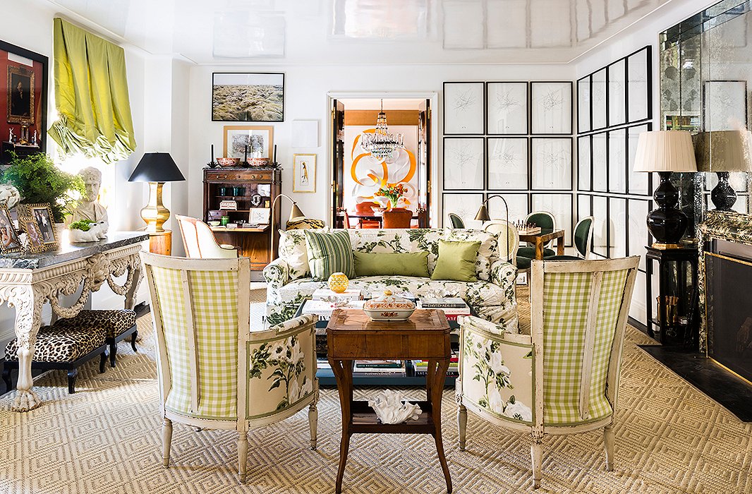
A swatch of Bob Collins chintz lay dormant in Kate’s “fantasy file” for seven years later, until it served as the driving force behind the design for her living room, taking center stage on a slipcovered sofa and two 19th-century Directoire-style bergères. “I think it comes from having grown up in Los Angeles, where my mother has a wonderful green garden with a kind of lush Southern feel to it,” says Kate of her affinity for the print. For an almost identical rug, see the Neptune.
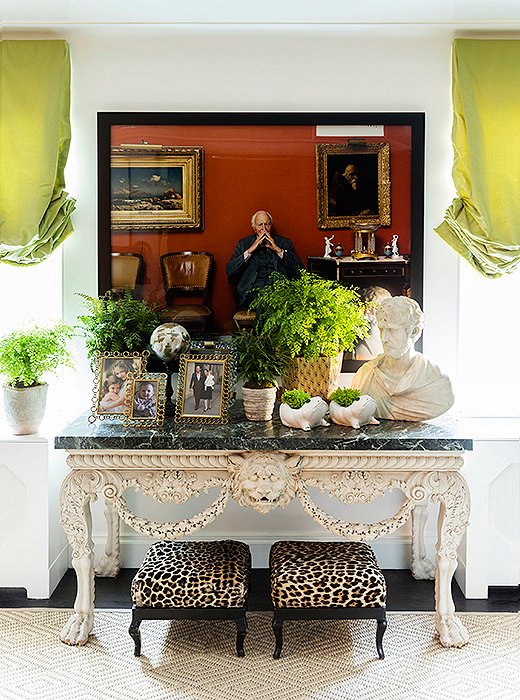
Bridging the gap between the contemporary and the traditional, a pair of leopard-print ottomans rest beneath a George II marble-top console and a Tina Barney photograph. “Sometimes people think he’s part of the family,” Kate says with a laugh of the pensive character framed in black, “and we’re okay with that.”

When you have limitations it forces you to be more creative and really think out your idea. And sometimes the best solution is not a creative one, but a very straightforward, classic one.
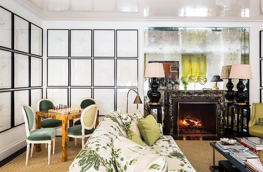
Drawings by Angelo Detanico and Rafael Lain surround a vintage burl-wood games table and Louis XVI-style chairs in the living room’s far corner. “It’s where my girls have their chess lessons and build Legos on the weekend,” Kate says, and where she and husband Alex eat dinner when it’s just the two of them.
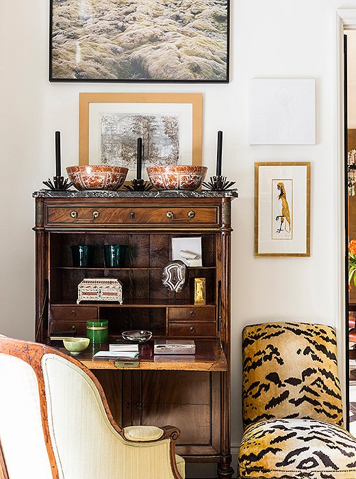
A birthday gift from Kate’s mother, a slipper chair covered in tiger-print velvet offsets a secretary filled with small treasures.
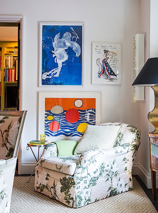
A roll-arm chair covered in the room’s signature chintz serves as Alex’s choice spot for a Saturday afternoon nap. Artwork by Alexander Calder and James Narse brings a touch of the modern to the otherwise traditional vignette.

My mother raised me to think that if I bought one good thing every year, then in five years I would have five good things.
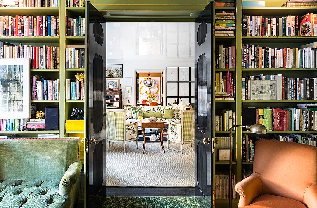
Purchased at auction, an orange wool chair in the library ties in nicely with the dining room’s color scheme. “I brought it home and I thought I’d recover it,” says Kate, “and then I put it in the library and I thought…well this is meant to be. It balances the orange in the dining room and it sparks it up a bit—it was sort of a happy accident.”
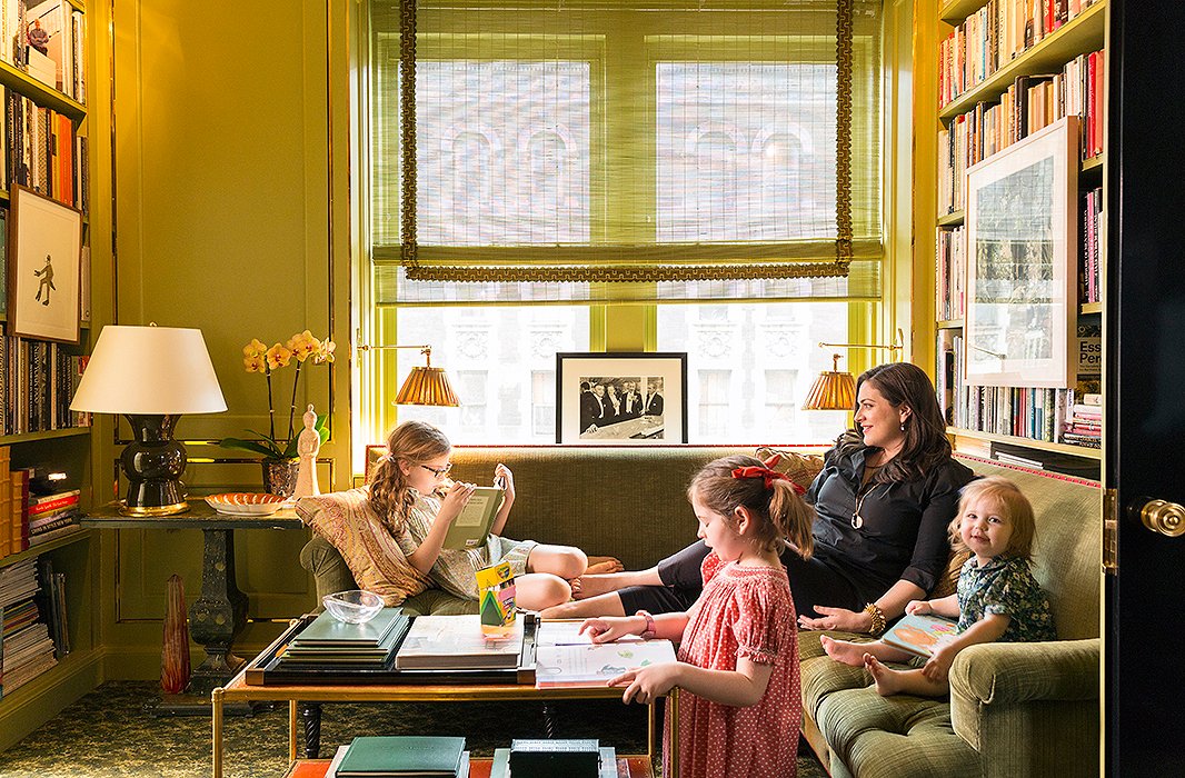
When it came to fabrics and materials, Kate was careful to choose things she’d continue to love even once they wore: “It’s impossible to have a house with three small children and an ancient dog that doesn’t have a lot of wear and tear, but I also didn’t want to have the mindset of waiting for my children to grow up to have nice things.” In the library, she and daughters Beatriz, Frederica, and Delphine lounge on a banquette upholstered in a linen velvet, selected for its durability and coziness.
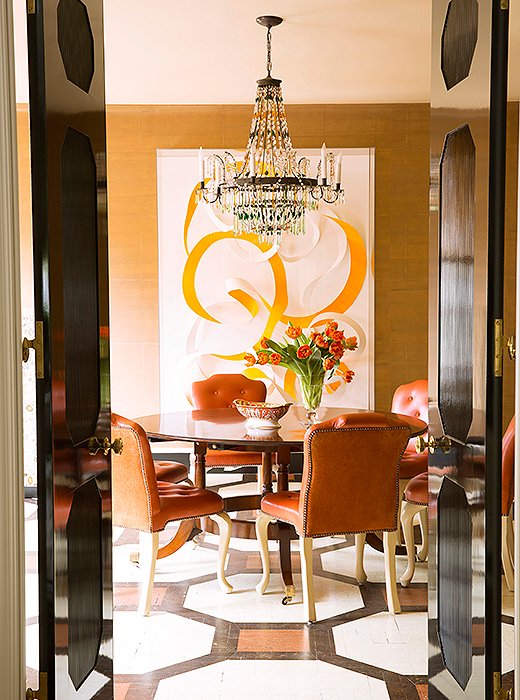
“Realistically, family dinner is a little hard for us,” says Kate, “because everyone’s lives are so busy, but we do try to have breakfast together four or five days a week at the dining room table.” Beneath a vintage Regency-style table by Jonathan Burden sits a 19th-century Austrian chandelier opposite artwork by Janaina Tschäpe.
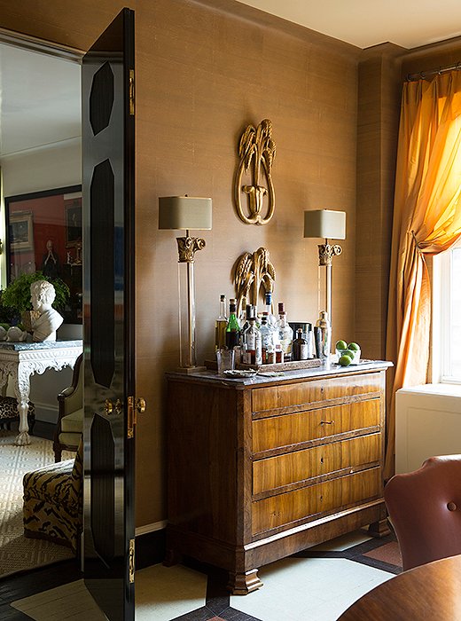
Walls covered in burnt-caramel-color Gracie wallpaper are paired with painted floors bearing an oversize motif inspired by a David Hicks pattern. Kate’s goal with her eclectic mix was to create a space that felt “more fun and less serious.”
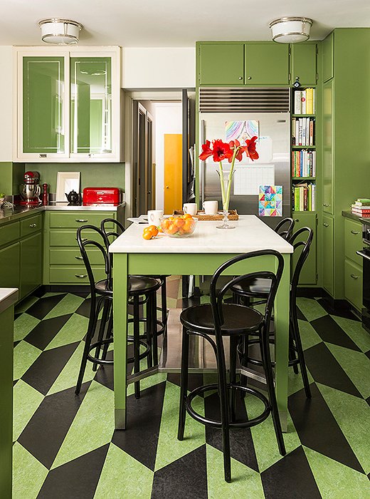
Ensconced in Benjamin Moore’s Courtyard Green, the kitchen is as stylish as it is practical. The glass cabinet doors were reverse-painted to keep messy shelves out of sight but still reflect incoming sunlight. The linoleum floor provides a pop of pattern, feels good under foot, and is easy to clean. Kate’s favorite element, though, is the marble island: “I like the way it looks as it stains and gets worn… it acquires a kind of personality.”

I wish I could say that I had a specific method for selecting things, but I don’t. It’s usually a cross-section between something I need and something I fall madly in love with.
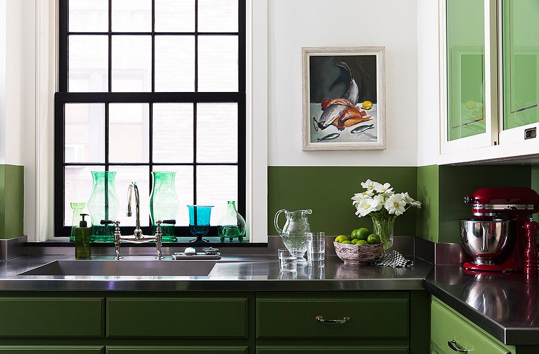
Stainless-steel countertops give the kitchen the utilitarian feel Kate was after and stand up to daily wear and tear. “I like materials that weather well,” says Kate. “It’s not so much that they should stay pristine forever, but I like to find things that I like the look of as they age. Stainless steel fits that bill for me… it has so many scratches at this point that it looks almost like a different finish, but I still love it.”
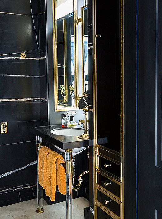
A black marble powder room with brass accents offers a stylish spot to freshen up. A hint of orange, similar in hue to what’s seen in the dining room library, appears in a set of hand towels.

I like materials that weather well. It’s not so much that they should stay pristine forever, but I like to find things that I like the look of as they age.
![Painted Benjamin Moore’s Bridal Pink, Beatriz and Frederica’s room is a space they can grow into. “In 10 years they may be so over pink it’s not even funny,” Kate says, “but the bones of the room will still work—the great metal beds [found at Hollyhock in Los Angeles], the wonderful Bunny Williams Home side table between them, the 19th-century French chair… I thought all the elements will continue to suit them as they get older so long as I make small tweaks along the way.”](https://okl.scene7.com/is/image/OKL/022417_KateRheinstenBrodksy_21?wid=1066&op_sharpen=1)
Painted Benjamin Moore’s Bridal Pink, Beatriz and Frederica’s room is a space they can grow into. “In 10 years they may be so over pink it’s not even funny,” Kate says, “but the bones of the room will still work—the great metal beds [found at Hollyhock in Los Angeles], the wonderful Bunny Williams Home side table between them, the 19th-century French chair… I thought all the elements will continue to suit them as they get older so long as I make small tweaks along the way.”
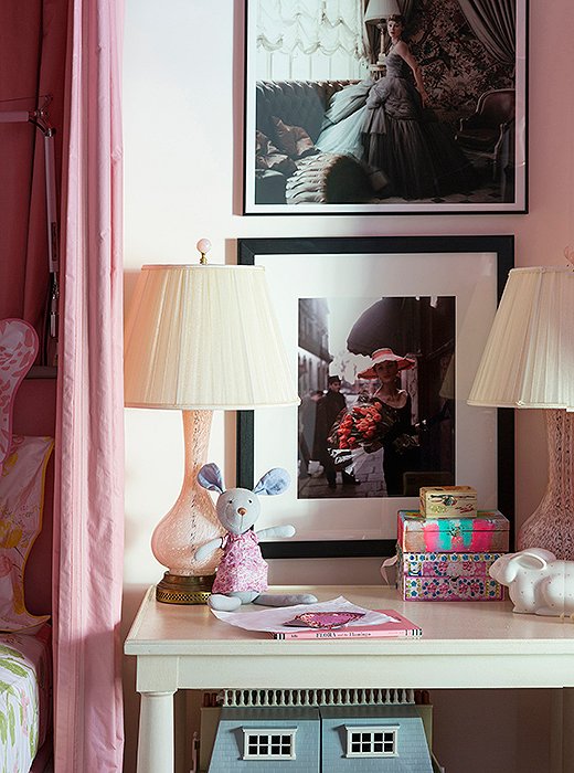
Fashion photographs are mixed with more-junior elements in the girls’ room to create a mature space that’s still age appropriate.

I wanted to create a room that had enough flexibility as they grew up that I wouldn’t have to redo the whole thing.
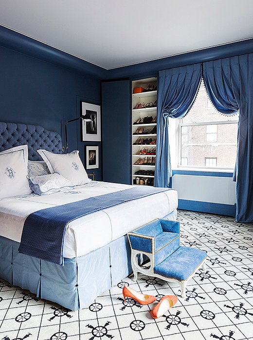
Farrow & Ball’s Pitch Blue informed the design of the master bedroom. “Once we decided on the blue for the walls—a color I feel is so French—I thought, Let’s be super French about it,” says Kate. “So I put in the Madeleine Castaing carpet and went with a really deep French-style tufting on the headboard.” A step stool at the foot of the bed completes the look. Purchased at John Rosselli, it was a 12th-birthday gift from Kate to her dog, Lucy.

Admittedly particular about bedding, Kate looked to Julia B. for her ciphered sheets.
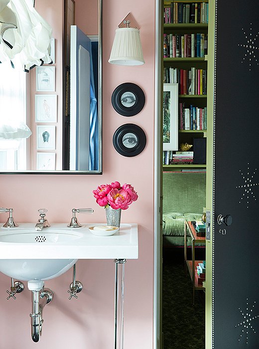
Kate had Ralph Lauren’s Persian Sunset, a discontinued shade, mixed specially for her master bathroom. “I love pink,” she says. “Green is my favorite color, but pink is happy. Pink is also so flattering. I wake up every morning and I’m like, I look good! My skin looks good, it’s so rosy and healthy!”

I try to find things that can work in both modern and traditional settings, not pieces so incredibly specific that they only work in one place and period in time.


Join the Discussion