In Harlem, atop an Italian Renaissance palazzo-style edifice built for the Astor family in 1901, is the apartment that Sheila Bridges calls home. While the veteran designer often creates contemporary interiors for clients, her own home reveals a devotion to classical design. “My sensibility skews to those shapes and silhouettes and symmetries of classicism,” she explains, “and my home is my laboratory.” Inside that refined structure she’s found lots of freedom for play: stencilling a bedroom with passages from her favorite books, for instance, and hanging outsider art in the formal dining room.
As Sheila charts her own evolving career, you might say she’s keeping the world of old-school decorating on its toes. Samples from her wallpaper line—which includes a witty take on African-American stereotypes called Harlem Toile—hang in museums. She’s had a television show; a shop in Hudson, NY; a firm on Madison Avenue. When Bill Clinton set up his offices in Harlem, she was tapped to design them. Sheila’s own life came into closer focus when, sparked by her diagnosis with alopecia, she penned a memoir titled The Bald Mermaid. The book is so imaginative and richly colored, it might have been published by an art house.
Come into one of New York’s most timelessly chic homes and meet the woman also known as @harlemtoilegirl.
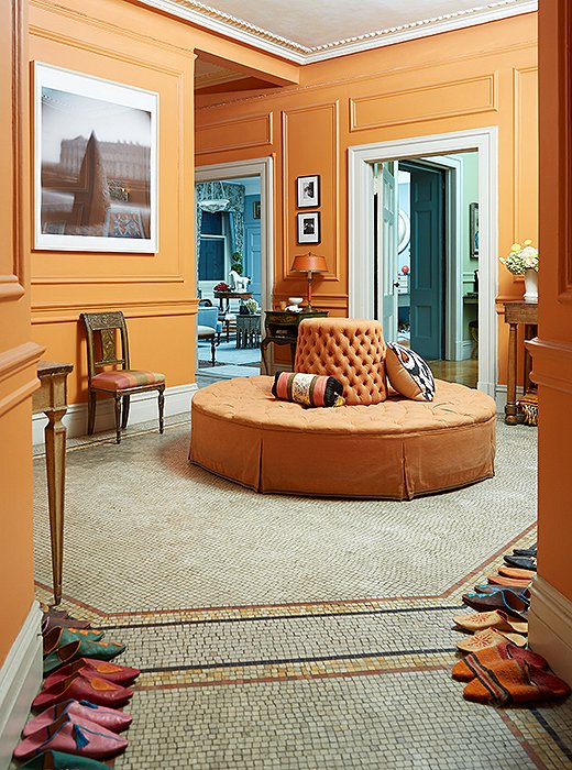
To mirror the orange tiles, Sheila placed an orange borne in the center of her entryway. In the foreground sit the Moroccan slippers that everyone wears inside.
Cleaning the Slate
Sheila says when she found this apartment more than 20 years ago, “it was a wreck.” It had just been the set for Spike Lee’s Jungle Fever, so she had to get rid of fake cabinets and a bad shellacking job. As if to clean the slate, Sheila painted it entirely in Benjamin Moore’s Cameo White. Then, after living in that creamy world awhile, she transformed the space into its current incarnation.
“As I evolved as a designer,” Sheila says, “I started to embrace color and take more risks.” It was here she first achieved that balance of lightly layered patterns and colors—nothing overblown, always exciting to the eye—that makes her so sought-after as a designer. In her own home, she hits that unexpected yet welcoming note right off the bat by offering everyone coming in a pair of patterned Moroccan slippers—she has every size under the sun. Slipping them on your feet is like easing into a more comfortable world.
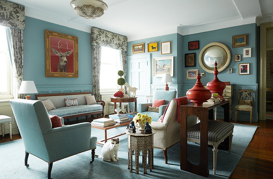
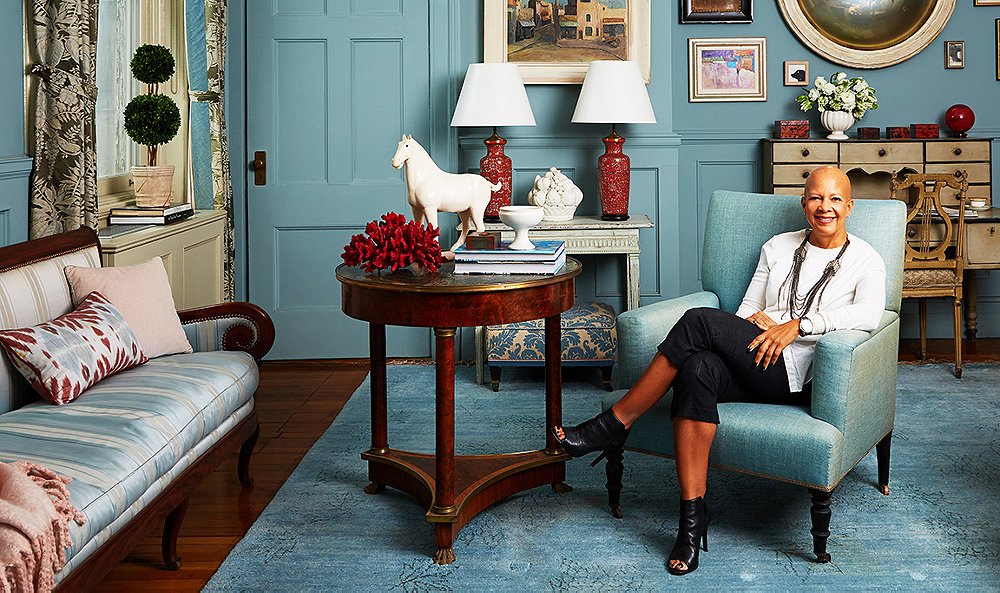
While the living room’s layout is high traditionalism, with a formal seating arrangement complete with silk-upholstered sofa, Sheila has woven in pieces from her travels such as red lacquered Burmese offering vessels and an inlaid Moroccan table.
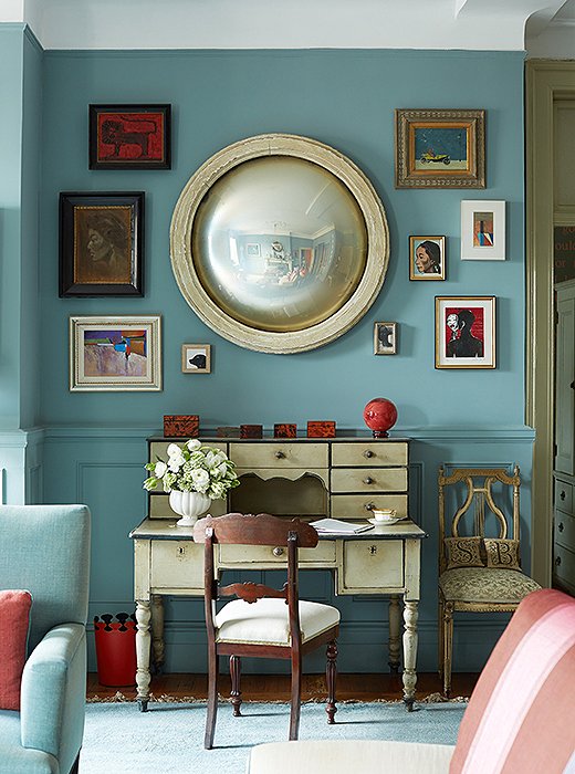
An evolving salon wall of art surrounds a French mirror. “I have a fetish for convex mirrors,” Sheila says.
Embracing the Process
Sheila traces the roots of her aesthetic to a childhood steeped in art. She grew up in Philadelphia in a “big old stone house with its own carriage house,” she recalls, which her parents filled with their art collection (much of which now hangs in her living room). True to the 1960s and ’70s, there was also lots of glass, Eames furniture, and shag rugs, which gave Sheila a lifelong fondness for putting modern pieces inside a traditional shell. Sheila’s design sense and love for classical proportion crystallized when she lived in Italy.
Beyond specific styles, Sheila’s guiding philosophy is to give herself—and her clients—time to find pieces that will last and last and last. She cautions against “blindly filling up the space,” saying instead to “respect that the design process takes time. The serendipity of gradually finding things along the journey is the fun of it. There’s no hurry.” Her approach is to create a backdrop of the floors, the walls, and the finishes, then search for the biggest piece of furniture, such as the sofa or the bed, since that’s where you should really invest.
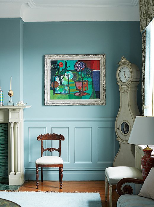
A Gustavian clock fills what was once “a dead corner,” Sheila says, “and I loved the fluidity of that clock.” The painting was an auction score.

My sensibility skews to those shapes and silhouettes and symmetries of classicism, and my own home is my laboratory.
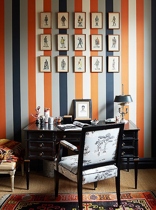
Sheila’s never met a stripe she didn’t like, and she used one of her own design for this wallpaper. The chair is upholstered in her Harlem Toile pattern, which is in the collection of New York’s Cooper Hewitt, Smithsonian Design Museum.
Always on the Go
Sheila’s life is full of intense work—and beloved dogs. “Many people don’t know that New York is one of the dog-friendliest cities in the country,” she says. Every morning she takes her dogs through Central Park, where they meet up with a regular crew, before she goes for her own run. After that, she works “wherever the light is”—often in her office, which gets eastern exposure, or the living room. She hits the streets to preview an auction or meet a client at the D&D Building or a design project.
One constant in Sheila’s world is travel, a lot of it design-driven. Yes, she did recently take a trip to Parrot Cay in Turks and Caicos to chill out, but she loves getting back to Europe—the Netherlands, Copenhagen, Paris—to see various takes on cutting-edge design. For her, travel is the ultimate way to “hit the reset button and replenish.”
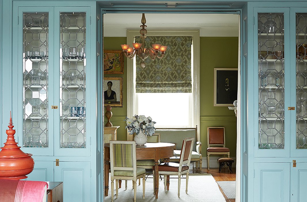
Blue-painted cabinets, which house glassware Sheila inherited from her parents and grandparents, divide the living room from the dining room. Sheila calls the dining room’s color a “Granny Smith apple green.” Find similar dining chairs here.
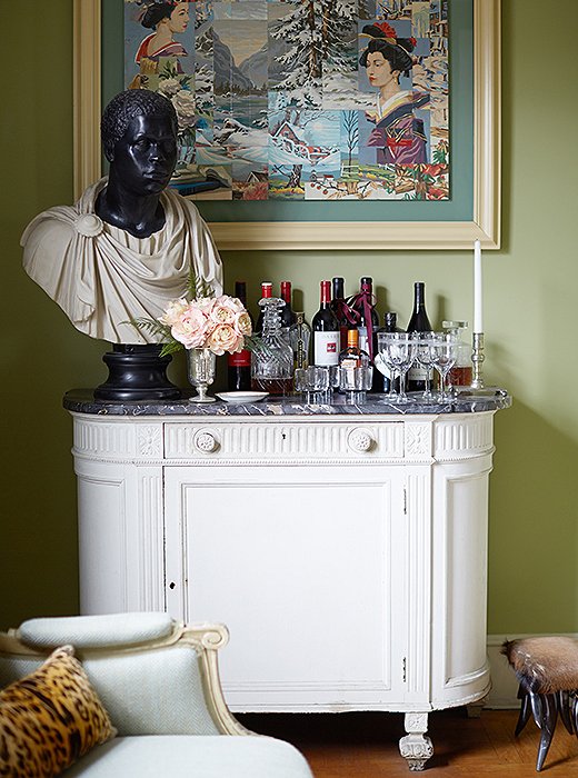
A perfectly Sheila vignette: A framed piece of outsider art hangs above a classical bust on the bar.
Dining More Democratically
In Sheila’s hands, a taste for classical design doesn’t mean being rule-bound. Case in point: Just because you have a formal dining room doesn’t mean it should feel like Downton Abbey. Sheila hit on the idea of joining two demilune tables together to make a round dining table. The arrangement perfectly suits her style: “I like the idea that there’s no hierarchy, no head of the table—everyone’s on equal footing and engages more.” To complete the look, she took a set of French dining chairs and upholstered half of them in leather and the other half in green silk.
These days, she says, what she really loves to throw is a cocktail party, when everyone can flow between the dining room and the living room, before heading to one of Harlem’s many chic restaurants. Her favorite is the one-two punch of The Cecil for dinner (“my watering hole”) and then Minton’s, next door, for jazz.
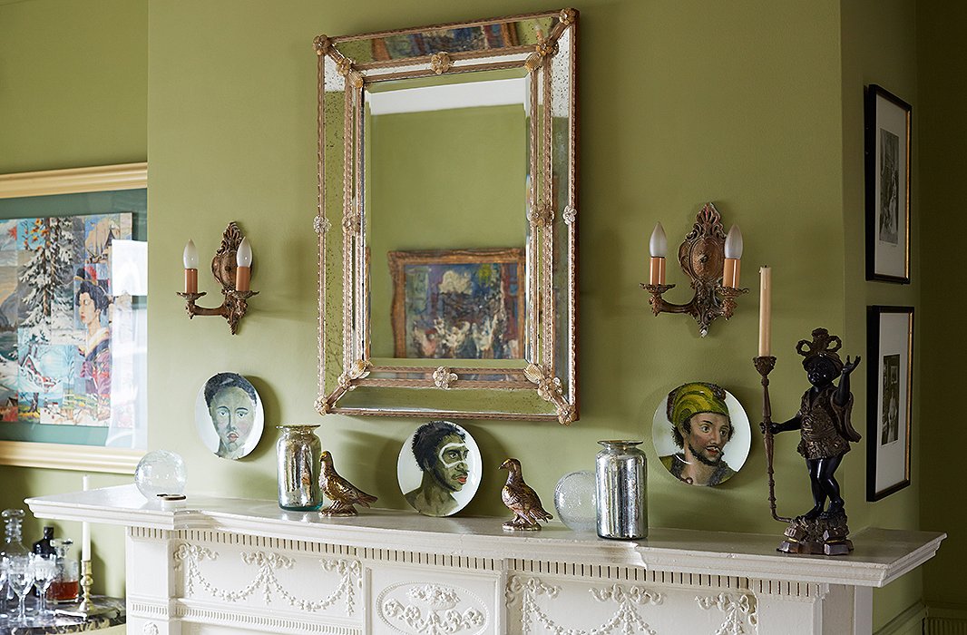
Sheila’s collection of Venetian glass includes this mirror, accompanied by a series of John Derian plates. Another dining room wall features a set of Hermès plates.
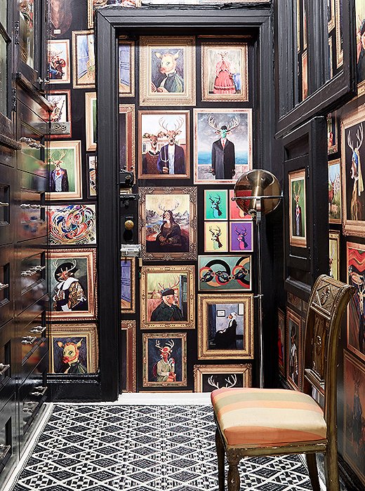
In Sheila’s Van Doe wallpaper, a deer stands in as the subject of many famous paintings. She uses the print to enliven a hallway.
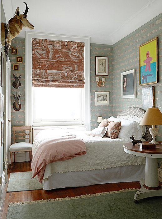
The walls of the guest room are covered in another of Sheila’s designs, this one featuring lines from beloved books.
Writing on the Wall
Sheila thinks of her walls as another canvas for personal expression. For instance, she didn’t have a formal library, so in lieu of shelves of books, she stencilled favorite quotes from beloved books in a guest room. “I started with what I remembered being read or told—like a line from ‘This Little Piggy’ and Dr. Seuss,” she says. Then she added quotes from Toni Morrison’s The Bluest Eye, from a Langston Hughes poem, from Zora Neale Hurston. The effect is both playful and deeply personal.
What is arguably her best-known wallpaper, her Harlem Toile pattern, takes the traditional 18th-century pastoral scenes and substitutes African-Americans doing “stereotypical things” like picnicking with watermelon and fried chicken or dancing to a huge boombox. She had always loved toile but wanted something that spoke to her. The effect is part tongue-in-cheek, part political commentary, part charming. “These wallpapers aren’t your grandmother’s wallpaper,” Sheila says. “They can be new, fresh, urban, and add dimension, color, pattern to otherwise boring Sheetrock walls.”
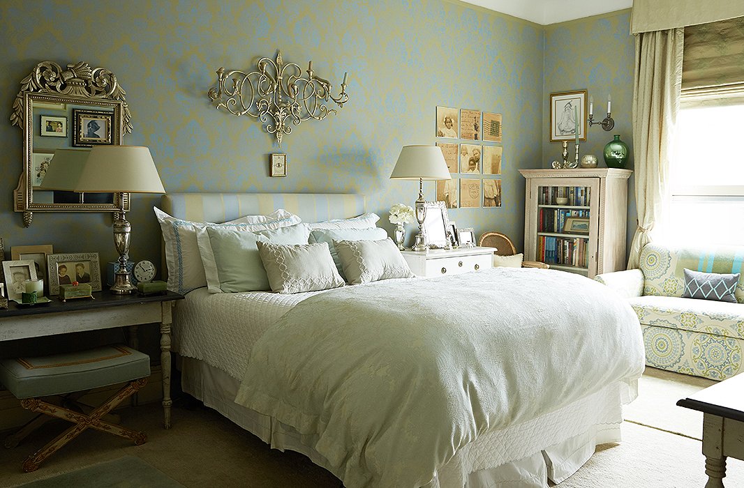
Sheila loves Gustavian furniture and anything painted gray or white: “It’s more feminine and light, and gives more flexibility in terms of decorating around it.”
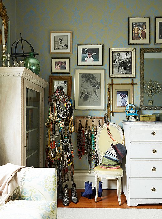
A wall of family photographs and art Sheila made when she was a child sets a personal note in the bedroom. A mannequin displays her collection of jewelry and antique bags from her grandmother.
Letting Things Go
Though the look of her apartment hasn’t changed dramatically (the bedroom is blissfully the same as it was a decade ago), there are always little additions and, more crucially, edits. Sheila likes to think of the decorating process as, in part, one of editing. For her clients, she likens it to therapy—helping people let go of the guilt that can pile up around those unused wedding gifts, misguided purchases, and inherited pieces that don’t really suit.
For herself, reckoning with accumulations of things—“especially when I had to help my parents pack 50 years’ worth of memories,” she says—was what forced her to finally edit. After donating some family china that had been sitting in a basement for years, she felt unburdened. “When there’s something you don’t love but feel obliged to, there’s always someone else who could use it,” she says.

The serendipity of gradually finding things along the journey is the fun of it.
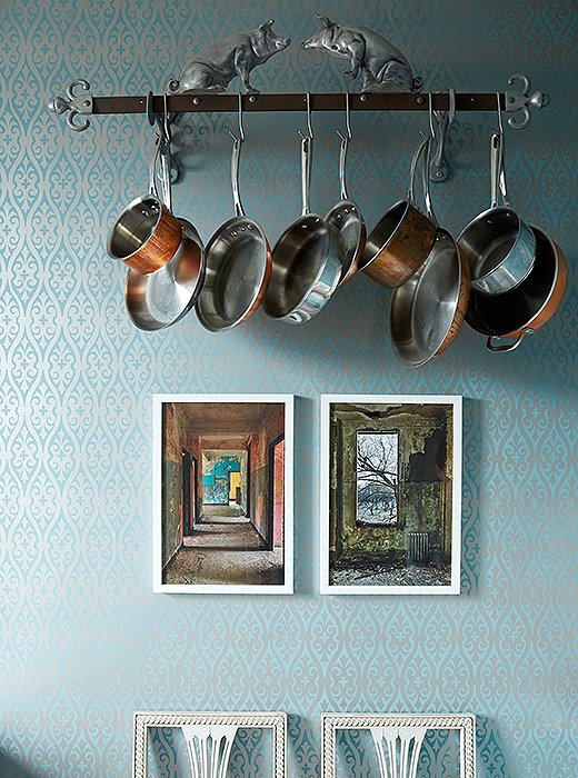
Sheila would love to see less of the all-white kitchen decorated with stainless-steel appliances: “I understand that it can be beautiful, but why not take a few risks?”
The Ultimate Refuge
In Sheila’s hands, the home can become a soapbox, a laboratory, or a salon, yet more than anything she seems to seek the same sensation you get from those Moroccan slippers that greet you in the entryway—a rush of beautiful pattern on the outside, combined with a soothing comfort on the inside. As she puts it, “It’s important to have a home that makes you feel safe and comfortable, at ease and relaxed. In spite of all the color and pattern, it’s very peaceful here. It’s a nice refuge from all the madness that can be New York City.”


What a beautiful, well -loved home.
Vibrant and beautiful. Thoughtfully designed yet playful. What a treasure trove.
This feels like a real home – elegant, yet lived in, surrounded by objects that have meaning – not just something acquired because it is in style right now. Her home is filled with memories, but not cluttered. Perfect!