During the past few years, an unexpected color has gradually become more prominent in the interiors world. At first it appeared, subtly, in fabrics and wall coverings. Now you can find it on furniture, in rugs and art, and on all manner of accessories. Designers and design-lovers call it many names: mustard yellow, tumeric, ochre, marigold. Whatever they call it, people are excited about it.
On Trend
Those with a keen eye for color would argue that this trend isn’t a trend at all. “The resurgence of ochre is a nod to a time-honored palette that will never go out of style,” says designer Marie Flanigan. For those who lived through the 1970s, this color is reminiscent of the earthy tones that rose to popularity during that decade. Sherwin-Williams includes the shade in its Color Through the Decade series, noting that “earth tones dominate in the era as the ‘earth movement’ begins in earnest in 1970 with the first Earth Day. Beige, rust, avocado, harvest gold, mustard yellow, [and] earthy brown play together in patterns and solids.”
Its popularity in recent years can be attributed to a return to color in general. “I think people love the color ochre because it’s so warm and inviting,” says interior designer Peti Lau. “It’s opulent but not pretentious. It’s really a grounding color, even though when you first look at it it feels bright.”
While it’s a wonderful color to use all year round, it feels especially au courant during fall. “Its warm hue, along with its neighboring color palettes, never fails to evoke a relaxed atmosphere,” says designer Jean Liu. For her, it conjures up thoughts of “falling autumn leaves, roaring fires, and evenings enjoying full-bodied wines.”
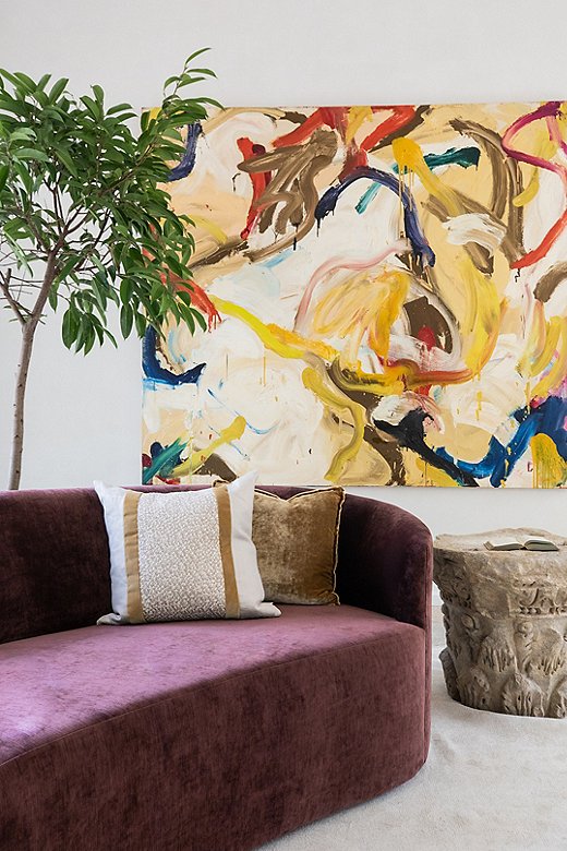
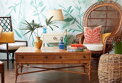
Photo courtesy of Marie Flanigan
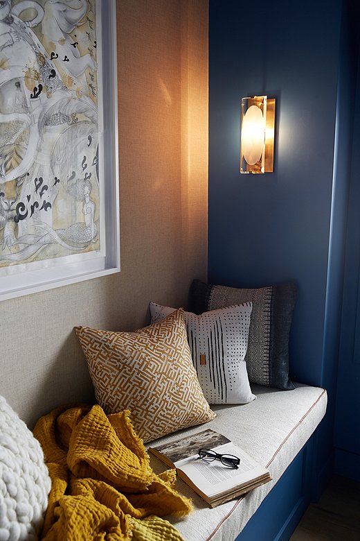
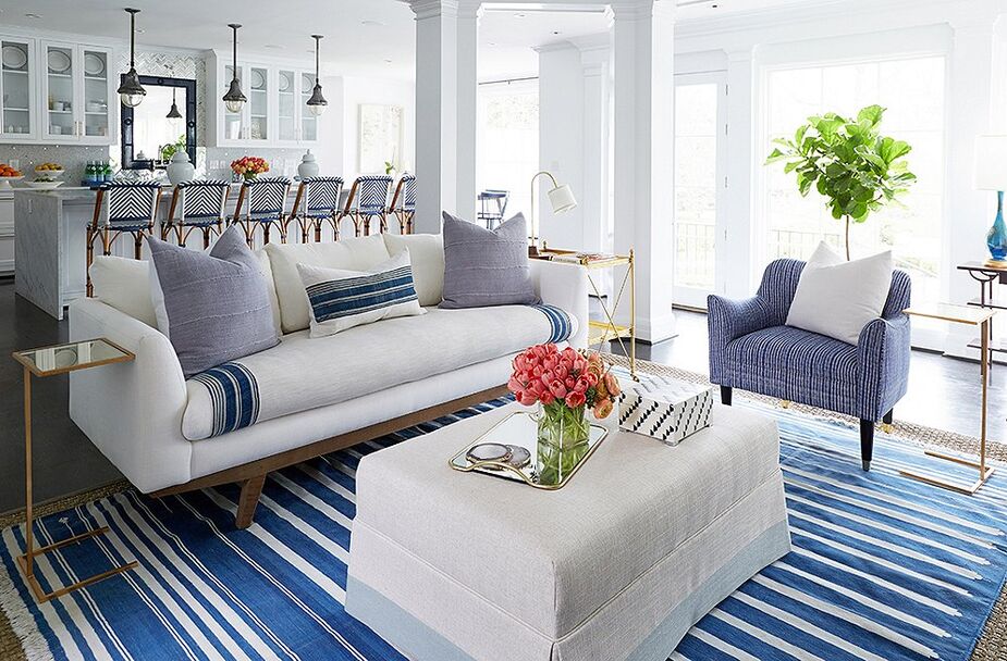
Photo courtesy of Jean Liu
Balancing Act
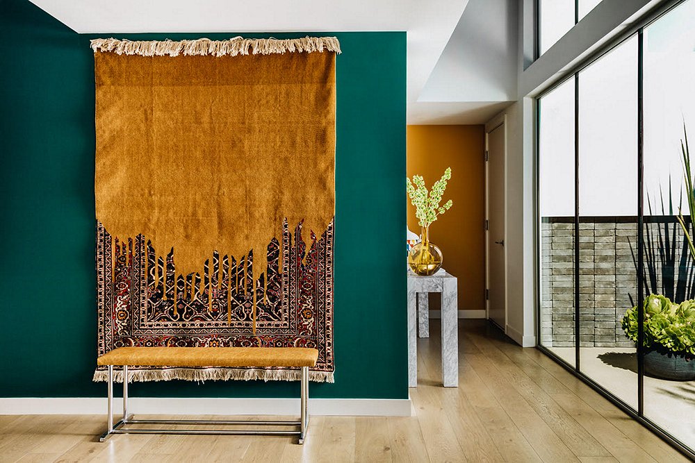
Decorating with this color requires an eye for balance. It can easily overpower a space if you aren’t careful. In the ’70s mustard yellow was typically paired with other earth tones. Today many designers opt to juxtapose it with amethyst, sapphire, or emerald for a modern spin. “I love teals and turquoise with ochre,” says Peti.
If you’re afraid to go all-in on the showstopping hue, it also makes a great accent color. Marie paired an amethyst sofa with a wildly expressive painting whose yellows add warmth to balance the coolness of the sofa. Jean paired pillows covered in a mustard yellow with a similarly colored blanket in a blue room. Much as in Marie’s space, these elements warm up the space. “I love the transformative power of the color,” Marie says.
Join the Discussion