When Paloma Contreras launched her blog, La Dolce Vita, in 2007, it was less of a career and more of a creative outlet; she already had a job as a high-school Spanish teacher. But little by little, she was drawn toward floor plans and fabrics over Spanish fluency. “I was feeling stifled, so I started penning my blog,” she says. “It began as a chronicle of our house that we had just bought.”
After six years spent remodeling and amassing an ardent fan base, Paloma made the leap into design full-time. “I quit my job at the time [director of marketing for lighting brand Visual Comfort] and opened my firm. And I’ve never looked back.”
When she’s not writing about color crushes or inspiring interiors, she’s working with clients from Southampton to Santa Barbara. “Because of Houston’s central location, it’s easy to jump to either coast,” Paloma says.
But even as her portfolio and project list grow, Paloma never forgets where it all started. The blog “is such a special thing,” she says. “It allowed me to carve out my own path, and I feel indebted to it. I’ll continue for as long as my readers will have me.”
In the home that she shares with husband Fabien and dog Tate, Paloma has created a “layered, polished, and comfortable” look. The former “vanilla builder’s box” now has plenty of character thanks to a skillful mix of classic and modern pieces, unexpected artwork, and subtle hits of pattern and color. “I wanted the house to tell our story,” she says. “To be a reflection of who we were, our taste, where we’ve been.”
Step inside the lovely home that launched countless blog posts and a blooming design career.
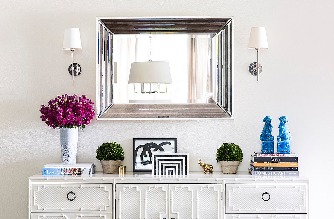
Part of a long hallway, the entry is open to a larger living space; Paloma defined the area without overpowering it. The credenza is from the 1960s and one of the first pieces the couple bought together. The mirror hails from a local store, and the sconces are Thomas O’Brien for Visual Comfort.
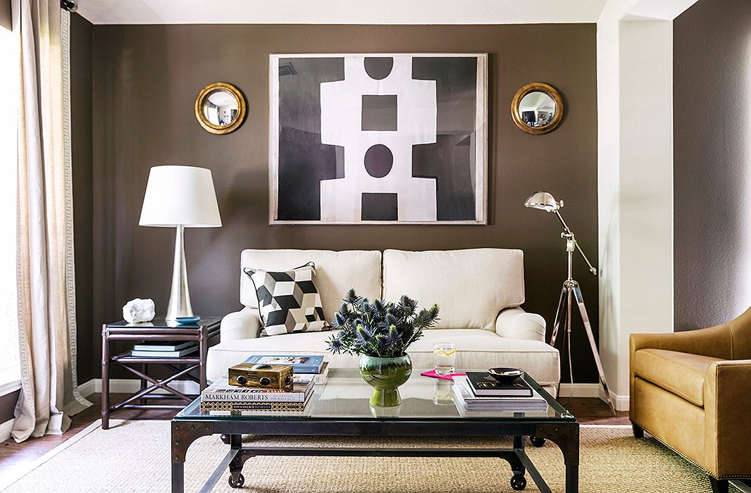
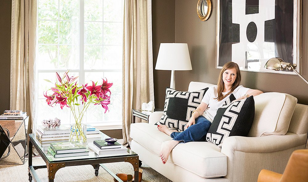
The home has two living rooms. Here, Paloma opted to create a cozy, chic salon vibe. The key? “Comfortable seating that lends itself to conversation,” she says. The English roll-arm sofa is custom. “I love how it pairs with the modern elements.” The coffee table and mirrors are vintage, and the artwork is by Paule Marrot.
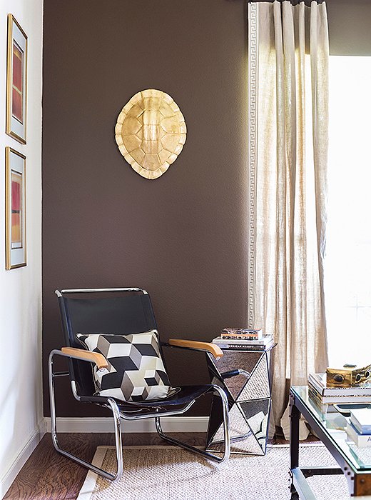
“I am not one for DIY,” says Paloma. “But we took a resin turtle shell and my husband gold-leafed it himself. It is a conversation piece!” The vintage Marcel Breuer chair (part of a pair) was a hand-me-down from her parents. “They’re special, since they’ve been in my family for decades.”
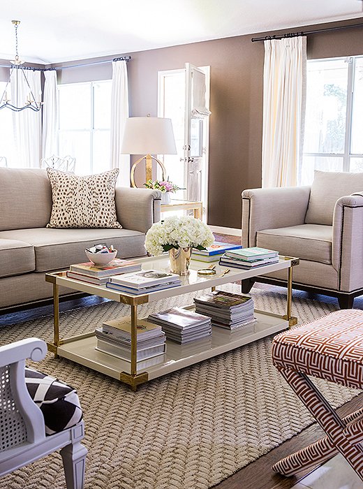
There’s no overhead lighting in the second living room, Paloma says, “because I wanted it to feel intimate. It gets nice natural light all day and glows in the evenings when the lamps are on. We enjoy conversation and cocktails before moving into the adjacent dining room for dinner.”
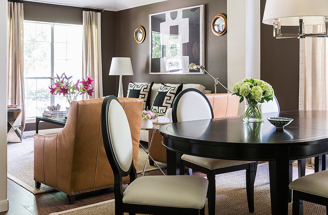
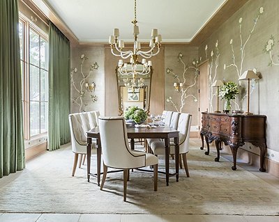
The dining area, just off the living room, reveals the home’s prevailing palette. “I use black, gray, chocolate brown, and then a few pops of color here and there.” The couple bought the dining table and chairs at a local showroom just before they were married.
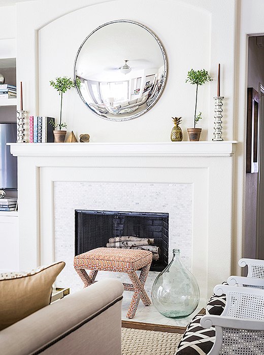
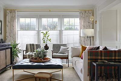
Open to the kitchen, the second living room is relaxed and airy while retaining Paloma’s signature polish. The sofa is custom. “I wanted something with clean lines that still felt classic,” she says. The rug’s as sturdy as it is stunning. “We spend a lot of time in this room with our dog.”

Everything should mean something to you, whether it’s a book on a favorite city, a painting from a favorite artist, or an object that reminds you of someone you love.
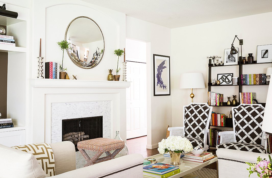
Paloma played with pattern in the space. “The chairs are 1940s, and we had them recovered in a fun bamboo print,” she says. “I designed the fabric used on the upholstered stools.”

It’s just an easy house. There isn’t anything pretentious about it or too precious.
![“I love this [Bernhardt] coffee table. The contrast of the cream lacquer and brass hardware is really beautiful,” says Paloma. Her styling tip? “I think a good mix of books, a few carefully chosen accessories, and fresh flowers are always a winning combination.”](https://okl.scene7.com/is/image/OKL/082916_PalomaContrera_23?wid=1066&op_sharpen=1)
“I love this [Bernhardt] coffee table. The contrast of the cream lacquer and brass hardware is really beautiful,” says Paloma. Her styling tip? “I think a good mix of books, a few carefully chosen accessories, and fresh flowers are always a winning combination.”
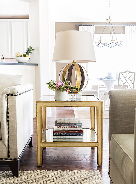
The gilded side table and lamp add some glamour to the tonal space. Paloma loves using fresh-cut flowers of all kinds. “Peonies, hydrangeas, and roses are my favorites. But I also love potted orchids, which last longer and look beautiful.”
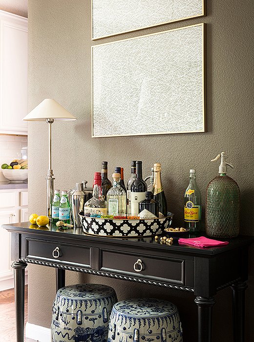
When it came to the bar, Paloma chose a console. “I love bar carts,” she says. “But I don’t find them to be all that sturdy or practical. Then I add a great-looking tray, glassware, maybe a lamp or two, and some art or a mirror above to define the area.” The house cocktail chez Paloma? “I like rosé or sauvignon blanc. My husband makes a great Maker’s Mark and ginger.”
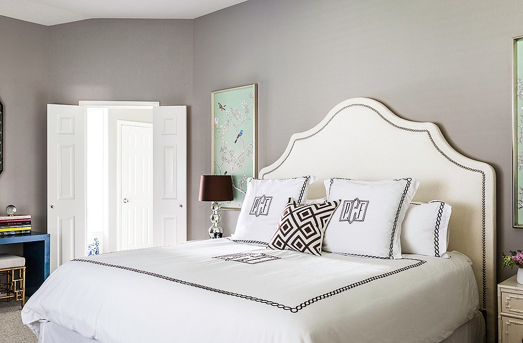
The master bedroom is one of Paloma’s favorite spaces. “It is kind of a departure from the rest of the home,” she says. “It’s much more feminine and glamorous.” Adding to the drama are a sumptuous upholstered headboard, monogrammed linens, and silk wall panels on both sides of the bed.
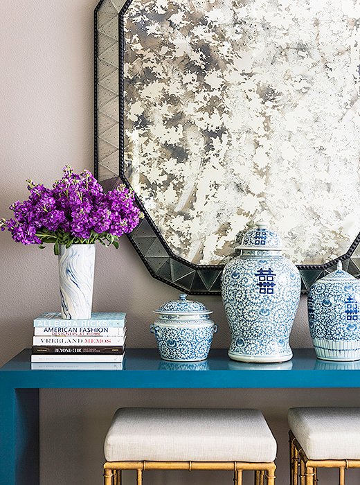
An unexpected major style moment in the master bedroom comes courtesy of a Karl Springer Parsons table. “It’s from the early ’70s,” says Paloma. Originally lime green, the console has had many color incarnations. “I chose this peacock blue because I was really inspired by it at the time. And I still love it.”

You can definitely mix design styles, periods, colors, patterns, but it’s about knowing when to edit and when to take something out.
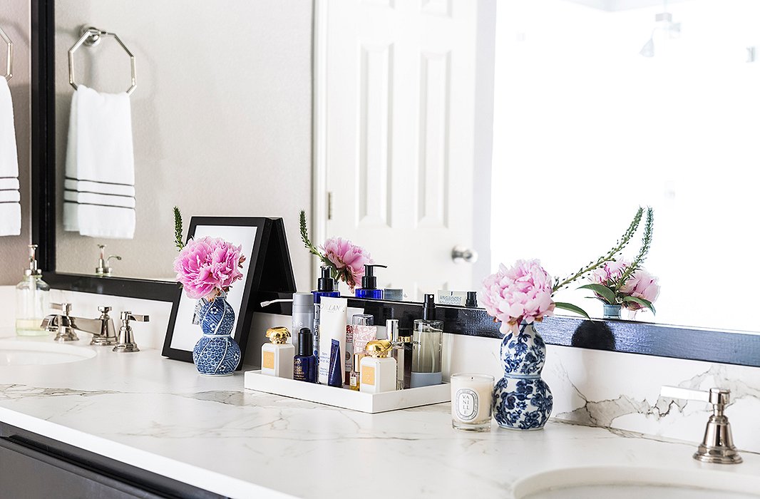
The master bath boasts a picturesque vanity. “Everything should have its place and be hidden if possible,” says Paloma. “If you don’t have room, use trays so it feels neat and collected.” She always opts for timeless materials in baths. “Think marble, a neutral palette, polished-nickel fixtures, and pretty lighting.”
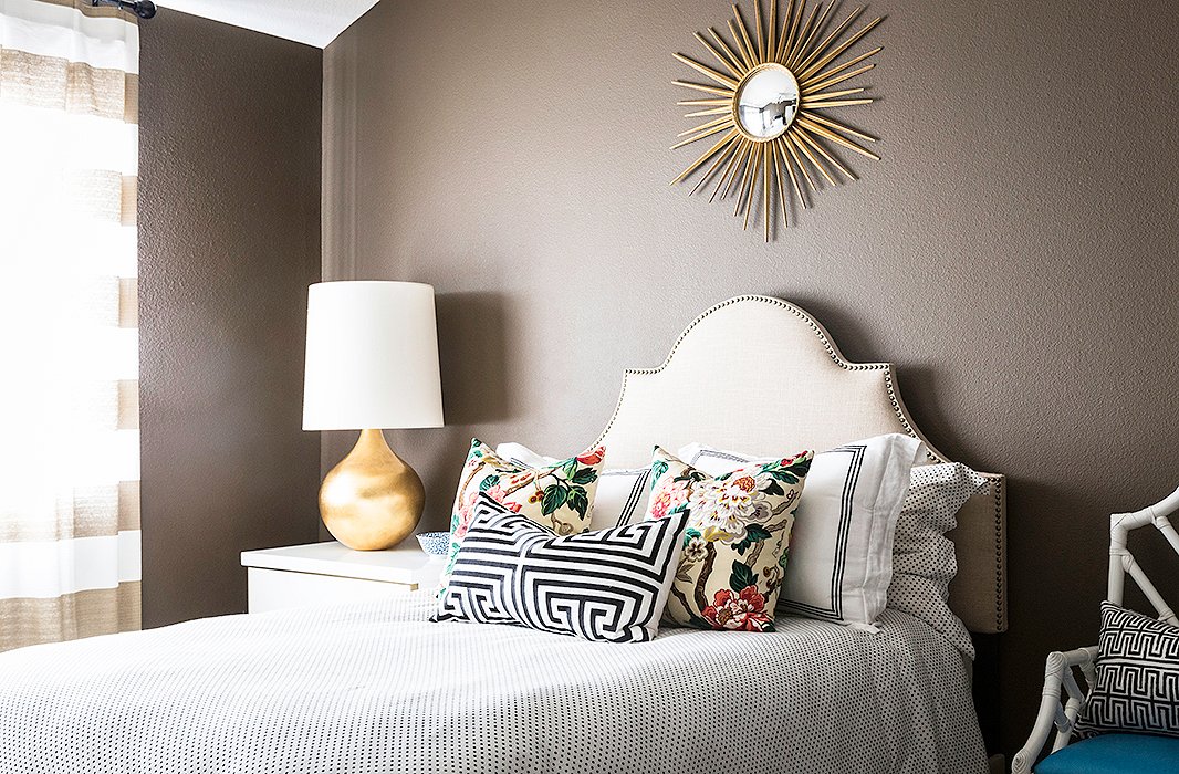
Paloma likes guests to feel “comfortable and happy.” Not a stretch in this pretty guest suite. An upholstered headboard is the background for a rich mix of bedding and pillows. She pairs a polka-dot duvet and shams with hotel linens and a pair of chinoiserie pillows with a peony print. A Greek key lumbar pillow finishes the look.

From a decorating standpoint, guest rooms are an opportunity to have more fun and take some risks with pattern or color.
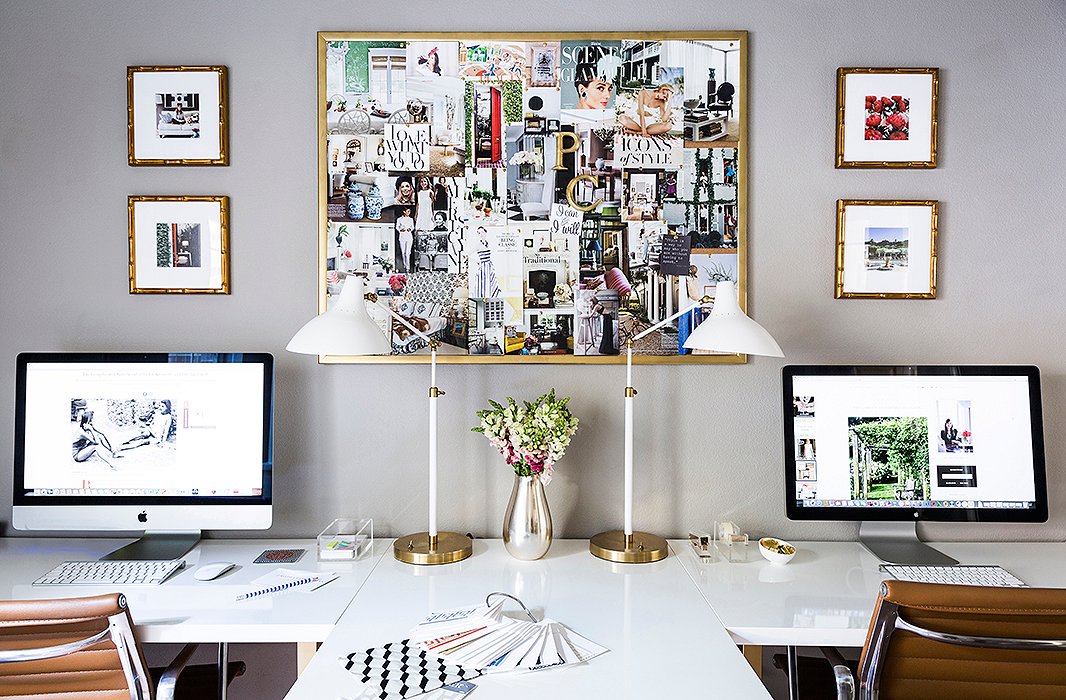
Paloma doesn’t have a lengthy commute to her office. Her home design studio comfortably fits the designer and her staff. “I wanted a space that was organized and had lots of storage, and so we eventually had this custom built-in desk made, which was a game changer,” she says. “The inspo board is a personal statement. The images speak to my aesthetic and make me happy.”
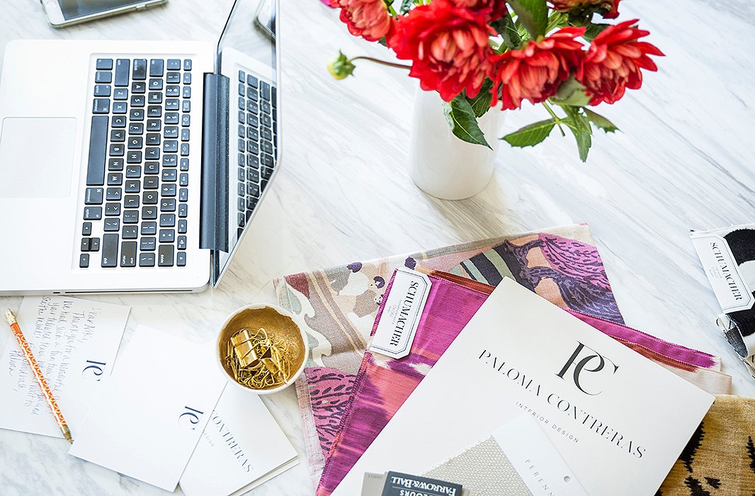
Paint chips and fabric swatches cover the table in Paloma’s breakfast nook. “I definitely have colors that I use a lot because they’re ultraflattering and seem to work in almost any space, like Benjamin Moore Revere Pewter, a soft warm gray. And their Decorator’s White is great. It’s crisp but not cold.”
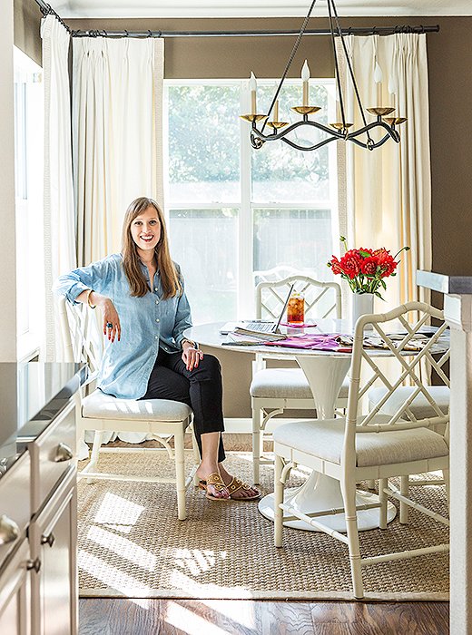
A polished Saarinen Tulip table and chinoiserie chairs fill a sun-drenched breakfast nook, where Paloma often works. The iron chandelier and the sea-grass rug balance the cool sheen with some natural texture.
Design Update
Just before this home tour was published, Paloma, her husband, and their dog settled into a new home in Houston. We’re excited to follow another interior evolution on her blog and via her Instagram @ladolcevitablog.
Join the Discussion