Instagram feeds and magazines are filled with photos of perfectly styled bookshelves where books seem an afterthought. But what if you actually have a library of books that need to be stored on your shelves? Is it possible to make those look good as well?
As we’re about to show, the answer is a resounding yes, with or without the addition of decorative items.
Book Smarts
“Books are beautiful,” says designer Becca Roderick. “The key is that you have to organize and display the books, not just chuck them on the shelves and hope for the best.”
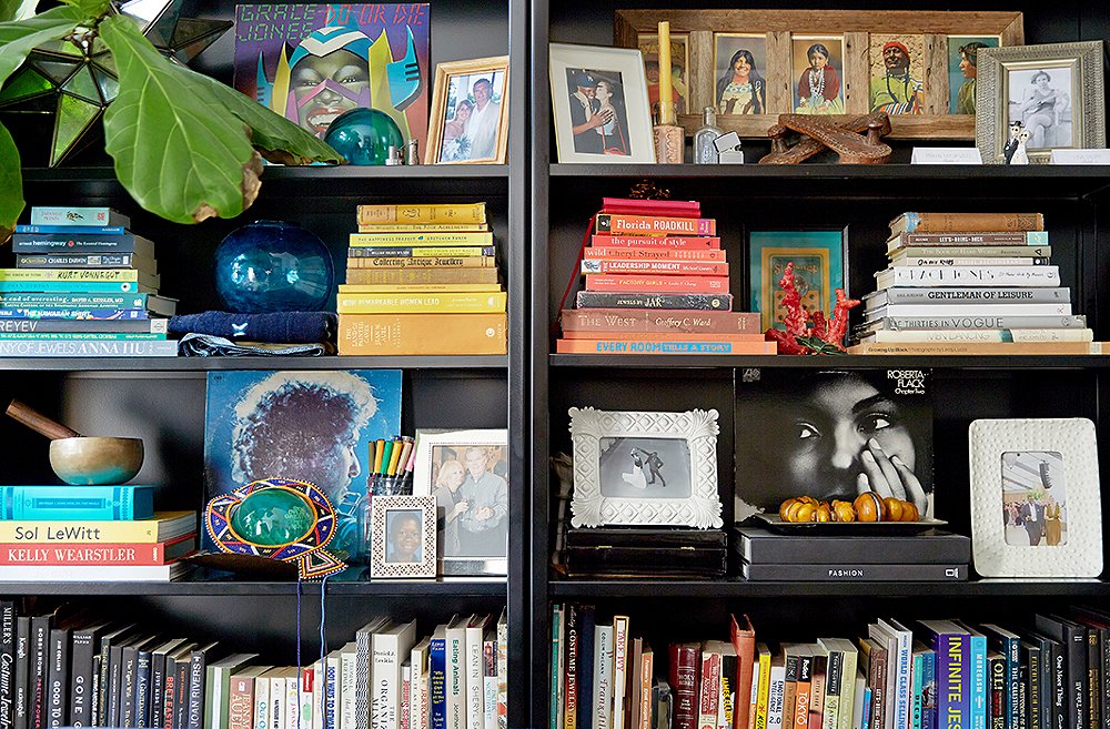
Those who aren’t a slave to the Dewey Decimal System can try organizing their books by color. “It’s a great way to add impact on a budget because it is just about organizing what you already own in a playful way,” Becca says. For best results you may have to remove the jackets from your hardcovers.
As for the somewhat controversial (at least among book-lovers) tactic of shelving your tomes so that the fore edges rather than the spines are displayed, Becca dubs it “another fun way to display your books that is impactful.” To create the same impact while retaining functionality, you could make identical covers for all your books and label the spines. Kraft paper is a durable and neutral option.
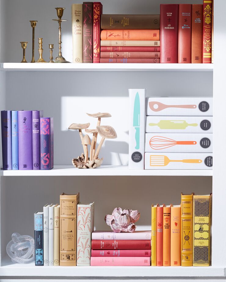
Alternating stacks of horizontal books among rows of vertical books can add visual interest—and enable you to neatly fit oversize volumes on your shelves.
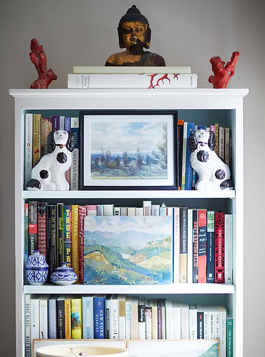
Placing art and collectibles in front of book spines can make a shelf look more cohesive (and can also obscure the titles of those guilty pleasures you might not want others to know you’ve read). Photo by Manuel Rodriguez.
If being able to easily find titles is more of a priority than aesthetics, or you have too many volumes to consider crafting covers for, you can still make those shelves look Instagram-worthy. “The most basic approach is to simply organize all the books with the spines facing out and all the covers facing one direction,” Becca says. “This simple approach will improve the look of your shelves right away.”
Those who find that a bit monotonous—or who have oversize books that don’t fit on their shelves—can alternate the rows of vertical books with stacks of horizontal ones. Stacks can also help fill the height of tall shelves.
For some bibliophiles, this is all the advice they need. Most of us, though, probably want to add at least a few decorative items among our tomes. For that, read on below.
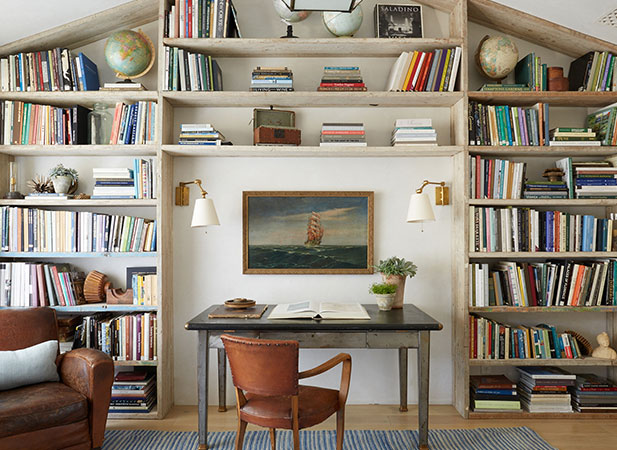
There’s no ideal ratio of books to objets, but there are guidelines to help you style shelves that work for you.
Top-Shelf Styling
When styling shelves for clients, “I think about three things,” Becca says. “First, what is the overall aesthetic that I am trying to achieve? Is it clean and minimal, for example, or traditional and abundant?Second, what does the client have already that makes sense to display? And finally, how can I bring balance on the shelf overall? Sometimes they may be packed with books and only a few small items, while it is also completely appropriate for your shelves to be filled only with objets, or every combination in between.”
While it might be easier to style shelves when you have some empty space to play with, that’s not a requisite. If your shelves are packed with books, consider pushing the tomes to the back of the bookcase and adding art, photos, and knickknacks in front of them.
To achieve visual balance, think about filling the vertical spaces along with the horizontal. A tall vase can complement stacked books, and the stack of books can also serve as a pedestal to elevate a favorite figurine or photo. Wallpapering the interiors of the shelves or painting them a contrasting color can also visually fill the space and tie the disparate objets together.

Painting or wallpapering the back of your shelves helps visually fill empty spaces and adds a flash of personality.
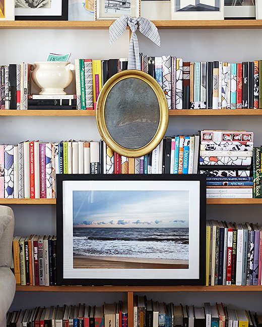
“Don’t forget about the outside of the bookshelf as well,” Becca says. “It’s a classic look to hang art on the outside of the bookshelf.” Photo by Manuel Rodriguez.
Ultimately, finding your ideal visual balance takes trial and error. For some, nothing less than perfect symmetry will do. For others, balance is ensuring that no one shelf feels more crowded or heavier than another, or that the decorative accents are eye level while the books are on the lower shelves. Any and all of the above is fine.
The most common mistake people make when styling a bookcase, Becca says, is simply giving up too soon: “Styling a great bookshelf takes time and effort. Simply being thoughtful about what you’re displaying and how you’re displaying it is a great place to begin.”
Join the Discussion