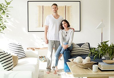
A blank slate with soaring beamed ceilings, a classic brick fireplace, glowing windows, and elegant white paneled walls, the living room in fashion designer Jenni Kayne’s Los Angeles home was pretty much an interior designer’s dream project. After recently moving in, the designer, who’s known for her laid-back apparel and accessories, called upon the team from One Kings Lane Interior Design to help her instill a similar sense of effortless cool in the space.
“I wanted it to be beautiful but also really comfortable and usable for the entirely family,” Jenni tells us. “It’s the one room we really all hang out in, so I didn’t want anything to be too precious. We have kids and dogs—I think that says it all.” She sought to create a space that was simple, organic, and natural, “not too complicated or serious, but with each item still being thoughtfully considered.”
For One Kings Lane designer Alex Reid, it was important to create a beautiful, functional design that not only reflected Jenni’s taste but also brought out the best of the architecture. “By layering textures and editing out our color scheme, we achieved a balanced and sophisticated space that works well for her lifestyle,” Alex says.
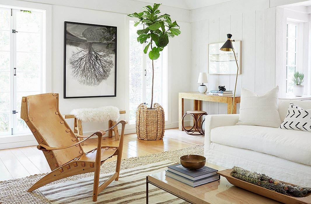
The house was a blank canvas, but Jenni had set aside a few pieces from her previous home that she thought might end up working in the space. “Jenni had a great collection of vintage leather chairs that I definitely wanted to incorporate,” Alex tells us. “We thought a supersimple slipcovered sofa in white would work well with them, and we also brought in a lot of vintage pieces to pull the look together.”
Au Naturel
A major theme throughout the space is the presence of natural furnishings. From wood furniture such as a burl console and bentwood Thonet stools to woven elements including a sea-grass planter and cane Hoffmann dining chairs, the influence of the great outdoors is felt throughout. It’s decidedly Californian and very in tune with Jenni’s personal style. “I love to decorate with natural textures, neutral colors, art, and handmade objects, and those elements are all represented,” she says.
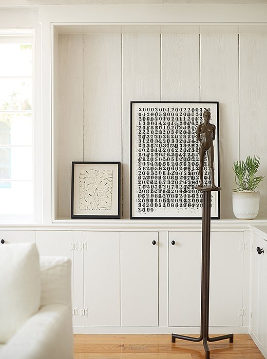
To achieve a calm and chic atmosphere, Alex tells us, “layers of white and tan were the way to go. Popping those shades with modern abstract art in black and white pulled it all together.”

I look for special items in my wardrobe the same way I look for them for a room. I want something that’s hand-worked and considered, something that tells a story and will age beautifully.
Monochromatic Accents
Beyond a majestic fiddle-leaf fig tree, there’s not much color to speak of in the space, but Alex made up for it with graphic, eye-catching pops of black. Mud-cloth pillows, midcentury floor lamps, and abstract artwork in black and white provide vivid contrast in the subdued space. And Jenni’s predominantly monochromatic art collection, which includes everything from landscape photography to typographic prints, can easily be moved around as she acquires new pieces or seeks a change.
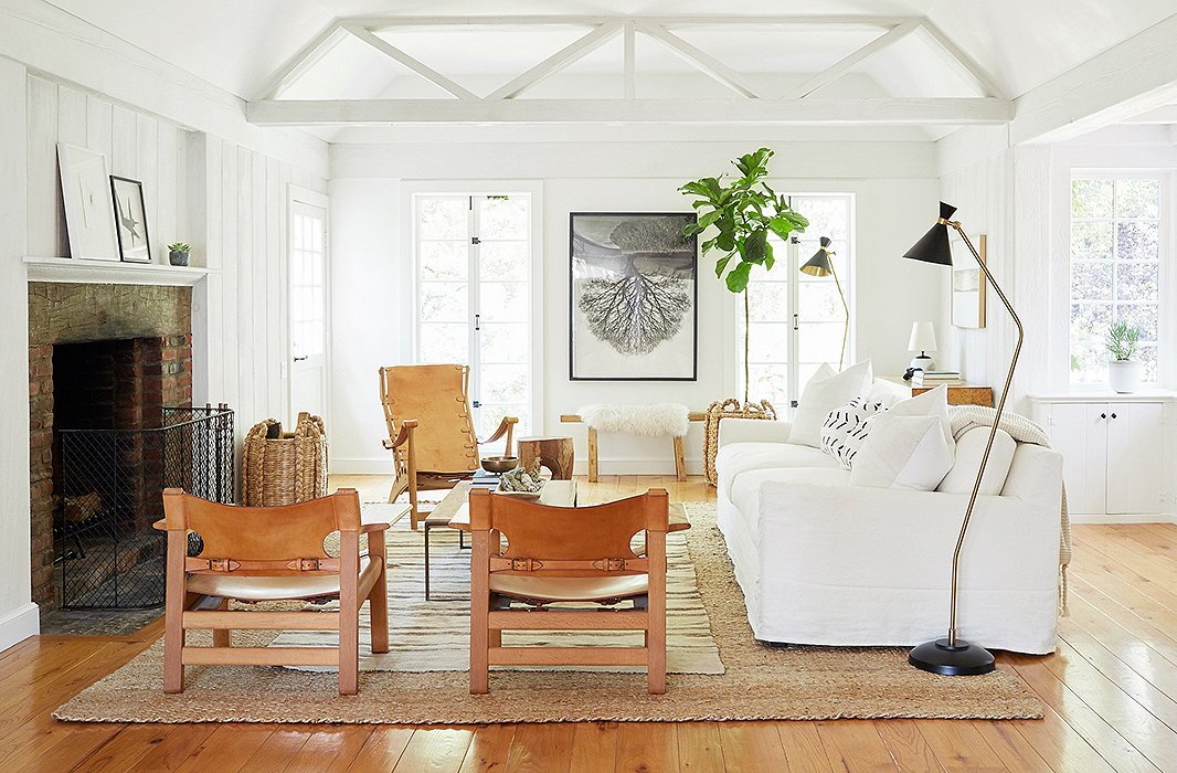
The design of this space was in part inspired by the living room in Jenni’s former home, which also had a lot of wood accents, white couches, and a central fireplace. “I love that everything is centered around the big fireplace,” she says. “It has a great feeling and makes you want to curl up on the couch and hang out all day and into the evening.”
A Master Class in Minimalism
While Jenni praises the One Kings Lane team for “making [her] vision come to life,” Alex admits he learned a lot from his client as well. “I can sometimes be a ‘more is more’ type of designer, but working with Jenni I definitely became much more edited and somewhat of a minimalist,” he says. “It’s not about having a ton of pieces to fill a room. It’s more about having the right pieces.” Intriguing, unusual finds such as a chandelier with articulated arms and a bronze figurative sculpture provided just the right amount of interest.
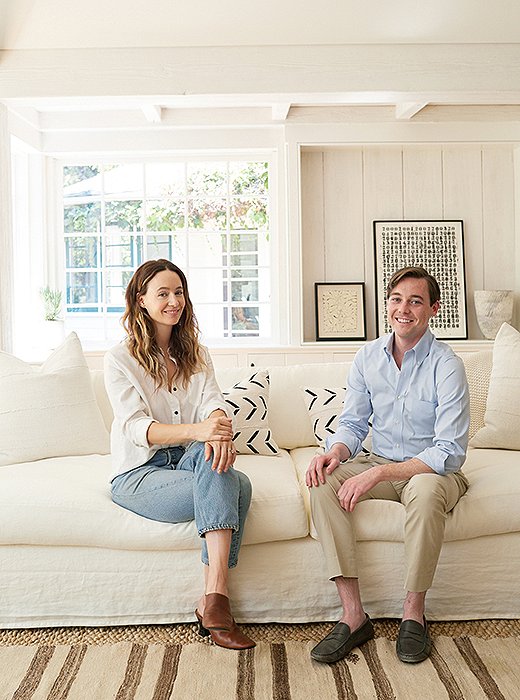
“I love the kilim rug because it’s grounded but still has personality,” Jenni says. “I like to layer old rugs over jute or sea grass so that you don’t have to worry about finding the perfect size.”
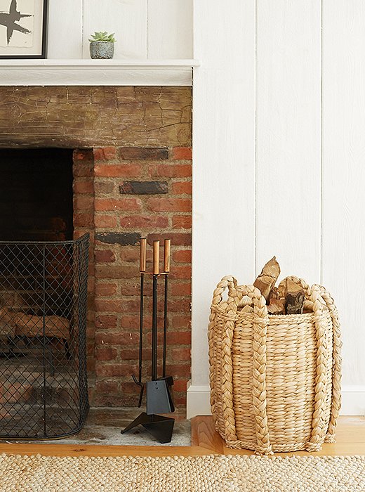
“The architecture of the room gives this design the casual feeling that it really needs,” Alex says. “It truly makes it a laid-back California living space.”
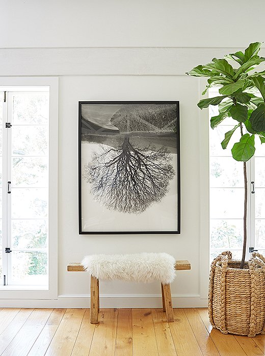
“I love to decorate with natural textures, neutral colors, art, and handmade objects, and those elements are all represented in the new living room,” Jenni says. This vignette—with its sheepskin-topped wooden bench, fiddle-leaf fig tree, and original art—incorporates all her favorite things.

It’s not about having a ton of pieces to fill a room; it’s more about having the right pieces.
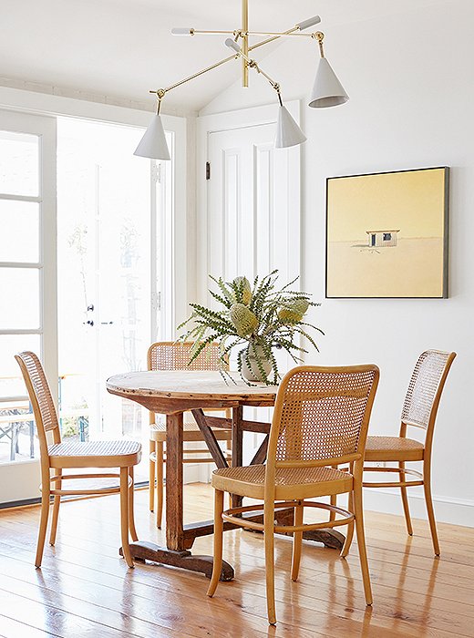
“The vintage Hoffmann dining chairs are so classic and chic. I love them,” Alex says. Juxtaposed with the French barn table, they “bring more texture and character to the space, without a ton of color.”
Alex Reid’s Top Tips to Get the Look
- “Keep your color palette to a minimum, and bring in details through texture.”
- “Use contemporary light fixtures juxtaposed with more-traditional furnishings—it creates that cool mix.”
- “Layer your rugs. I do this in every project—it’s comfortable and chic.”
- “Pop your neutral upholstery pieces with black. We used this in the art and lamps, and it helps give a stronger edge to your design and keeps it fresh!”
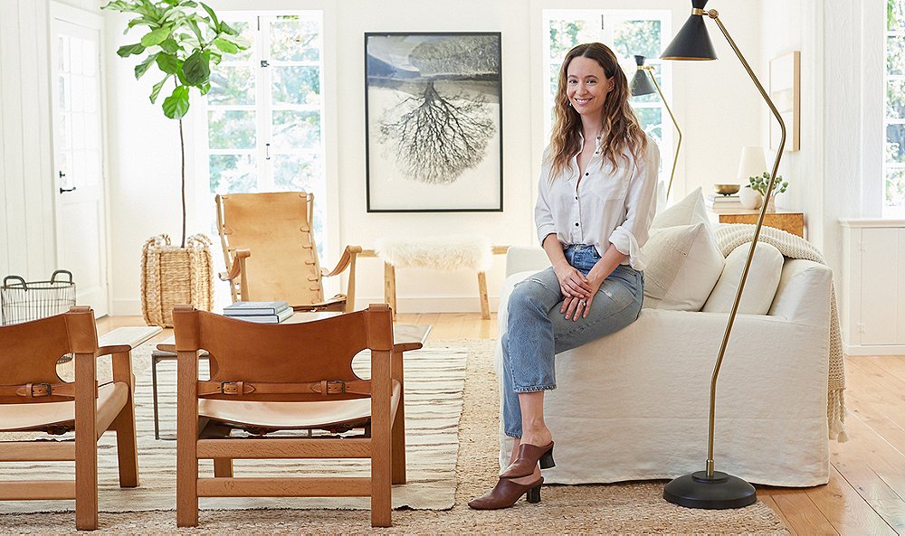
![“In the living room, the burl-wood console and mismatched Thonet ottomans bring a lot of texture and character,” Alex says. “I love that we didn’t use a matching pair [of stools]. It helps you remember that nothing is perfect.”](https://okl.scene7.com/is/image/OKL/081716_JenniKayneMakeover_11?wid=520&op_sharpen=1)

Join the Discussion