When a client’s directive for a design project is “Let’s just have fun,” the result is sure to be something special. That was precisely the case with a recent home redesign by Hannah Crowell of Nashville-based Crowell & Co. Interiors. Longtime clients had purchased a brand-new, fully furnished vacation house in Anna Maria Island, FL, but found it lacking the personality and pop they craved. Hannah took up the challenge, bringing along her signature mix of vibrant color, bold pattern, and eclectic artwork and furnishings.
Her goal was to create a fun and functional home that the clients, their young kids, and their friends and family would enjoy for years to come. But she didn’t want to create a typical Florida beach house (no seashell motifs or sorbet pastels—though you will spot a mermaid or two). “I never want my projects to feel overly designed but rather playful and imaginative—especially a beach house for a vibrant young couple and their supercute kids,” she says.
First order of business: paint. “All the walls were a light shade of blue that was pretty but just a little too blue,” Hannah says. “We painted the entire house white and began anew.” Read on to see how this sunny, spirited space came together.
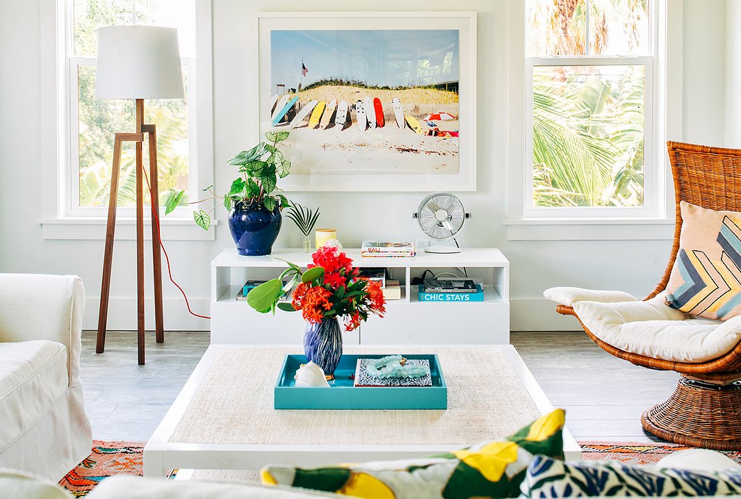
“This home has a lot of art that is beach themed, but instead of local beaches I focused more on beaches around the world,” Hannah says. “There are some Los Angeles surf photos, one from Hawaii, and another of the Amalfi Coast. I think it makes the house feel a little more eclectic and unpredictable.” The photo above is Ditch Plains by Natalie Obradovich.
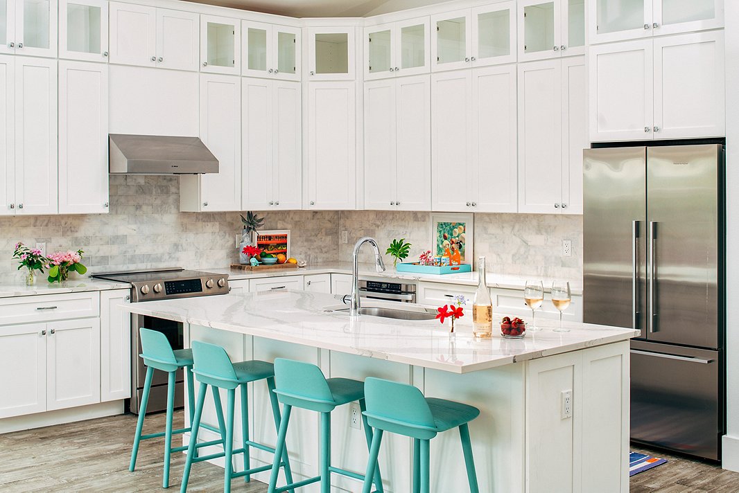
Light, bright, and airy: Everything you want in a beach-house kitchen. A row of turquoise barstools offers the perfect spot for post-pool lunch.
Letting Instinct Lead
Hannah describes her aesthetic as “modern bohemian” but doesn’t limit herself to any single style. “I like clean lines and minimalism, but then I also love to go overboard with wallpapers and textiles. I try to create well-curated spaces that somehow straddle those two worlds,” she says.
To achieve that balance, the designer takes a somewhat intuitive approach. Art placement, for example, is often done on the fly. “I always tell clients not to think about where the art is going but rather focus on what you love,” she explains. “I’ll be intentional about the art if there’s a large wall I need to fill or a quirky little spot that needs something specific. Otherwise I just wait until it all arrives in the space to figure out placement.”
Design schemes come together in a similarly fluid way. This home incorporates touches of turquoise throughout, from the barstools in the kitchen to the tray on the coffee table to the vanity in the boys’-room bath—a thread Hannah recognized only after her photographer pointed it out. “I love it,” Hannah says of this unconscious theme. “I am not a structured person by nature, and I think my work follows suit.”
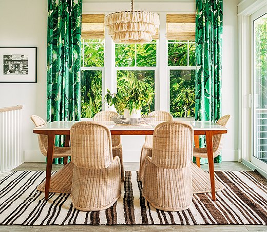
The dining room curtains, custom-made from Dorothy Draper’s iconic Brazilliance fabric, are one of Hannah’s favorite elements in the home. “I have carried that fabric around for years, just waiting to have someone love it like I do,” she says. “When my clients called me about this project, that fabric was the first thing I thought of.”

I like clean lines and minimalism, but then I also love to go overboard with wallpapers and textiles. I try to create well-curated spaces that somehow straddle those two worlds.
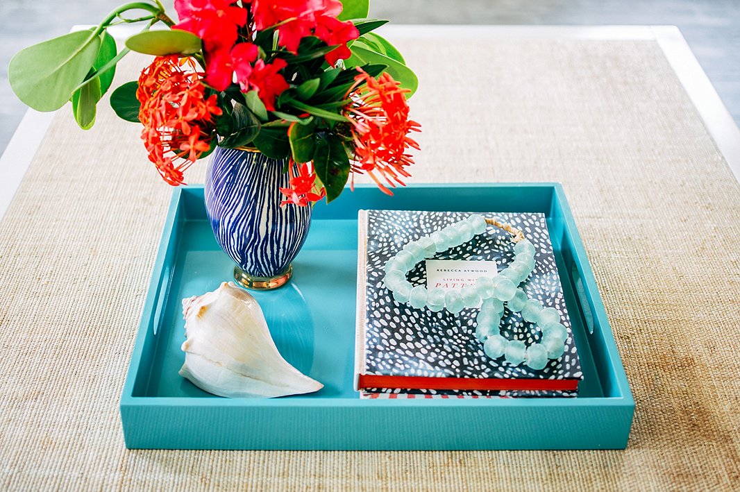
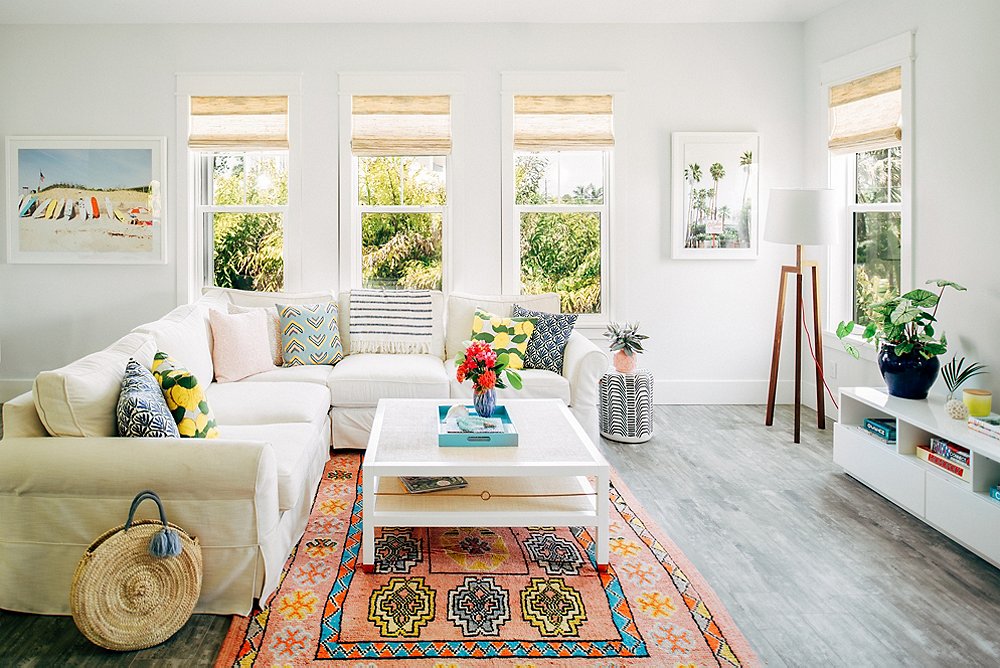
A string of beads in sea-glass blue and a vase of tropical flowers create a focal point atop the living room coffee table. The raffia surface adds relaxed, earthy texture to the space.
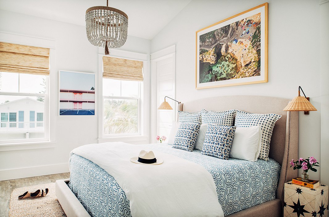
“I love mixing patterns and textures and prints,” Hannah says—and she does so fearlessly, whether it’s a bright banana-leaf fabric paired with a bold striped rug or a mix of three geometric prints on a bed, as in this master bedroom. “I am of the mindset that if you love something, it will somehow work into the space.” For a similar chandelier, see the Surrey. The art on the far wall is Vegas Motel by Claudia Lucia.
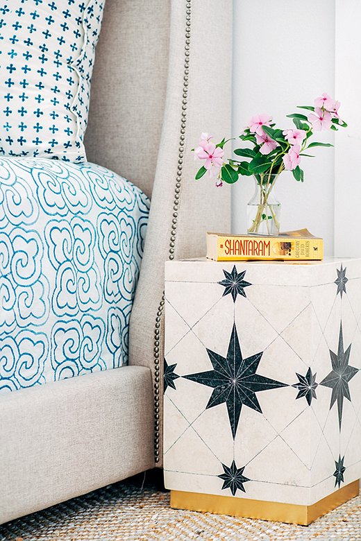
A side table with a black-and-white geometric pattern is an unexpected—yet decidedly chic—choice for a nightstand. The bed’s neutral upholstery lets the blue-and-white linens take center stage.

I never want my projects to feel overly designed but rather playful and imaginative—especially a beach house for a vibrant young couple and their supercute kids.
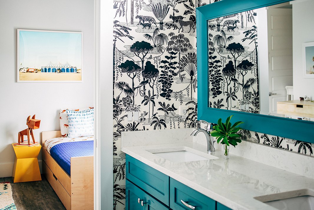
The home’s existing plumbing and lighting fixtures were all brand-new, so while they wouldn’t have been Hannah’s first choice, she opted to work with them rather than start from scratch. “I could not in good conscience replace them,” Hannah says. “Instead I created bold moments with wallpaper and art to draw attention away from the fixtures.”
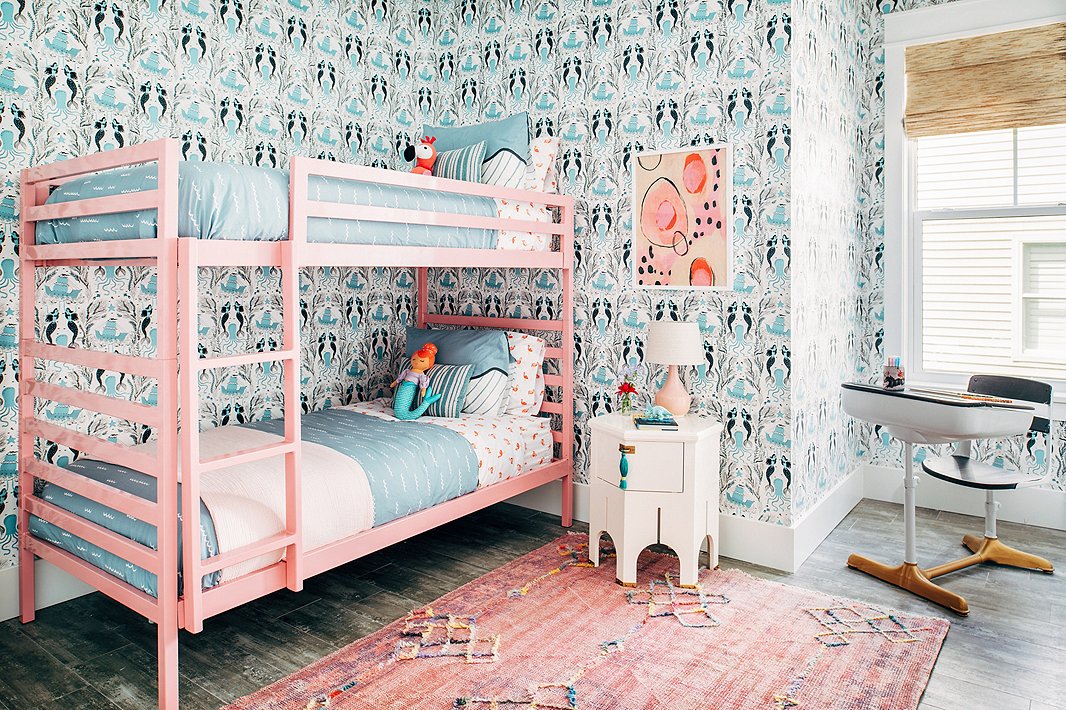
From the vintage rug to the Moroccan-inspired side table to the abstract artwork, this girls’ room is anything but juvenile. The pink bunk bed? Pure fun.
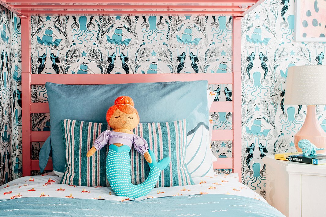
Flamingo-print sheets and mermaid-theme wallpaper offer playful nods to the home’s Sunshine State setting—and when paired with classic stripes and timeless lighting, they manage to look more cute than kitsch.
When Pretty Meets Practical
To create high-style spaces that can stand up to kids, pets, and wet bathing suits, Hannah has a few go-to tricks. “I gravitate toward textiles that either hide dirt (lots of pattern!) or can be bleached,” she says. When it comes to the walls, her solution is somewhat counterintuitive. “Wallpaper is expensive, but it is actually so much easier to keep clean than painted walls,” Hannah says. “And the walls in kids’ rooms—especially at a vacation home—get pretty trashed pretty fast!”
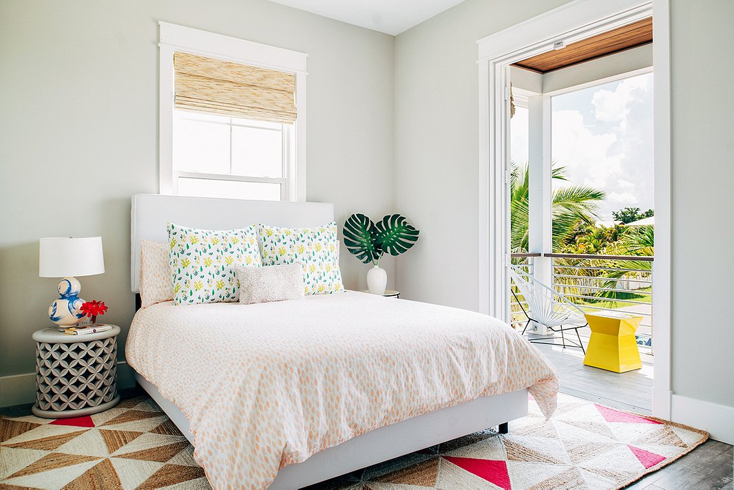
The clients often open up their home to friends and family, so this light-filled guest bedroom sees frequent use. The pops of pink in the geometric rug liven up the soft gray walls.
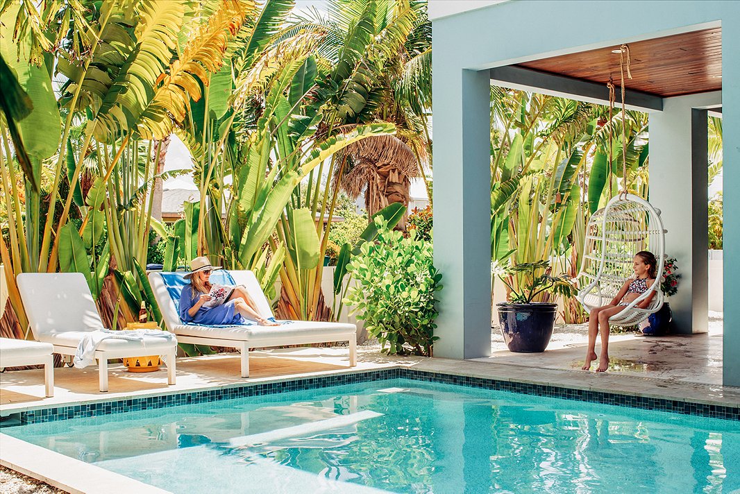
Nearing the project’s completion, Hannah took her daughters along for a trip to finalize the install and have the home photographed. “It was amazing to spend time there with them,” she says. “They ran into the little girl’s room with all the wallpaper and said, ‘Mama! This is the best house you have ever done!’ Best compliment yet.” Shop the swing chairs here.
Join the Discussion