Change is an imperative that underlies A-list decorator Amanda Nisbet‘s jewel-box apartment on Manhattan’s Upper East Side, which she shares with her family. Originally three separate apartments, the home has had many incarnations during the past 20 years, a result of repeat coats of paint and a constant shuffling of furniture arrangements on Amanda’s part.
Yet as the home has evolved, one reigning philosophy has remained consistent. It always leads back to (and begins with) color. “I just don’t think that any colors don’t go together. There isn’t a color I don’t like,” Amanda says. “I don’t have any fast rules. It’s always where I start, and it’s the thing that excites me the most.”
Fuchsia, sapphire blue, turquoise, and hot pink (her favorite color) are staples in her design palette, so it’s no surprise that her home is vibrant as well. And the genius of her colorful touch is boldly haphazard: “I pull fabrics and throw them all on the floor and come up with my palette.”
Among a brilliant backdrop of juicy orange and pretty pinks, gemlike treasures abound. Heirlooms from her grandmother and great-grandmother share space with an enviable collection of modern art, spanning Elizabeth Peyton to Natasha Law; gorgeous materials and textures, including leather and lush linens, mingle with plaster, gilding, and blackened steel. It all adds up to a home that’s beautifully layered yet edited and surprisingly livable. “Function and elegance should not be mutually exclusive,” Amanda says, “so it’s very much my mandate that every piece is not only pretty but also comfortable, usable, and steady.”
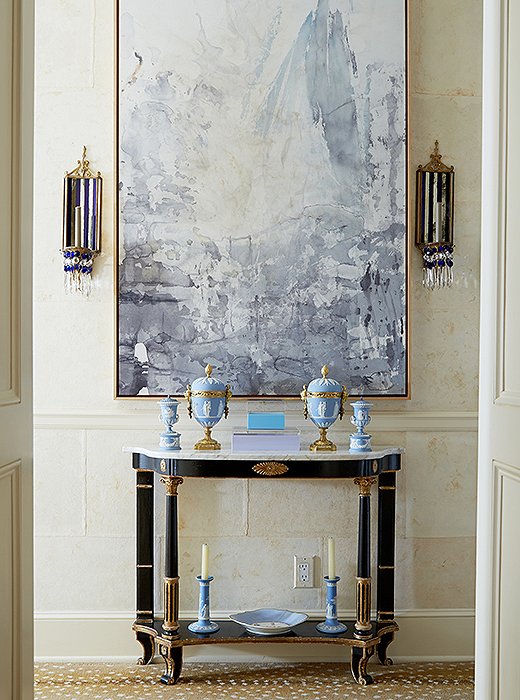
The front hall showcases Amanda’s intuitive touch for balancing old and new: A modern abstract by Ray Kass and flanking midcentury mirrored glass sconces command focus above a neoclassical-style console—“one of my first purchases,” says Amanda. The antelope carpet is by Stark.

I’m not shy in my decorating... To me, it’s always about contrasting seemingly opposite things, whether that be materials or styles. That’s where you get the most interesting design.
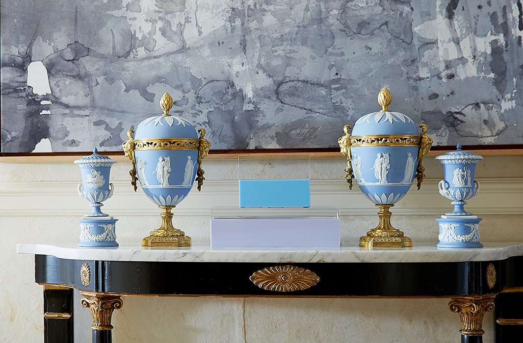
Wedgwood vessels represent family history. “They were my great-grandmother’s,” says Amanda. “I love the juxtaposition of the color of the Wedgwood with the gold and the sculptural quality of the modern art.”
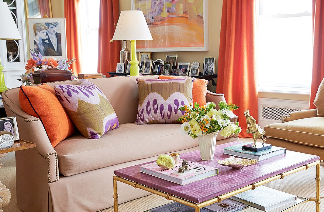
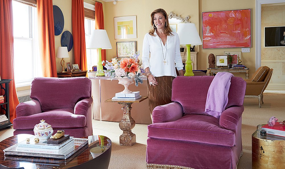
Brilliant colors lead the way in the ever-changing living room (“It’s a hazard of the profession”), starting with the punchy orange boiled wool by Holland & Sherry used on the curtains and pillows and the purple leather-top table designed by Amanda for Niermann Weeks.
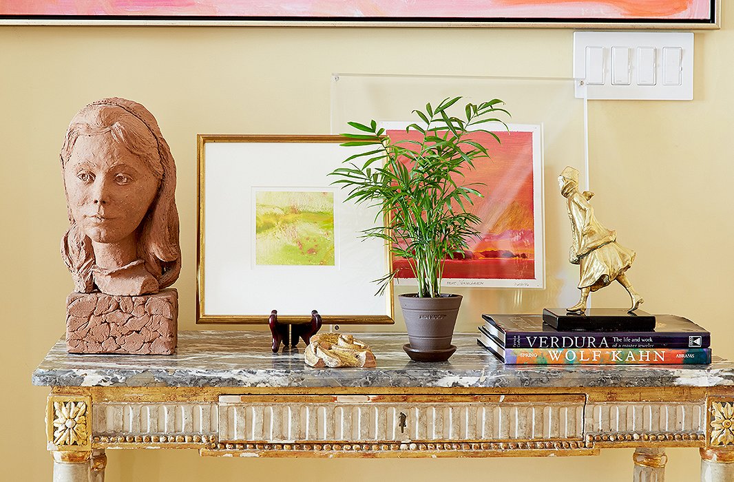
Objects such as a terracotta bust from Amanda’s parents’ home and her grandmother’s gold-plated skater often recall stories. “I’d always loved the movement of the sculpture growing up,” says Amanda, a passionate art collector. “I love photography, oils, watercolors, sculptures, and I love to mix up the different mediums.”
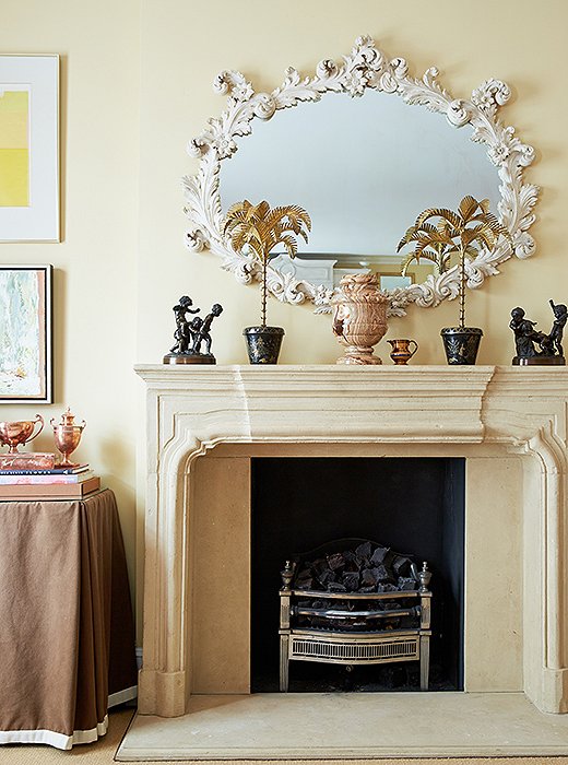
Elegant juxtapositions underlie Amanda’s designs. Case in point: The living room’s limestone mantel is topped with a favorite rococo white plaster mirror and her grandmother’s cast-bronze figurines.
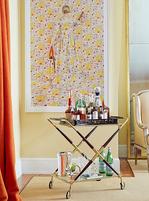
“I love that bar carts have come back into fashion,” says Amanda, whose rosewood-and-brass bar is always ready for cocktail hour in her living room. Equally intoxicating is a large-scale photo by Rachel Perry Welty.

There isn’t a color I don’t like. It’s always where I start, and it’s the thing that excites me the most.
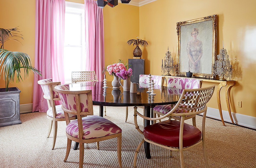
“This room gets so much light, and I repainted it about two years ago,” says Amanda of her dining room, which had been a chocolate brown and used less frequently over the years. “Now that I’ve repainted it I use it a lot to think and write when I’m not actually in the office.”
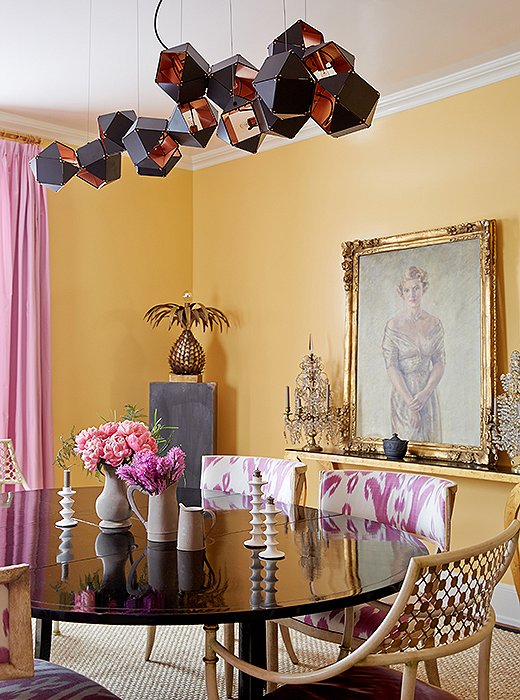
A steel-and-copper light fixture by Gabriel Scott hangs above a painting of Amanda’s maternal grandmother (“I like to think that she watches over all of my parties!”) and a black lacquered dining table surrounded with chairs she designed for Niermann Weeks.

It gives a room more soul, more of a patina, and more of a homey look to bring in all the elements of old and new.
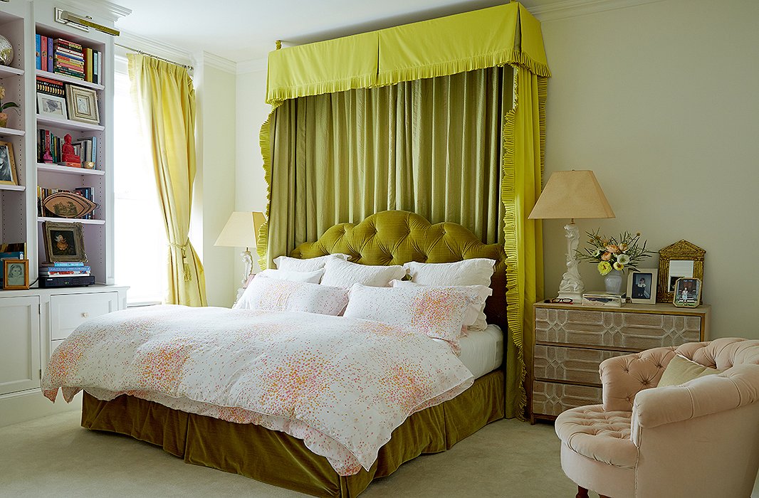
The bedroom is Amanda’s haven, although color finds its way inside. “I believe in a soft palette for the bedroom, but I’m not one to do all white for myself,” she says. The walls are painted in Farrow & Ball’s Pointing, and the green bed curtains are made with Manuel Canovas and Fortuny fabrics.
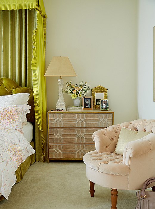
Amanda’s bedside essentials can be distilled down to a really good reading light (“I’m always reading three books at the same time”) and a big glass of water.
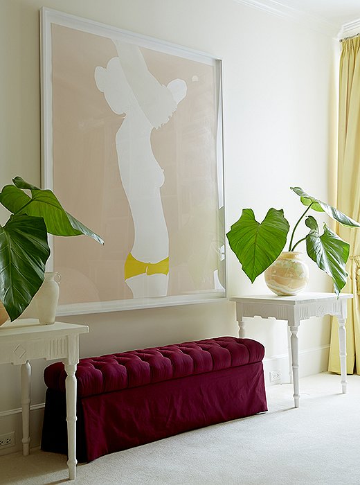
“I love the cheeky subject matter and her use of color,” says Amanda of the nude painting by Natasha Law, which presides over her bedroom above a custom-made bench and tables by Brooklyn plaster artist Stephen Antonson.
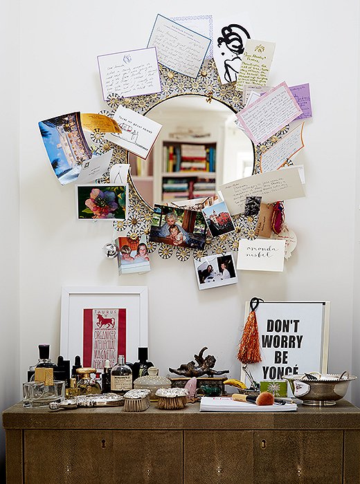
The vanity in the master bedroom is a place of memories: favorite perfume bottles, silver brushes from Amanda’s grandmother, photos and notes from close friends, and a Beyoncé print from her daughter after they attended a concert together.
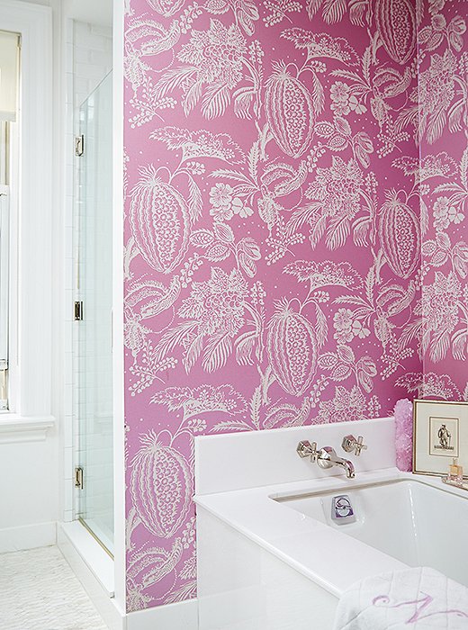
To invigorate the all-white bath, Amanda covered the walls with a Manuel Canovas paper in hot pink. “It’s sort of my little nook when I’m relaxing at the end of the day,” she says. “It’s my happy spot.”

Your home should evolve and not be static. You should move your art around, you should move your furniture around. There should always be fluidity in your design.
Join the Discussion