Brooke and Steve Giannetti had a dream. The pair, who helm Giannetti Home, a full-service design firm and a store in Los Angeles, fantasized about a property where they could fulfill the family passions: Brooke’s gardening, Steve’s landscape painting, and daughter Leila’s love of horses. “Steve and I have always dreamed of living on a farm,” says Brooke. “It would have gardens and animals and room for an art studio. Then we discovered Ojai.”
Indeed, it was a 2009 design project in the idyllic town at the foot of the Topatopa Mountains (just 80 miles north of L.A.) that made their dream a reality. After discovering a lush five-acre parcel of land, they planted the seed that would grow into their current home, Patina Farm.
After six months of planning (Steve is the architect, Brooke the designer) and 18 months of construction, the couple moved to the property that they call their “future empty-nester” home, though they are hardly alone. In addition to their three children, the couple share the farm with a menagerie of animals including three goats, four donkeys, a dozen chickens, four dogs, and counting. “We’re looking at sheep perhaps,” says Brooke.
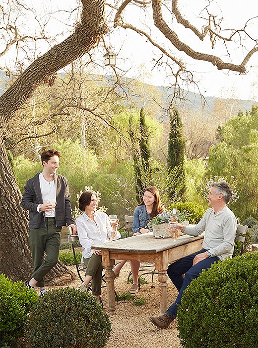
Brooke and Steve relax with two of their children in the alfresco dining area. “We wanted the outdoor spaces to be real rooms, an extension of what is inside the home,” says Brooke.
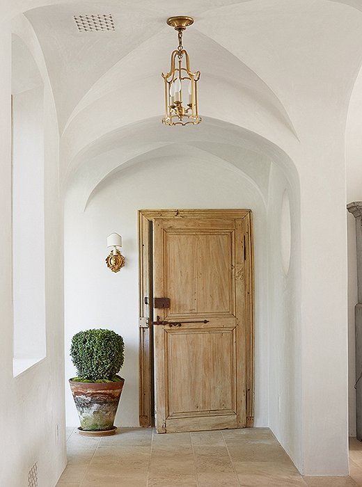
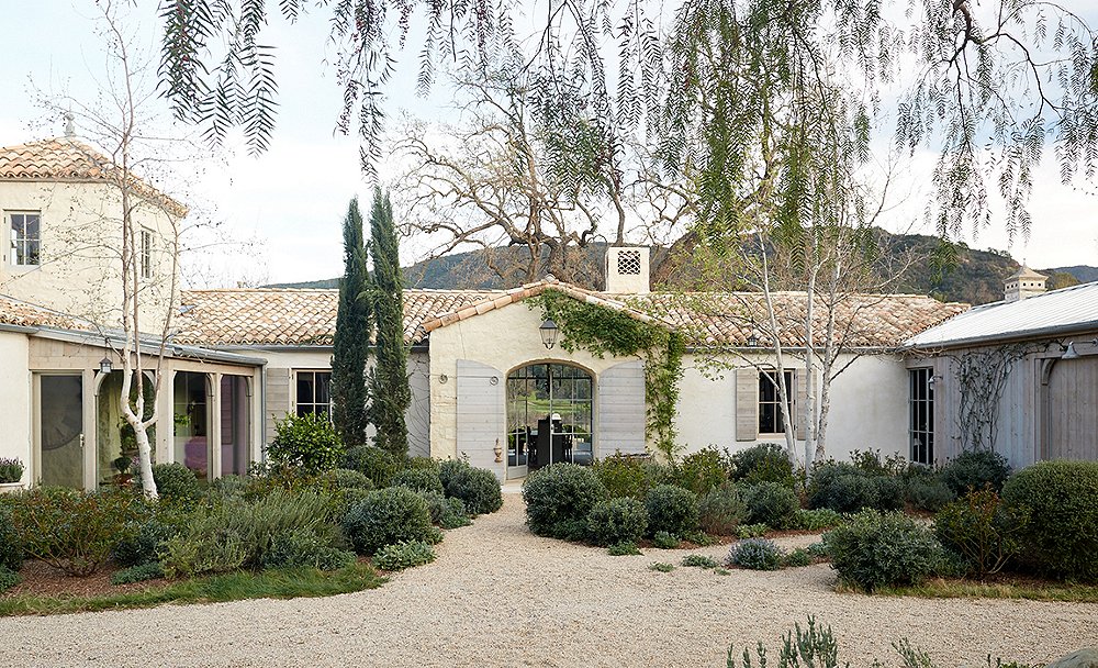
The couple planted boxwoods and other trees and shrubs both outside and inside the home so that “you feel like the lines blur between inside and out,” says Steve. The small sconce beside the door is antique.
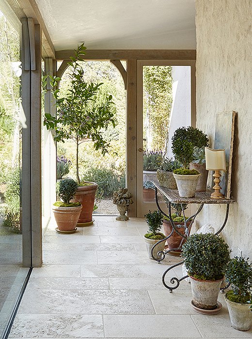
A glassed-in walkway leads to the children’s rooms. “When designing your own home, there is a freedom in experimenting,” says Brooke. “It’s like a laboratory of design ideas.” The pots are from Giannetti Home.
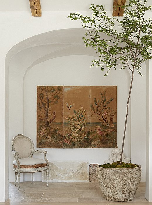
Classic and modern architecture coexist at Patina Farm. Forgoing baseboards or molding, the couple chose simple vaulted arches to add interest. The screen is a flea market find. “It’s interesting in that it is both embroidered and painted,” says Brooke.
From the abundant gardens to a picturesque pond to each effortless, elegant room, it’s hard to believe the home has been here for a mere three years. What’s the secret? The clever blend of classic and modern architecture, the Old World materials, and the mix of distinctive antiques and pieces from Giannetti Home’s own furniture line. “We wanted the home to have the feel of a European farmhouse with a modern twist,” says Brooke.
From the 300-year-old oak tree that shades the front door to the plaster walls, the French limestone floors, the repurposed wood doors, and the antique-tile roof, there is a sense of permanence, romance, and personal touch everywhere. “I’d rather see a plaster wall with a faint handprint on it than a perfect facade,” says Steve. Take in this sweeping, stunning home, inspired by the natural beauty that surrounds it.
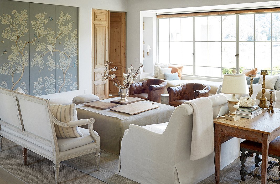
With a neutral palette, Brooke and Steve use a strong focal point in the living room: a striking wallpaper panel. “You think that a sofa or a chair has to be the focus,” says Brooke. “But it can be a piece of art or a window.”
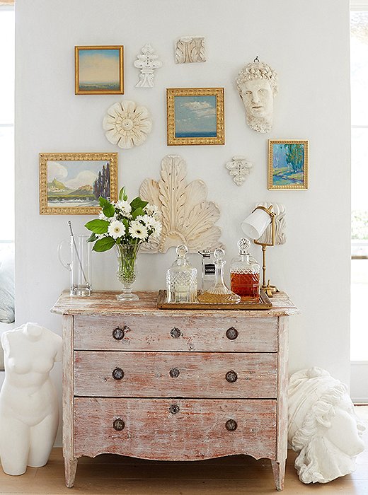
Steve, a painter as well as an architect, grew up working with his grandfather in the family’s ornamental-plaster studio. A wall holds many of the family’s plaster pieces and his own paintings. They mingle with works by Jennifer Moses and Michael Abrams.

Steve and I have always dreamed of living on a farm. It would have gardens and animals and room for an art studio. Then we discovered Ojai.
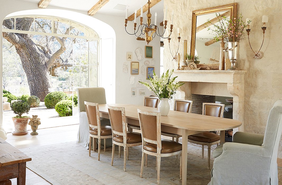
Knowing that they wouldn’t use a formal dining room, the couple created a flexible space. “We use it for meetings, school projects, and of course family meals,” says Brooke. Antique side chairs are paired with Giannetti Home armchairs.
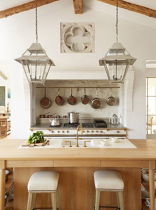
Above the Lacanche range, copper and stainless-steel cookware is within easy reach. The stone quatrefoil is from Belgium. Limestone was used for the range’s backsplash.
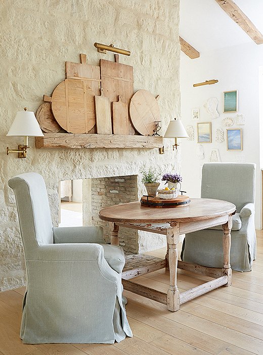
“We eat here every morning,” says Brooke of the kitchen’s dining nook. “The fireplace makes it cozy for winter dinners.” The slipcovered chairs are Giannetti Home, and the couple’s collection of vintage cutting boards gets prime placement. “I felt that they were too pretty to be hidden,” says Brooke.
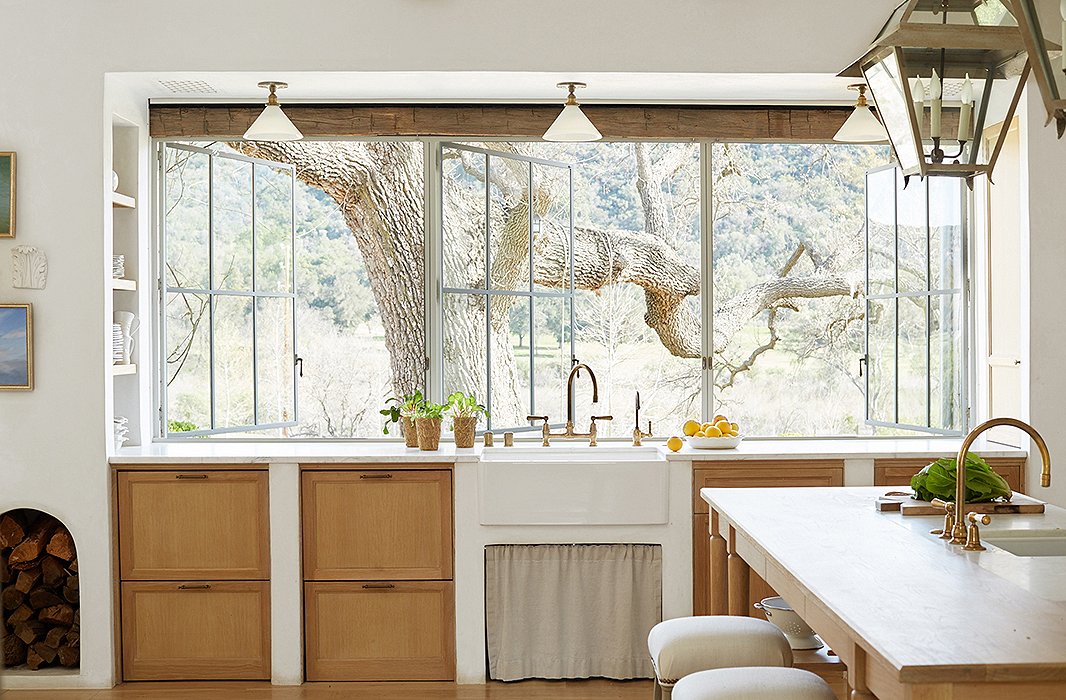
Wanting to harness “every bit of natural light,” Steve designed a wall of windows to connect inside and out and flood the room with sunshine. A farmhouse sink sits atop white-oak cabinets, a material used throughout the home for “a sense of continuity.”
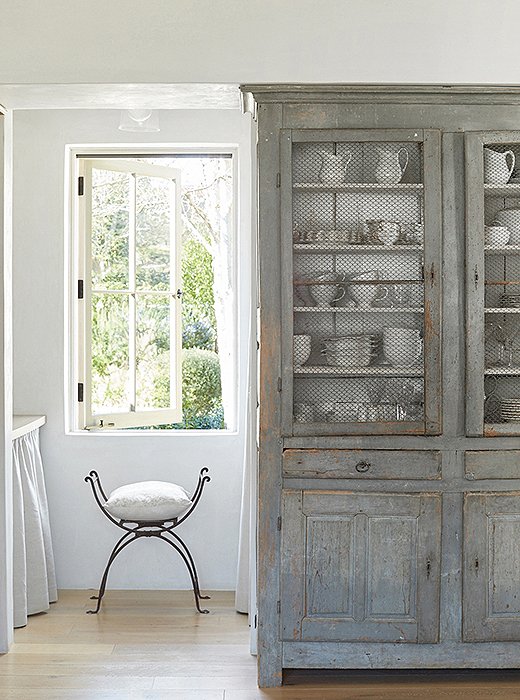
The pair take frequent trips to Europe to source the antique furniture they love. In lieu of built-ins, Brooke uses an antique French cabinet for silverware and dishes. “I tend to stick with white,” she says.
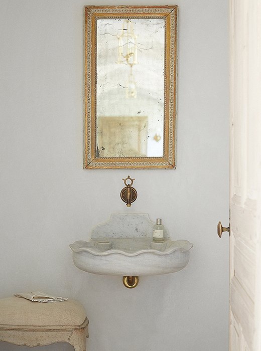
The powder room reflects the couple’s signature mix of rustic and refined. A marble sink found in Belgium is suspended on the wall, and a fountain spout finds new life as a faucet. The mirror is from Marston Luce Antiques in Washington, DC.
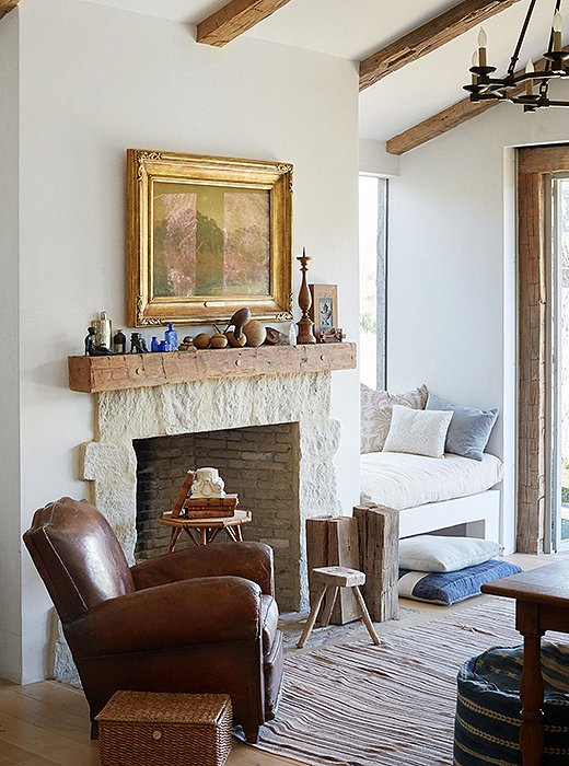
Brooke and Steve set up individual offices, each with a personal touch. Steve’s office has a “modern, rustic bent” with warm browns and camels. Antique barn beams frame the vaulted ceiling, the glass doors, and the stone fireplace.
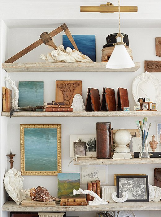
“Steve’s office is steeped in his own history,” says Brooke. “Vintage tools and molds, his paintings, and family photos. They are all reminders of our ability to create beautiful objects.”
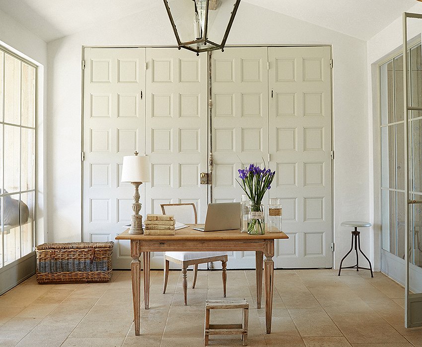
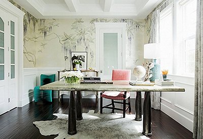
Brooke’s office “feels like a conservatory and surrounds me with the things I love,” she says. “I can see my potager garden and the chickens.” The desk and chair are French and Swedish antiques. Office supplies hide behind the antique doors.
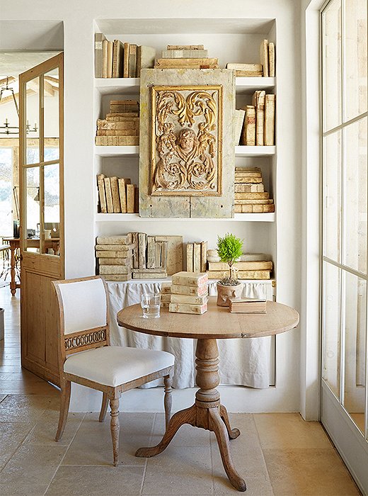
The exposed plaster shelves in Brooke’s office display her collection of antique paper and vellum books. Brooke meets with her design associates at the table, while just beside it a natural linen curtain hides dog and rabbit supplies.
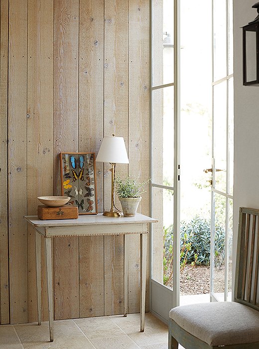
A wall of weather-grayed cedar in Brooke’s office is a backdrop for an antique Swedish table and a framed set of pressed butterflies. The limestone floor from the covered porch just outside runs through the entire room.
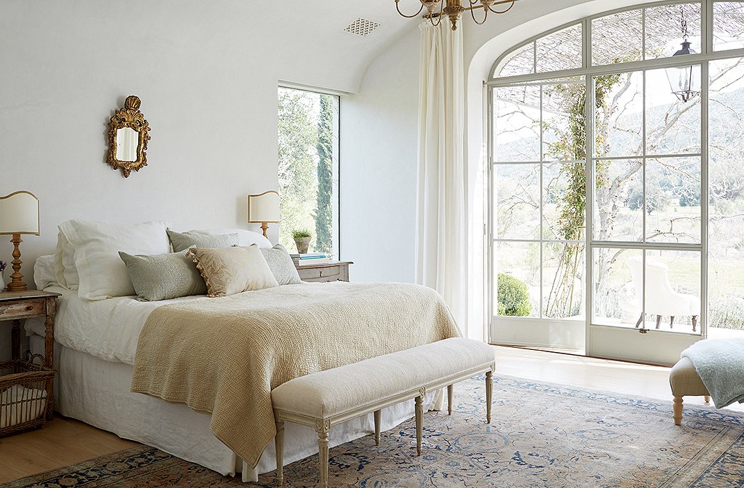
A headboard was initially planned for the couple’s bedroom, but “we realized we wanted it to be ‘less is more,’” Brooke says. Keeping with the minimalist feel, soft Belgian linen and a pixie-size gilded mirror balance the rustic yet refined vibe.
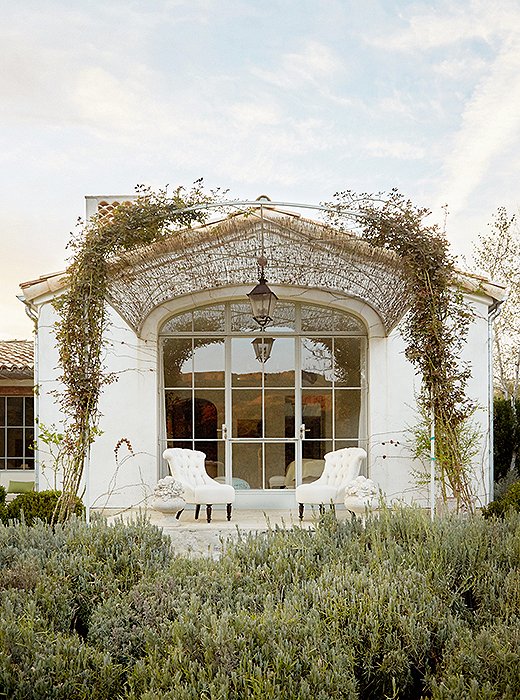
One wall of the master suite leads to a stone porch. “We like to create outdoor extensions to as many rooms as possible,” says Brooke. An arched steel trellis with some reed fencing drapes a pair of upholstered chairs from Giannetti Home.
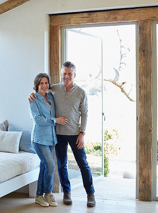
“We balance dedicated spaces for everyone with an open-floor plan. There’s a sense of togetherness throughout the home,” says Steve.

How would we describe our home? Classic. Relaxed. And happy.
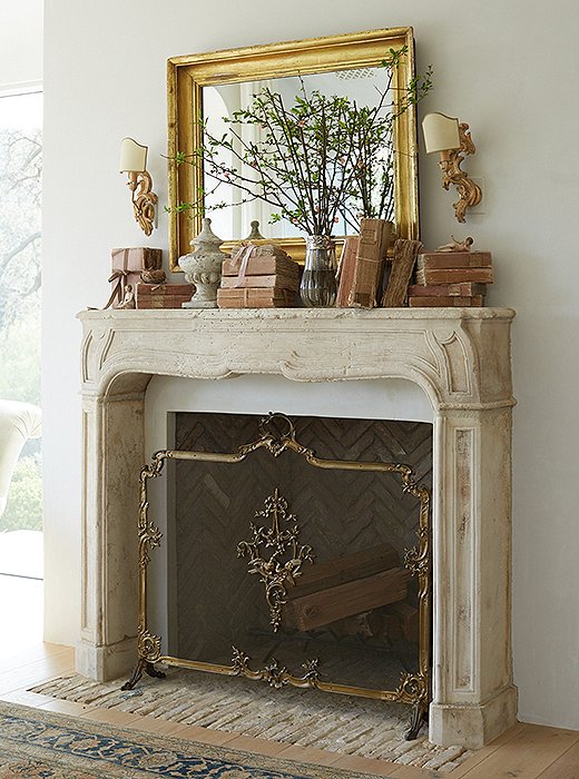
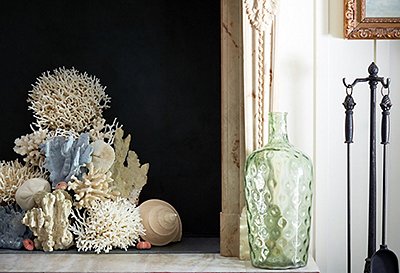
Venetian sconces complement the master bedroom’s French limestone mantel. “I like using seasonal flowers to bring nature in, and I select objects that go with the palette of the room,” says Brooke. “The blush books echo the pink sunset we see each evening.” The fire screen belonged to Brooke’s mother.
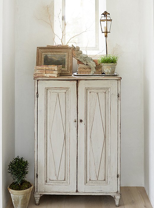
Steve’s design did not include closet cabinetry; instead a group of Swedish antique cabinets add charm as well as storage. “This is one of the first pieces we purchased,” says Brooke. “It has lived in different rooms in a couple of our homes now.”
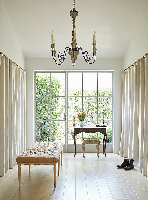
The dressing room feels like a still life. “We begin and end our day here, so we kept it calm and uncluttered,” says Brooke. “And we left a lot of room on the floor to stretch and play with the pups.” The linen panels conceal hanging clothes.
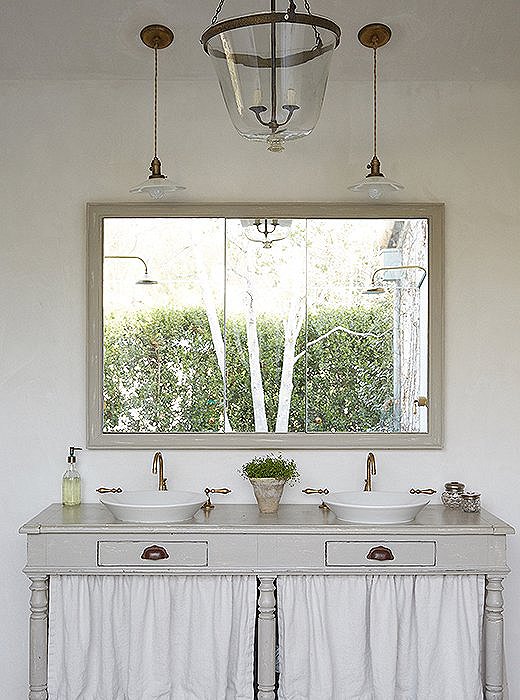
A draper’s table finds new life as a sink base and “has the air of a potting table,” Brooke says. The framed mirror has deep storage cabinets behind it. The bell-jar pendant was created from a vintage garden cloche.
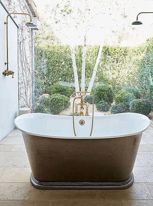
To create a “greenhouse atmosphere” in the master bath, floor-to-ceiling sheets of glass envelop the pewter tub and shower and connect the space to the garden—filled with boxwoods, blue hydrangeas, and campanulas—just outside.

When you design for yourself, you can do things you’re unable to do in clients’ homes. There’s a freedom in experimenting, like a laboratory of ideas.
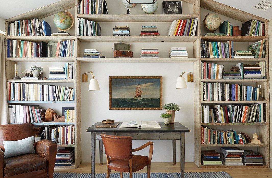
In son Nick’s bedroom, Steve designed a wall of shelving from repurposed scaffolding planks. “He asked for a cool room with storage for his sneaker collection,” says Brooke. “We turned it into a library when he went to college.” The desk is a vintage industrial table.
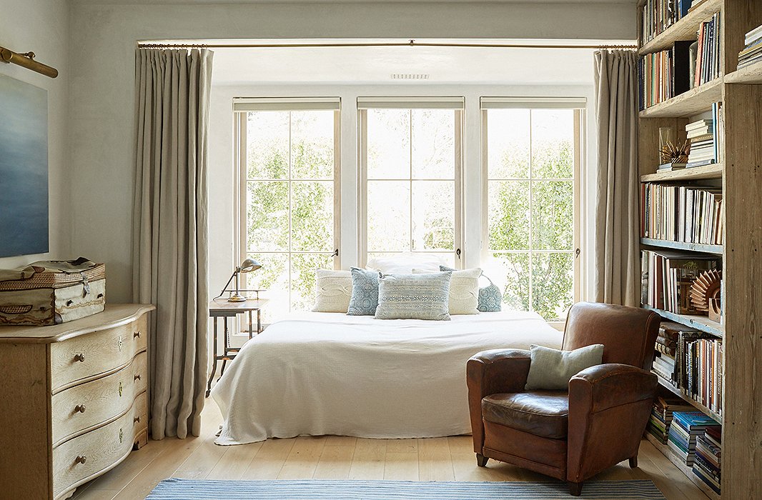
The bed has a new life as a reading nook. The linens are from Libeco, and the pillows are vintage from Giannetti Home. The comfy leather armchair was found at an antiques show.
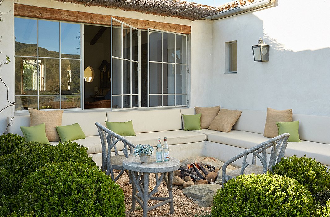
The lounge area with fire pit is a popular hangout. Built-in sofas made from plaster are softened with custom cushions covered in outdoor fabric. “The benches are nice and deep,” says Brooke. “They’re super-comfortable.” The color palette and the faux bois chairs echo the surroundings.
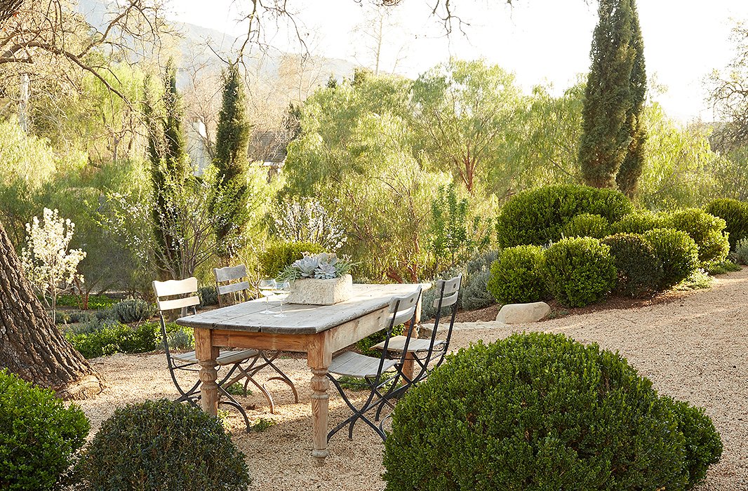
“We’re very casual. We just pass plates of grilled chicken or fish and salads through the kitchen windows and eat family-style here,” says Brooke. The table is from a shuttered antiques shop, and the chairs are vintage. Hanley gold gravel defines the area.
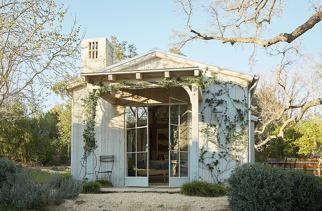
The guesthouse is set next to an old oak tree. “One of our dreams was that this would be a place for our family and friends to visit and share the world we created,” says Brooke. Rose vines frame the entrance for an aromatic welcome.
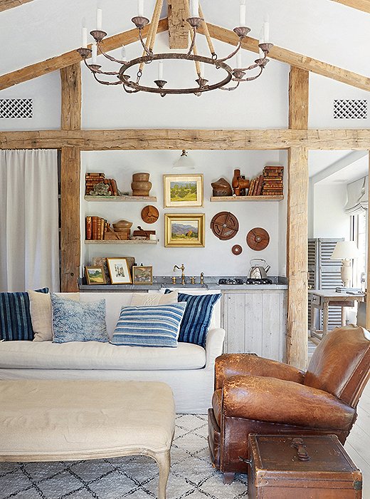
The guesthouse feels like an “artist’s studio”—a bucolic design filled with collections of classical pieces including vintage landscape paintings and ornamental plaster. Antique barn beams frame the kitchen area.
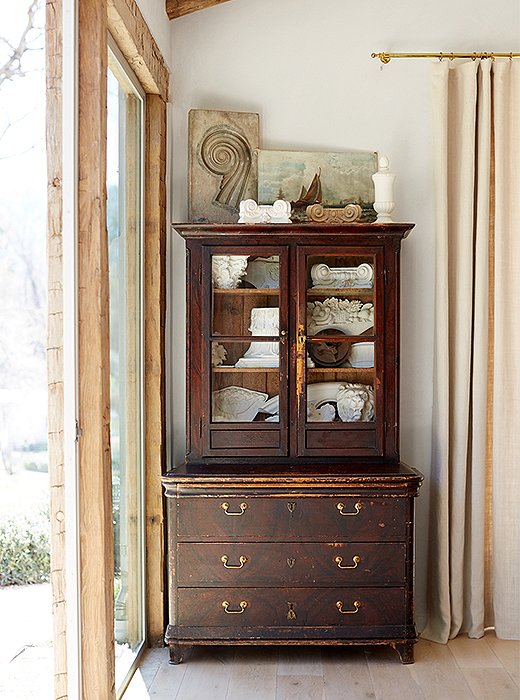
An antique Italian cabinet with embossed leather interior adds storage and is a display place for ornamental plaster pieces. “Like in Steve’s office, we used large single-pane glass to provide great views of the pond and the donkeys,” says Brooke.
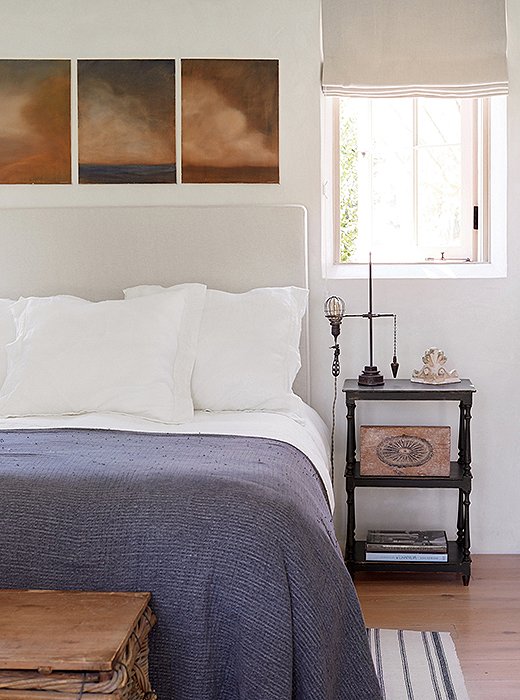
“Steve’s paintings were the inspiration for the palette of the guest bedroom,” says Brooke. A linen headboard, a woven blanket, and a striped rug add texture. The vintage industrial light with its original cloth-covered wiring is a unique bedside lamp.

We chose relaxed, natural materials that would forgive the heavy use they would encounter in our home, filled with children and pets.
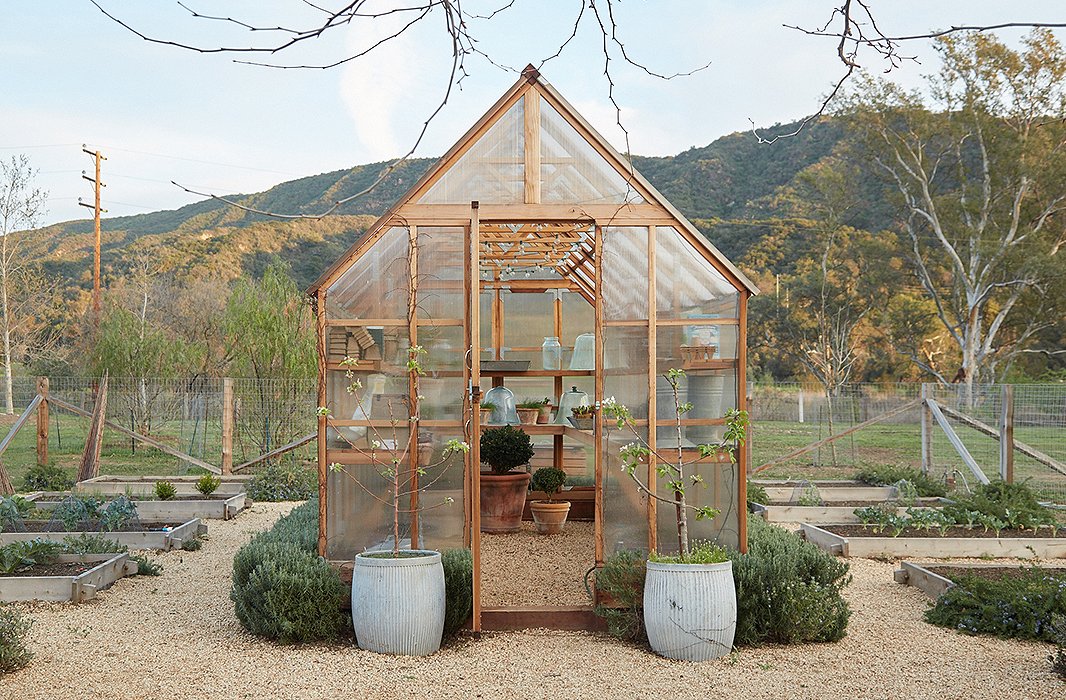
Gardens and animals were always part of the plan. “We envisioned eating our chickens’ fresh eggs and cooking with the vegetables and fruits we would grow,” says Brooke. The prefabricated greenhouse has shelves to protect delicate plants and start seedlings. A miniature hedge of rosemary grows around the perimeter.
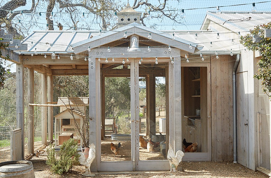
The chicken coop is framed in wood and walled with open mesh. “Champagne grapevines climb one wall, providing shade as well as a tasty treat for the chickens,” says Brooke.
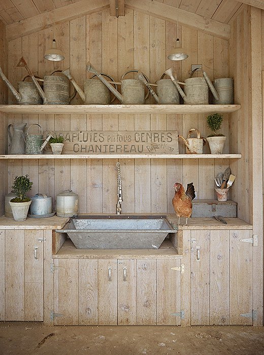
A small kitchen in the coop has a galvanized sink made from a vintage trough. “I store all of my kitchen and chicken supplies here,” says Brooke. The vintage metal watering cans come from their frequent trips to flea markets and antiques shops.

We want all of the spaces here to enhance our connections with the people we love and our relationship with the animals.
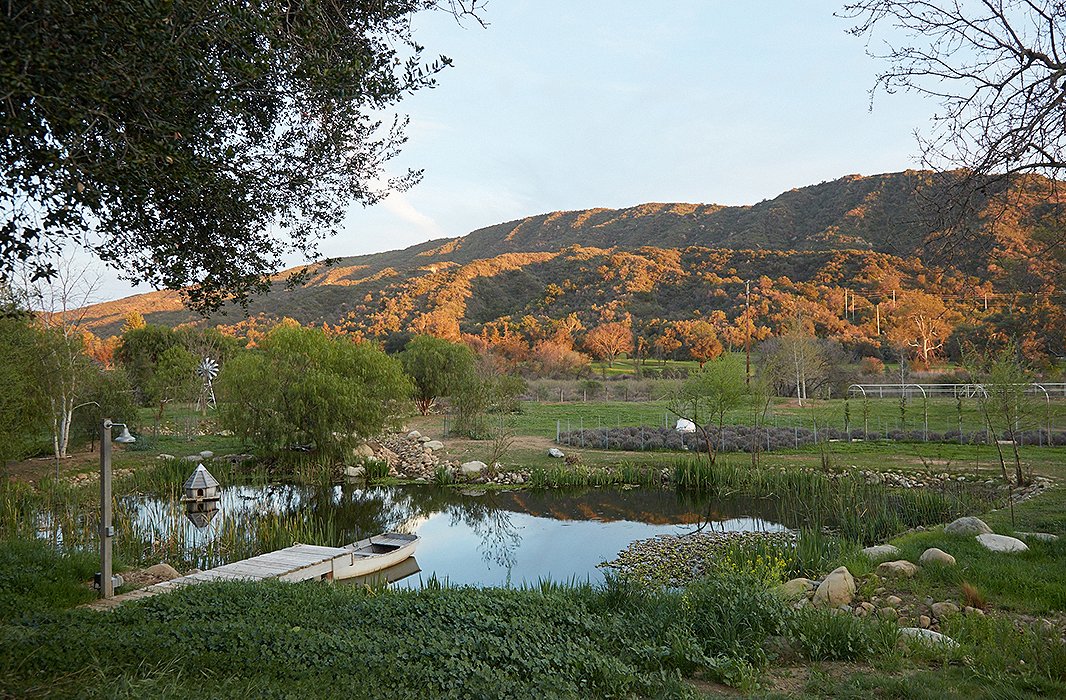
The property’s pond is a work in progress. “It has become a hobby for Steve,” says Brooke. “We’ve planted different varieties of water plants, and the frogs, turtles, and ducks discovered it and have now made it their home.” The canoe is a Craigslist find.
3 Lessons Learned from Patina Farm
The home’s creation—documented on Brooke’s blog, Velvet & Linen, resulted in a new book, Patina Farm. It’s a lush album in which the couple share not only the nuts and bolts of designing and building a house but also the emotional evolution of a home. Among the book’s takeaways:
1. Blur the Lines Between In and Out
“We committed to the same natural palette that we used outside for all the home’s interiors,” says Brooke. “It reinforces the fluidity within as well as the connection to the outdoors. French limestone flooring also connects the interior to the exterior rooms.”
2. Be Flexible with Furnishings
“Using neutral furniture comes in handy when you want to move things around to suit your life,” says Steve. “A linen sofa can move from a living room into a children’s space. A console table becomes a desk in your office.”
3. Edit, Edit, Edit
“Less is sometimes more,” says Brooke. “It starts with smart architecture. Steve’s designs allow for clever storage, glass walls for light, and wood frames adding detail and texture. There are many areas that didn’t need much because of what was already there.”
Truly beautiful, even the chicken coop! Airy and open, while also intimate and welcoming. Furnishings and accessories are in a nice balance: not too much, and not too “zen”. Love that all the office supplies are hidden behind those doors, as it keeps the room from feeling cluttered – as open shelves inevitably do.
Love it!
The home is lovely, but very beige and boring. Even the books are the same color. Books should not be purchased for the color scheme. I feel this house was “designed”, but is not a home for a family. There is no sign of life or living. No warmth. It is classic, but no sign of a true family home. I can find no fault with design, only no sign of living in this house! The gardens and outside are breathtaking.
i agree with the “sterile” observation. hopefully, it was styled and tidied up for the photo shoot. 😉
Your description of the books is entirely inaccurate and I completely disagree with your overall assessment. I had a look at your Floridian home and found it (and your recipe choices) extremely bland and tasteless. I suggest you stick to your Better Homes and Gardens subscription and refrain from exploring past where you belong.
This home is perfection.