As is so often the case in New York City, finding the perfect apartment was a waiting game for CeCe Barfield Thompson—just not as long of a wait as she expected. The designer, who worked under Bunny Williams before launching her eponymous firm in 2015, has a master’s degree in historic preservation and a fondness for the city’s storied old buildings. Her husband grew up in a classic home in Virginia and similarly craved something with a bit of history. Their dream was an apartment on Gramercy Park: a charming private green space (only residents of the bordering blocks have keys) nestled amid the bustle of downtown Manhattan, surrounded by a square of stately townhomes. It feels like a glimpse into a New York of the 19th century. There’s “a little bit slower pace,” CeCe says. “You know your neighbors. The buildings are low-rise, so you have a lot of sun. And on top of that, there’s an element of preservation in the area that makes it very special.”
Parkside apartments rarely come on the market—once you’re lucky enough to get in, you stay—so when an 1883 co-op went up for sale early on in the couple’s search, they didn’t wait around to see other options. “It’s one of the oldest buildings on the park and maintains a lot of the original details,” CeCe says. “We saw it and just fell in love with it.”
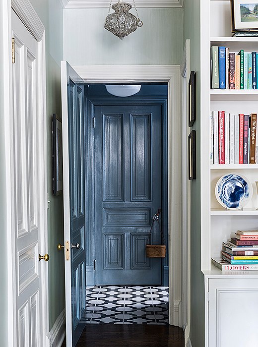
A palette of calming blues runs throughout the apartment, from the living room’s pale sky walls to the patterned tiles and slate-tone woodwork off the kitchen.
How did CeCe’s time with one of decorating’s top doyennes prepare her for creating a home of her own? “I learned so much in Bunny’s office, but I’d say what I really took away is the importance of comfort and practicality. Form and function are equally important, and to create a successful space you really have to marry the two seamlessly.” It’s a philosophy that has served CeCe well as she designs spaces for her two young daughters—and that has resulted in an elegant yet utterly inviting family home.
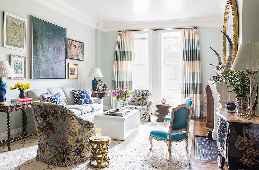
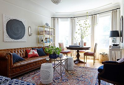
In the living room, CeCe aimed to emphasize the apartment’s connection to the green space nearby. “We have this beautiful view of the treetops because we’re on the fourth floor and of the skyline because all the buildings around us are low.” An airy blue wall color (a custom-mixed French strié) helps blur the boundaries between indoors and out, and curtains with a broad horizontal stripe visually widen the narrow windows.

Form and function are equally important, and to create a successful space you really have to marry the two seamlessly.
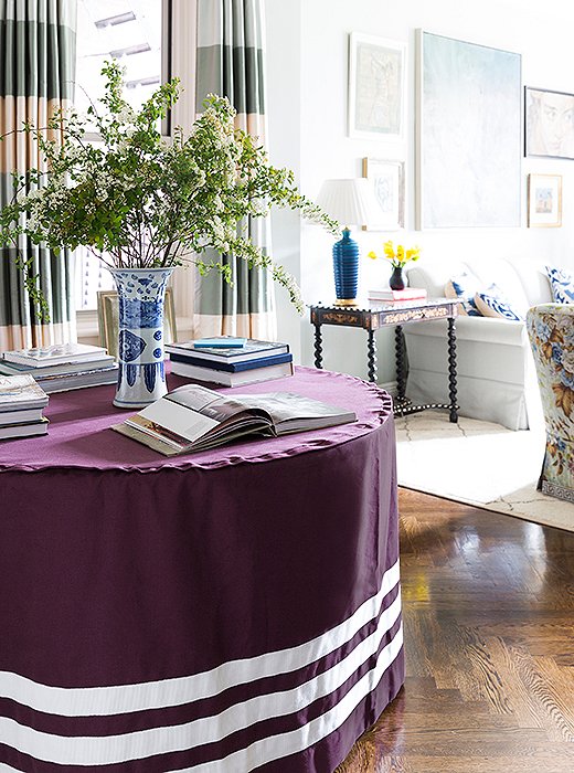
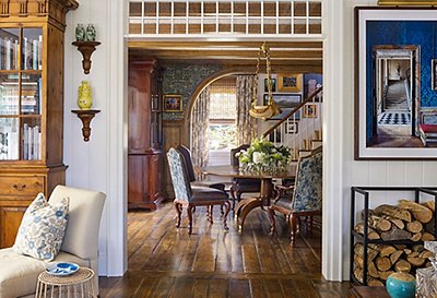
The couple loves to entertain. Before kids, “we would probably have a dinner party a week,” CeCe says. These days, they’re more about the Sunday brunch playdate, so a flexible living/dining space suits them better than a formal dining room would. CeCe added this round skirted table to serve as a purse drop, a dinner table, and a makeshift desk in one, all with a direct sight line to kids playing in the living room. (And with its custom tablecloth removed and leaves added, it can seat up to 16—which it does at least four times a year, when both families join for holidays.)
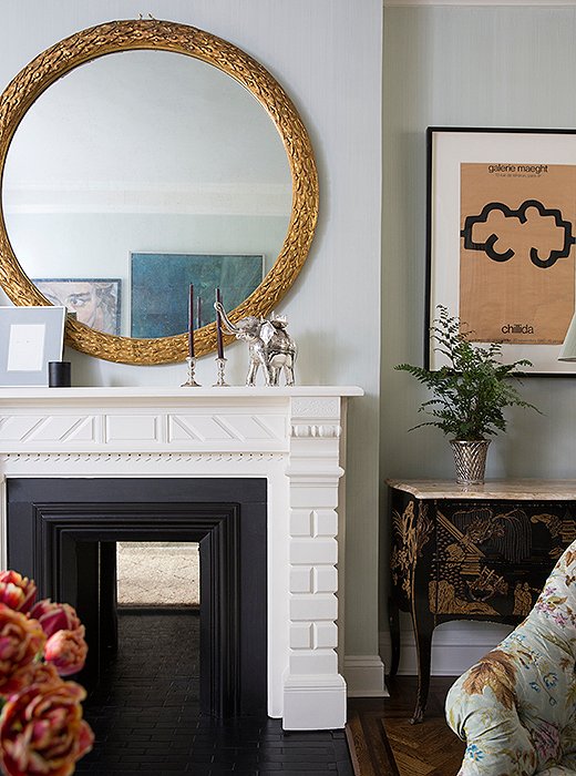
A 1950s chest, picked up at an antiques store in San Antonio, fills a nook next to the living room fireplace. It’s a piece that has moved with CeCe from apartment to apartment. “It’s been a bedroom chest, it’s been an entry table, and now it’s toy storage!” she says. CeCe found the graphic gallery poster on One Kings Lane.
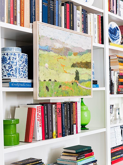
Bookshelves fill one wall of the living room, providing a home for CeCe’s collections of Italian midcentury glass and blue-and-white ceramics, along with her treasured library of decorating reference books. “It’s hard because there’s not endless amounts of room, so we try to just keep books that we love and use,” CeCe says. A painting that recalls the Virginia landscape (a gift from CeCe for her husband’s birthday) creates a colorful focal point.
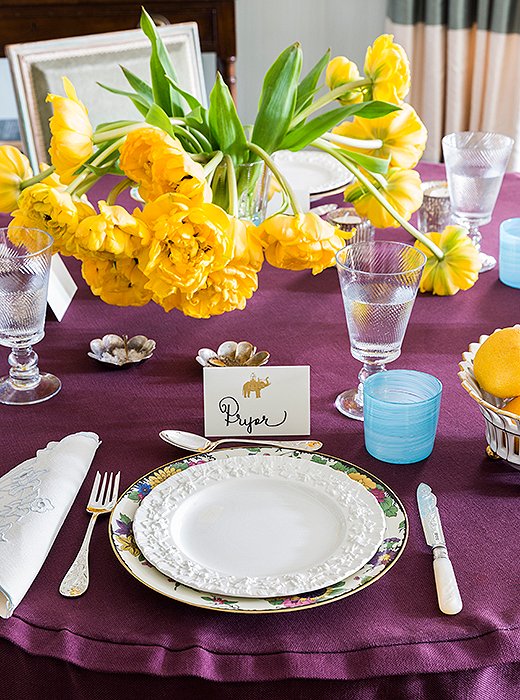
CeCe’s small-space vice of choice? Tableware. “I have an entire closet dedicated to china and silver, which is a lot in a small apartment—but it’s a great way to make a quick change and to just be creative without a big commitment,” she says. Here, a set of antique Bavarian plates are topped with white Wedgwood, adding a hint of color that complements the aubergine table skirt.
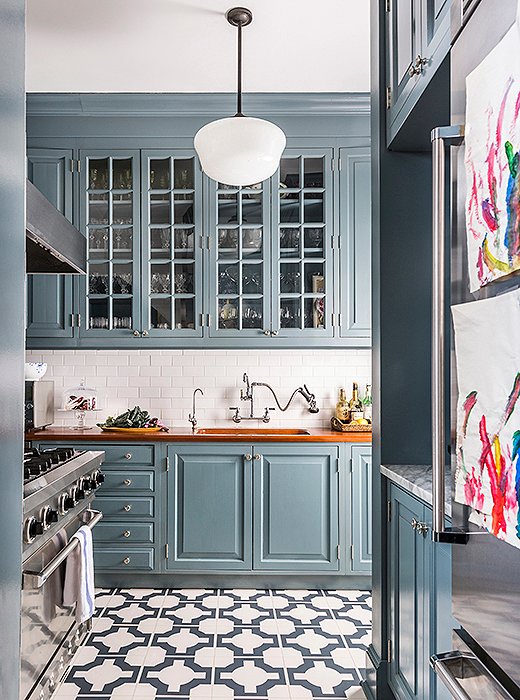
With a move-in date that left no time for a major redo, CeCe opted for some “minimally invasive work” to cheer up the dreary and dated kitchen. Patterned linoleum tiles were laid on top of the existing green checkerboard floor, and a glossy coat of paint (Benjamin Moore’s Smokestack Gray) refreshed the cherrywood cabinets. Wood countertops are handsome and practical—and a small marble section (CeCe’s an avid baker) adds a luxe touch.

I have an entire closet dedicated to china and silver, which is a lot in a small apartment—but it’s a great way to make a quick change and to just be creative without a big commitment.
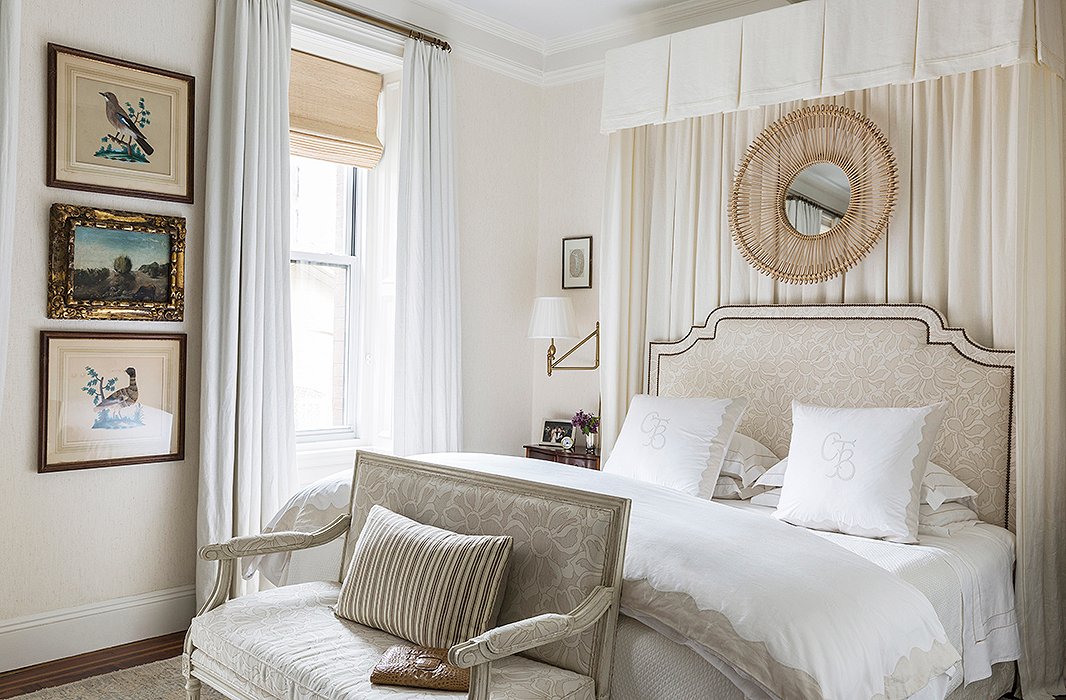
In an all-white palette, the bedroom is soothing and serene. “I look at color all day long, so I wanted to come home and really be able to rest my eyes and have a peaceful space to start and end the day,” CeCe says. “It’s so dreamy—but the challenge was to not let it get boring.” Layers of texture (grass-cloth walls, lush linen curtains, and subtle patterning on the headboard and bench) add depth and warmth to the tonal space.
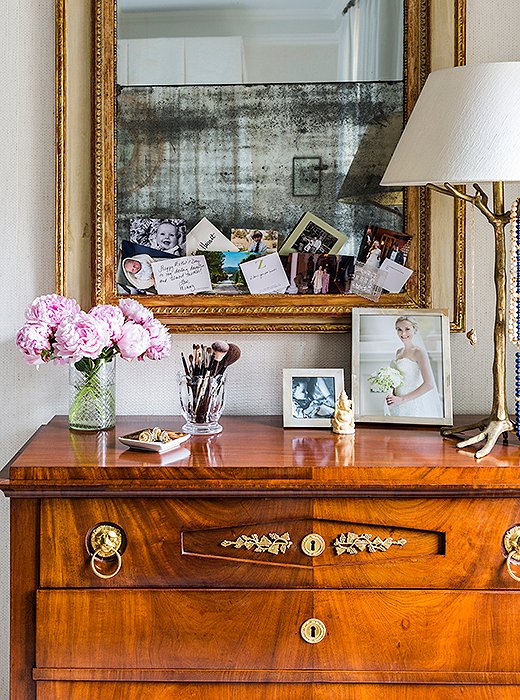
A Biedermeier chest with a fold-down drawer serves as CeCe’s bedroom vanity. She tucks personal mementos and photographs into the mirror above: “Just little things that make me happy.”
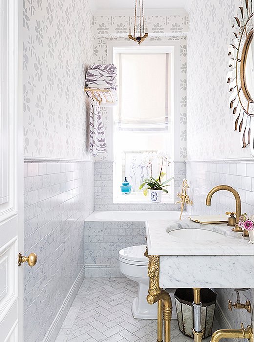
CeCe renovated the apartment’s diminutive bathroom, adding a petite (and perfectly kid-size) tub. Custom-colored wallpaper matches the tones in the marble; the monochromatic look helps the space feel more expansive.
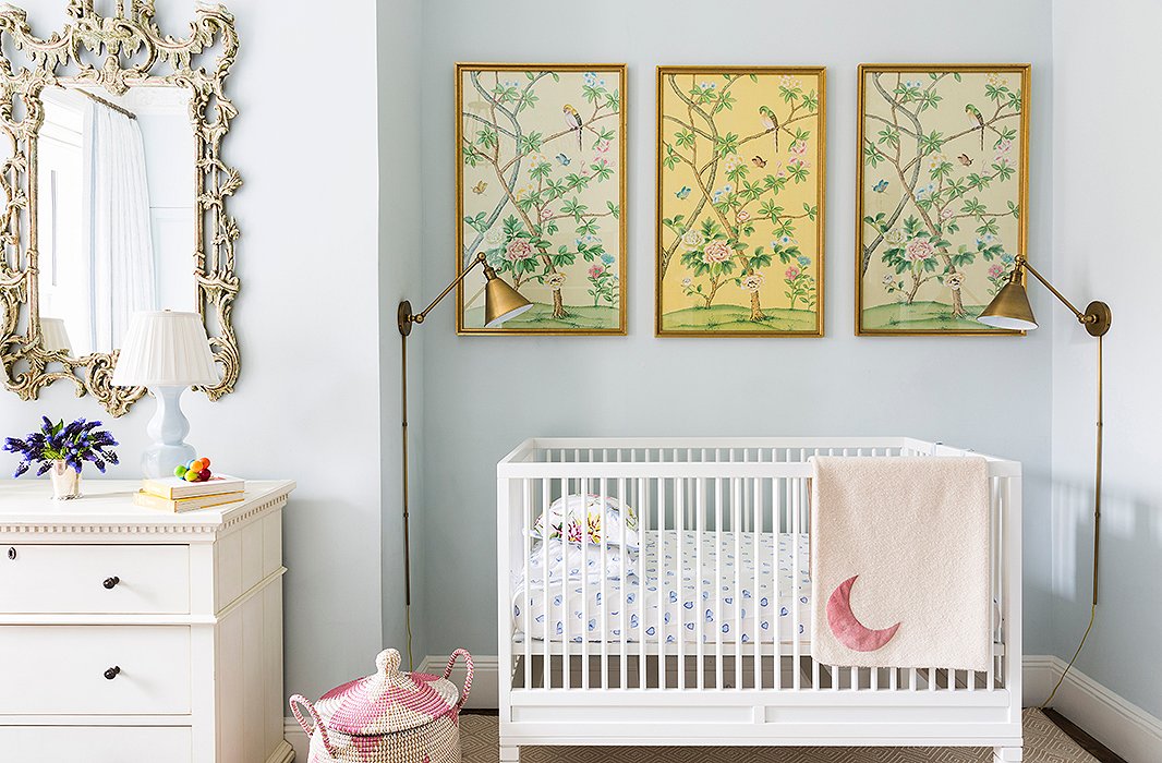
A trio of framed wallpaper panels that once graced CeCe’s mother’s dining room (“a nice little nod to my parents’ house, which makes me happy”) fills the wall above her daughter’s crib. It’s a reflection of CeCe’s elevated approach to designing kids’ spaces. “Just because something is usually thought to be more adult doesn’t mean it can’t be perfectly at home in a children’s room,” she says. “I think it’s better to buy things that you can have forever and your kids can grow into.”
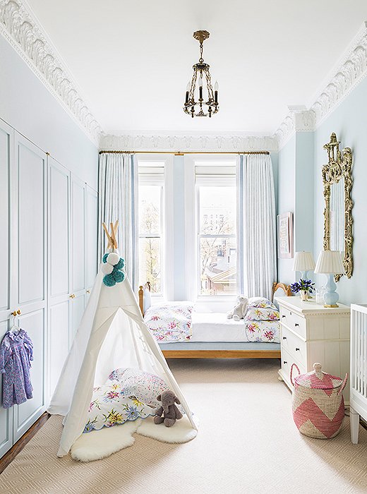
Walls in Farrow & Ball’s Borrowed Light set a restful tone in the girls’ room, with hints of lively color added mainly through sweet accessories. “I wanted to create a space that was peaceful and beautiful for my daughters and really not too childish—because I knew that once the toys started to fill the room that the kiddie aspect would take care of itself.” Another goal for the space: practicality. Scotchgard protects the light-colored wool rug from spills, and durable outdoor upholstery ensures a glider won’t get grubby. “Even though it looks sophisticated, nothing in here is too precious.”

Just because something is usually thought to be more adult doesn’t mean it can’t be perfectly at home in a children’s room. I think it’s better to buy things that you can have forever and your kids can grow into.
Join the Discussion