When two 20-something sisters decided to move in together, they enlisted designer Kati Curtis to help them find the perfect apartment. “They had first come to us to help them find something that was in a healthy building,” says Kati—one of the sisters has a chemical sensitivity that renders prewar homes with lead paint a no-go—so she pointed them toward a new build in Chelsea. Located in a LEED-certified building, it checked most of the “green” boxes. Its hyper-contemporary all-white interior, however, was hardly befitting of the young clients’ eclectic tastes.
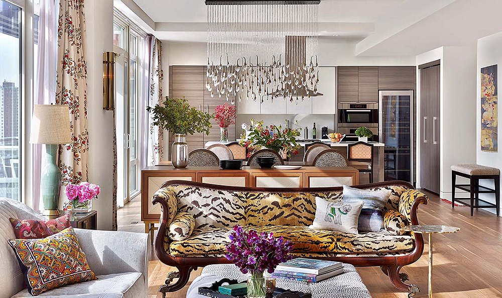
“The hope that I had in the end was that we could create something beautiful and glamorous but still healthy and nontoxic at the same time,” Kati recalls. To that end, she opted for environmentally conscious building materials and VOC-free paint and sourced vintage furnishings whenever feasible. It was a secondhand piece, in fact, that inspired the overall look of the four-bedroom duplex. “We called it the Tigress,” Kati says with a laugh of the animal-print living room sofa. “It was their grandmother’s, and it was the one piece they knew they wanted to use from the start.” From there, Kati addressed her clients’ differing tastes by balancing the wild (bold prints, layers of color) with the subdued (a white wall, neutral nods) for a look that embraces both sisters’ creative spirits.
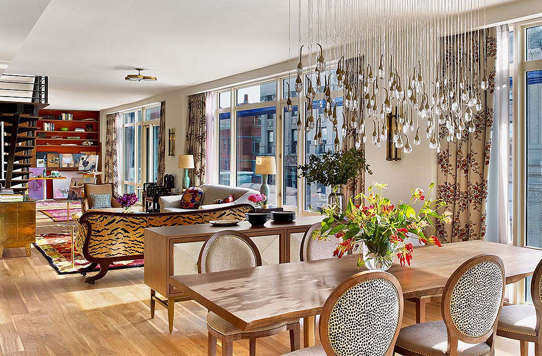
An artful chandelier gives the dining area a sense of presence above a live-edge table and chairs custom-designed by Kati. The sideboard, cleverly floated, helps to delineate the space from the rest of the apartment while providing much-needed storage.
The apartment was originally a series of plain white boxes accented with little more than steel and glass, and Kati was challenged to make each space feel loved and lived-in. “One of the ways we were best able to achieve that was by using antiques and vintage items,” she says. “They also make the space feel fuller and richer.” So while the designer was careful to consider the contemporary architecture, she looked to the Tigress for continued inspiration. Elegant with a bit of funk, the vintage sofa ties in perfectly with the Indonesian temple door-turned-coat closet, the colorful Moroccan rugs used to anchor furniture arrangements as “zones,” and a diverse array of colorful accents.
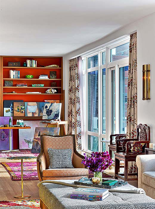
Built-in bookshelves and an art studio become one along a living room wall. One sister is a painter, so a space to practice her craft was a key requirement from the get-go. Kati had initially planned to wall off this creative spot, but they ended up loving the open look.
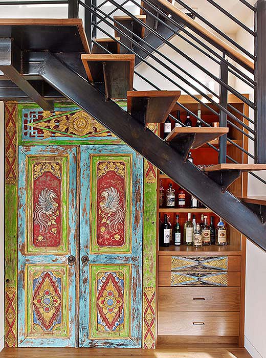
Kati transformed a niche below the stairs into a coat closet and bar using a temple door she found in Indonesia.
Despite the design scheme’s emphasis on color, white was not the enemy—in fact, it plays an important role. The colorless walls in the living and dining areas were a “very deliberate choice,” Kati says. “Because there is so much color and pattern elsewhere, we needed the white to prevent it from feeling over-the-top.” This decision allowed for touches such as patterned drapes, a red grass-cloth accent wall, and sculptural light fixtures to intermingle without visual conflict. As a whole, the open-plan first floor is conducive to many modes of living—a solo painting session, a relaxed dinner for two, a cocktail party for 12.
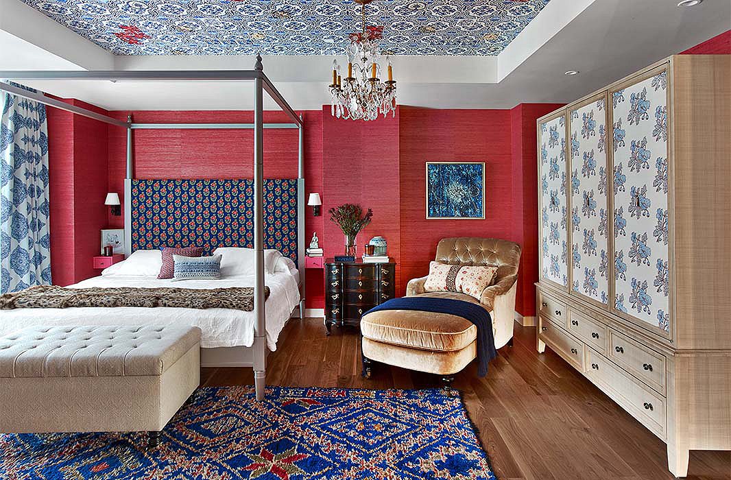
Katie wrapped a bedroom in red grass-cloth paper and dressed it with patterns of varying scale. Hints of royal and navy blues, such as those found in the rug and the headboard, temper the warmth of the walls to create an ideal space for sleep.
Upstairs, the vibe couldn’t be more different. The bedrooms—one red, one blush—were decorated to the specific tastes of each sister. “The red room,” as Kati calls it, was something she and the client fought over a bit. “Typically, I would not choose red for a bedroom… I thought, You’re never going to be able to sleep!” But compromise is the name of the game, so she opted for wallpaper with a hint of pink to soften the feel and layered in shades of blue in addition to a camel chaise to construct a cocoon ideal for rest. In the blush room, which belongs to the sister who paints, dusty walls were crowned with metallic paper and a vintage Murano-glass chandelier. Heavier linen drapes work with the deep hues of the vintage Balinese fabric on the bed to “turn the volume down a notch.” Compare them side by side with the downstairs space and it’s like reading three different chapters of the same character-driven book.
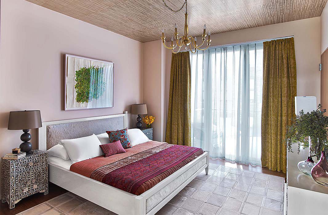
A mix of metallics and global touches breathes character into the second bedroom. Blush walls soothe the eye and pick up the underlying tones of the über-resilient patchwork cowhide rug (for similar, see the Striations hide rug).


Join the Discussion