To call contrast welting a trend feels somewhat reductive. It’s a design feature that’s been around for years—and we predict it will stay in vogue for many more to come. Right now we’re particularly smitten with the style, due in part to its classic yet wonderfully fresh appeal. Why else do we love it? Read on and get inspired to give this designer detail a try.
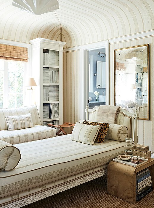
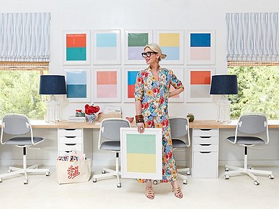
Photo by Joe Schmelzer.
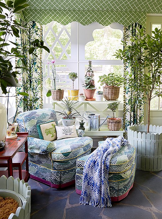
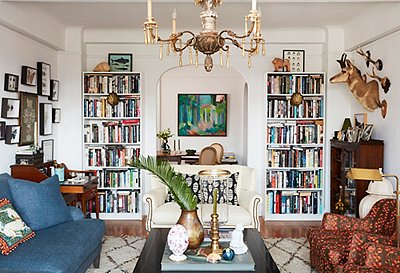
Photo by Tony Vu.
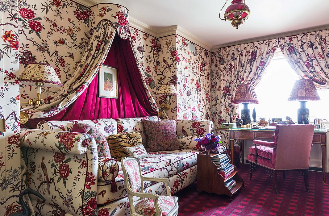
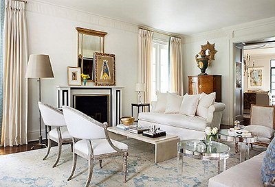
Photo by Lesley Unruh.
Contrast Welting…
… is a designer favorite. From Alex Papachristidis to Mark D. Sikes, designers of all styles love incorporating contrast welting in their own homes and client projects.
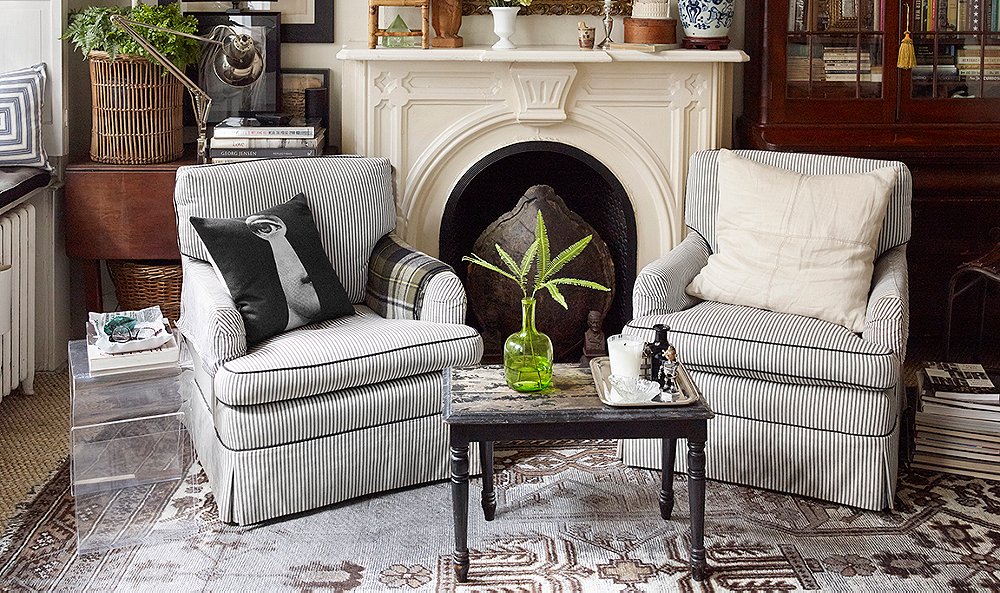
… makes a piece feel finished. Adding contrast welting to a piece of upholstery is like finishing a drawing with a bold outline. It’s not necessary, but it goes a long way in lending contrast and polish to a space.
… grounds pattern. We love a bold print. But in a space with other patterns and hues, it’s easy for a busy design to get lost. Trimming upholstery with contrast welting is the perfect solution here, creating a clean outline that helps the piece really stand out.
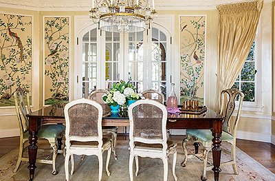
… connects a design to the rest of a room. On the opposite spectrum, a print that might feel out of place can feel right at home thanks to contrast welting that coordinates with other colors in the room.
… adds interest to solids. Single-hued furnishings get a graphic upgrade with the addition of contrast welting, whether in a simple cream or something bolder and brighter.
…. works on a variety of styles. Pillows, ottomans, headboards, sofas, chairs… you can bring contrast welting to nearly every piece of upholstery in your home.
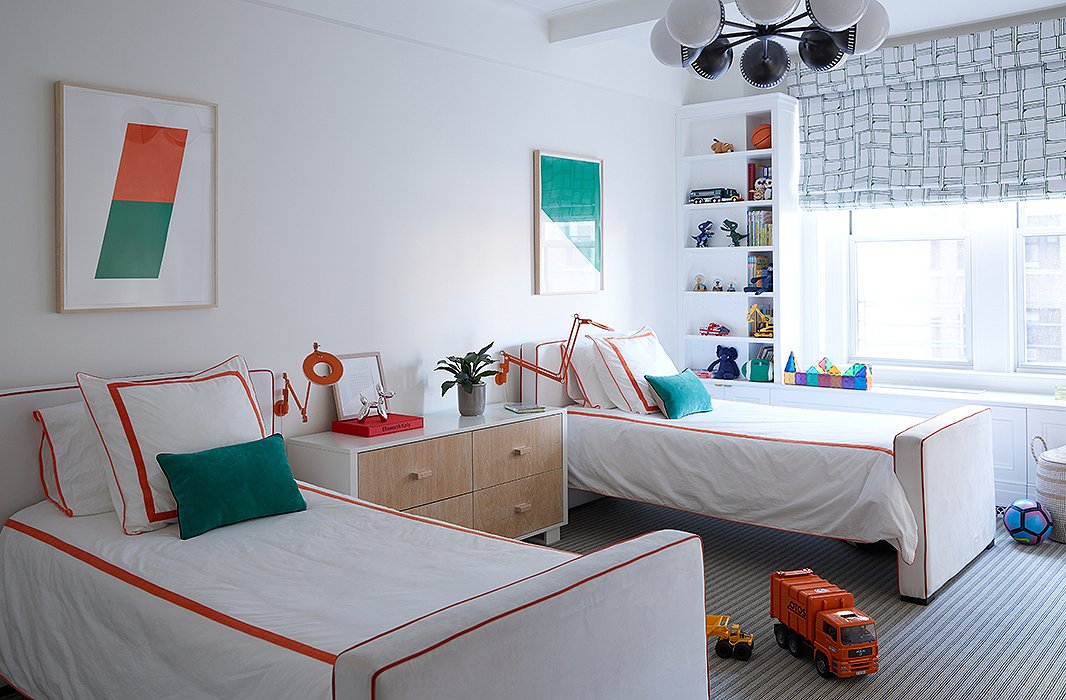
Photo by Manuel Rodriguez.
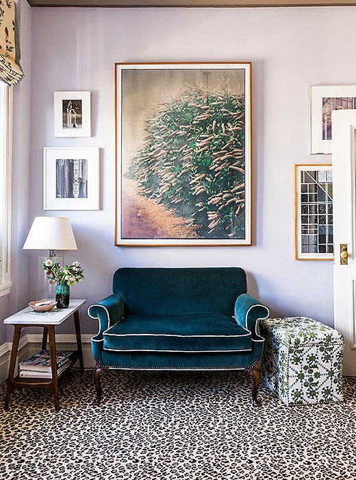
Photo by Lesley Unruh.
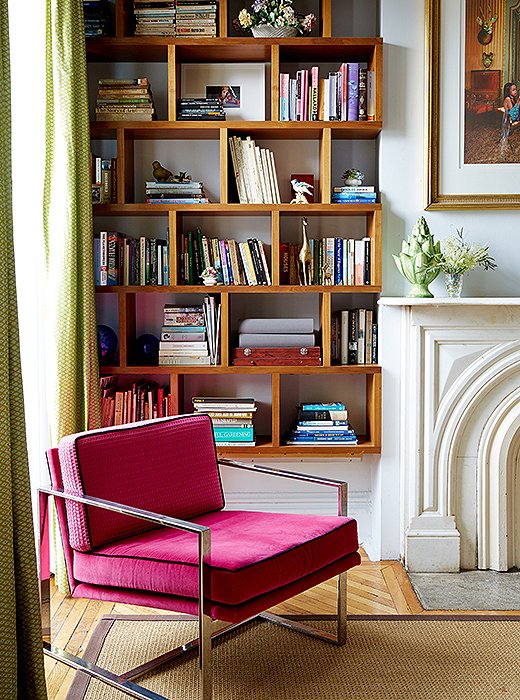
Photo by Tony Vu.

Join the Discussion