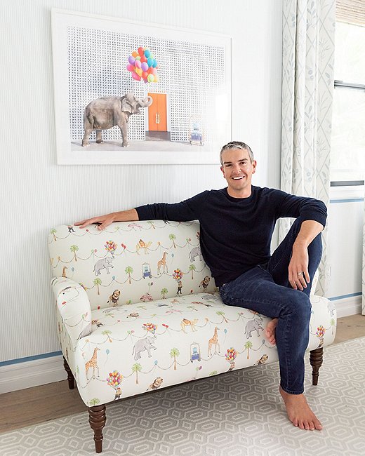
Photographer Gray Malin in front of a shot from his Gray Malin at the Parker series, which inspired the designs in his new collaboration with Cloth & Company. Photo by Ryan Garvin.
Sweeping views of the beach, exotic animals in unexpected locations, Mylar balloons spelling out cheeky messages: Gray Malin’s vibrant photography instantly livens up a room. It has also gained a serious following, and the joyful images have been adapted into a dizzying array of other products, ranging from phone cases to wallpaper to coffee table books. Gray’s latest stylish endeavor is a kids’ furnishings collaboration with Cloth & Company, whose made-to-order upholstery designs have long been One Kings Lane favorites. Read on to discover the inspiration behind the collection, the pieces he’s using in his own twins’ rooms, and more.
Shop Gray Malin x Cloth & Company →
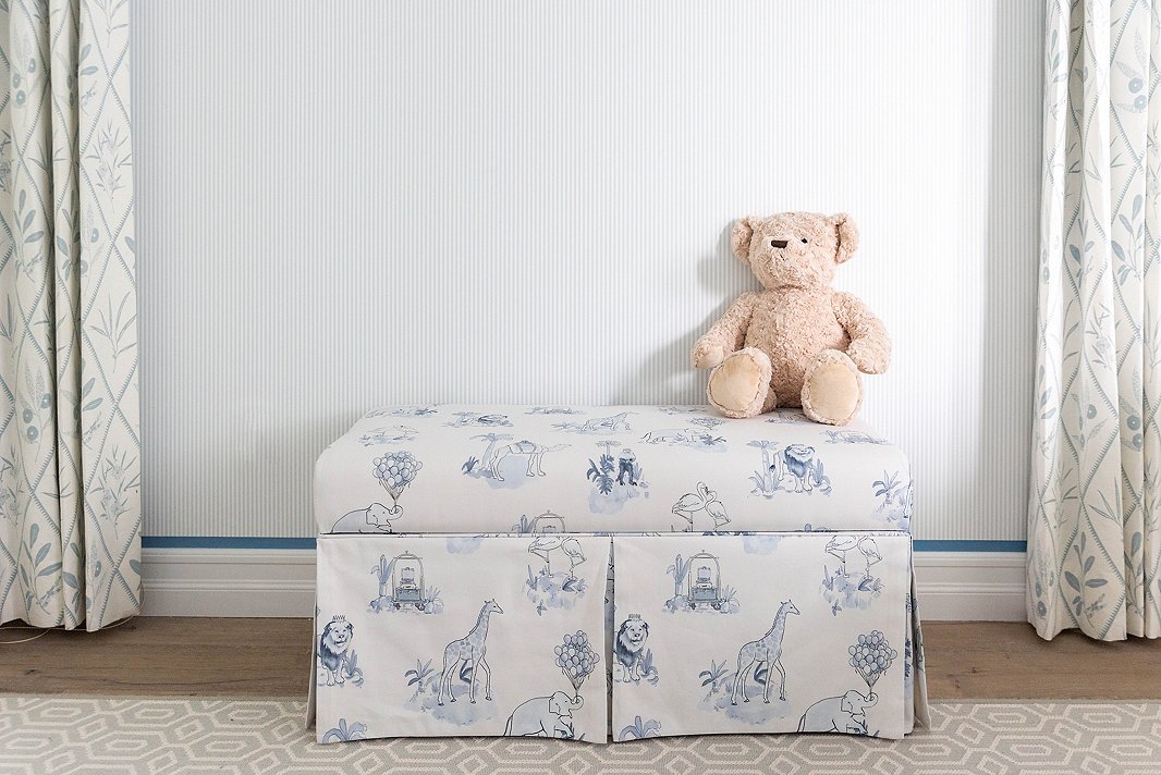
The Malin Toile print, seen here in blue on a storage bench (it also comes in pink), is a favorite of Gray’s. “It feels both elevated and playful and is very much the vibe of my twins’ nurseries,” he says.
Q: You are known for your photography and have developed other product lines with your prints. What made you want to branch into furnishings?
A: Whenever I begin the design of a room, I always start with the artwork selection. From there, I let the creation of the room’s elements—from the furniture to the color palette to the textures—come to life. This creative process was the catalyst behind utilizing my photography in new ways, specifically within the home decor genre. Over the years, I’ve created decorative accents such as acrylic trays with some of my most popular prints, as well as a wallpaper collection inspired by my prints. When I began to think about furnishings, it felt natural to begin with nursery and children’s furniture, as I have spent the last year designing my own twins’ rooms and now spend a lot of time there.
Can you dive into the inspiration behind the collection?
The Parker Palm Springs’ magical grounds sparked the idea to place wild animals throughout the property to create a photography series that captured this whimsical world and evoked the feeling of childlike wonder. After seeing how well the photography series was received and releasing an accompanying children’s book, Be Our Guest!, last year, I definitely felt that the bright hues and playful animals of this modern-day fantasyland collection would lend itself perfectly to nursery and children’s furnishings.
Do you have a favorite design from the collection?
I love the Malin Toile pattern, which feels both elevated and playful and is very much the vibe of my twins’ nurseries. I also really appreciate how many of the pieces have built-in storage, which is key for smaller spaces.
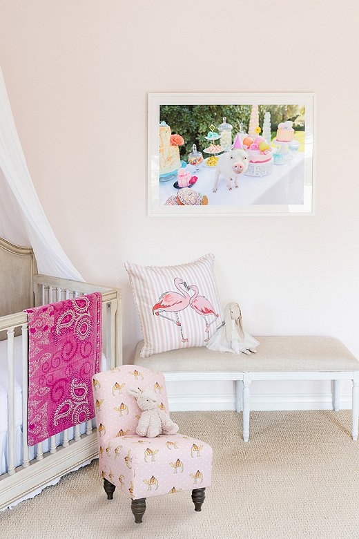
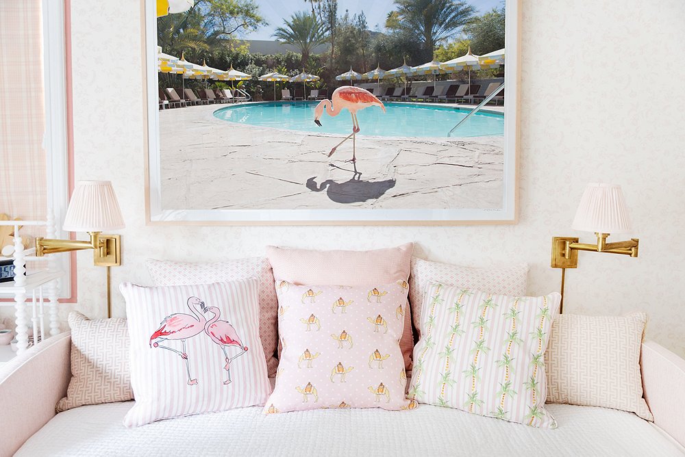
The Flamingo Stripe Pillow and the kid-size Camel Dot Chair (both shown in pink) make a sweet pairing in Gray’s daughter’s room.
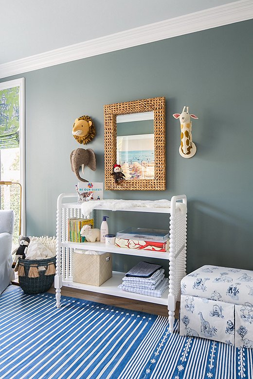
The Malin Toile Storage Bench, seen here in Gray’s son’s room, provides a soft spot to sit and a sneaky space to stow away blankets and toys.
How has becoming a father changed your view on design and decorating?
Most of my design aesthetic has easily transferred over to decorating for the twins. I think there is absolutely a way to merge elevated and playful, which was really important to me when developing this collection. Mixing complementary colors and patterns is my key to designing a well-rounded room, and I love how this collection really incorporates those elements so well.
How did you think about designing your twins’ spaces?
With twins, it is recommended that they sleep in the same room during the first year, as they are comforted by each other’s presence and this also gets them on the same sleep schedule. Therefore, the room that they’re sharing is a bit more gender-neutral and incorporates prints from my series Gray Malin at the Parker, yet it will easily transition into our son’s room when it’s time for our daughter to move into her own [space].
Both rooms are designed quite traditionally with very sweet and joyful moments throughout. In our daughter’s room we went more feminine, incorporating different shades of pink. She has the Flamingo Stripe Pink Storage Ottoman, as well as all the pink-hued pillows from the collection piled together on a daybed. In our son’s room we have the Malin Toile Blue Storage Bench, as well as the Elephant Stripe Blue Storage Ottoman and matching Elephant Stripe Blue Pillows on the feeding chairs.
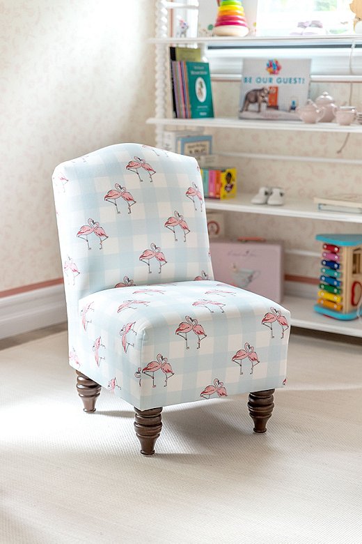
With its pastel check pattern, the Flamingo Gingham Kid’s Chair, which Gray used in his twins’ playroom, is the ultimate in preppy chic.
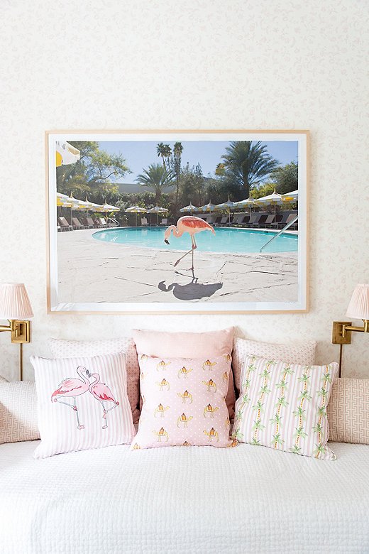
These pieces were made to mix and match, as Gray did in his daughter’s room with the Flamingo Stripe and Palm Tree Stripe pillows.





Join the Discussion