When One Kings Lane co-founder Susan Feldman’s daughter Kim left the nest, moving from the family’s Hollywood Hills home to New York City, her room existed in a state of flux: part teenage time capsule, part guest room, part storage space. “It became a catchall,” says Feldman, “and really needed to be more comfortable for guests.” The impetus struck when Feldman expanded the kitchen, which sits directly below, and a happy side effect was that this room suddenly possessed a balcony with a fabulous view of Los Angeles. “We put in French doors to lead outside, but the room needed a refresh to do the outdoor space justice,” she says.
So she teamed up with friend-slash-designer Kenneth Brown, who’s based in Baton Rouge with an L.A. office, to turn her daughter’s old room into a never-want-to-leave-it retreat. And according to friends who’ve slept there since, the overhaul gets a gold star: “There’s actually another guest room with a private bathroom,” says Feldman, “but people like to stay in this one more.” Adds Brown, “I think I’m actually due for a little vacation!”
Here’s a look at the space pre- and post-makeover.
BEFORE
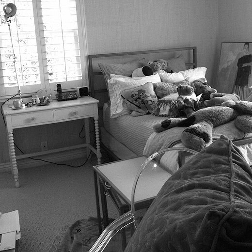
The Issues
Insufficient storage was one of the issues Feldman and Brown wanted to tackle. “My daughter’s stuff was still in there,” says Feldman, “and if guests came to stay there was nowhere for them to put their things or sit and read a book.” She adds: “For a while the room was even doubling as my home office! It just wasn’t serving a purpose.”
The Bright Side
“It’s a corner room with windows on both sides, and such an amazing view,” says Brown. “All great features to build on.”
The Inspiration
“I tend to be all about the neutrals,” says Feldman, “but I was so inspired by recent trips to Morocco and India that I really wanted to infuse color into my home.” She’s a huge fan of textiles, so she and Brown wound up choosing fabrics first, then gearing the room around the palette and mood of those designs.
AFTER
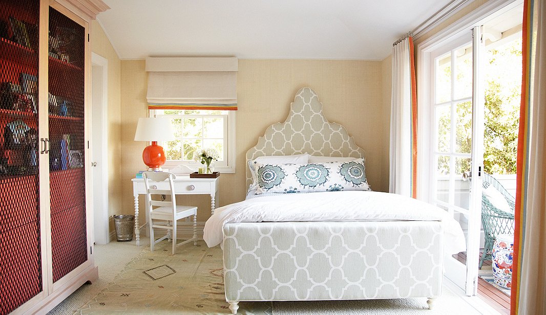
To play up the Moroccan theme, Brown worked with his “furniture guy” to create a custom headboard for the bed. Once it was completed and upholstered in Windsor Smith Fabric for Kravet, the custom bed found a perfect sidekick in Feldman’s childhood desk and chair. “All we did was put new hardware on it,” she says. A punch of tangerine, coloring the base of a lamp from Mottega (a completely customizable line) and edging the raw-silk window treatments Brown had made, complements the room’s blue-green hues and “brings in the rich orange of sunset you can see out the back window in the evenings,” says Brown. A rug from the souks of Morocco completes the thought.
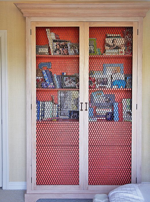
Design Mix Furniture customized this cabinet for the space: It’s tall and thin to take up minimal floor space, has drawers for clothes and shelves for knickknacks, and plays up the palette. “My daughter’s stuff gets corralled here,” says Feldman, “while guests have another dresser all to themselves.”
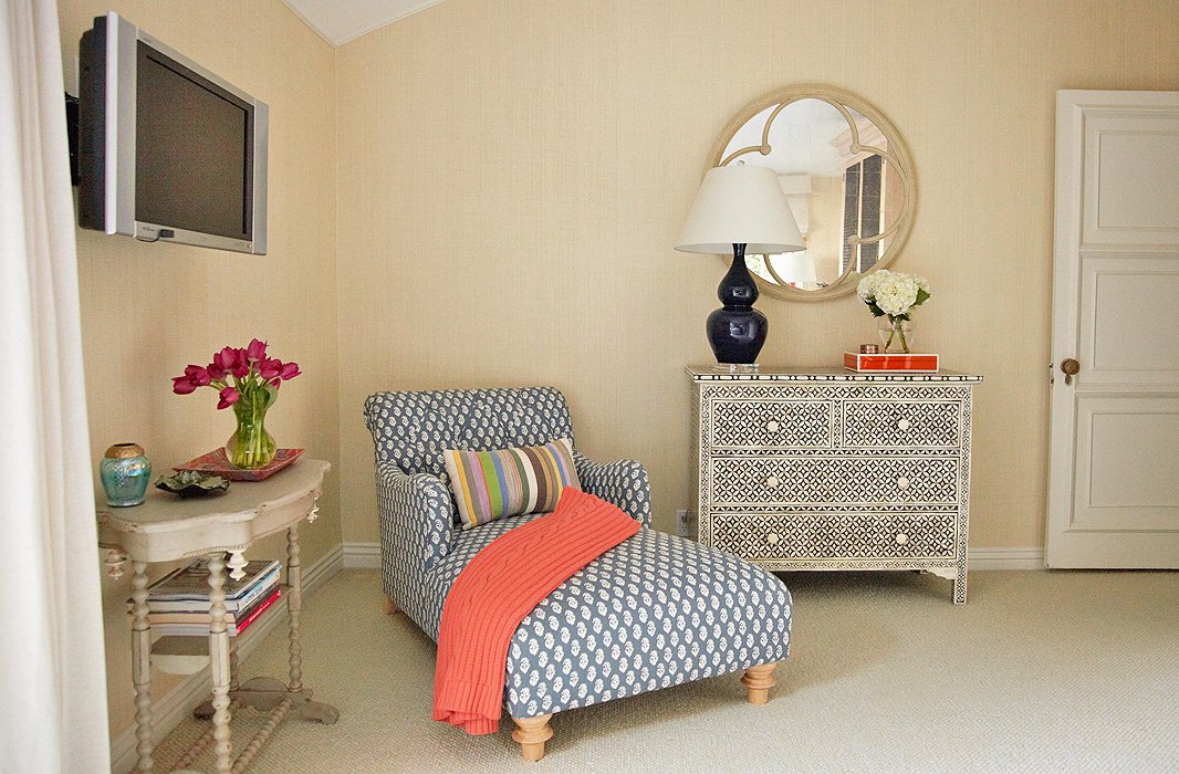
In the newly created reading nook, a chair done up in Peter Dunham fabric shares space with an inlaid dresser Feldman brought back from India. “I knew from the get-go that I wanted to use that dresser, so we had to work around it,” says Feldman. It’s topped with another Mottega lamp with a curved base that mirrors the curves in the tables’ spindle legs and the minaret-inspired headboard.
“The biggest challenge when working with different colors and patterns is finding the thread that holds it all together,” says Brown. “For this space it was the raffia grasscloth wallpaper from Phillip Jeffries and luxurious wool carpeting. They’re both slightly textured, catching the light just enough to create a subtle pattern that ties in with the other prints in the room.”

Join the Discussion