When it comes to hotels, you have your beautiful big-box brands, your middle-of-the-road motels, and your boutique gems oozing style and sass. You know the ones—they feel like you’re spending the night in the pad of an effortlessly stylish pal. And Austin-based hotelier Liz Lambert is one of the best at this last category—all of her Texas properties hit a pitch-perfect mix of vintage cool, authentic charm, and standout service.
We decided to tour one of Austin’s hippest hotels, none other than Liz’s Hotel Saint Cecilia. Named after the patron saint of poetry and music, the hotel has a rock-and-roll soul we can’t get enough of—but the best part? It’s full of genius design ideas you can easily translate to your home. Below, Liz shows us around, and we share 10 style takeaways.
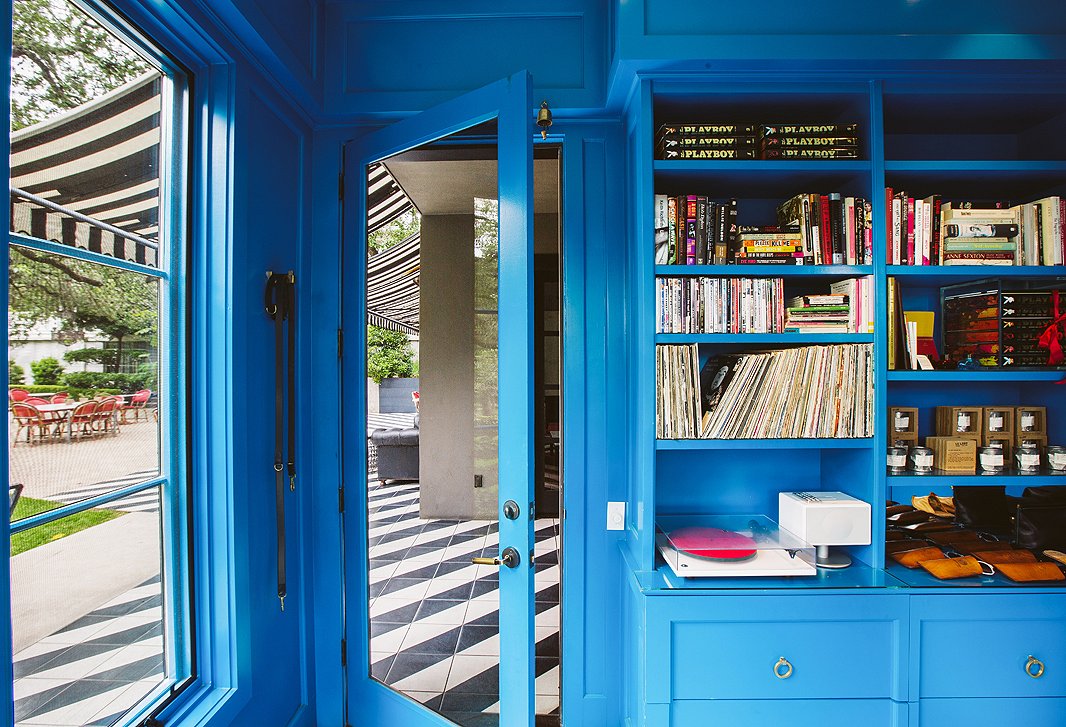
Parisian storefront facades inspired the built-ins edging the hotel’s lobby-slash-shop, which were painted a custom blue (Sherwin Williams H03520), and stocked with cool products—think leather slippers and a perfume made from on-property tea roses.
#1: Use pops of the same color in every room
This trick, an all-time designer favorite, gives different rooms in a space a cohesive feel. In the Saint Cecilia, the color blue runs throughout, from the lobby walls (shown above) to the tiles under the poolside arbor. “There are maybe 20 shades of blue,” says Liz, who decided on the hotel’s signature Mediterranean blue, then riffed off it in lighter and darker shades.
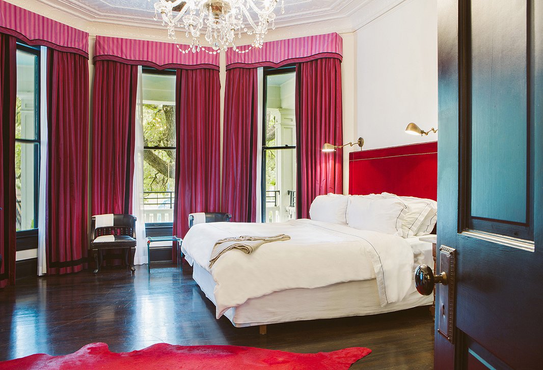
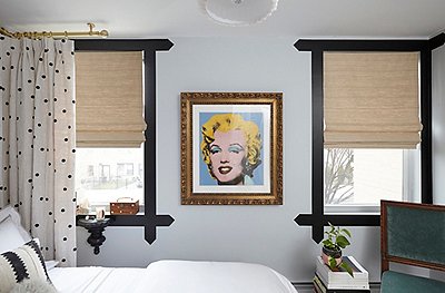
With windows sporting curtains made with Dutch Designers Guild fabrics, all rooms feature a cloudlike Swedish Hästens bed.
#2: Accentuate existing architecture
After purchasing the 1886 home, Liz divided it up in a modern way—every room has its own entrance—but she was determined to keep its old-school integrity intact. “It’s a beautiful old Victorian,” she says. “I didn’t want to lose that.” So she played up time-period touches like molding, millwork, and Anaglypta (textured wallpaper).
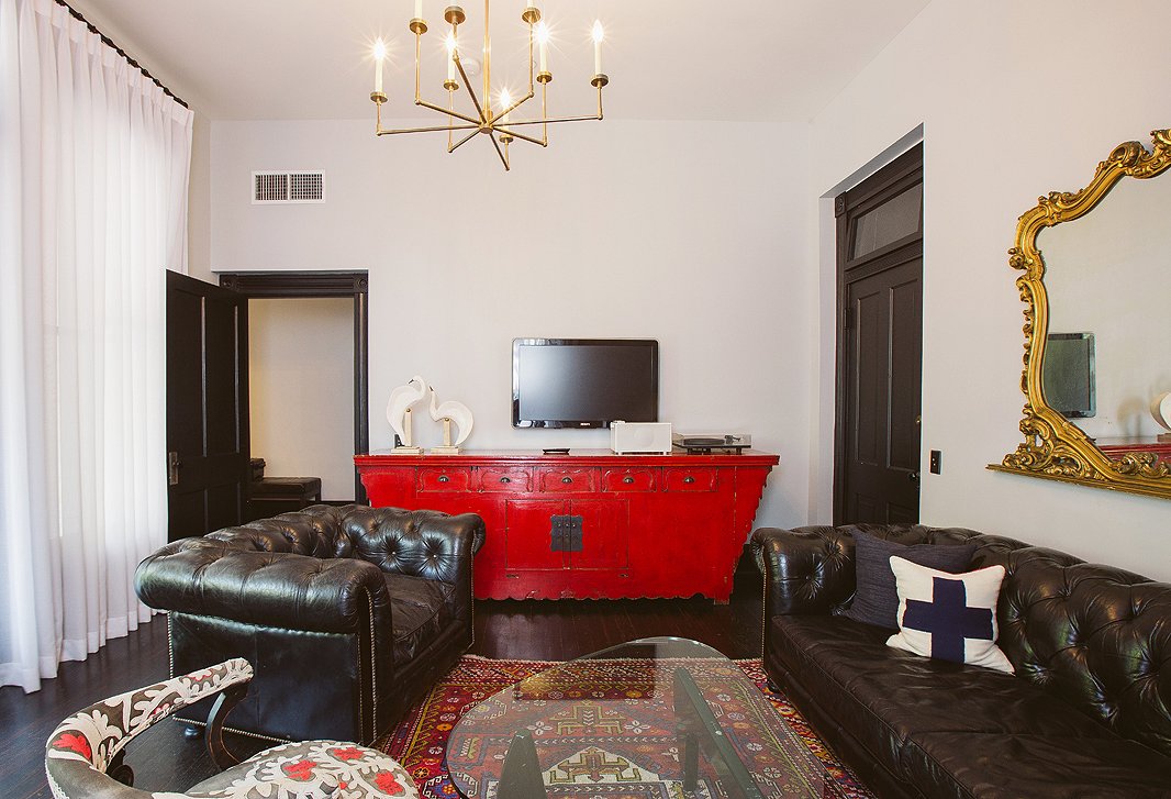
Liz searched high and low for furnishings to fill the hotel, pouncing on the right piece as soon as she spotted it. Her favorite spots to shop? Texas’s legendary Round Top Antiques Fair, online antiques emporium 1stdibs, and Berkeley, CA-based Ohmega Salvage.
#3: Embrace a mixed bag of inspiration
Your granny’s house, complete with doilies and stained wood, and the decadent, edgy, peacock personas of ’60s and ’70s rock stars: These two seemingly opposing themes equally inspired Liz’s vision for the hotel. “I saw some picture of the Stones in front of an old Victorian mansion,” she says. “They’re in their glam clothes—that velvet, those bright colors and metallics—and there’s a chauffeur washing a Bentley in the back. That’s how I thought of the hotel, like a Venn diagram of styles.”
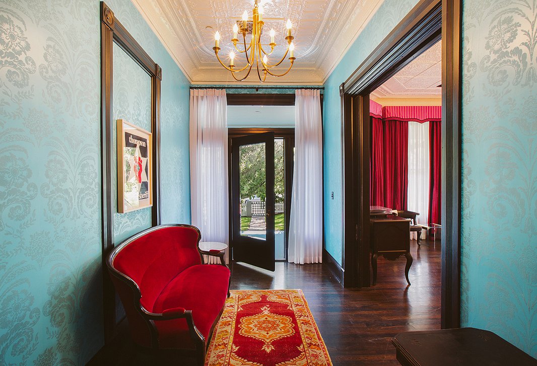
Other hotels give you pillow chocolates; Saint Cecilia gives you extra living space in every room. Case in point: Suite 1 comes with a spacious bedroom, sitting room, and study.
#4: Work in some wallpaper
Wildly popular during Victorian times, wallpaper is undergoing a major resurgence. Liz loved how Dutch Designers Guild’s flocked wallpaper looked as rock-and-roll as it does old English mansion. She used it in entryways and on accent walls.
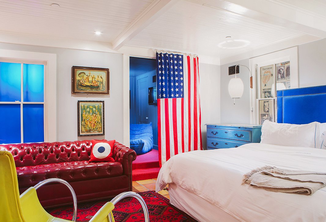
If blue is the hotel’s signature color, red runs a close second, chosen for its color-wheel contrast with blue and classic Americana leanings.
#5: Pick patterns sparingly
“You can mix crazy pattern on crazy pattern, which can work, but it’s not exactly calming,” says Liz. “The trick is to mix styles but have them be really easy on your eyes. So you see that I work with a lot of solid color and not a lot of pattern. My brother, who’s a designer, told me years ago, ‘Let the people be the color in the room,’ and I try to remember that.”
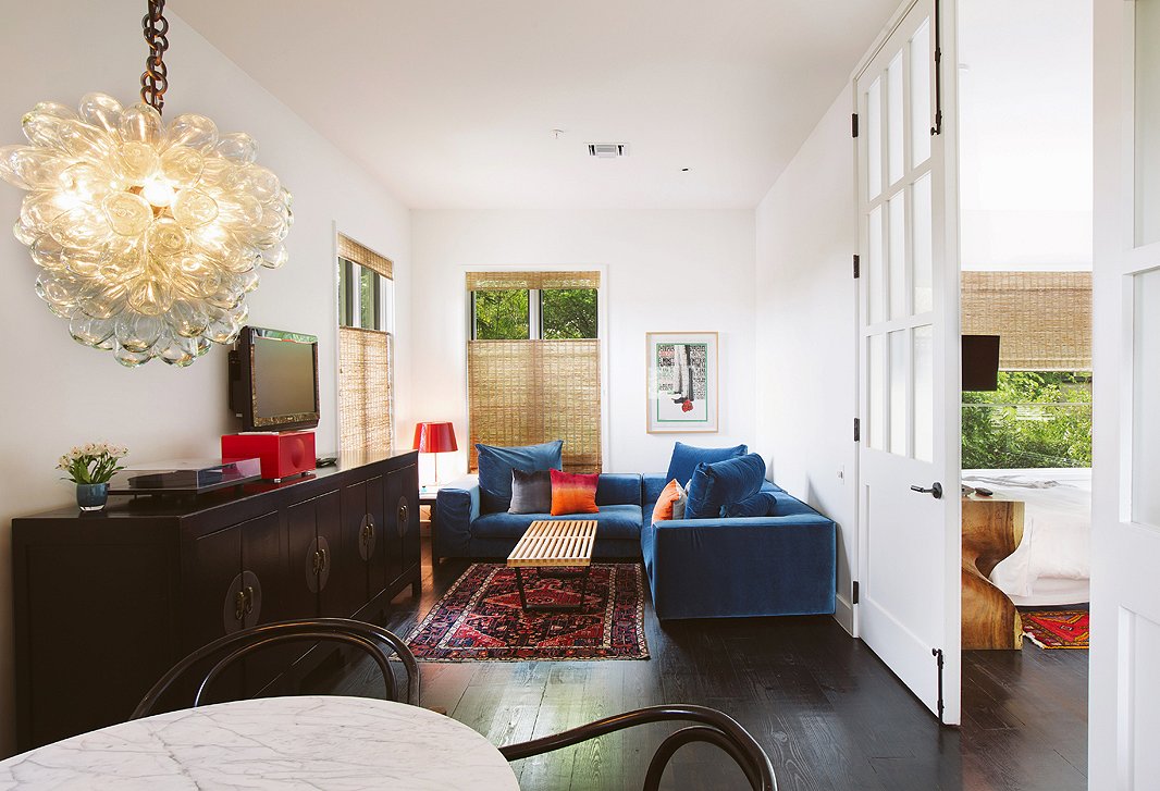
Liz and crew looked to the lighting gurus at Visual Comfort for everything from chandeliers to bedside pendants to bubble lamps.
#6: Update vintage pieces
Just because Liz is a die-hard vintage fan doesn’t mean she thinks everything is best as-is. Few of her vintage finds were left untouched: Most scored minor repairs or received a new coat of paint or varnish, and many were reupholstered in chicer fabrics like mohair or velvet.
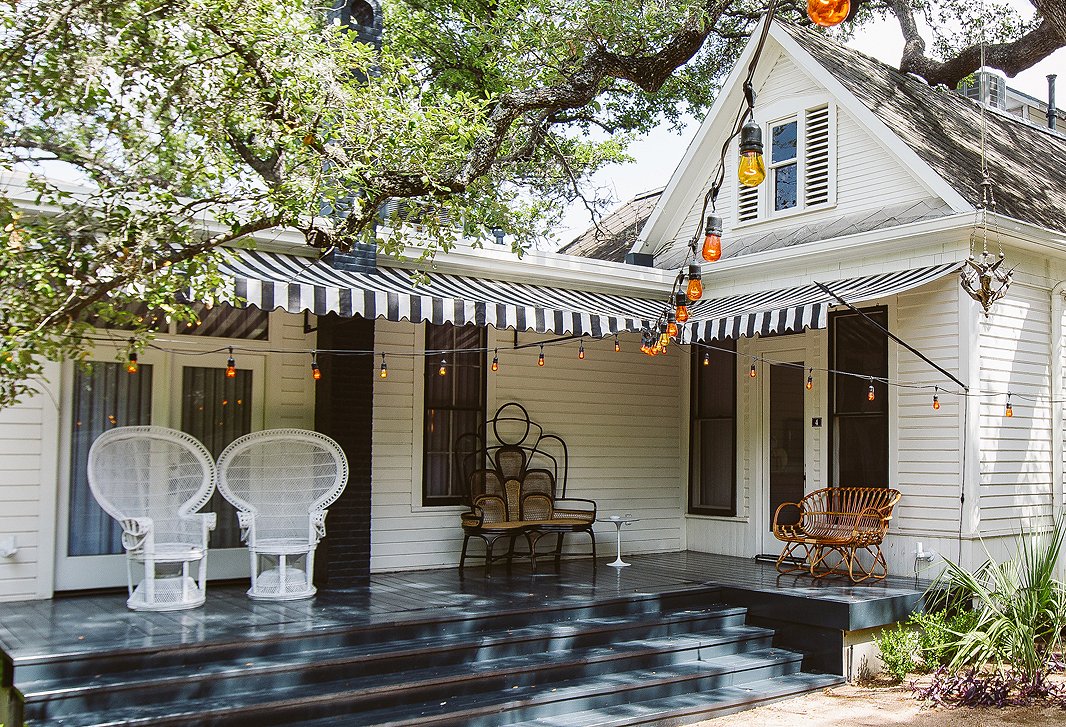
All the rooms come with an outdoor space, though none are as grand as that of Suite 4 (shown above), with its own yard complete with fire pit and tucked-away lounge area.
#7: Beauty and function can coexist
If anyone knows which furnishings can stand up to intense use, it’s a hotelier. And over the years, Liz has fine-tuned that knowledge. The winners? The leather couches, which develop a cool, lived-in patina; mohair upholstery, which is known for its durability; hemp cushions, which are like grain sack but sturdier; and—surprisingly—Carrara marble.
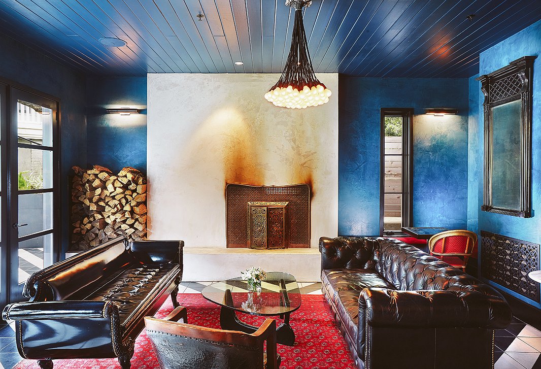
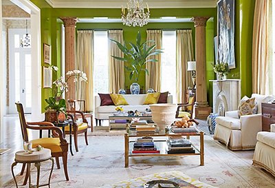
Every year on November 22, the hotel celebrates its patron saint with a mash-up of friends, neighbors, and local musicians convening for an outdoor feast before ending the night lounging by the fireplace in the lounge (shown above), passing a guitar around until late into the night.
#8: Establish a language with your materials
Take a walk through Hotel Saint Cecilia and you’ll see patterns emerge: Throughout the hotel, Liz stuck to black and brown leather, bentwood accents, cowhides, and mohair. And though the pieces themselves vary in shape and size, the repetition of materials lends a calmness even to such a hi-fi space.

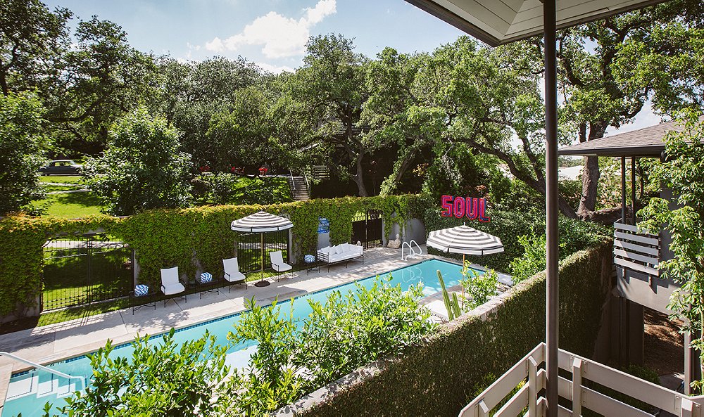
The pool? Fifty-feet-long heated bliss. The patio furniture? Luxuriously Riviera in feel. The “soul”? The hotel’s unofficial mantra, in a word.
#9: Buy what you love
When Liz bought the “soul” sign—“part of a larger sign that used to say Louisiana,” she laughs—she didn’t know where it was going to go. After holding it up in multiple spots, she and her team landed on this placement, which instantly turned the pool into a showpiece that remains one of the hotel’s most photographed angles.
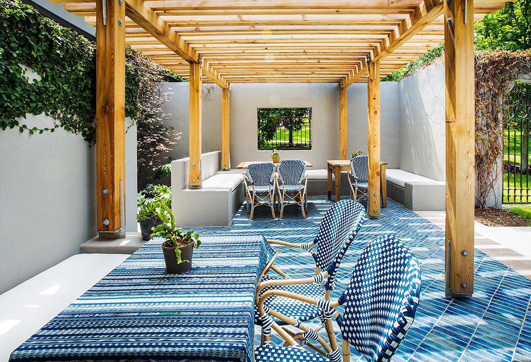
After guests expressed a desire to sip and sup alfresco, the hotel built this arbor. Tile from Ann Sacks’s Design & Direct Source and bistro chairs complete the dreamy sidewalk café feel.
#10: Don’t forget your outdoor spaces
When it came to decorating the hotel’s outdoor space, Liz gave it as much consideration as any of the rooms, opting for sophisticated furniture and ceramic tile that mirrored the style of the lounge. “We wanted something casual but elevated in the spirit of the rest of the hotel,” she says.

Join the Discussion