If you’ve been stuck at home, staring at the same boring white walls for the past few months, we’ve got just the thing to spice up your space: murals. They’ve been popping up recently in the design ether, riding on the coattails of a larger maximalist movement. We love their all-encompassing design power (like Sasha Bikoff’s staircase from the 2018 Kips Bay showhouse) and think they’re the next big thing.
One reason murals are so popular right now is their accessibility. “Decorative painting is a great way to bring a pop to a room that’s custom and typically less expensive than a total refresh to your space,” says Jess Hutchison, a member of the One Kings Lane Interior Design team. And because murals use paint instead of wallpaper, they’re renter friendly. No more white boxes for renters!
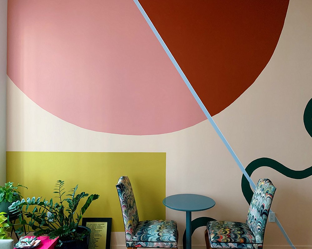
As we started to notice this trend, the mural of former Domino editor Alyssa Clough kept surfacing on our Instagram feed. (That’s it above.) Alyssa has a track record of painting her New York apartments. She wanted to keep that tradition alive and go all-out in her new Brooklyn home. This apartment has 12-foot-tall ceilings and tons of natural light that streams through her industrial windows.
“I felt like one solid color would be too obtrusive, wallpaper too busy,” she says. “I decided to lean into a hand-painted wall mural with a larger scale and organic shapes.” She enlisted help from Elaina Sullivan, an artist and fellow Domino alum. Together they pulled inspiration and decided on eight colors from Benjamin Moore. We asked Alyssa to share some of her tips on crafting the perfect mural.
Color Theory + Design
Color theory, and the way the palette of a room works together, is hugely important in the planning stages of the mural. Get it wrong, and the whole room could fail. “If you’re going for a statement wall mural look, let it be the first or last thing you do in your space,” says Alyssa. If you’re starting from scratch, as Alyssa did, you can easily build a palette around the colors in the mural. If not, Jess suggests turning to the palette you’ve already established. Pull from there to create the mural.
Consult with the experts to figure out which type of paint is best for you. (You can also read our complete guide to painting your house here). Buy more than you think you’ll need, as you never know what will happen along the way. Be sure to swatch the paint and test the colors out in different lighting—early morning as well as late evening, for instance.
The next step is figuring out how you want the mural to look. Alyssa had Elaina’s artistic eye to take care of that, but if you’re doing it yourself, there’s one thing you need to keep in mind: Proportion is everything. Get an accurate measurement of your space and decide how big or small you want certain aspects of the mural to be. Follow the adage of “measure twice and cut (in this case, paint) once.”
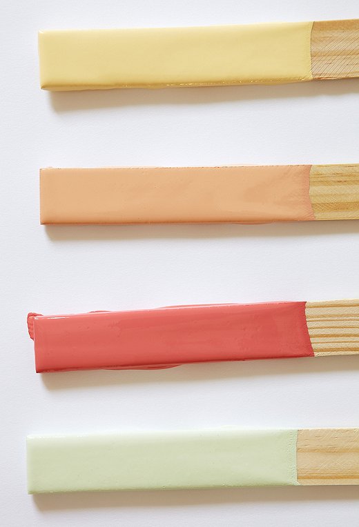
Using complementary colors is an easy to way to build a color palette.
Palette Perfection
Once you’ve established a color palette and general idea of what you want your mural to look like, it’s time to consider how it works with the rest of your space. The way you approach this will vary depending on where in the design process you are.
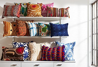
Starting from scratch: Congrats, this is the easiest place to be! Take a cue from the colors you used in the mural and incorporate them into the design. Alyssa’s mural is the focal wall in her open-plan apartment. “Essentially the mural works because it’s the only painted wall in my common space. The rest of the walls were left white on purpose,” she says. She incorporated the mural colors throughout her space. Pro tip: If you’re afraid to spring for large pieces that have major color, use pillows or other soft goods to bring color in.
Making it work: This is a little harder than it would be if you were starting from scratch, but it’s not impossible. The basic principles are the same. Be strict in choosing your colors. “Bring color in that complements and pulls from what you already have,” Jess advices. Look to accent colors in the fabrics around the room. Take inspiration from the art and objects on your walls and shelves. Using these colors will keep the space from feeling chaotic.
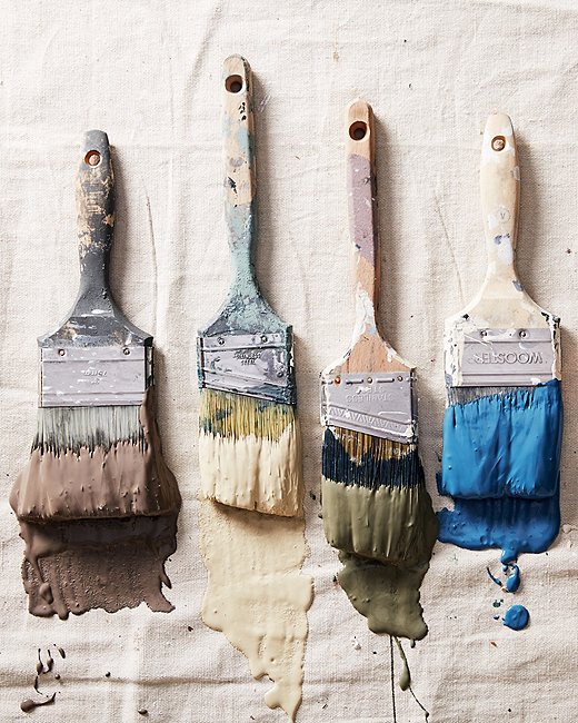
You’re finally ready to paint. If this is your first time painting, let’s go over the basic rules. “Don’t cut corners on the prep work,” says Jess. You’ll need to clean your walls, tape all the necessary areas (such as trim or corners), and protect your floors with drop cloths. Once you’ve prepped and prime, it’s go time. Good luck, everybody!
DIY Mural Checklist
- Pick your palette. Have you landed on a palette that matches (or will match) your furnishings?
- Time to test. Consult with the experts on the best type of paint to use (semigloss, eggshell, etc.) for the look you want. Paint swatches on the wall and live with them a few days. Notice how they change with changes in light conditions.
- Sketch it out. Pick your design, and make sure you’ve figured out proportions before sketching it on the wall. Don’t forget that practice makes perfect.
- Prep and prime. Prepare your space before you paint. Lay out drop cloths, tape the borders, patch any holes, and prime the walls.
- You’re ready to paint!

Join the Discussion