Given the time, money, and effort involved, painting a room is a real commitment—which is why many of us let paint swatches languish on our walls for months, agonizing between shades of not quite white and barely there gray.
To help make the process a bit more painless (and dare we say, fun?), we tapped Andrea Magno, Benjamin Moore color and design expert, to share her expert approach to painting with confidence. From the best method for testing shades to the one small-space rule we can (finally!) ignore, read on as Andrea answers our most frequently asked questions about all things paint.
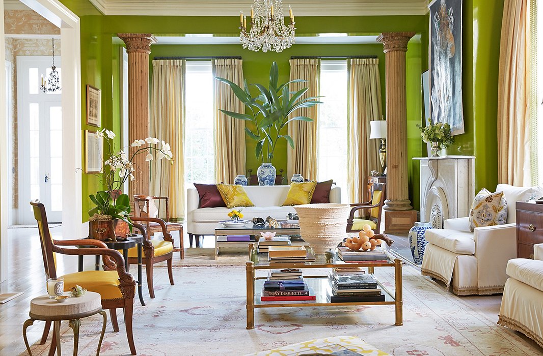
In the New Orleans home of luxury-linens maven Jane Scott Hodges, zingy chartreuse walls make a bold statement—but thanks to the room’s ample natural light, the color doesn’t overwhelm. Photo by Tony Vu.
First things first: Where do I start?
Andrea Magno: We always tell people to find some point of inspiration. Let’s say it’s a kitchen and you have a countertop with veining in it—pulling color from that is one way to go. Maybe it’s starting with an area rug or window treatments. It can even be as simple as a pillow fabric. Using some kind of guide is going to help you narrow down which color families you want to look at.
When you’re trying to figure out what mood you want to create, you have to give a lot of thought to how different colors make you feel. If you’re wearing green do you feel particularly good? What colors are you drawn to? That can help shape the direction you want to go in when you’re choosing color.
Okay—I know what color family I like. Now how do I pick a specific shade?
AM: Start by asking where you want to be lightness- to darkness-wise in that color family—do you want a really pale blue, or do you want navy blue? That’s the next step in narrowing it down.
Once you figure that out you can start comparing different colors. I always urge people to compare colors next to each other or overlap them, so that you start to pick up on undertones. That’s going to help you say, “Maybe I like the blue-green versions of blue as opposed to ones that go a little bit more purple.” And at that point you would start testing the colors to see how that variation on blue is going to work with your lighting.
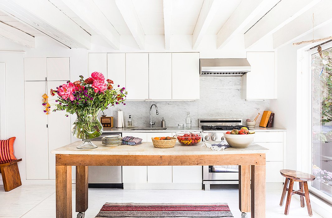
A Brooklyn kitchen goes sleek and chic in allover white—from the cabinets to the ceiling to the floor. Home of Jenni Li; photo by Lesley Unruh.
And what about white? There are seemingly infinite tones.
AM: That’s where I think it’s most important to compare one color to the other. I like to literally overlap the two colors. If you have two whites and you’re looking at them in isolation, they’re probably going to look alike. But if you take those two color chips and put them one on top of the other, you start to see that one is a little bit more creamy, and maybe the other has more of a green undertone. But you wouldn’t be able to appreciate that until you have them right on top of each other.
What’s the best way to test shades in my space?
AM: Once you get down to two or three colors that you’re really torn between, we usually encourage people to buy a pint sample rather than work off a one-inch-square paint chip.
If you paint out a piece of foam core, for instance, you’ve got a really big chip, and you’ll be able to move it around the room and understand how the color is going to work in the morning light versus the evening light. Then you can make a color decision with a lot of confidence—because you’re not making a guess. You’re almost living with the color. And it’s better to paint a sample color onto something like foam core as opposed to painting it on the wall itself, because the existing color is going to throw you off.
It might take some time, but if you can take that extra step of actually sampling the color, then you wind up with something that you’re going to be happy with for a much longer period of time.
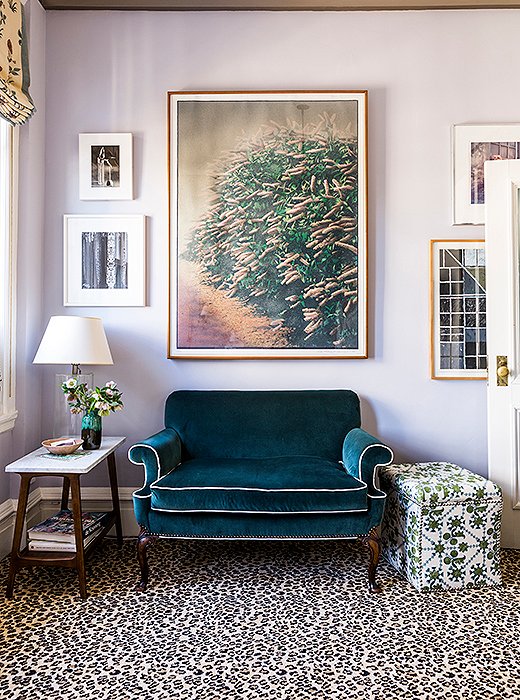
Soft light gives lilac-toned walls a dreamy, changeable vibe in the NYC home of designer Katie Leede. Photo by Lesley Unruh.
How does natural light come into play?
AM: If you have a southern-facing room with that strong sunlight coming in, that opens up a lot of possibilities as far as what colors will work well; you can bring in a darker color or a color that’s a little bit more saturated, because you have that light to balance everything out.
Sometimes northern light can do some strange things to colors—they can pick up a different undertones. Which, again, is why it’s really important to sample them!

It might take some time, but if you can take that extra step of actually sampling the color, then you wind up with something that you’re going to be happy with for a much longer period of time.
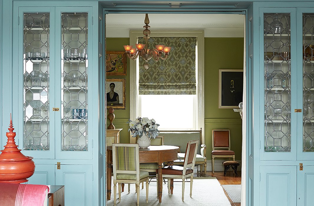
An apple-green dining room plays nicely with adjacent blue-painted cabinets in the Harlem home of designer Sheila Bridges. Photo by Manuel Rodriguez.
What impact does the wall color of adjacent rooms have?
AM: You want an easy transition from one color to the next. If you have a really stark contrast, it’s going to take the eye a little more work to adjust. But you can also think about that inspiration point, so you have some element that’s tying everything together—whether it’s a rug, a countertop… And you’re able to make a connection that makes the transition from one color to the next seem logical.
Once and for all: Are dark colors a no-go for small spaces?
AM: I feel like that’s one of those myths. You can use a darker color in a smaller room and it’s going to be really dramatic—it can make the room almost feel bigger in a way. I like to use the example of the sky at night: It looks huge and expansive; it doesn’t feel like the sky is falling in on you. It’s the same concept. When you get into the corners and the shadowed areas of the room, it’s going to blur the lines, so you’re not able to focus on definite beginning and ending points.
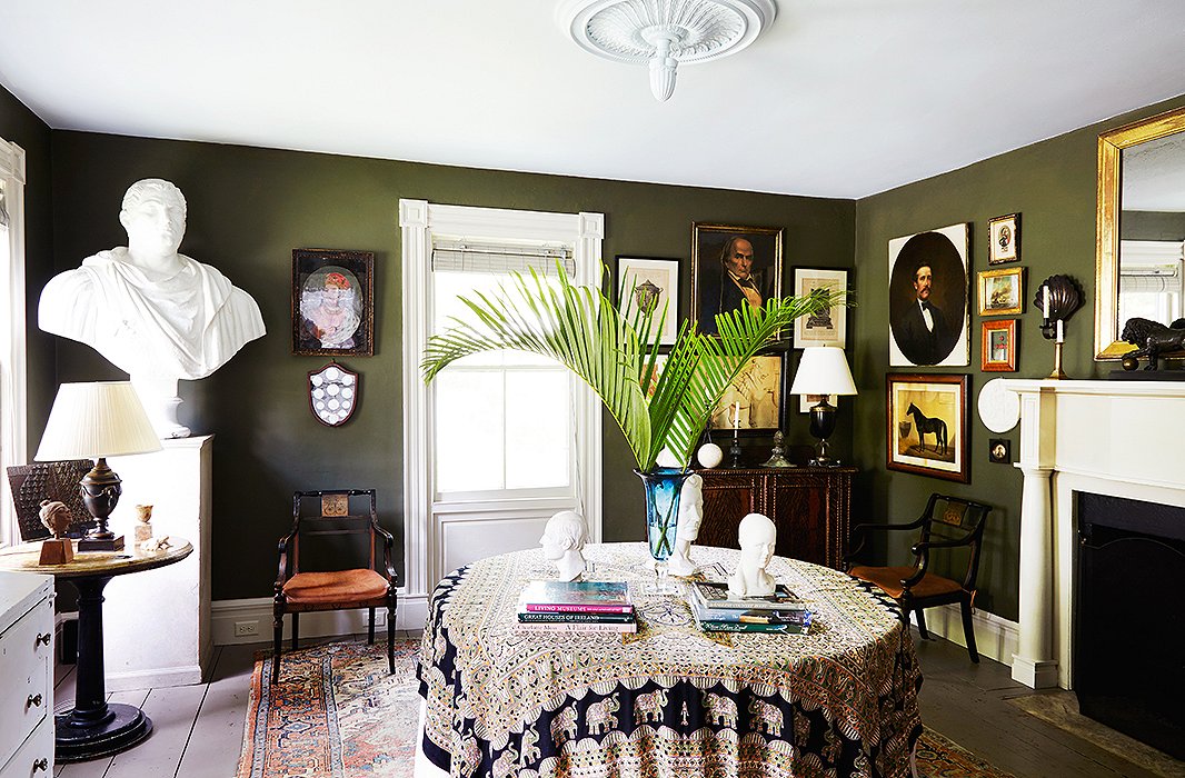
A deep green hue lends depth to a small dining room in artist Frank Faulkner’s upstate New York home. Photo by Pernille Loof.
I finally painted the room—and I don’t love it. What now?
AM: You could always repaint it, but if you want to avoid having to go through that work again, one of the easiest things you can do is play around with the light bulbs in the room. Different light bulbs have different color temperatures, and they’re going to have an impact on the way the color looks on the wall.
Usually if the light bulb is really cool, it’s just not as appealing or welcoming, so switching to a warmer light bulb will sometimes do the trick. Instead of bringing the drop cloth back out, that’s a very easy way to course-correct.
Tell me more…
AM: A lot of the LED bulbs out now are very comparable to traditional incandescent bulbs, and they’re pretty warm. Compact fluorescent light bulbs [CFLs] are going to be cooler and probably less appealing. Be sure you look at the color-rendering index: If you have a color-rendering index of 85 to 100, that’s really good. A 70 is where you get into trouble.
You can use a darker color in a smaller room and it’s going to be really dramatic—it can make the room almost feel bigger in a way.
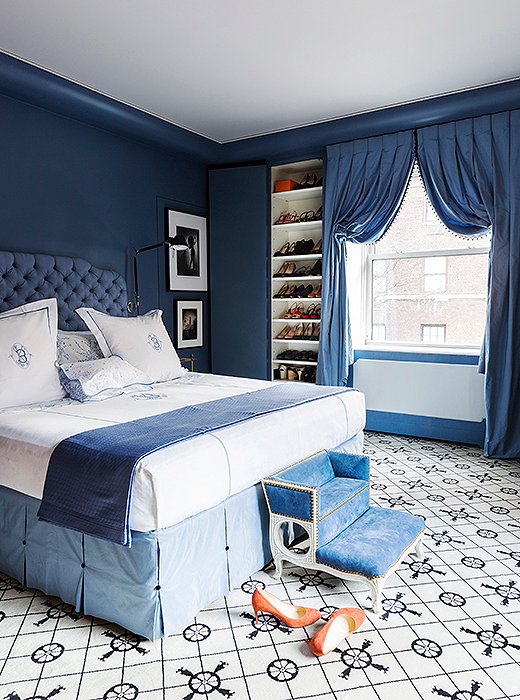
In a range of soothing blue tones, designer Kate Brodsky’s monochromatic Manhattan bedroom radiates calm. Photo by Lesley Unruh.
Color Schemes, Simplified
Andrea pulls out her color wheel (so you don’t have to), digging into the three basic types of color combinations:
Monochromatic color schemes rely on variations of a single color and are often the most approachable, Andrea says: “Usually these are very easy on the eyes.” To keep things interesting, play around with different undertones within a color family.
Analogous color schemes incorporate hues that are next to each other on the color wheel. These combinations often feel intuitively right—think blue, blue-green, and green, which work together effortlessly to “create nice color flow,” Andrea says.
Complementary colors are opposite each other on the color wheel—red and green, for example, or yellow and purple. Andrea’s advice for these bold pairings? “Make sure you’re not using the midtone of each one of those color families. Using a lighter value of one color and a darker value of another color works pretty well.”
A Note on Custom Blends
Whether it’s having a paint color mixed to match a favorite fabric or tinting a shade with touches of black or white, this designer trick can pay off—but it comes with a risk. “Down the road you may need to do touch-ups or repaint something, and it’s going to be a lot harder to have that custom match be exactly perfect,” Andrea says. “I personally find it a lot safer longevity-wise to stick with an actual formulated color.”
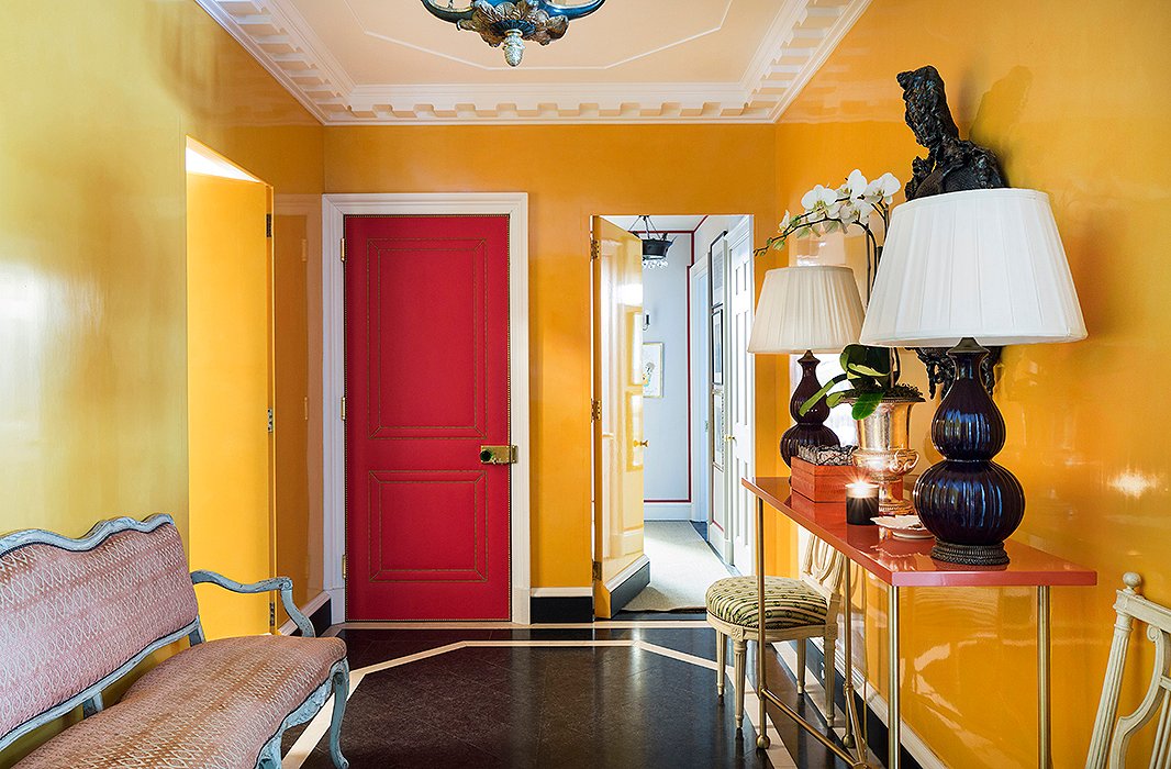
Brodsky’s foyer makes a striking impression, painted a high-drama orange in a high-gloss finish. Photo by Lesley Unruh.
Paint Finish 101
Once you’ve chosen a color, there’s one last factor that’s key to achieving the look you want: the finish. Below, Andrea breaks down the most common types, from the lowest sheen to the highest.
Flat: “Flat is traditionally used for ceilings because it’s very forgiving,” Andrea notes. Of any surface in a room, the ceiling is likely to have the most imperfections—simply because it’s the most difficult to work on—”so using a flat or an ultraflat is the easiest way to go.”
Matte: With just “a teeny bit more sheen” than flat, matte is another good choice for ceilings. “I personally like the matte finish because the color looks very rich, meaning there’s not as much light being reflected off the surface,” Andrea says.
Eggshell: This finish wins most popular, thanks to its “scrubbable” qualities—ideal for hallways, kitchens, and other high-traffic areas.
Satin: A solid choice for trim or doors, “where you don’t want it to be supershiny but you want a little bit of a gloss,” Andrea says.
Semigloss: A “tried-and-true” finish for doors and millwork, semigloss “has a nice gloss level, and it’s going to contrast nicely with either matte or eggshell finishes.”
High gloss: At the top of the sheen spectrum, high-gloss paint gives trim and doors a bit of drama. And while it can be used on walls to stunning effect, take note: The higher the gloss, the less forgiving the paint. “As you’re going up in the scale, more light is being reflected,” Andrea says. “You’ve got to make sure your walls are in perfect shape, because any imperfection is going to be amplified.”

Join the Discussion