
Kim Salmela has been designing, in one form or another, for her entire professional life, from being a creative director for Prince (yes, he of Purple Rain and unpronounceable symbol) to owning decor shops in her native Minneapolis, to starting her eponymous upholstered-furniture line, all while taking on interior-design clients when time permitted.
Her design sense has shifted and streamlined over time, but she has always (“and will always!” she says) possess an unabashed love of color and print. Her fearless and fun approach to mixing, matching, and seeking out pieces with soul is, unsurprisingly, showcased to perfection in her homes. This 1920s cottage she previously lived in was a case in point. A mash-up of Craftsman-style built-ins, a midcentury fireplace, and French lead-paned windows, it appealed to her for its bright, beautiful light and party-ready backyard. While living there, she filled it with eclectic pieces pulled together in an effortlessly joyful way. “Life is short. Honestly. You should just walk into your home and be happy. There are no rules. That’s the rule.”
The Living Room
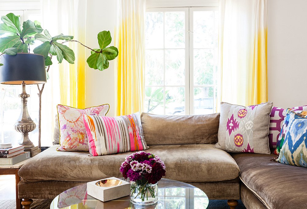
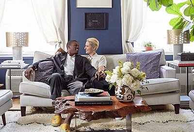
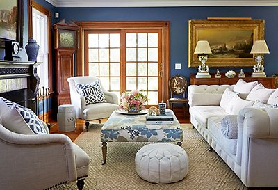
“When I’m designing,” says Kim, “I ask people, ‘What’s the mood you want to feel when you enter this room?’ For me, I wanted my living room to be uplifting. I wanted to smile when I walked in.” She achieved this mood-boosting vibe with white linen curtains she dyed ombré yellow to “give the room a glow,” a mix of pillows in collected vintage fabrics so bright they shout rather than whisper, and an oh-so comfy sofa she had custom-made. “Sometimes I work backward,” says Kim. “I designed that sofa for this space, then ended up putting the same design in my furniture line because it was just so comfy and useful.”
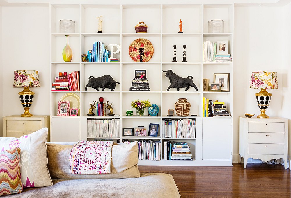
The bookshelves were arranged to highlight Kim’s favorite pieces—like the midcentury plaster bulls (she’s a Taurus)—and feel airy and orderly. Her tips: Color-coordinate to achieve calm, group smaller pieces when possible, and think both vertically and horizontally.
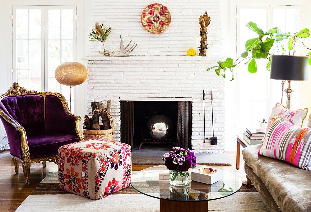
Beside the fireplace was one of two purple upholstered chairs that Kim scored at a Paris flea market and has had for more than 15 years. “They’ve worked in every home I’ve ever had,” she says. “They’re the perfect example of ‘buy what you love.’”
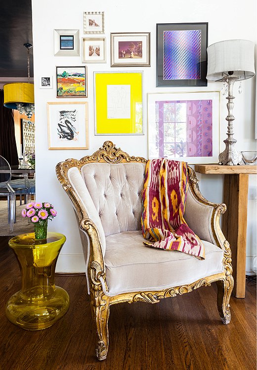
The purple chair’s lavender twin was tucked into another corner of Kim’s living room, under a salon-style art wall that she arranged by first laying the pieces—a mix of flea-market finds and works by friends—on the floor to find the right layout.

Good design withstands time regardless of color or pattern.
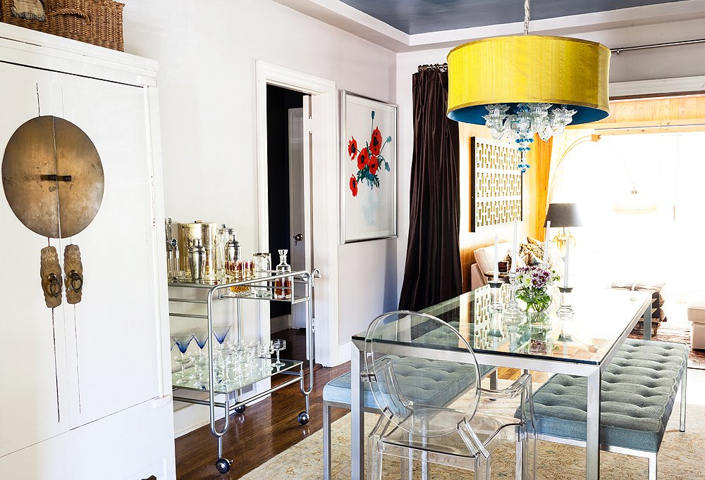
The Dining Room
Smack in the middle of the house, the dining room came with two design challenges: It’s a highly trafficked pass-through to other parts of the home, and it gets very little light. Kim tackled these shortcomings by opting for benches that can be tucked under the table and sticking with mainly glass and Lucite furnishings. “They almost make up for the lack of light,” she says. The exception? A “big, monstrous” Asian-style armoire she used to stash her eclectic tableware collection, which included everything from Moroccan tea glasses to Limoges china.
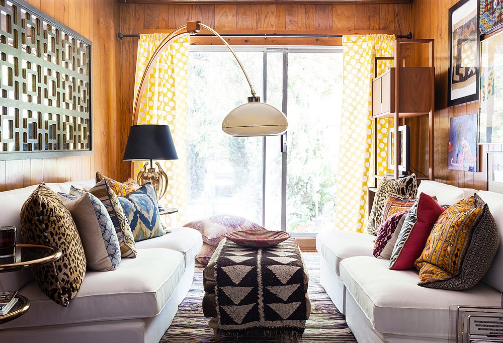
The Den
“When you’re trying to land on a seating arrangement, you need to consider the function of the room,” says Kim. “Lounging? Entertaining? Having intimate conversations?” She wanted the pint-size room off her kitchen to function as a kick-back lounge pad, so she kept the retro-cool wood paneling (“I loved the cheesiness!”), added in a chunky sisal carpet, and found her seating solution in twin sofas from Ikea. “They’re the perfect example of how I decorate,” says Kim. “A mix of high and low.” An arc lamp created added intimacy without blocking sight lines.
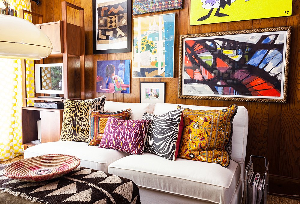
When entertaining, Kim and friends often ended up in the den, made extra cozy by vibrant art prints and patterns.
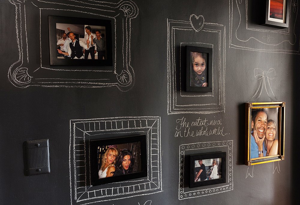
The Hallway
The day after losing her computer on a plane (and not having her photos backed up), Kim woke up, dug through her closets and drawers, and found about a dozen prints. “If that was all I had left, I wanted to make it a true statement,” she says, so she painted her hallway with chalkboard paint and drew on elaborate chalk frames. A container of chalk nailed to the wall let visiting friends play Picasso when the mood strikes.
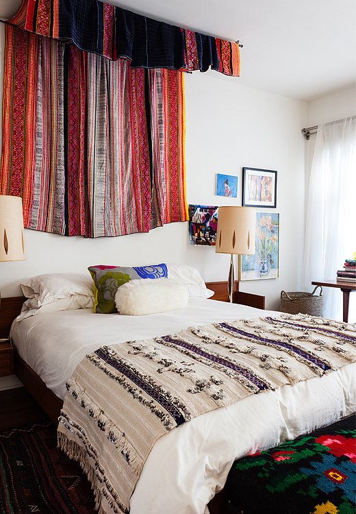
The Master Bedroom
In earthquake-prone Los Angeles, hanging art above your bed is a risky idea. To keep herself from being smacked on the head with falling pictures and to balance out her low-profile platform bed, Kim instead opted to create a “canopy” by hanging from the ceiling with two curtain rods a textile she brought back from Thailand. “It frames the bed and instantly creates this huge presence,” she says. A Moroccan wedding blanket added another layer of texture without introducing another color to the vibrant bedroom. “You always need those quiet moments,” she says.
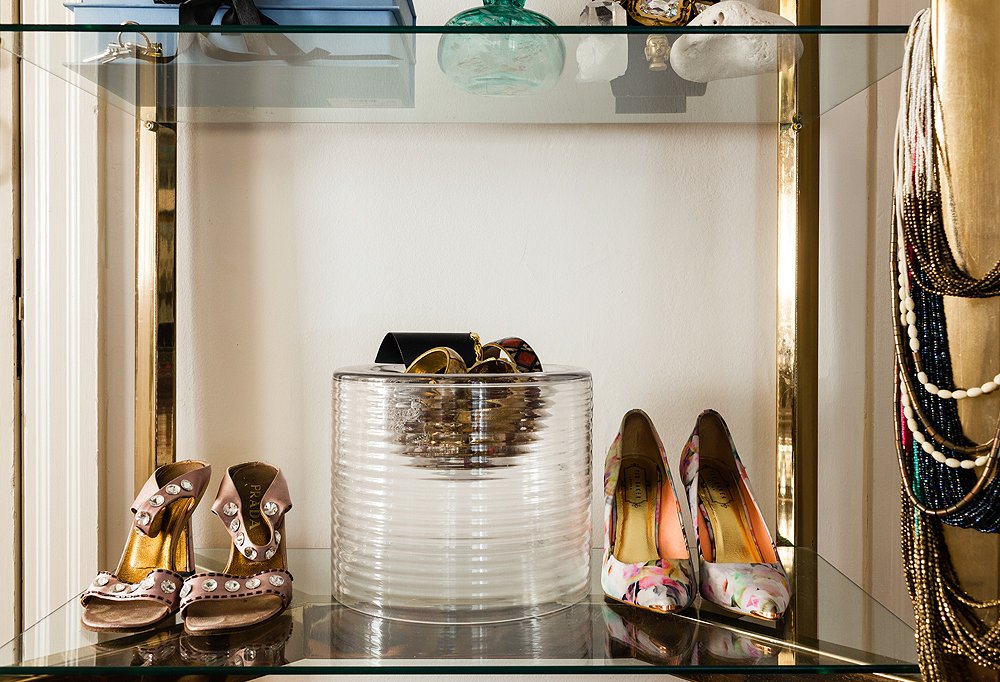
In the brass-and-glass bookcase in her bedroom, Kim mixed things up by displaying her shoes, letting her current favorites share shelf space with personal photos and frequently worn jewelry.
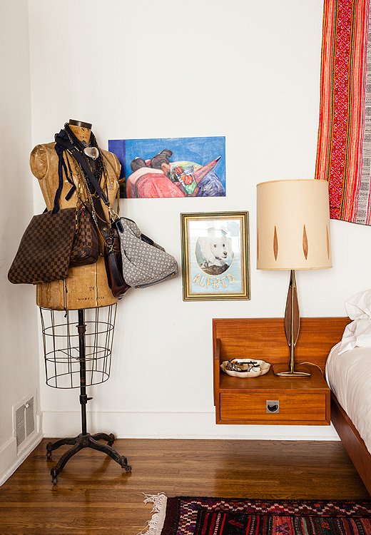
When she lived in Minneapolis and owned a shop, an old fur salon closed and sold off its dress forms. Kim sold several through her store but “had to keep one!” she says. “I’ll have it forever. They’re so practical.” She drapes purses and extra-long necklaces around hers.

Masculine next to feminine. Inexpensive next to expensive. Contrast creates the best design and highlights the beauty of each piece. If everything is all one style, you look around the room and nothing stands out.
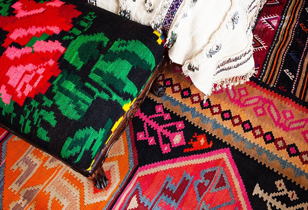
Sitting at the foot of her bed was an old French bench that Kim found in Paris and reupholstered in a Mexican textile. Side-by-side Turkish kilims stood in for a single rug under her bed. “Alone they were too narrow,” she says, “and when you hop out of bed you want your feet to land on something cozy.”
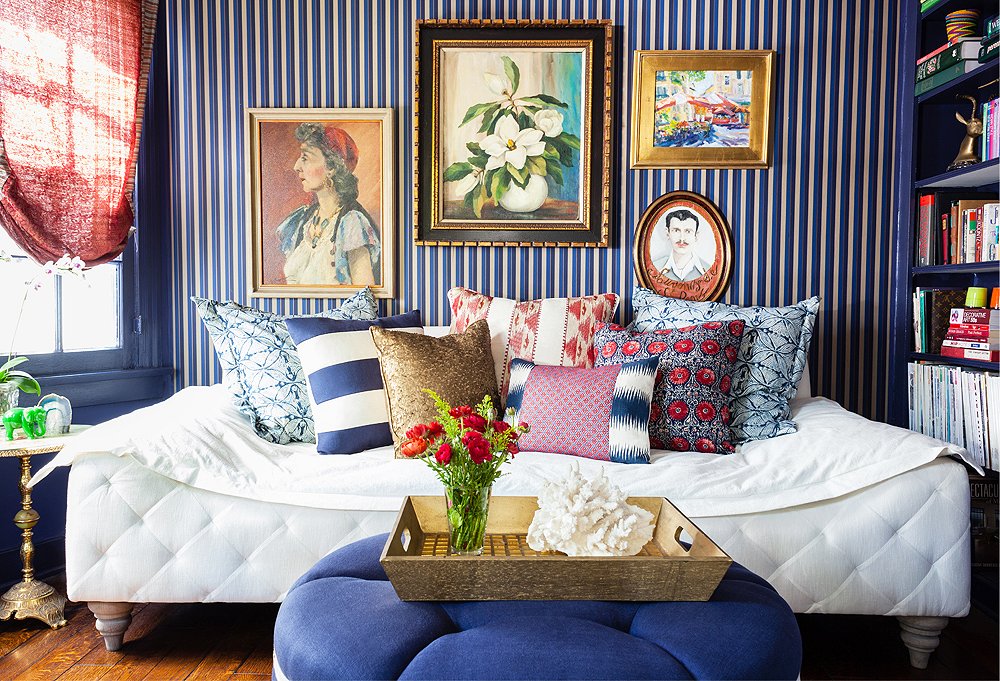
The Guest Bedroom
“I decided to go in a different direction with this bedroom, since it’s such a small space,” says Kim. “Really, I treated it like most people treat a powder room.” She opted for masculine, traditional colors, which stand out in cool relief from the rest of her light-filled home. Thanks to its sloped shape, the couch (designed by Kim and sold in her line) could double as a daybed—versatility that’s key in a small space. Paintings in bold primary colors broke up the linear wallpaper and finished the look.
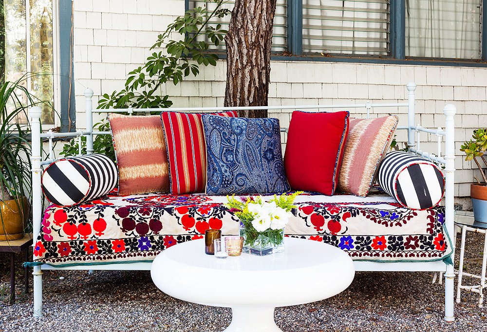
The Patio
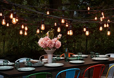
A consummate hostess, Kim entertains frequently. Whether a casual catching-up-with-friends night or a proper dinner party, “we almost always end up outside,” she says. “Six of us will be wrapped in blankets and squished up on the daybed.” She covered that daybed in a suzani, one of her favorite ways to switch up the look of her seating without reupholstering, and topped it with a pile of pillows so that it felt like a continuation of her home.
Join the Discussion