In their book Prints Charming, designers John Loecke and Jason Oliver Nixon of Madcap Cottage point out many of the ways pattern can enhance one’s life. Let’s say your boss comes over and conversation is off to a slow start: A set of dining room chairs, each upholstered in a different print, can serve as an icebreaker: “David, you can have the trellis in palm. And Maureen, please enjoy the fabulous floral in daffodil. More gin?” The point, of course, is that color and pattern are fun, and an artful mix of the two gets the mind churning, satisfying what Dorothy Draper called an “innate yearning to be lifted momentarily from our own lives and into the realm of charm and make-believe.” And, indeed, how funny it is to discover the transporting power of a pink-and-yellow peony chintz paired with a flame stitch in purple and maroon. This is the power that John and Jason prove so well in their book, showing that creating a safeguard from the ho-hum is as simple as rethinking the upholstery of your living room’s throw pillows.
Below, we spoke with the designing duo about their reasoning behind the book and a few of their tried-and-true tips for creating a haven with pattern and print.
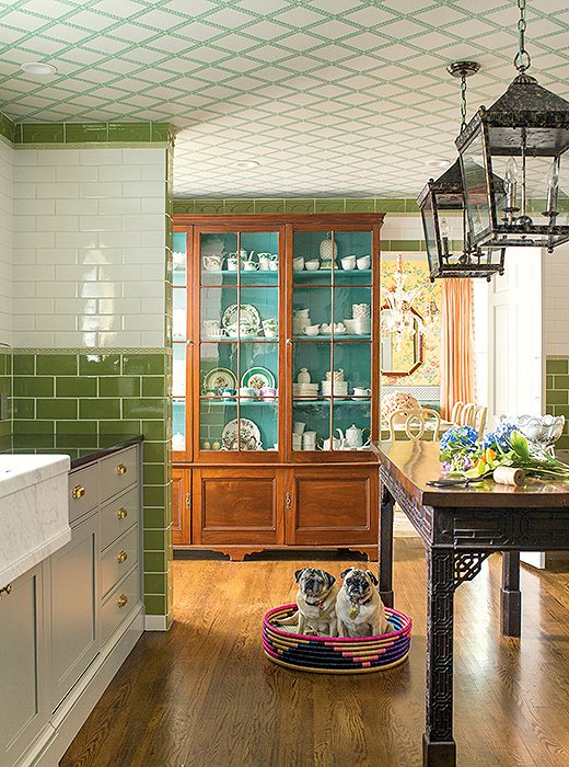
Chinoiserie details and wallpaper with a trellis motif add interest in John and Jason’s own kitchen.
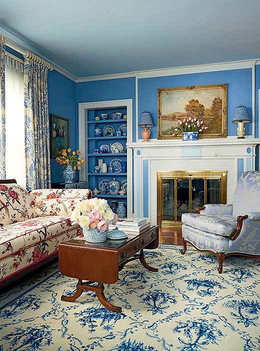
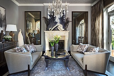
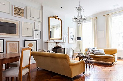
A shade of blue lends a sense of unity to a richly layered living room.
Rule of thumb: “Find one color as your go-to and carry it throughout the room. As long as your eye has something consistent to follow, your mind will be able to connect the dots. So if you decide to go with a floral wallpaper, for example, pick a shade of blue from the petals and carry it through to a novelty pattern on your sofa and a contemporary graphic on your chairs. So long as it’s the exact same shade, things will work out.”
On scale: “Vary the scale of patterns in a room. You want to have a mix of larger-than-life prints and smaller, more detailed versions to serve as visual connectors. In terms of size, you don’t want to have everything at 200%, as it’ll just be too much to take in. Instead, have a more exploded print on the wall and then something more condensed on the ottoman, then go big again on the lampshades. You want the end result to feel intimate and cozy, not loud and obnoxious.”
On needlepoint: “It has a very homey quality, and it adds a personal, witty touch. We love the idea of needlepoint as something handcrafted—an art form that takes time to produce. Needlepoint is important because it underscores pattern as texture. It adds another dimension in terms of pattern play to a room.”
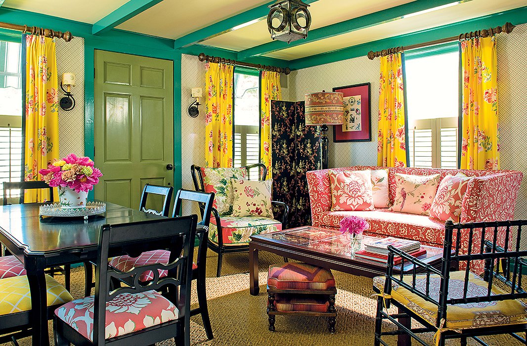
From fabric to paint, this small space represents Madcap Cottage’s signature mix.
Know your history: “You can see a lot on Pinterest and Instagram, but there’s also a lot of inspiration to be found in books by designers from the past, movies, and auctions. Gone with the Wind takes us 19 hours to watch because we keep stopping the movie so many times to catch a detail on some furniture trim or the bullion on the outfit she wore when she took the drapes down. These are the kind of touchstones that will help you find your own pattern personality.”
On making a statement: “When someone doesn’t have anything to say and they enter a room awash in 20 different patterns, there’s an automatic opportunity for them to latch on to a topic other than the weather. We’ve had people over for dinner, and we didn’t quite know where to start the conversation, so we thought to ask them to choose the dining chair they were most drawn to [each chair in John and Jason’s dining room is of a different pattern]. If they chose a floral or stripe it gave us an opportunity to ask ‘Why did you choose that?’ And in an instant, the conversation is off and running.”
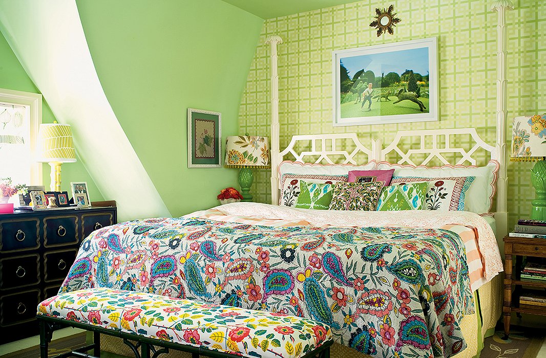
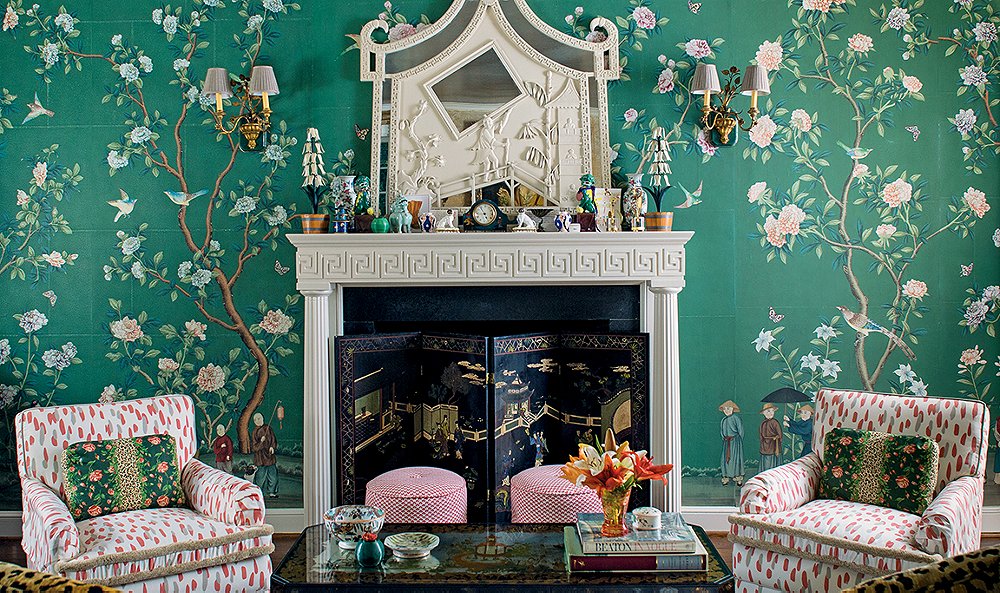
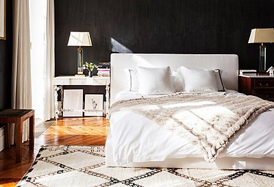
United by green and varied in scale, this bedroom’s seven prints appear perfect together.
On writing the book: “We’ve found that a lot of our clients are intrigued by pattern but don’t know quite know how to use it. And the book is really a response to that. It’s a way for everyone, not just our clients, to learn how to best embrace pattern in their own homes… to decorate with conviction and have a blast doing it. Life is short, and if you can’t have a home that feels fun and reflects your personality, well, that’s just kind of boring, don’t you think?”
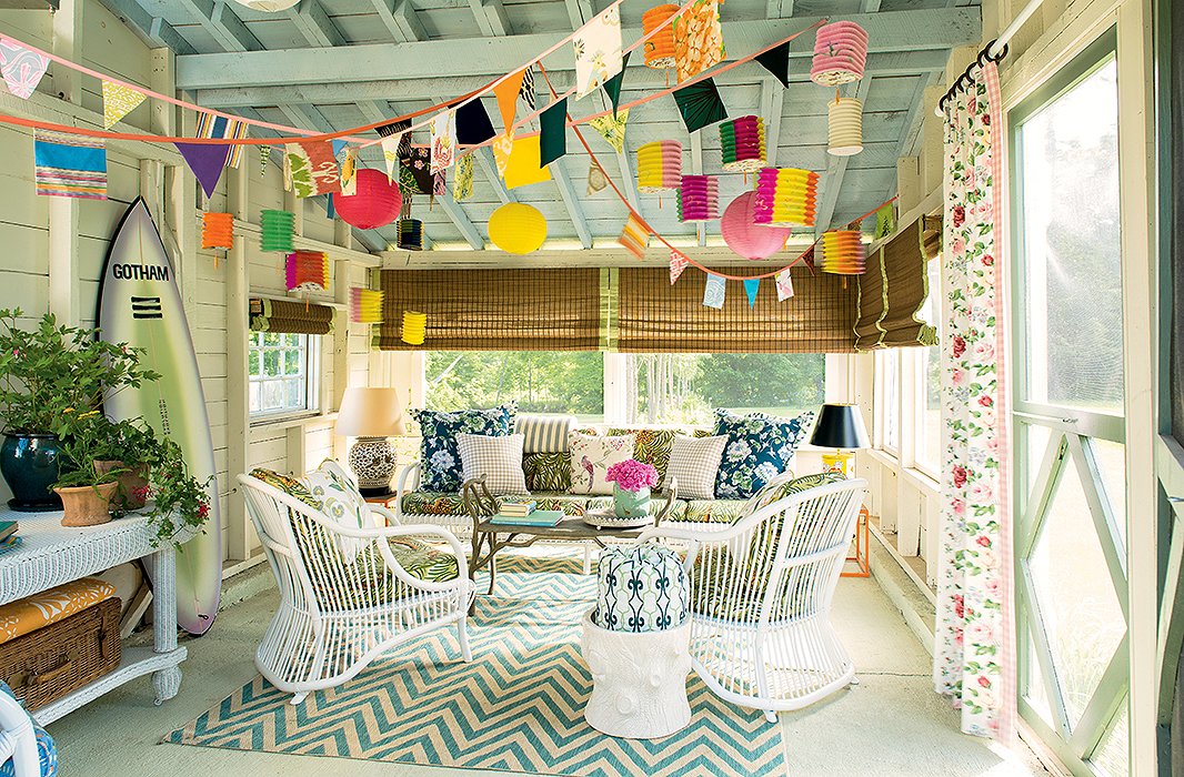
A pop of chevron anchors a sunny porch, accented with rose prints and gingham.
Join the Discussion