This dramatic before-and-after comes to us by way of Texas, where designer Marie Flanigan worked with a young family to turn a blank-slate new-construction house into their “forever home.” The results are stunning, to say the very least, so we asked Marie to give us the full scoop on the yearlong renovation process.
Before: Cookie-Cutter New Construction
Before Marie and team got their hands on this Gulf Coast home, the space was swathed in a sea of beige, with lackluster finishes and out-of-scale details. Seeking a home geared for entertaining that could grow with their young family, the clients asked for an overhaul of the layout that would create more shared living spaces. “The goal was to create a haven where their kids would be excited to hang out with friends,” Marie says. “What began as primarily cosmetic changes quickly escalated into a full-scale renovation with the mentality ‘If you’re gonna do it, do it right!’”
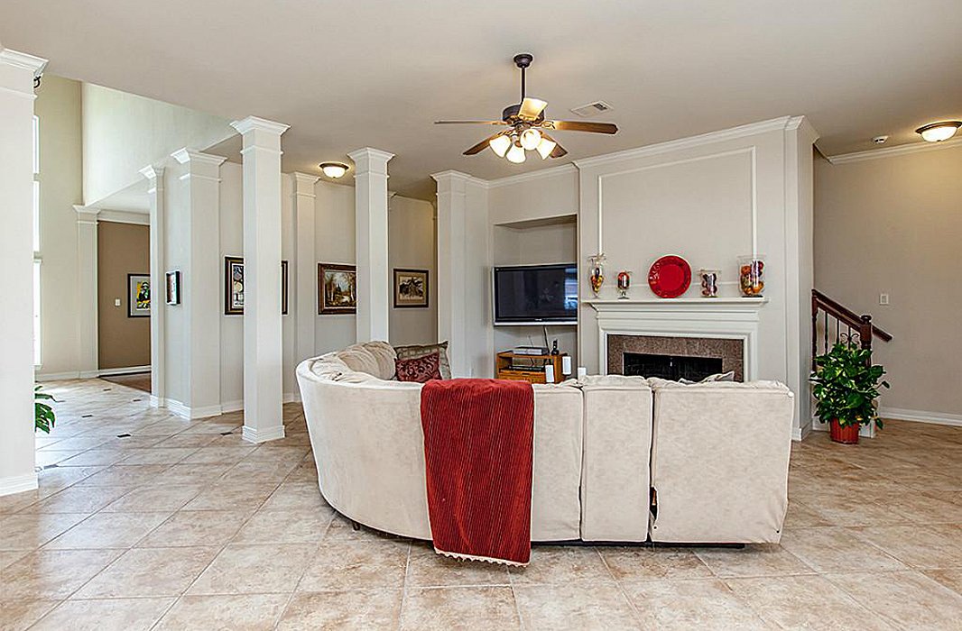
The living room before. The fireplace was lost amid an awkward layout.
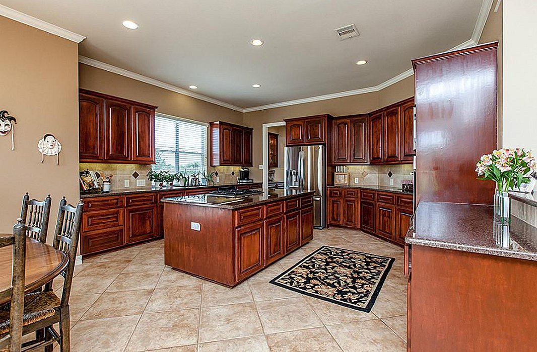
Dark cabinets and counters made the original kitchen feel closed off.
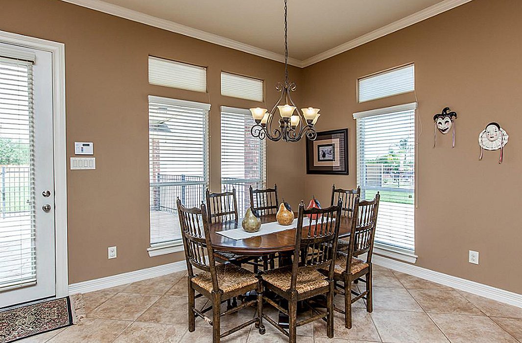
The breakfast nook offered ample space, but it wasn’t being maximized.
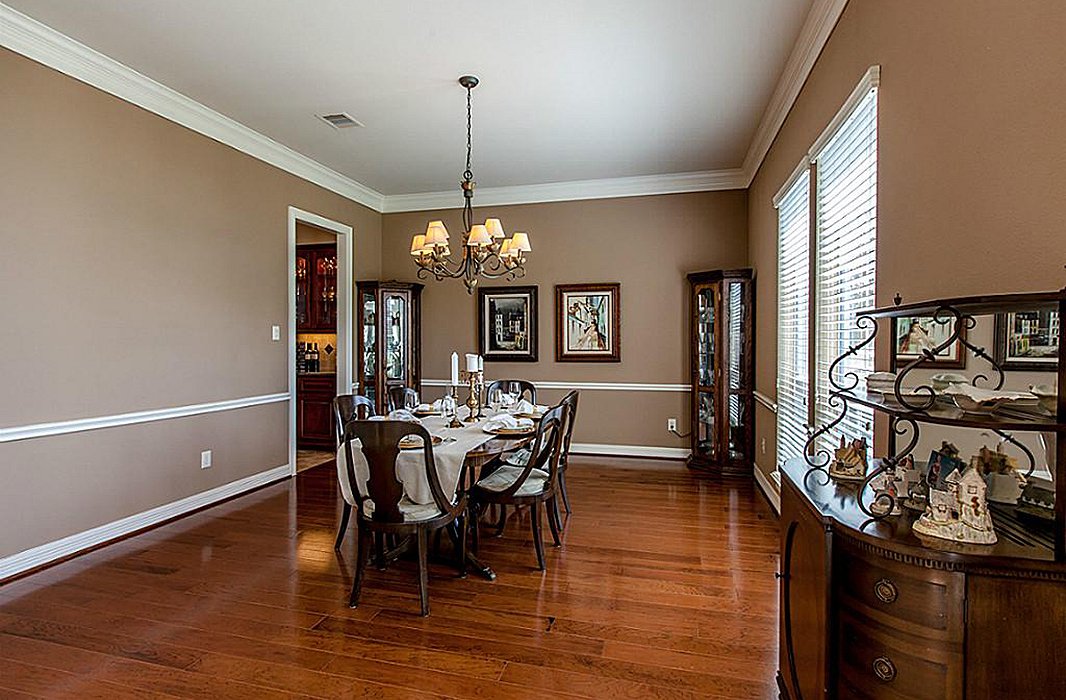
A diminutive chair rail didn’t fit the scale of the dining room.
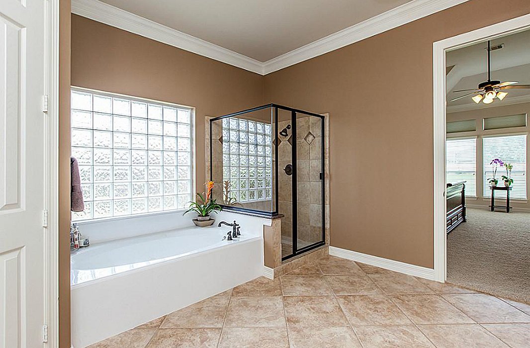
Though spacious, the master bathroom didn’t feel luxurious.
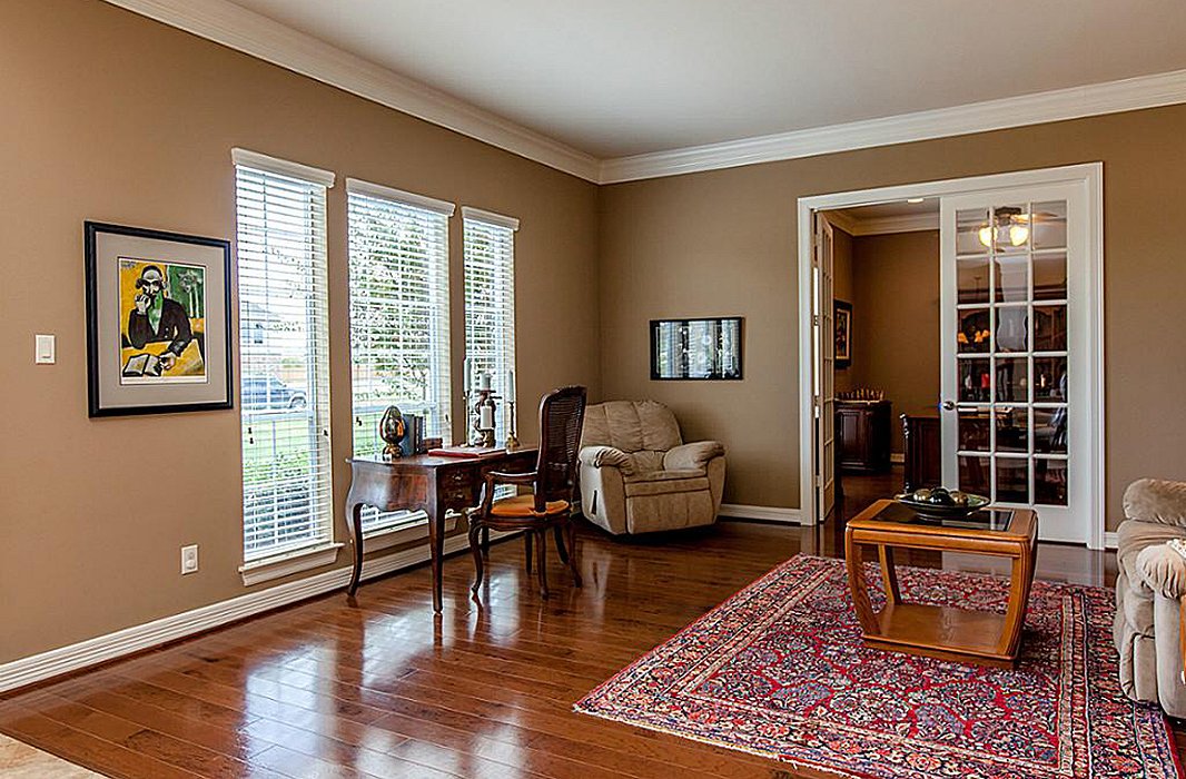
A family room off the entry was bare and underutilized.
After: Chic, Calm, and Full of Character
The finished space balances practicality and beauty, with a palette drawn from the coastal blue hues of the nearby bay. The refined-meets-rustic finishes, including paneled walls and beamed ceilings, give the home a sense of regional character, while “furnishings with vintage appeal lend a sense that these newly constructed spaces were lovingly collected over time,” Marie says.
To ensure that every member of the family feels at home—including three children under the age of six and the family dog—the team chose design elements that “work hard but feel luxurious,” Marie says. “We used a wide variety of stain-resistant indoor/outdoor fabrics, and anything that wasn’t inherently spill-proof was treated.”
And though every renovation comes with its fair share of hiccups, the project flowed smoothly thanks to clear communication between designer and clients. “Throughout the design process, they had a clear understanding of what they liked and disliked, but they totally trusted our team to bring the vision to life,” Marie says. “We’ve learned that the strongest client-designer relationships occur when trust and communication come easily, and that was definitely the case with this beautiful family.”
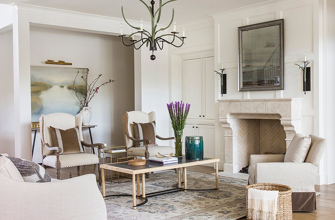
A new stone mantel turned the fireplace into a stunning focal point for the living room, which was dressed in soft tones of brown and blue. Marie’s firm worked with The LaRocque Group on the remodel. Photo by Julie Soefer.
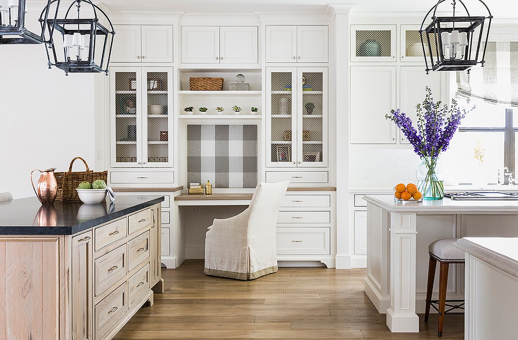
The kitchen now offers a range of spaces for working and for gathering, including two expansive islands and a built-in desk. Marie accented simple Shaker cabinets with wire mesh screens, allowing for a balance of open and closed storage. Photo by Julie Soefer.
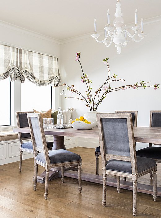
The team added a built-in window bench to maximize seating in the sunny breakfast nook. Photo by Julie Soefer.

Furnishings with vintage appeal lend a sense that these newly constructed spaces were lovingly collected over time.
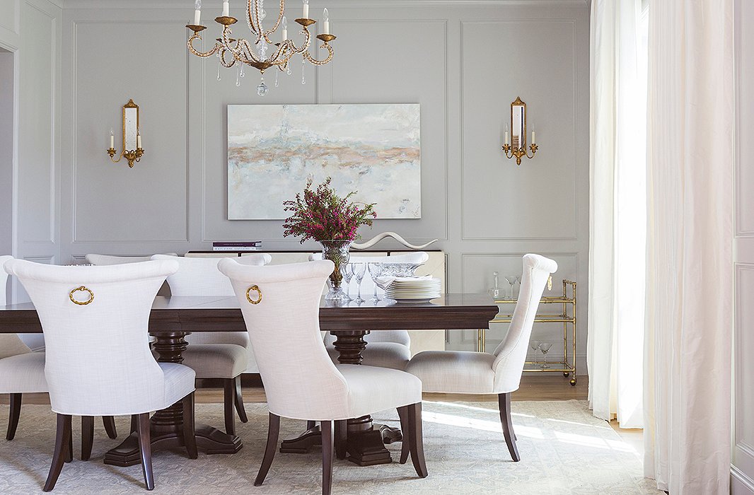
Paneled wall moldings and brass fixtures give the formal dining room a sense of grandeur. Photo by Julie Soefer.
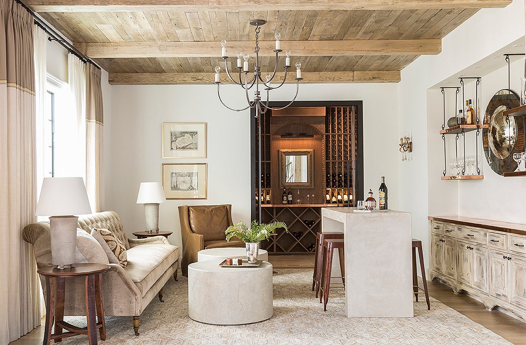
The original family room is now a sumptuous lounge that marries light-tone traditional elements and a rustic, masculine vibe. Photo by Julie Soefer.
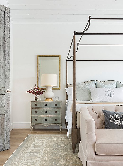
A beautifully distressed door leads to the master bedroom, where a graceful canopy bed makes the most of the soaring ceiling. Photo by Julie Soefer.
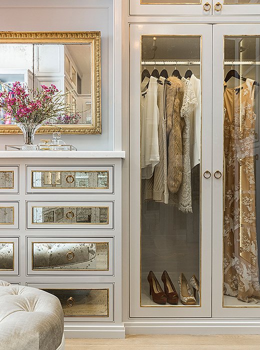
A mix of clear glass and antiqued mirror gives the master closet a glamorous feel (while keeping clutter hidden away). Photo by Julie Soefer.
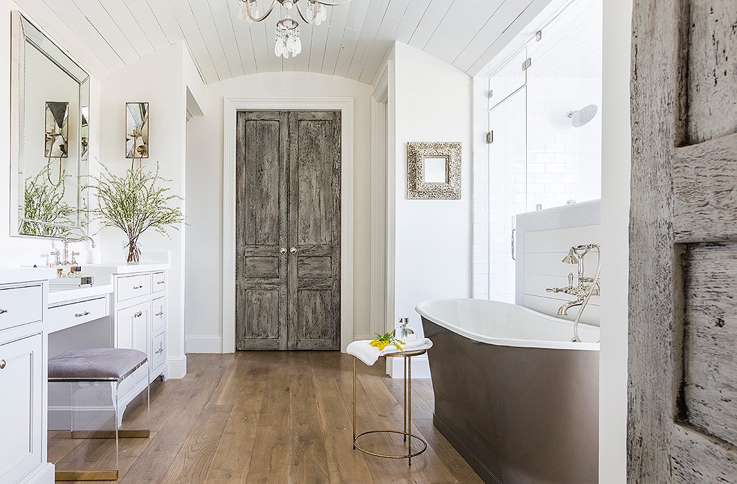
Marie’s team transformed the master bath, creating a new shower enclosure and adding a freestanding tub. Photo by Julie Soefer.
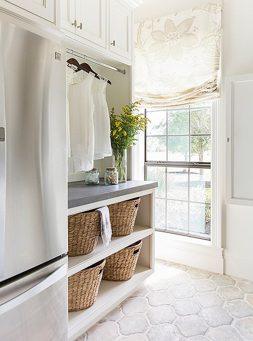
The laundry room doubles as a mudroom, with plenty of storage to accommodate a growing family. Photo by Julie Soefer.
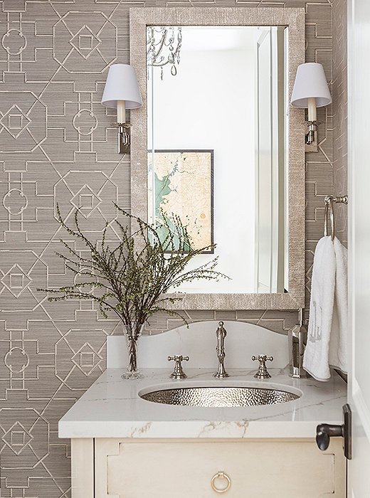
A powder room shines in shades of pearly gray. Photo by Julie Soefer.
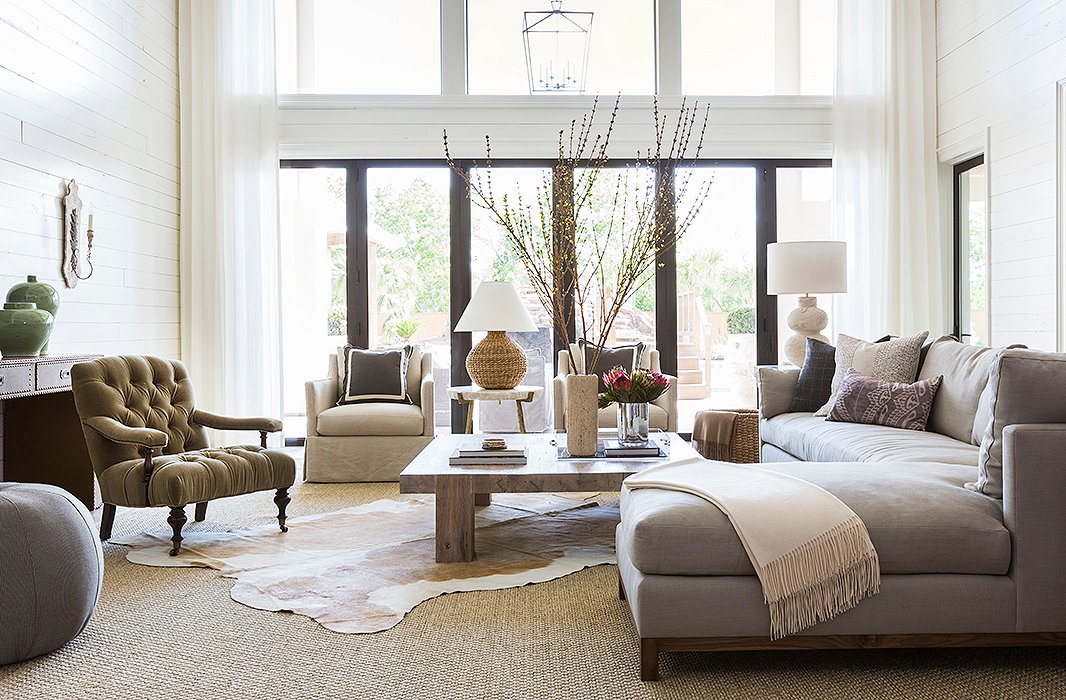
The home’s large lot allowed Marie and her team to close off part of the back patio, creating a new double-height family room. Find similar hide rugs here. Photo by Julie Soefer.
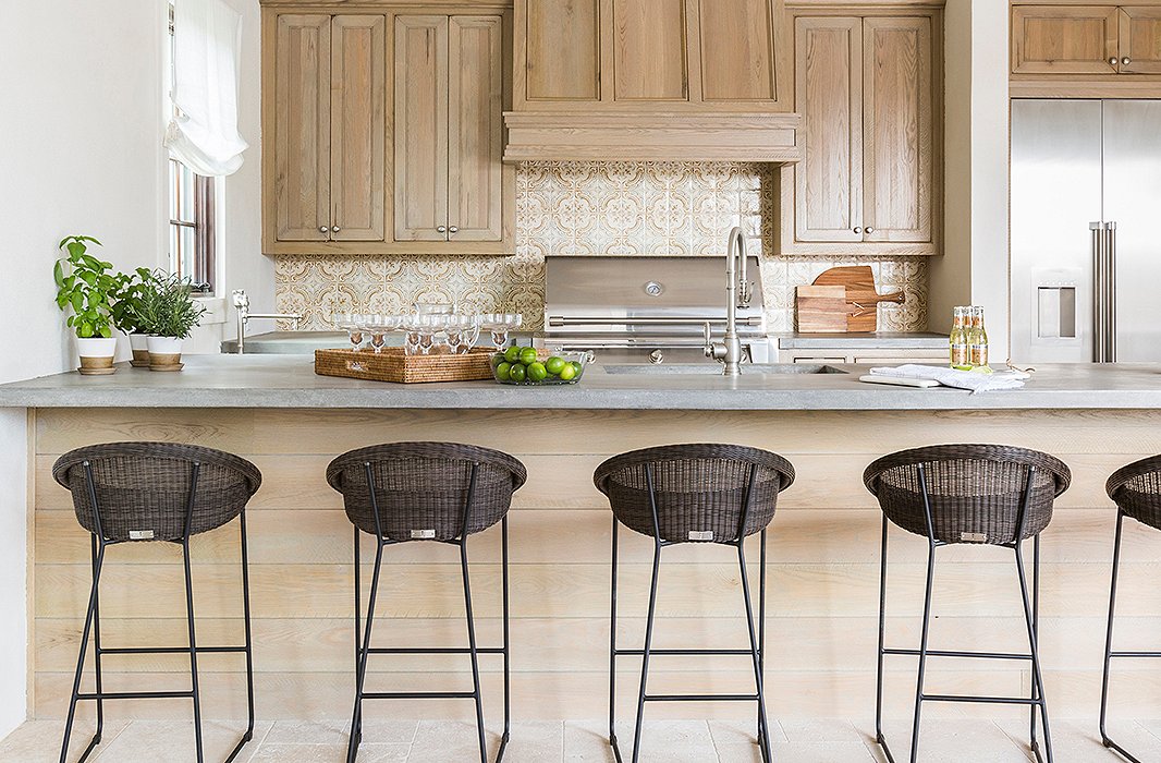
The addition included a kitchen off the new patio, built to encourage indoor-outdoor living year-round. Photo by Julie Soefer.
3 Easy Ways to Transform a Space
Not about to embark on a full-scale renovation? You can give your home a fresh feel without calling in a contractor. Below, Marie shares three of her go-to tips for making over a space without investing major time and money.
Go light and bright. “A fresh coat of paint and a strong lighting plan will make a massive—and cost-effective—impact on the look and feel of your home. Opt for a cohesive color story on the walls, and choose consistent hues like warm whites to make your home feel more spacious. Then turn to a strong combination of task, accent, and natural lighting sources to set the mood depending on the time of day.”
Don’t forget to look down. “Rugs adorn your floor in the same way that art adorns your walls, anchoring the room and infusing a powerful dose of texture and color. Whether a rug serves as a starting point for a room’s design or it’s selected to complement a finished space, I gravitate toward pieces that boast a sophisticated play on pattern and texture.”
Remember that less is more. “We all have a natural desire to fill our homes with special things, forgetting that many of the most memorable and enjoyable spaces celebrate simplicity. Avoid the temptation to overload accessories and instead choose to edit the excess. I find the best way to achieve this is to clear everything out and take a step back to review. Then slowly add in the pieces that speak to you, bearing in mind that odd-numbered groupings of varying heights and scales offer the most visual interest.”

Join the Discussion