Interior design was always part of the plan for Michelle Smith—the native Southerner jokes that she grew up in a Home Depot because her mom was always renovating houses—but she kicked off her career as a lawyer. “I thought design was going to be something I did later in life,” she says. In 2009, when she was practicing law in New York City, she found the perfect challenge: a two-bedroom apartment in a 1930s building whose previous tenant hadn’t fixed anything in 60 years. She bought it and quickly realized she enjoyed renovating more than reviewing court documents.
Smith opened her own boutique design firm, Studio MRS, in 2012 and has worked on numerous projects since then, including the home and showroom of fashion world luminary Prabal Gurung, and her Sag Harbor weekend home, but this airy 1,500-square-foot Union Square apartment can be seen as her thesis. It’s like the decor version of Smith’s clean, chic personal style, down to her commitment to neutrals and perfectly imperfect vintage accents.
Personalizing Your Pad
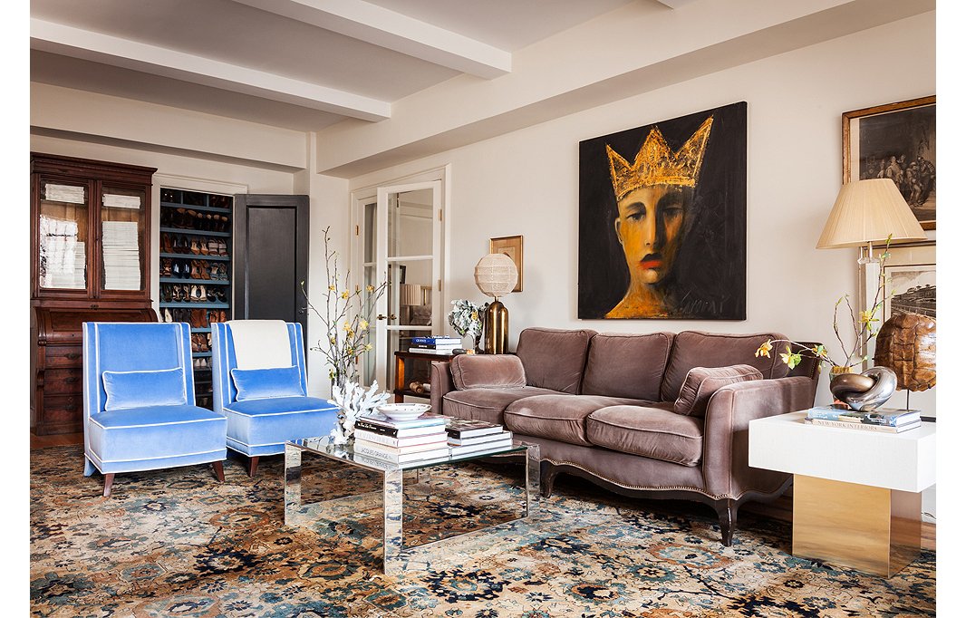
“If you buy something you love, there’s always a place for it,” says Smith, who reupholstered two Baker slipper chairs from her previous apartment in plush periwinkle velvet to give them new life. She pulled her color inspiration from the blue in her rug, a purchase that proves her passion for good design: “I found it at a trade-only place and had to beg them to sell it to me.” The pieces add a rare pop of color in the otherwise neutral living room painted one of Smith’s favorite colors, Benjamin Moore Gray Mist. In a nod to her love of fashion, a shallow linen closet was converted into a dreamy living room shoe closet, complete with blue interior.
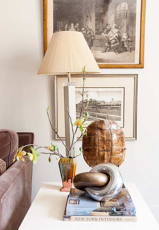
Although she collects a lot of amazing objects, Smith keeps her space from feeling cluttered by corralling pieces into vignettes and letting other areas breathe.
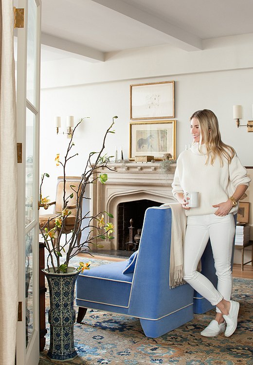
Smith’s classic taste and love of neutrals translate into her wardrobe as well as her interiors.
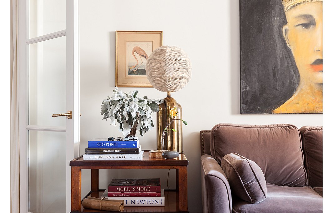
Smith, an admitted design-book addict, only keeps out titles she references regularly for inspiration. A crocheted lampshade, recently scored at a flea market in Florence, makes the perfect topper for a vintage lamp.
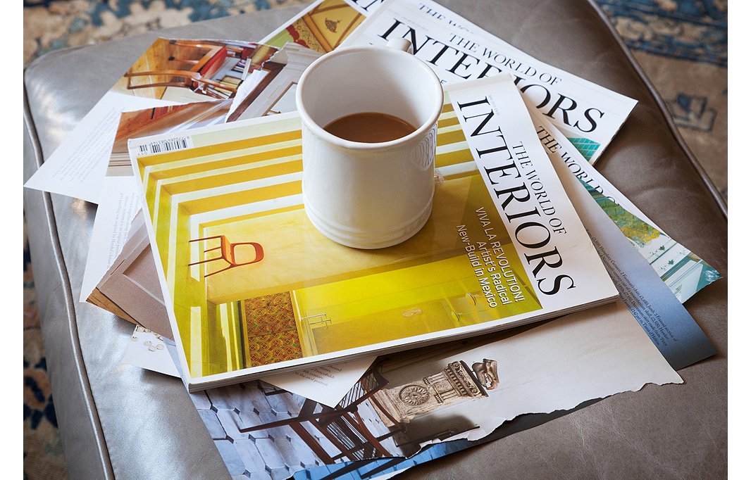

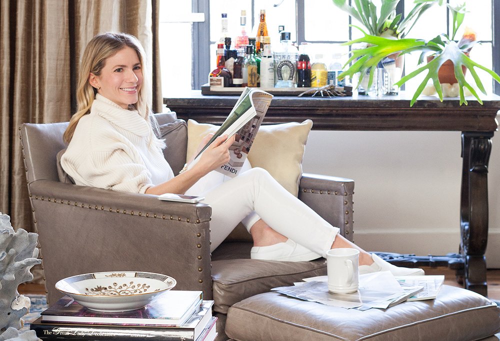
One of my favorite things is curling up with design magazines and a cup of coffee.
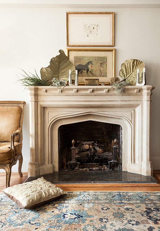
A layered composition gives the mantel an artful elegance.
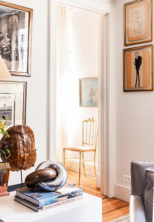
A peek into the guest room, just off the main living space, reveals a Charivari chair.
Creative Sparks
Smith updated the original limestone fireplace with a more convenient gas insert, making it a great place to daydream. She uses the mantel to display pretty objects such as silver Georg Jensen candlesticks and “dry and creepy” natural elements like Spanish moss. The art arrangement—hung low and close together—is a Smith signature. “I like to layer art one on top of the other, especially if it’s all flea market junk,” says Smith. “I didn’t have any grand piece to fill the whole space over the fireplace, but two pictures together look prettier.”
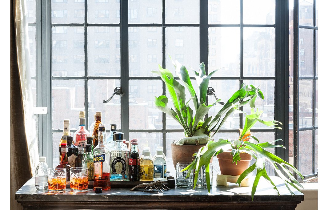
The kitchen island from Smith’s previous apartment is repurposed as a makeshift bar in the living room, ideal for entertaining.
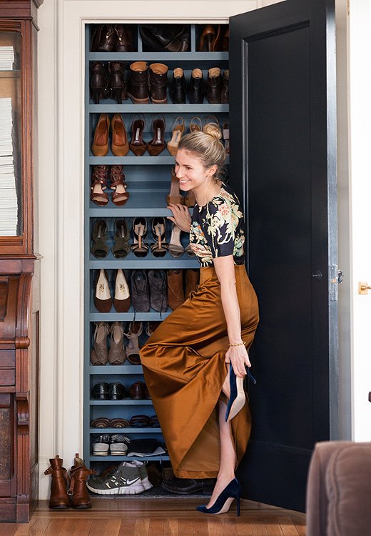
Smith ingeniously turned a shallow, unused living room closet into a place to store (and display) her shoes. To keep her collection under control, she limits herself to the number of pairs that will fit this special space.

I don’t really think about a style; it just kind of happens. When it’s my own place, I just have to love each thing.
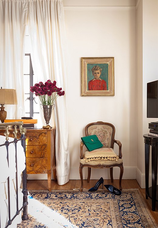
There’s only one pop of red in the whole apartment, and it’s this flea market painting of a little boy in a red shirt. Smith couldn’t resist, because the dimple on his chin matches hers and her grandfather’s.
Masterful Mornings
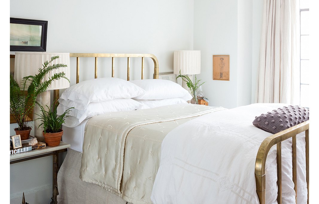
Mixed metals including a bronze spray-painted table that Smith borrowed from her grandfather and an antique queen-size bed create a feminine look in the master bedroom, which she uses her for more than just sleeping. “I’m never home except in the mornings, so I wake up at like 5:30 or 6 a.m. just to have two hours of morning to myself,” she says. “I have coffee and my computer, iPad, and phone in bed with the TV on. It’s my favorite time.”
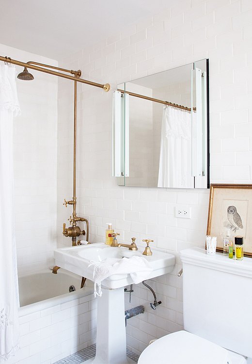
The all-white bathroom is an oasis of porcelain and metal thanks to the subway tiles and the custom unlacquered brass shower. The goal was to keep the room uncluttered and sleek.
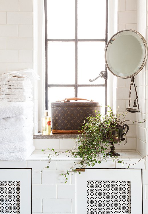
A clever tile built-in hides the formerly exposed radiator while adding storage. A trophy from Mardi Gras doubles as a planter, while the metal scale, a souvenir from Syria given to Smith by her journalist boyfriend, works as a jewelry catchall.
Guest Central
Anyone who has lived in New York City knows that having a second bedroom can be both a blessing and a curse. “I always have houseguests who stay forever. Because I have a second bedroom, they never go home,” say Smith. Of course, many of her guests, including her mother, are very welcome, and Smith makes sure the bed is made just so for their arrival. “I think down comforters can look messy, so I do a tight coverlet and just fold the comforter on the bottom so that it’s intentionally messy but you have some neatness to balance it.”
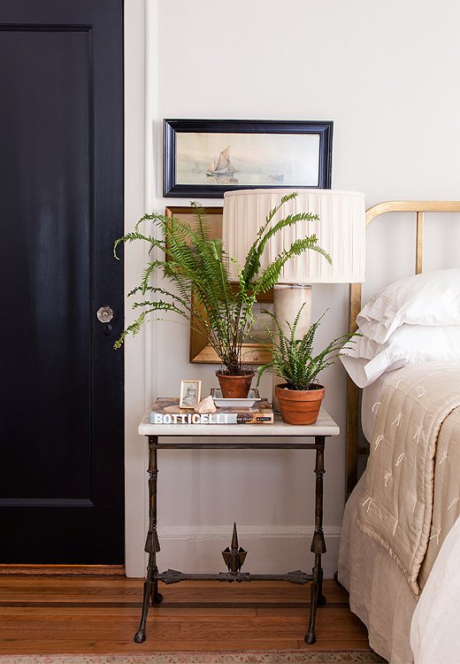
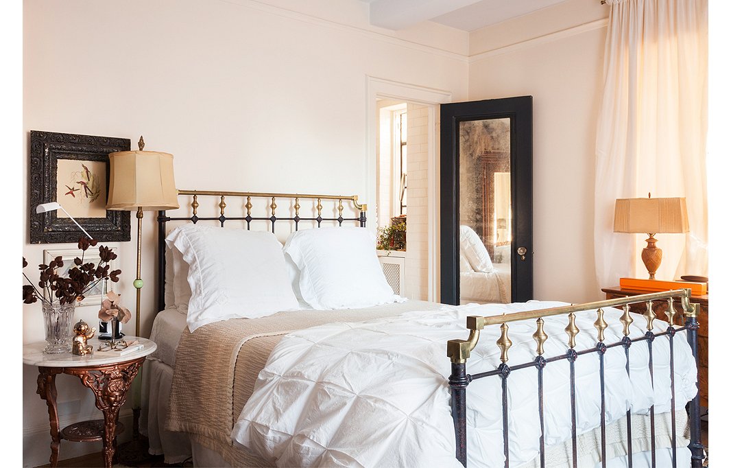
Smith prefers to paint doors what she calls “noncolors” such as black or taupe rather than white. In the guest bedroom the black door adds a masculine edge to an antique brass bed and marble table.
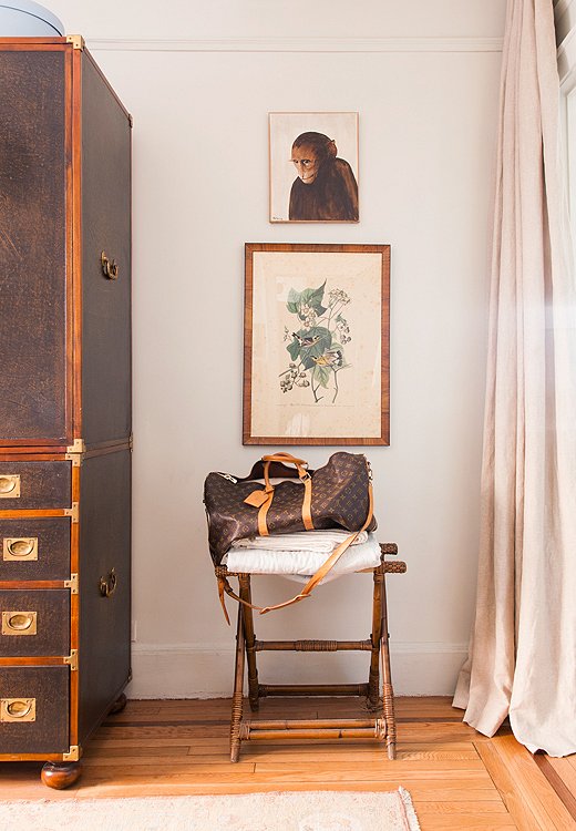
A small empty corner of the guest room becomes highly functional with the addition of a stool-cum-luggage rack. The tight palette helps make vintage finds, like the monkey painting and the Audubon print, look cohesive.
Kitchen Confidential
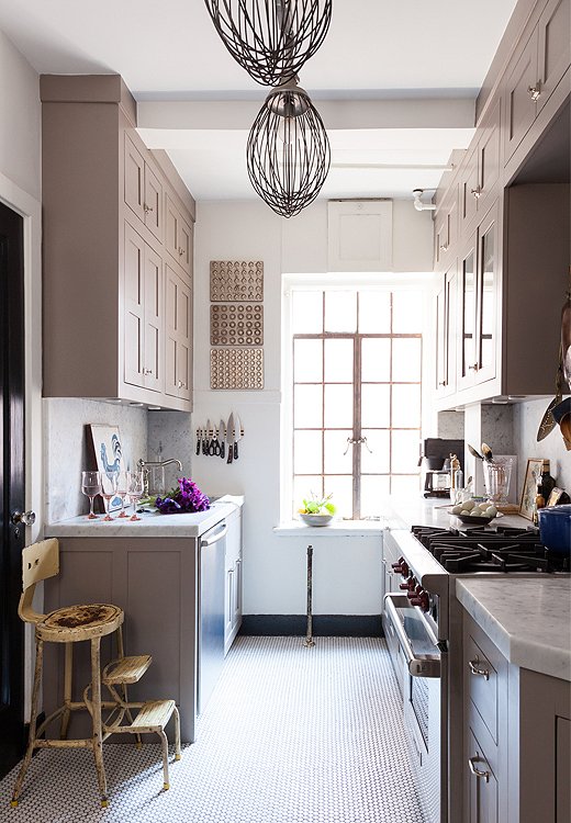
Don’t let the Wolf stove fool you: Coffee is usually the only thing Smith makes in the kitchen, unless she’s plating takeout. “I’m not a big cook by myself,” she says. “Any time I can make it an event or a party, like for the Oscars or the Super Bowl, I’ll cook.” But the kitchen’s light-flooded original casement windows and witty repurposed industrial whisk “lampshades” make it a nice hangout spot. With the help of a contractor, Smith put up inset-frame Shaker-style cabinets painted Farrow & Ball Charleston Gray (the color she chose for her office). “If you want a color that goes with everything, that’s it,” she says.
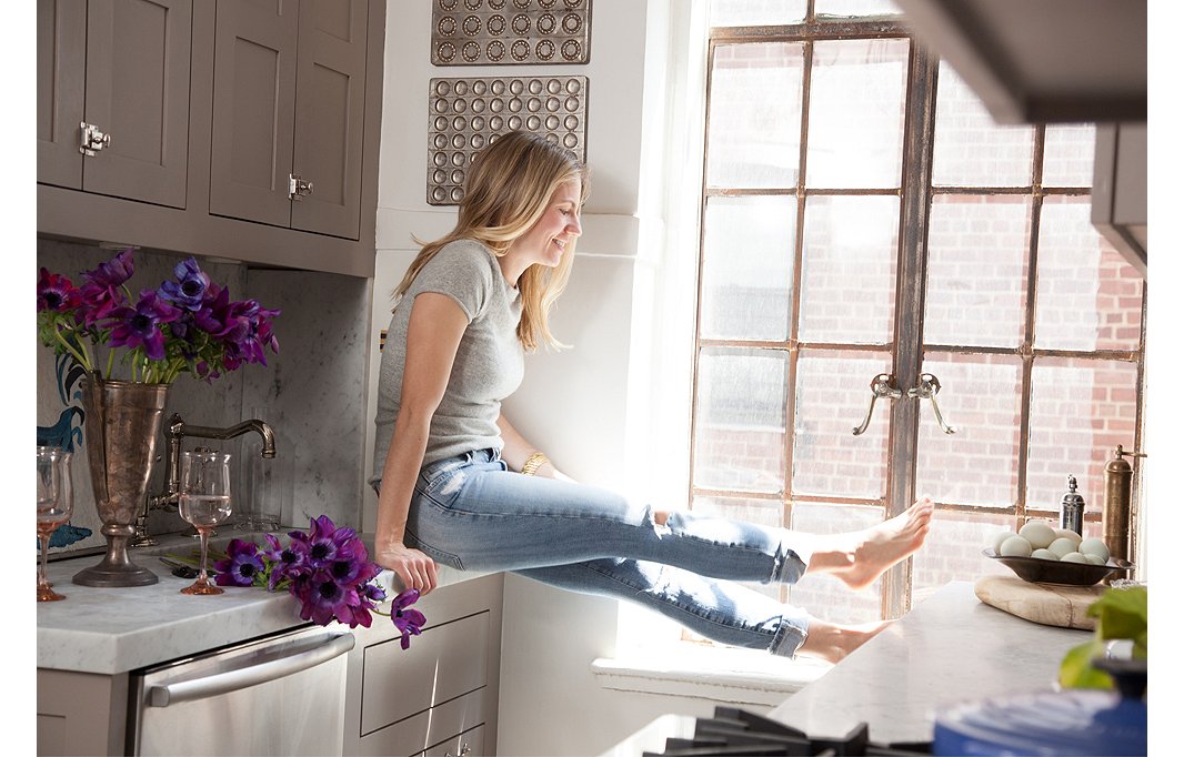

I love how much sun I get in my apartment. You can open the windows and feel like you’re outside on a pretty day.
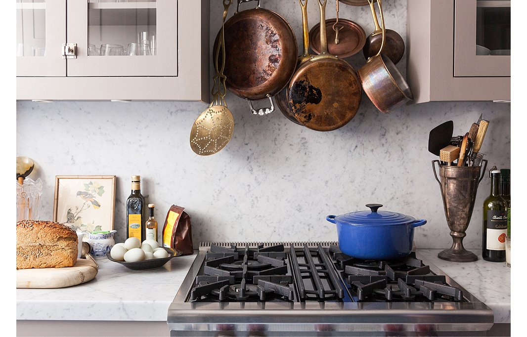
Smith decided on a seamless Carrara marble counter and backsplash for its modern and clean look.
A Place to Gather
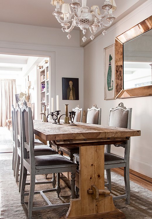
Friends often gather around the rustic Maine-made trestle table to eat. “We eat in the dining room, but we always end up in the living room,” says Smith. “I’ve had proper parties for 35 people and it still feels okay to just use the whole space.” The wood of the table is nicely balanced by fancy chairs bought at an estate sale in New Orleans, a decorative chandelier, and a copper mirror from Marburger Farm Antique Show in Texas.
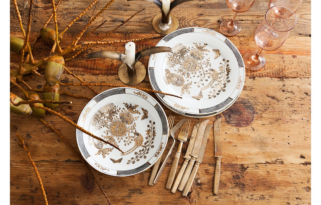
Smith isn’t precious with her vintage finds; she puts this fancy china, found at a New Orleans estate sale, to work every day. Antique gold flatware adds some glitz.
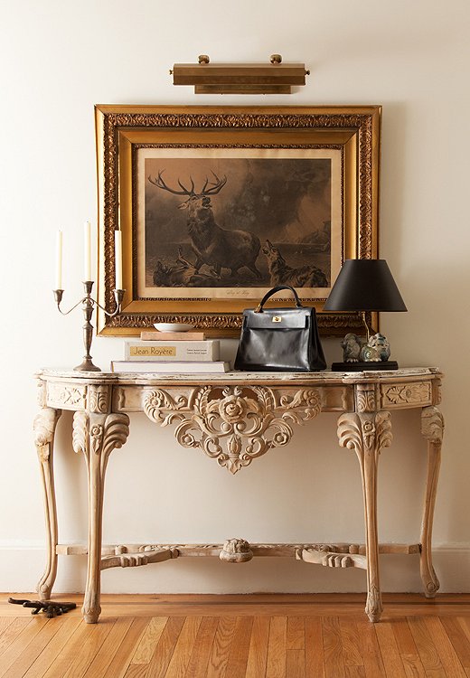
Whether you’re coming or going, an unfinished carved wood table and a grandly framed flea market find create an eye-catching moment in Smith’s entryway.

If you buy something you love, there’s always a place for it.

Beautiful!
My favorite out of all homes on this site.
Truly magical and inspirational.
Love it!