Opposites attract: It’s a great rule in love and in design. Except when it isn’t.
The clients of New York-based designer Tina Ramchandani came to her with a problem. They were expecting their first baby, moving into their first home, and had completely different styles that seemed impossible to reconcile. The wife wanted traditional. She envisioned transforming their suburban home into a cozy farmhouse. The husband wanted modern: clean lines, simple silhouettes, and an open floor plan.
What was Tina to do?
Fortunately there was no need for her to don the marriage-counselor cap that so many designers dread. Instead, the whole thing was relatively easy. “It turned out to be a very collaborative process,” Tina says.
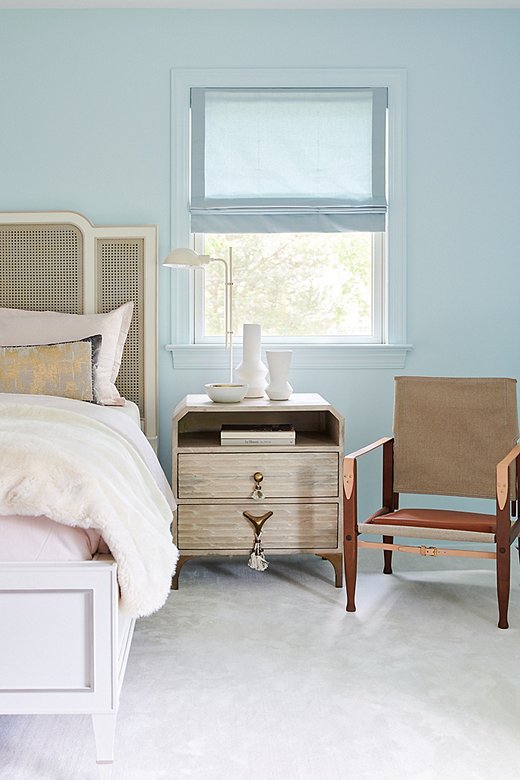
The guest room was designed for the grandmother of one of the clients. The caned bed exudes a sweet, traditional feel, while the whimsical nightstand and the safari chair are classic in a more modern sense.
First, they had to find common ground on a color palette. While most people would equate white with both modern and farmhouse-style homes, Tina went for shades of bluish green for the trim and the walls. It softened the modern feel of the house by grounding the design in a calming color family. (There is a reason blue is such a popular color.)
“The color palette acted as an anchor,” says Tina. “So if styles swayed more modern or country from one room to the next, we carried a natural balance throughout the home.”
Once the color palette was established, she set about juxtaposing modern and farmhouse in a way that felt fresh, comfortable and above all, harmonious. There would be no design-related identity crisis in this home. Throughout the house, she mixed modern silhouettes and traditional touches. Every piece had its foil. “It’s a well-balanced mix of straight lines with curvature and character via the furniture, art, and accessories.”
Each room is a study in mixing silhouettes and redefining what modern farmhouse actually means. You won’t find white rooms framed by steel windows. There are no giant exposed wood beams. Instead, Tina’s approach relies on quiet color and playfully elegant layers of traditional-meets-modern design.
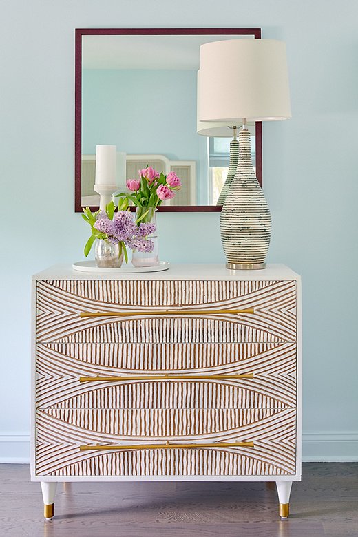
Opposite the caned bed, a carved dresser with gold detail amps up the glam.
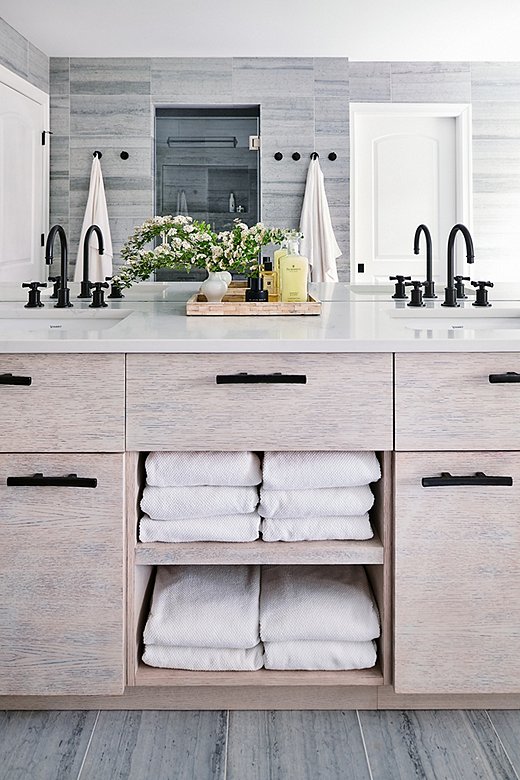
The bathroom’s cool palette and streamlined hardware lean modern. The ingenious touch of farmhouse comes with the rounded-cross sink knobs.
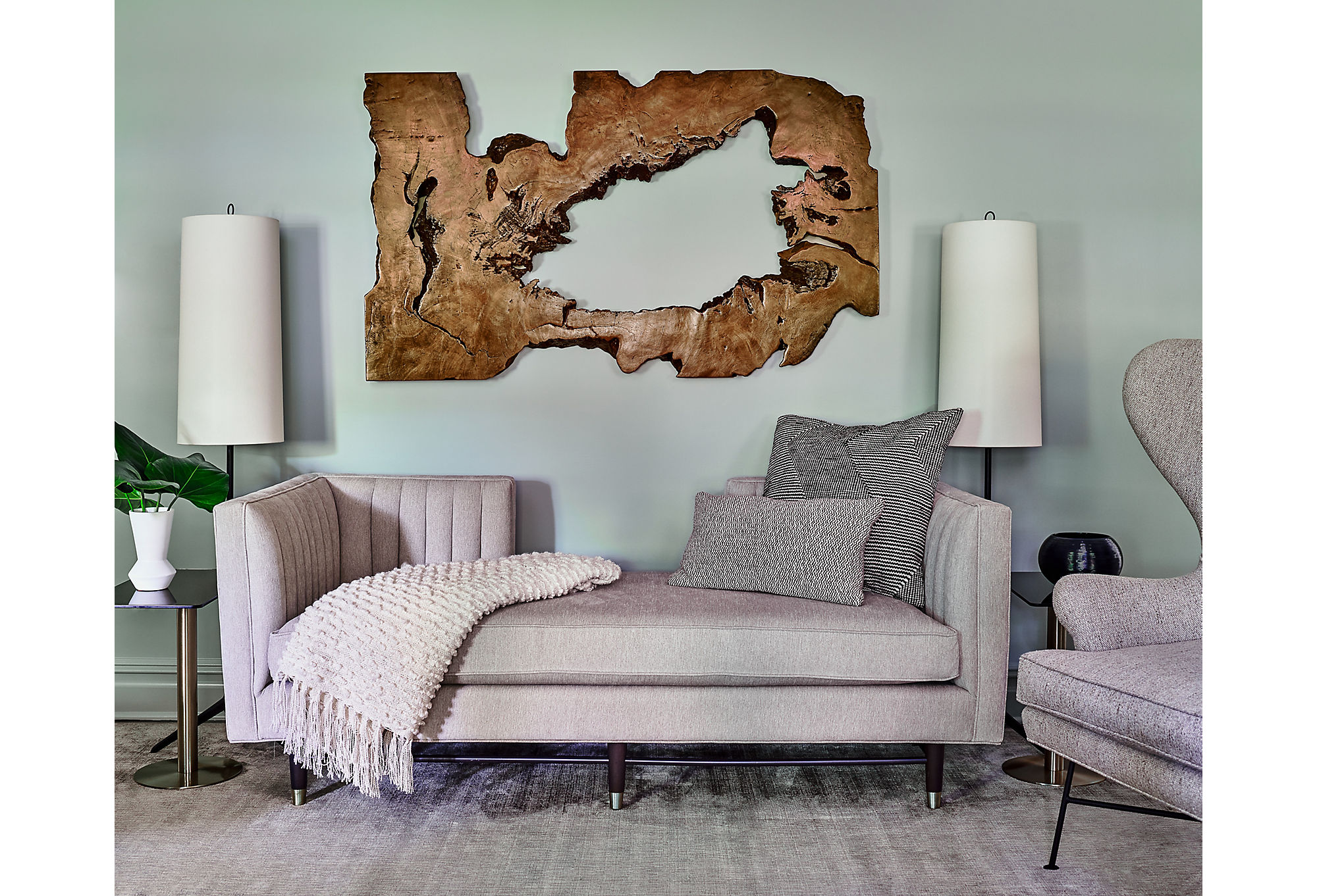
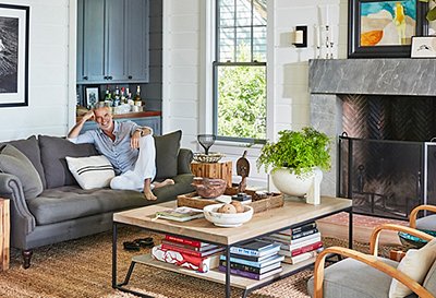
The formal living area uses organic wood art to balance the modern aesthetic of the gray channel-back sofa.
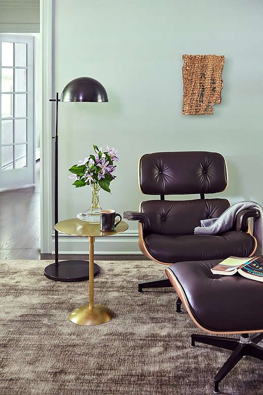
Brass elements such as the side table warm the space. Tina used custom rugs by Stark Carpet throughout the home.
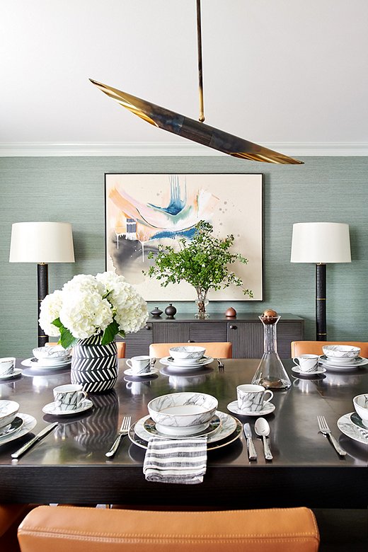
“We wanted to incorporate some formality in the dining room,” says Tina. She paired a custom table with a textured mahogany sideboard.

It’s a well-balanced mix of straight lines with curvature and character via the furniture, art, and accessories.
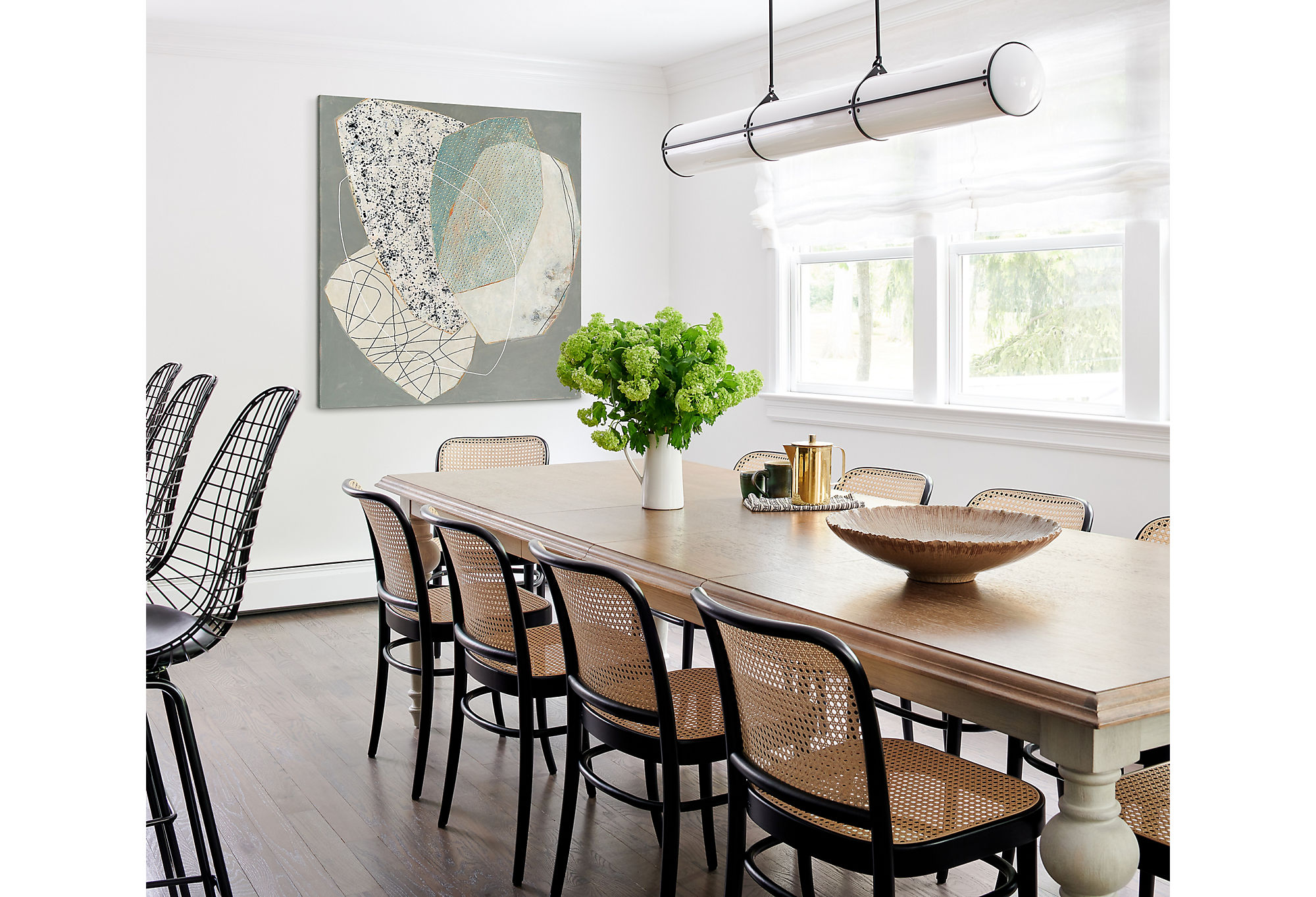
The homeowners have a large immediate family and love to entertain. Tina found a chic farmhouse-style dining table that would seat the entire family for a casual meal. The art at the head of the table brings in the modern aesthetic.
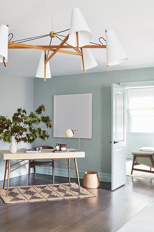
Tina warmed the office space with jute and other natural materials.
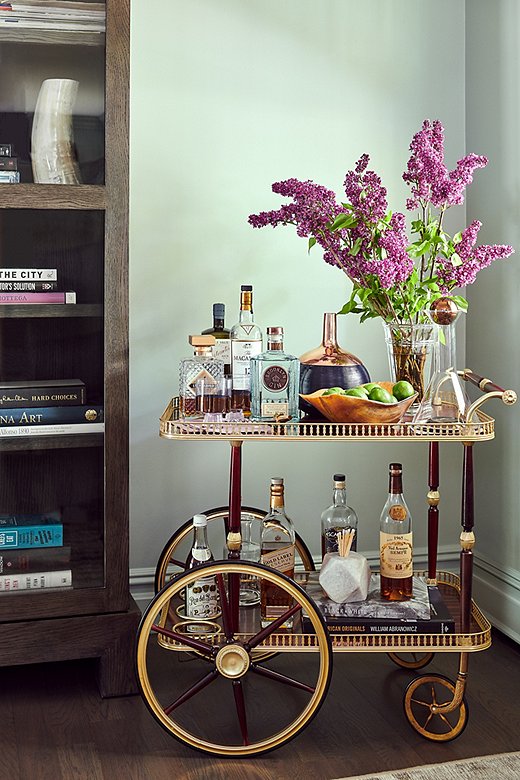
Because the couple loves entertaining, a well-stocked bar cart was a must.
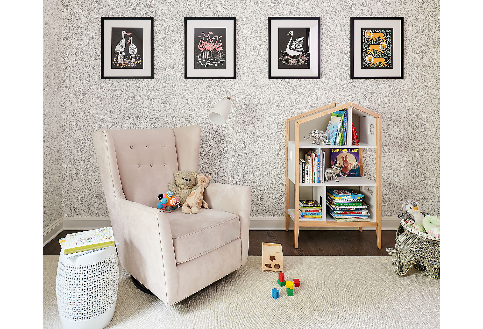
“After much discussion, we thought it would be best to keep the nursery gender-neutral,” says Tina. “We used a soft patterned wallpaper by Lee Jofa that adds interest to the room in a subtle way.”
Join the Discussion