Part of being an interior designer is pushing clients to try new things. It’s a little easier to expand their horizons when they’re friends first, clients second. That’s exactly what designer Christina Nielsen discovered when decorating a childhood friend’s first purchased apartment in Manhattan.
“They knew they wanted something that was elegant, serene, and calm,” Christina says, “but they just didn’t know where to start.” Originally they requested an all-white space. “I personally feel like white is so overdone,” Christina says. “I really pushed them to warm it up.”
The project wasn’t without challenges. Christina started as the world shut down in March, and while they were in the middle of the design process the client found out she was pregnant with her first child. These road bumps were no match for Christina, though. The result is a beautiful family home decked out in a soft but welcoming palette with touches of bold color.
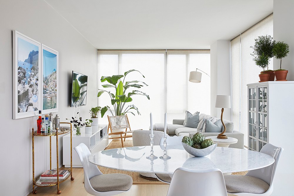
After Christina persuaded her clients to leave the idea of a stark white box behind, she had to find subtle—and now baby-friendly— ways to bring in color. She started in the living room with a soft gray sectional in a minimalist silhouette that has metallic flecks of gold in the stain-repelling performance fabric. Because space is at a premium in New York apartments, especially when your family is growing, Christina went light and airy when she could. The gold in the sofa upholstery is reflected in the tan sisal rug and the gauzy gold window treatments. The acrylic waterfall coffee table takes up no visual real estate and leaves room for a little one to crawl around without the parents having to worry about sharp edges.
Next Christina looked to the kitchen. As in many other New York apartments, the kitchen and the living room occupy the same space and needed to be visually separated. Christina, who recently partnered with Plain English Cupboardmakers, wanted to make the space feel special. The cabinets were a boring pine and needed a little color. She went with a gray tone, Farrow & Ball’s Down Pipe, to echo the color in the sofa and pillows.
The main bedroom is a master study of how to use color in a small space. It’s important to consider where or how much to paint in a small space, according to Christina. “I don’t like accent walls because I feel like it makes the space look smaller,” she says. It took some convincing, but the clients eventually came around to letting her paint the entire room in Farrow & Ball’s Inchyra Blue. She kept it from feeling too cluttered by going simple everywhere else. No loud colors in
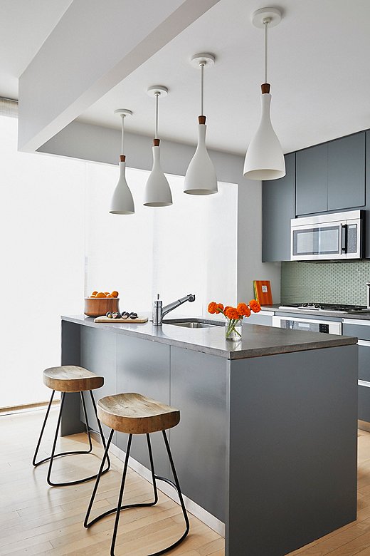
Modern white pendant lights add a nice curved shape to the kitchen vignette. Wooden counter stools bring some natural warmth.
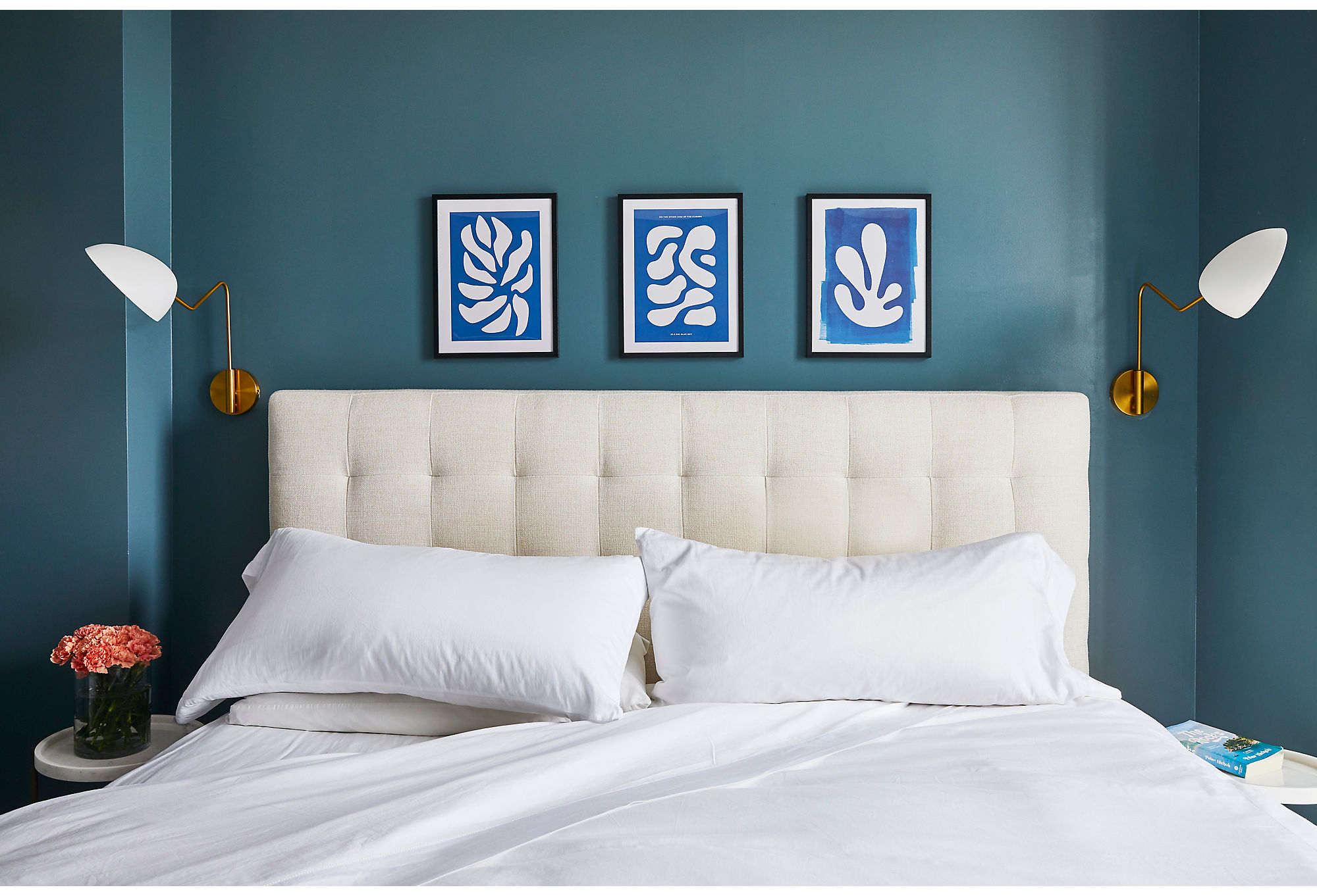
A tufted headboard (see a similar bed here) and crisp white linens create a serene place for the couple, who work high-stress jobs, to lay their heads. Streamlined sconces flank the bed, allowing the trio of Matisse prints to be the star of the show.
the bedding or art competed with the walls, with the vivid blue of the Matisse prints accentuating the beauty of the rich teal walls.
Christina took on the nursery in a similar manner: She got the color to do the heavy lifting for her. Christina chose a soft pink as the backdrop of a room meant to grow with the child. Sophisticated accents throughout, such as the Dawn Wolfe Design artwork, make the space feel all that more grown-up.
Together, a dash of color and a bit of confidence brought this small Manhattan apartment to life. We asked Christina to share more tips on decorating for small spaces below. Follow her advice and you’ll end up with a home as beautiful as this.
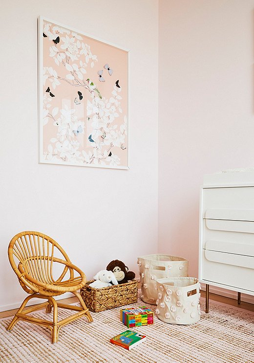
Dawn Wolfe butterfly art takes center stage in the nursery. Storage baskets from Pehr keep toys organized without taking too much space, and, because they’re canvas, they can easily be tucked away when not in use.
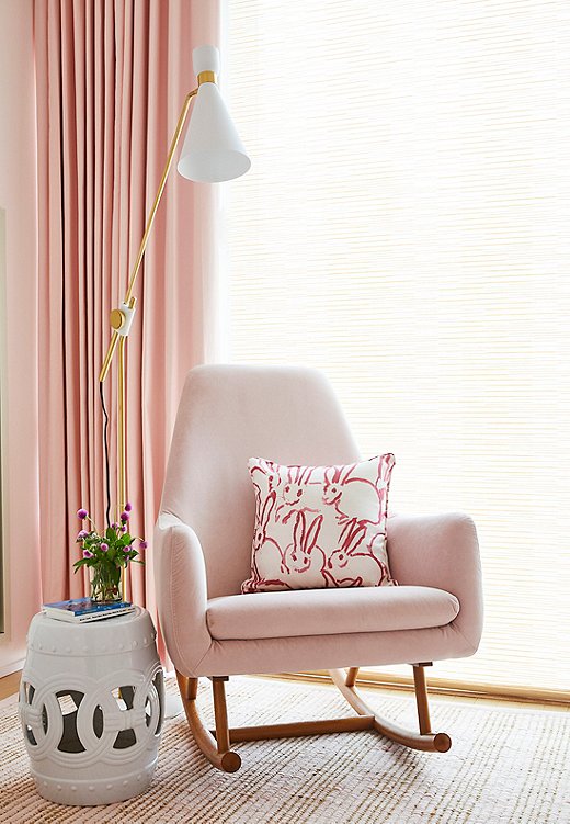
The Amelia Garden Stool is a nice substitute for a side table in a small space. Christina also went with a slim floor lamp to minimize visual clutter. Find similar pillows here.
Christina’s Tip on Decorating Small Spaces
- Go green. “I love plants. I think they make such a difference and transform a house into a home,” says Christina. She also notes that tall plants are a great way to bring a slightly sculptural element to a space. Shop greenery →
- Bring in area rugs. In a small apartment, defining spaces is key. Using different rugs in different areas is a great way to delineate them as separate spaces. Shop rugs →
- Opt for multipurpose pieces. Space is at a premium in apartment living, so hardworking furniture is a must-have. For that reason, Christina is a fan of sleeper sofas. For storage, she has a secret weapon: “I love hollow ottomans.” These chic storage items allow you to quickly hide away clutter. Shop storage ottomans →
- Use color wisely. “If you don’t have a lot of furniture to work with and you want to keep things more minimalist, which is important for keeping the space more open, then color is a great way of bringing in your own personality,” she says. Opt for bold statements instead of smaller moments.
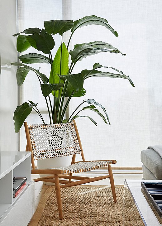
A tall banana leaf plant adds a pop of green to the quiet living room.
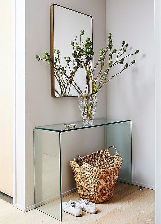
The Franco Wall Mirror sits over a glass waterfall console table in the entry. A woven basket and greenery add natural warmth.
Join the Discussion