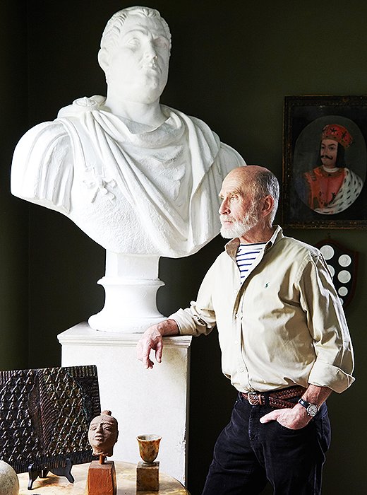
Frank with a plaster bust used as a prop in the 1963 movie Cleopatra starring Elizabeth Taylor. “I chose him because he’s so thug-ish looking,” says Frank. “He looks like Tony Soprano’s uncle.”
The artist and interior designer Frank Faulkner has bought and lived in so many houses in New York’s Columbia County, he has been called both “architecturally promiscuous” and “a shelter slut”—information he shares with a smile. In true Don Juan fashion, he can’t recall the exact number of late 18th- and early 19th-century houses he’s owned during the past 25 years (is it 17? 18?), and he claims that he moves into each one with the best of intentions. “It’s never been about flipping them or reselling them. I always intended to grow old in them. But after everything is finished and I’ve lived in it for a while, I see another house I want to play with.”
But Frank’s gadabout days may be drawing to a close. His current house—a white clapboard two-bedroom likely built at the far end of the 18th century—has won him over. Set in a town he loves (the hamlet of Spencertown), it offers comfort, the classical architecture he craves, a gorgeous garden he created along with his partner, Philip Kesinger, and the space and proportions to display his prodigious collection of art and objects. “I just love the dignity of this house,” Frank says. “It’s not a grand house by any means, but it’s a very, very beautiful house.”
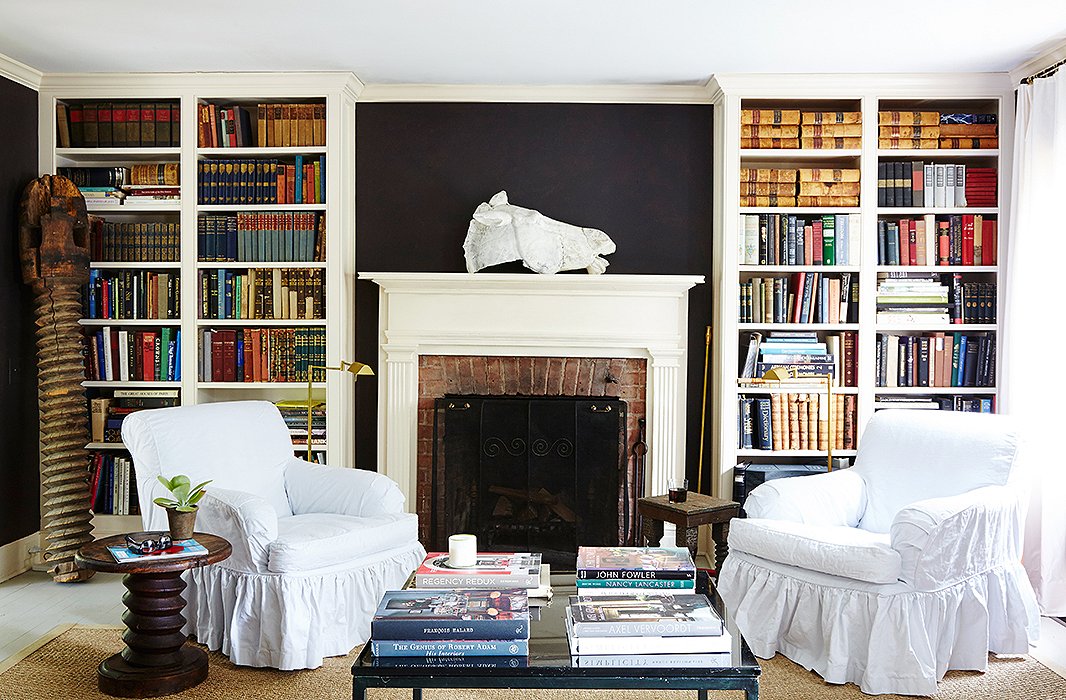
Dark walls highlight the light-colored objects in the room, including the horse-head sculpture on the mantel. Cast in plaster from the original at the Parthenon, it was at one time owned by the Metropolitan Museum of Art.
Celebrating the Dark Side
Bucking the conventional wisdom that pale walls make spaces feel bigger, Frank painted the walls of the living room and library relatively dark colors—but only after making the mistake of first painting them a light gray. “It looked somewhat banal,” Frank says. “Somehow having the darker colors paired with lots and lots of gold-leaf-framed paintings and white plaster objects created so much depth it kept you from thinking about the size of the room.”
The library is painted in Benjamin Moore’s Dark Caviar, a blacky brown with purple overtones which provides a dramatic contrast to the explosion of color contained in walls of books. The wide floorboards—many of them original—will eventually be sanded and scrubbed, a treatment popular in Scandinavian homes, but for the moment they are painted a soft gray that approximates the look.
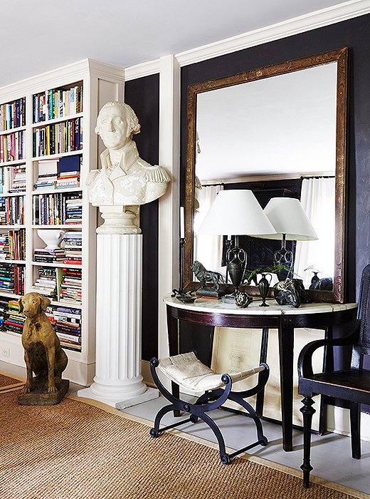
A huge bust of George Washington and an enormous framed mirror make a small room feel grand.
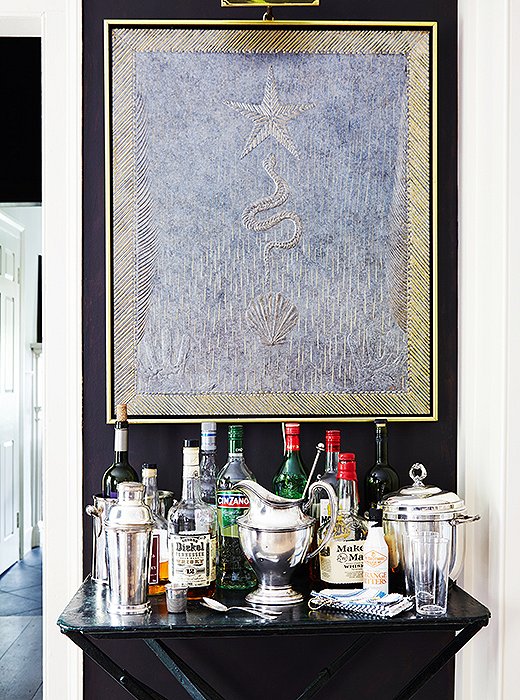
Dark walls and a dark marble-top table make a dramatic contrast to glittering barware and one of Frank’s luminous gilt-edged paintings.
Going Big
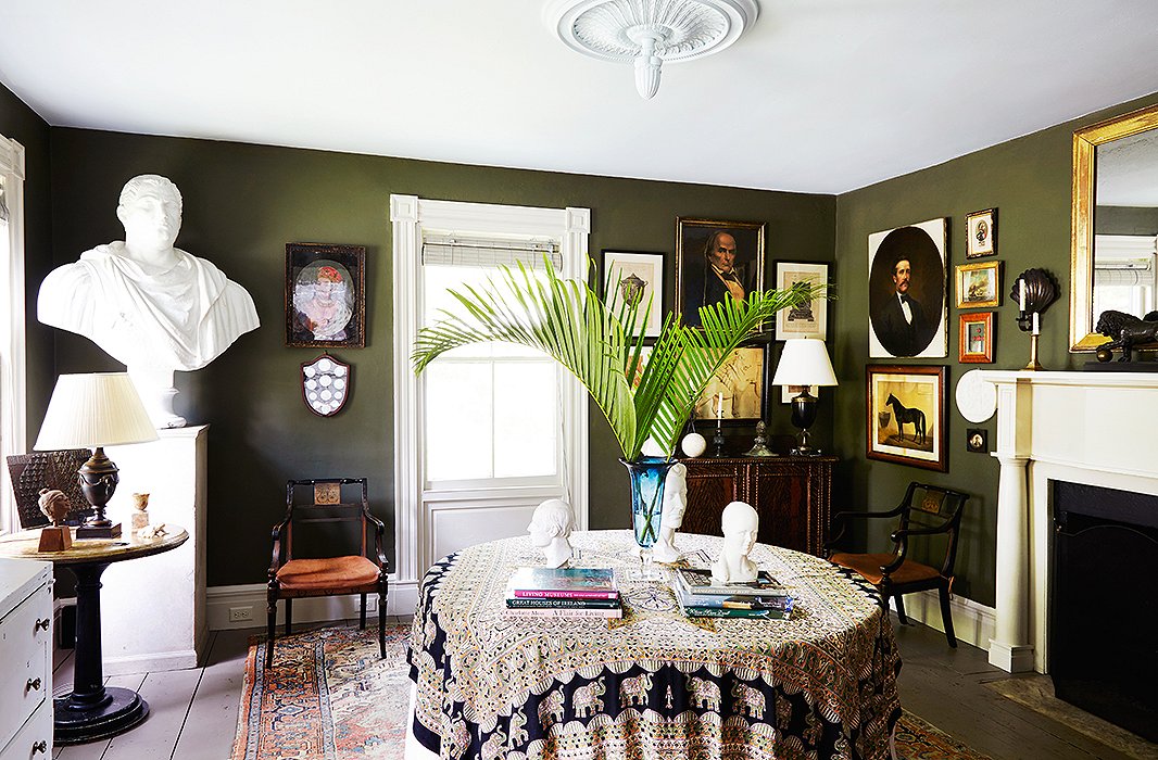
While many people try to size down in a small room, filling it with small furniture and objects, Frank thinks this makes a room look “timid and tame.” Overscale objects or furniture or a large group of paintings grabs attention and “diverts the eye from the size of the room.” He advises including “at least one overscale—sometimes very overscale—thing: one large sculpture or a huge, huge bust, or a complete wall or several walls filled with bookcases floor to ceiling.” In Frank’s house, his big pieces include oversize armchairs, urns, and vintage plaster busts.
All the ceilings throughout the house are painted a very pale ice blue. “It has a very calming, fresh feeling,” says Frank. “You can almost feel the fresh air.”
Going Maximal with Minimal Space
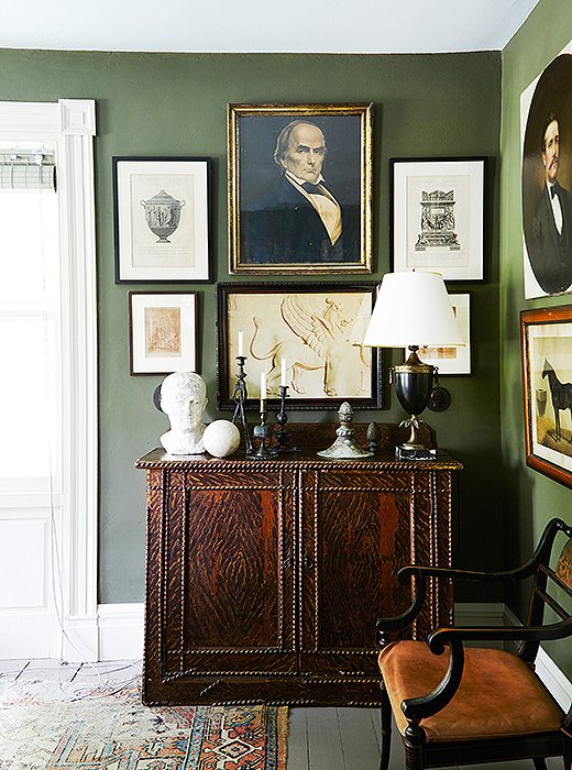
“I like very, very clean, bare spaces if the proportions of the room are good and the lighting is good. But an empty room, to me, is not minimalist,” says Frank. “It’s just empty. If you have relatively small, chopped-up rooms I think you’re better layering them to within an inch of their life.” That is exactly what Frank has done in his current home, which like many other old houses has fairly small (16′ x 16′) rooms. Walls are covered with gilt-framed mirrors and a complex mix of paintings, drawings, photographs, and etchings; bookshelves are packed to the ceiling with books; end tables and mantelpieces are topped with a fascinating mix of figurines, objects, urns, and lamps. The layers add a sense of plenty, and the overall effect is inviting and cozy. “Each room is like a cabinet of curiosities,” he says. “It diverts the eye with things to look at. Rather than overwhelm you, it makes the room seem larger.”
For the dining room he used Benjamin Moore’s Forest Floor, a calming gray-green he says he might have chosen as a result of “watching too much Downton Abbey.”
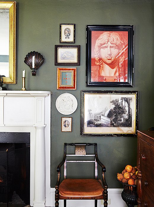
One of Frank’s favorite pieces is this sepia print of a sculpture depicting Hephaestion, Alexander the Great’s bodyguard (and possibly lover), which he found at a flea market in Bath, England.
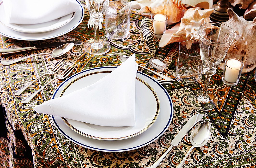
Antique glassware sparkles atop an Indian bedspread-turned-tablecloth.
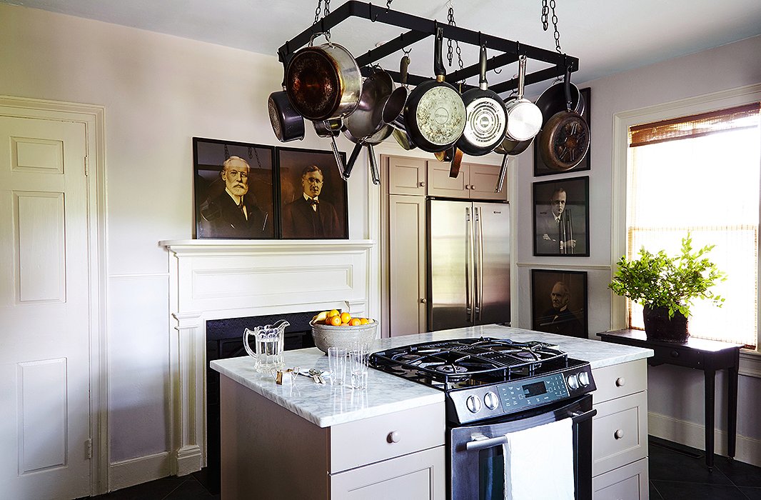
The kitchen is dignified by a series of sepia portraits—found by Frank in a trash bin at a junk store—of several generations of a well-known family from the nearby town of Hudson.

I like very, very clean, bare spaces if the proportions of the room are good and the lighting is good. But an empty room, to me, is not minimalist. It’s just empty.
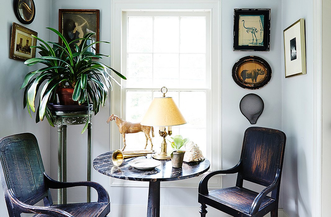
Dutch Colonial chairs from South Africa, an antique marble-top table joined to a cast-iron base, and art in weathered frames share a handsome patina.
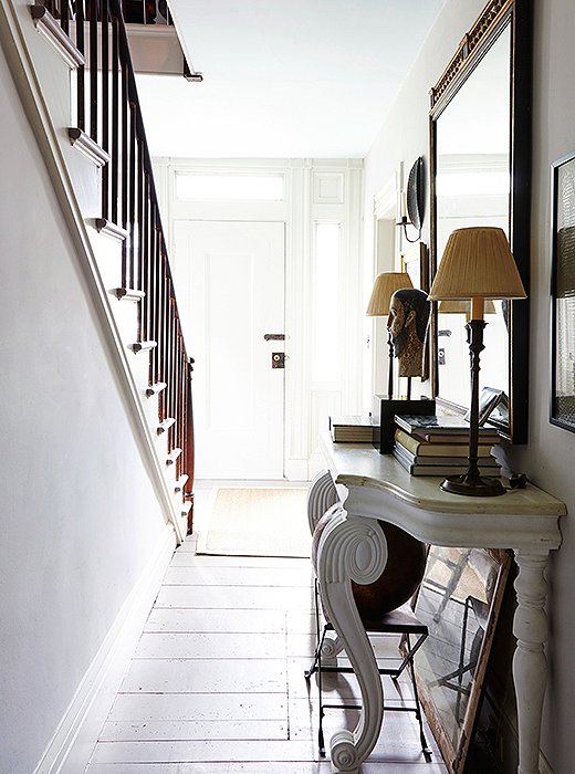
The entryway and the kitchen are painted the same pale gray (Benjamin Moore’s Nimbus), and the entry is enlivened by a playful placement of mirrors. “Mirrors are so important,” says Frank. “You get light and that sense of movement.”
A Canny Collector
When Frank visits an antiques shop or a flea market, he doesn’t bring an agenda: “I don’t have a rigid list of things. It’s anything that I find beautiful or interesting.” His possessions include things found by the side of the road, in trash cans, and at high-end antiques dealers. “I love beautiful objects. Some of them are very fine objects. Some of them have been gifts by designer friends with wonderful eyes. Some of them are just interesting junk.”

Frank has issues of The World of Interiors, Architectural Digest, House Beautiful, and House & Garden going back decades. “There’s nothing more pleasurable, especially on a rainy day, than flipping through them.”
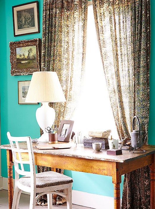
When guests aren’t present, the guest room is used as Philip’s dressing room and study; the curtains are made of Indian bedspreads found online.

Each room is like a cabinet of curiosities. It diverts the eye with things to look at. Rather than overwhelm you, it makes the room seem larger.
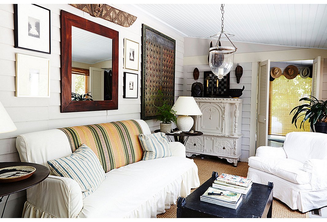
In the sunroom and throughout the rest of the house, Frank mixes light and dark pieces to create a liveliness that legendary decorator Nancy Lancaster called “movement.” Find a similar armchair here.
Keeping Calm
Though there are many objects in each room, they are united by what Frank calls a kind of clarity. “All of my stuff goes together because it’s based on a sort of classical, symmetrical look.” The symmetry of individual objects extends to the groupings of art on the walls and objects on surfaces, along with the furniture arrangements. “I love symmetry,” he says. “I find it very calming, soothing, and stabilizing.”
To further this sense of calm and keep the richly layered rooms from feeling crowded, Frank stays away from pattern. With the exception of the occasional ticking stripe and Indian textile, the art and objects do the talking. The furniture, a mix of humble and fancy pieces slipcovered in white, offers a striking contrast to the eclectic mix. “It crisps up everything and pulls a room together very quickly,” he says of the white cotton slipcovers. What’s more, they can be thrown in the laundry, a major plus in a house with four cats.
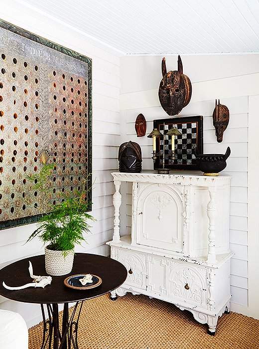
Frank transformed a mahogany chest, meant for a man’s dressing room, by painting it white. “I can’t stand boring brown furniture. Unless it’s really valuable, I usually paint things. It just makes it fresh.”
Going Legit
Given his home-owning history, it remains to be seen if this house is in fact the one for Frank. “I never, ever bought anything that I didn’t mean to grow old in,” he insists. “But so far, that’s not happened.” But as he waxes on about the wonders of his home, it seems that a commitment might be a real possibility this time. “We just love this house. We love the comfort of it. We love sitting by the fire with our cocktails, we love our neighbors, we love our cats. Every day is a perfect day for us here.”
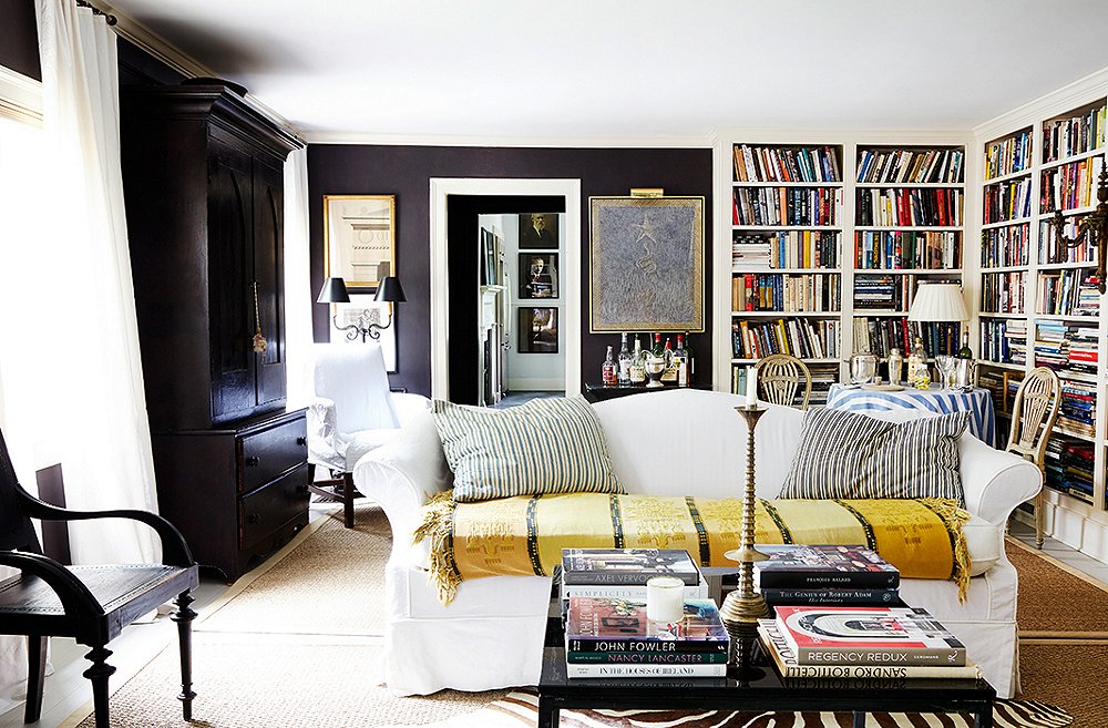


The link to Dark Caviar at Benjamin Moore connects to Deep Caviar, and the paint chip really does not resemble the wall color. Is it possible to get clarification on the living room wall color?
A very loved and lived in home hard to believe Frank is a professional designer, as he just left the house speak for itself. Love this home it just has good vibes in the pictures of it not at all pretentious like many New Yorkers weekend homes just a lovely warmth about all of it especially the classical details so subtilly used through out this jewel…done by a master who understands houses…and really living in them…Bravo
This is a great example of intuitive decorating – what at the start seems eclectic perhaps even random is soon realized as intuitively gathered items/spaces/ interior scapes that work on a much deeper level than any textbook rote decorating (matchy matched/faux grandeur/pretense and superficial perfection) can ever accomplish. Kudos and prosst!
Kimann
http://www.modlodgeluv.com
Where did he get the slipcovers for the couch???? I needed them!! THANKS THNAKS 🙂 🙂